
Microsoft. Think 4-square logo against a white showroom floor with one accent blue guiding every interaction.
- Brand
- Light theme
- 7 colors
- 1 typeface
Microsoft.com is a corporate store-and-marketing surface: a near-white canvas punctuated by a single vivid corporate blue, with product cards floating on subtle elevation and one-color hero banners. Segoe UI carries the entire system — a humanist grotesque that reads utilitarian and confident rather than editorial. The visual rhythm is grid-disciplined: 4-column product rows, centered max-width bands, and hero sections that alternate between blue-tinted lifestyle photography and pure white card overlays. Components feel light, flat, and functional — minimal radii, thin borders, one shadow stack, no decorative gradients — letting product photography do the visual heavy lifting while the blue accent marks every action.
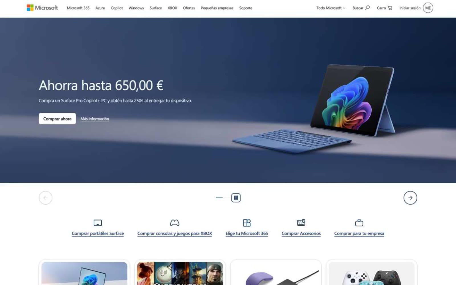
Microsoft design system

Brand1
Primary action background, link text, navigation accents, icon strokes — the single chromatic authority in the system, used for all filled CTAs and interactive highlights
Neutrals6
Primary text, card borders, hairline dividers — the dominant typographic and structural color
Dense text blocks, list separators, button border variant — the darkest neutral after pure black
Body text variant, list borders, navigation dividers, secondary headings
Secondary text, navigation text, muted UI elements, footer copy
Footer background, subtle surface tone, page canvas under cards
Page background, card surfaces, button text on blue, surface elevation
Try a pairing
Pick any two colors from the palette to check whether text stays readable on top.
Aa
Pure White on Microsoft Blue
5.78 : 1 contrast
- Body textPasses AA 4.5
- Large textPasses AA 3
- StrictFails AAA 7
More DESIGN.md files. Same web, different personalities.

Airbnb
Brand
Aker
Brand
Alison Roman
Brand
Alpine Bio
Brand
Alveos One
Brand
Amrit Palace
Brand
André Cândido
Brand
Anna Jóna
Brand
Apollo
Brand
Apple
Brand
Arva
Brand
Ashton Bespoke
Brand


