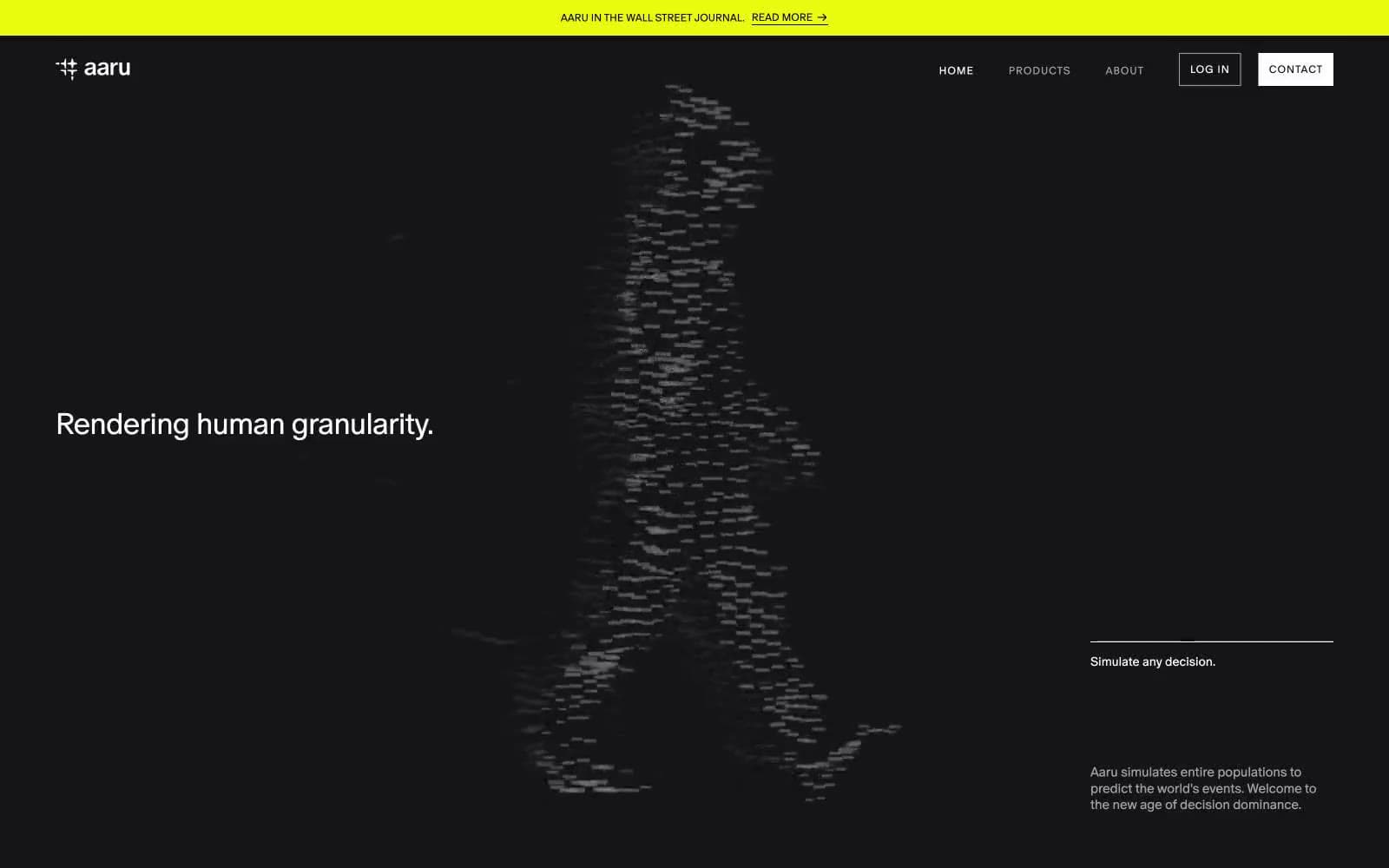
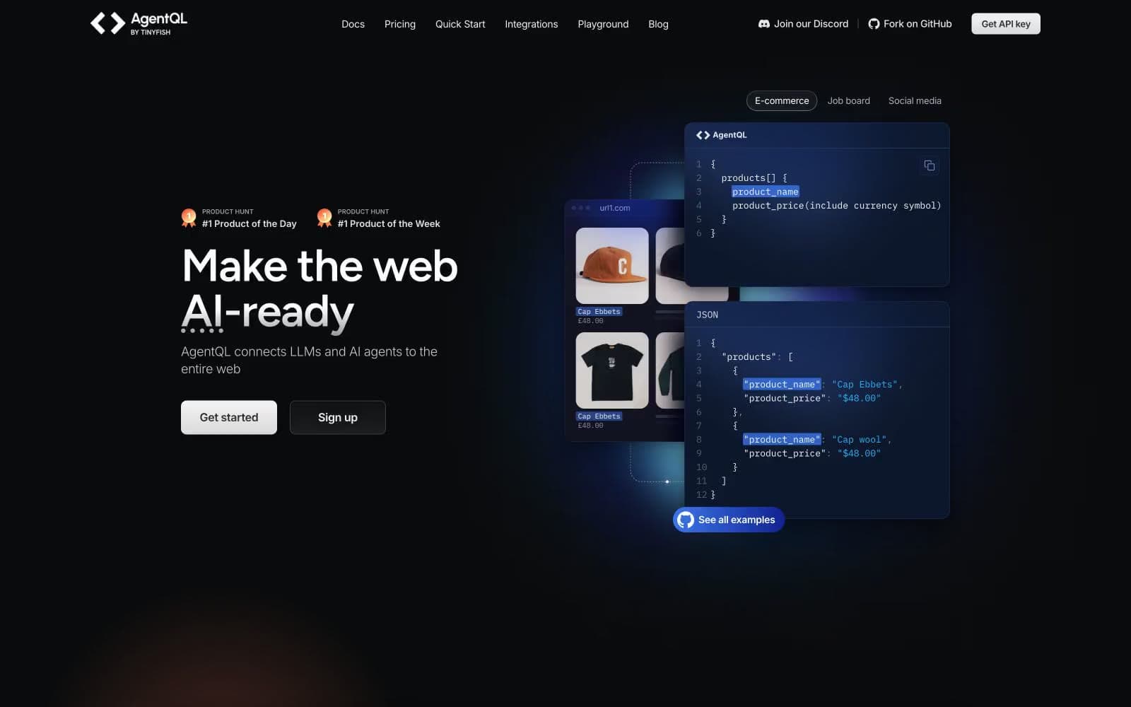
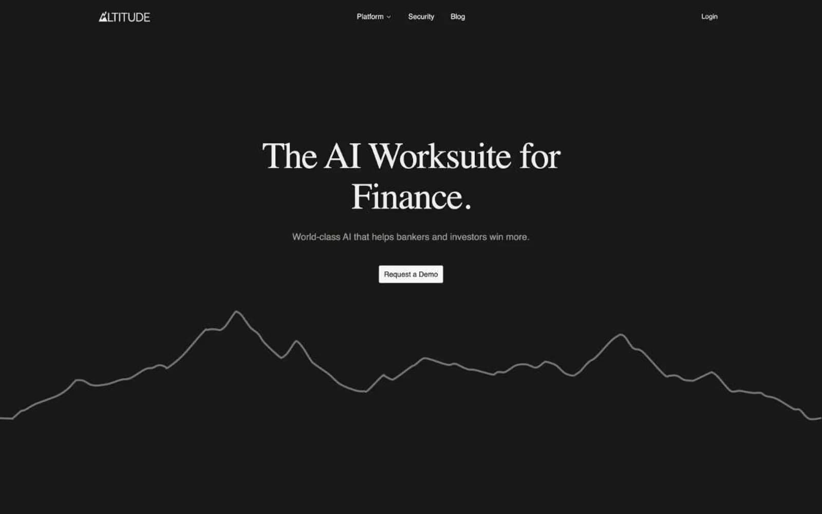
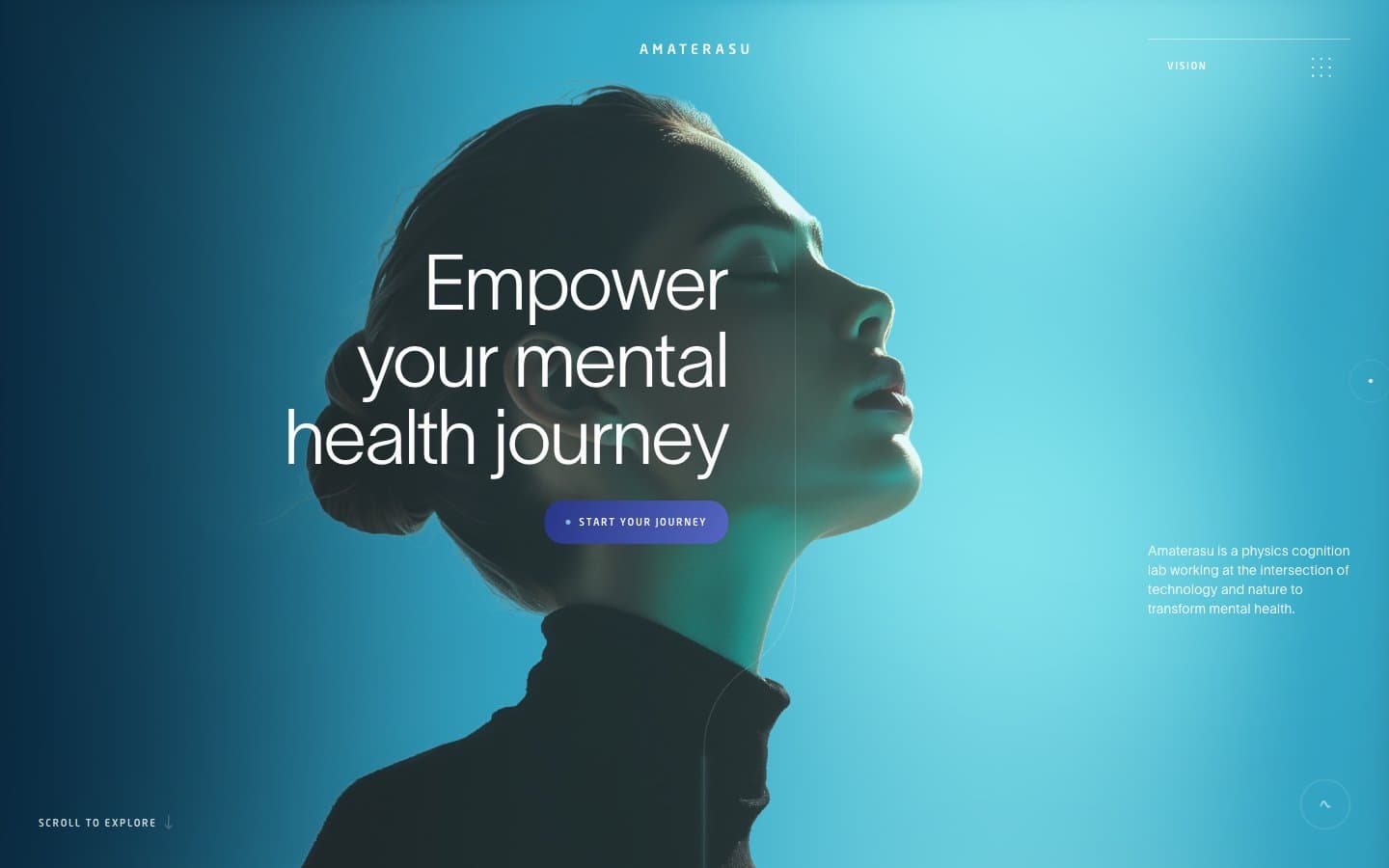
Metaview. A near-black instrument panel lit by a single living mint signal.
- AI
- Dark theme
- 13 colors
- 2 typefaces
Metaview is a dark-mode AI product surface — a near-black canvas tinted with the faintest green, typed in a geometric neo-grotesque at whisper-light weight, and punctuated by a single vivid mint that acts as a live signal for action and selection. The interface reads like an instrument panel for a recruiting agent: deep, controlled, and precise, with green used sparingly as a switch-on indicator for the primary CTA, active tabs, and a few brand glyphs. Components stay flat and low-elevation; the page gains its depth from a soft radial green bloom behind product mockups, not from drop shadows. Typography is airy and tight-tracked, and the only non-monochrome voice is that electric mint — it is the brand's heartbeat.

Metaview design system

Brand1
Green action color for filled buttons, selected navigation states, and focused conversion moments.
Accent3
Pale mint accent for decorative borders, outline strokes, and subtle highlight washes — the low-saturation companion to Electric Mint used when the full vivid tone would be too loud
Supporting palette color for small decorative accents when the core palette needs contrast. Do not promote it to the primary CTA color
Linear green-to-black wash used on secondary atmospheric blocks and footer transitions
Neutrals9
Maximum-contrast text, outline button borders, and the dark-side baseline that all neutrals are calibrated against
Violet accent for outlined action borders, linked labels, and lightweight interactive emphasis.
Page background, hero canvas, footer — near-black with a barely-perceptible green undertone that ties the surface to the mint accent
Card and secondary surface background — sits one step above the canvas, used for product mockup containers, nested panels, and dark secondary buttons
Elevated card surface, modals, and overlaid containers — used when a component must visibly float above the Pine Bark layer
Muted body text, helper copy, and secondary descriptive text on dark surfaces
Tertiary text and subdued labels on dark surfaces
Light borders, dividers, and hairline rules on lighter or mid-tone surfaces
Primary text color on dark surfaces, inverted button text, icon strokes, and the dark-theme default for all reading copy
Try a pairing
Pick any two colors from the palette to check whether text stays readable on top.
Aa
Pure Black on Electric Mint
16.79 : 1 contrast
- Body textPasses AA 4.5
- Large textPasses AA 3
- StrictPasses AAA 7