
Metamask. Cozy, loud headlines, quiet controls.
- Crypto
- Light theme
- 16 colors
- 3 typefaces
MetaMask's visual system is a warm, maximalist-on-type language built on a single signature cream-peach canvas (#fff1eb) that makes every page feel like an editorial spread. Display type does the heavy lifting: an ultra-condensed geometric face at 75–158px in deep violet carries authority through sheer scale rather than weight, while the rest of the interface stays compact and quiet. CTAs are small black pill buttons that sit against the warm canvas as a precise, high-contrast anchor. Color is used functionally as wash — green, pink, blue, and orange swatches paint cards and illustrations rather than chrome — leaving the chrome itself nearly monochrome.
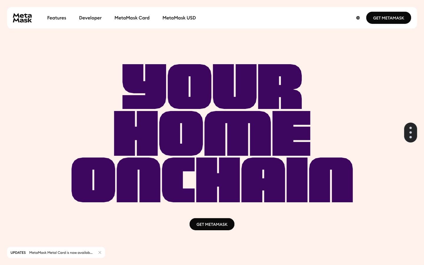
Metamask design system

Brand2
Brand primary — display headlines, decorative strokes, key UI accents; saturated enough to dominate 158px type against the cream canvas
Headline emphasis, link text, dark card backgrounds — the second register of the violet system, used when Deep Violet needs a partner with more weight
Accent8
Accent card surface, decorative wash — fresh, spring-green that lights up product/feature blocks
Saturated green highlight inside illustrations and graphic accents — punctuation color, never structural
Soft pink-purple card wash, pastel type accent — gentle partner to Deep Violet
Saturated pink-purple for decorative shapes and graphic punctuation sitting over lilac or cream
Cool blue card surface — the cool counterweight to the warm canvas in feature blocks
Saturated blue highlight for icons and illustration fills
Warm accent card surface — echoes the cream canvas but steps up in saturation for energy
Dark warm accent for display text and decorative borders — the orange system's deep register
Neutrals6
Primary text, pill CTA fill, nav icons, borders — near-black rather than pure #000 for slightly softer edges
Muted body text, secondary headings, icon strokes — lifts information below the black primary
Borders, dividers, list-item separators on neutral surfaces
Secondary surface, link/button hover washes, soft card backgrounds when a section needs visual cooling
Page canvas, hero backgrounds, dominant surface — the warm skin of the entire site
Card surfaces on cream sections, button labels, inverted text on black CTAs
Try a pairing
Pick any two colors from the palette to check whether text stays readable on top.
Aa
Pure White on Deep Violet
15.11 : 1 contrast
- Body textPasses AA 4.5
- Large textPasses AA 3
- StrictPasses AAA 7
More DESIGN.md files. Same web, different personalities.
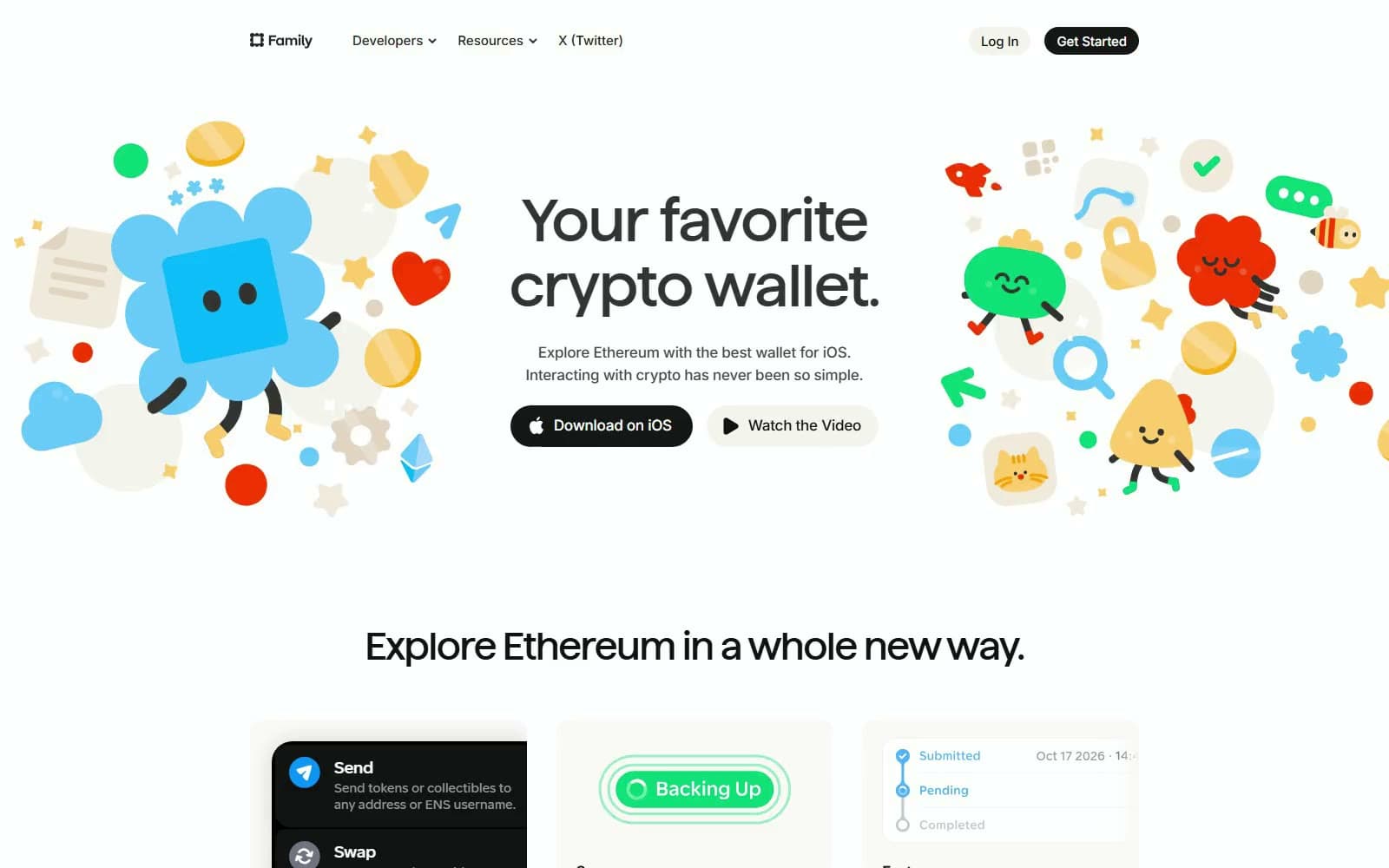
Family
Crypto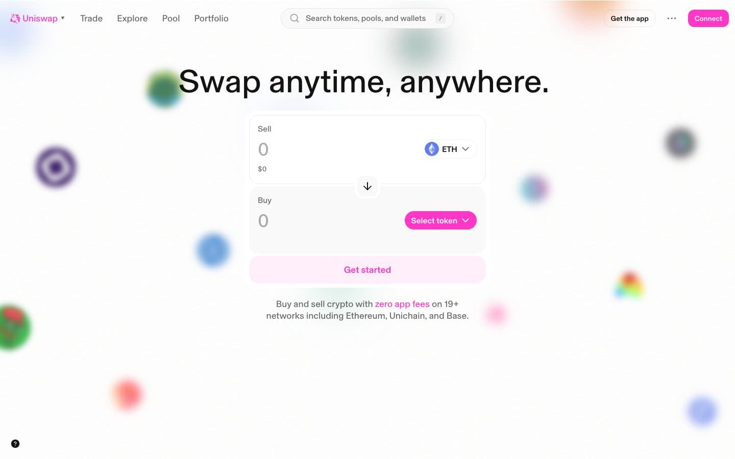
Uniswap
Crypto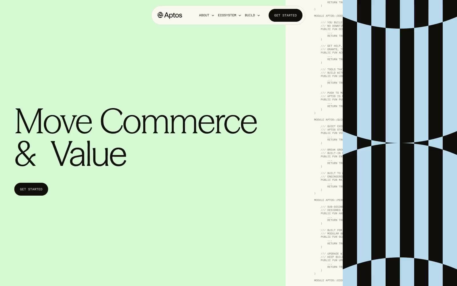
Aptos Network
Crypto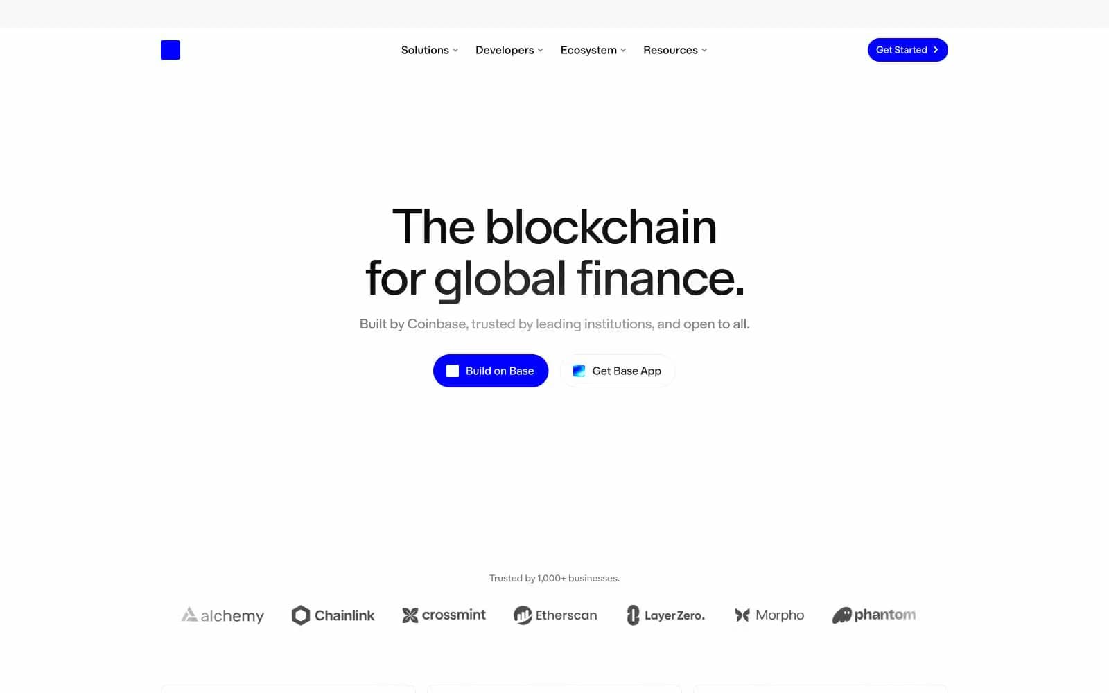
Base
Crypto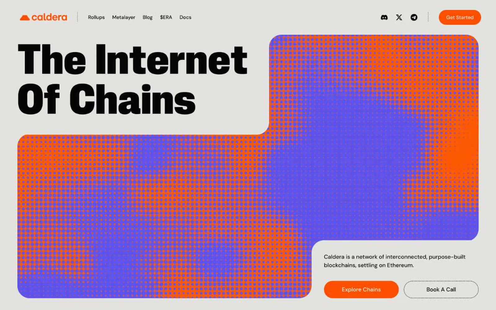
Caldera
Crypto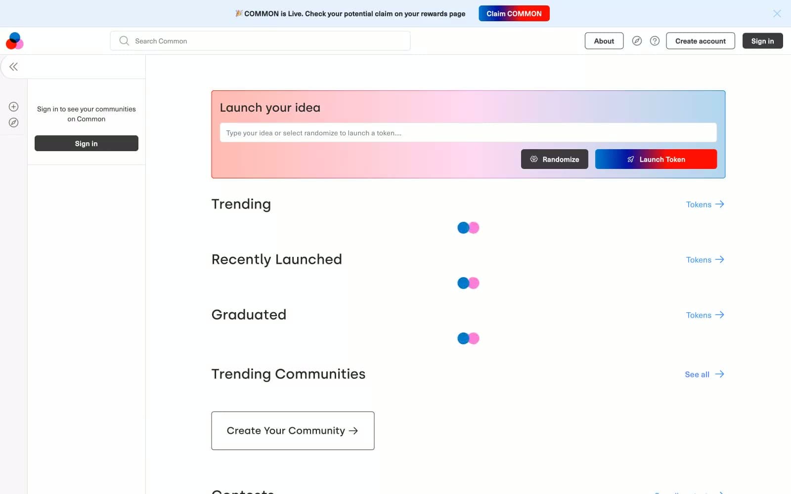
Common
Crypto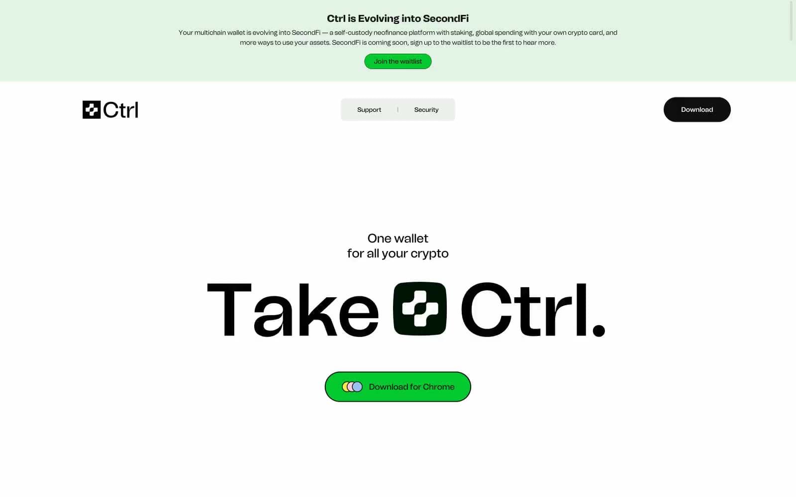
Ctrl Wallet
Crypto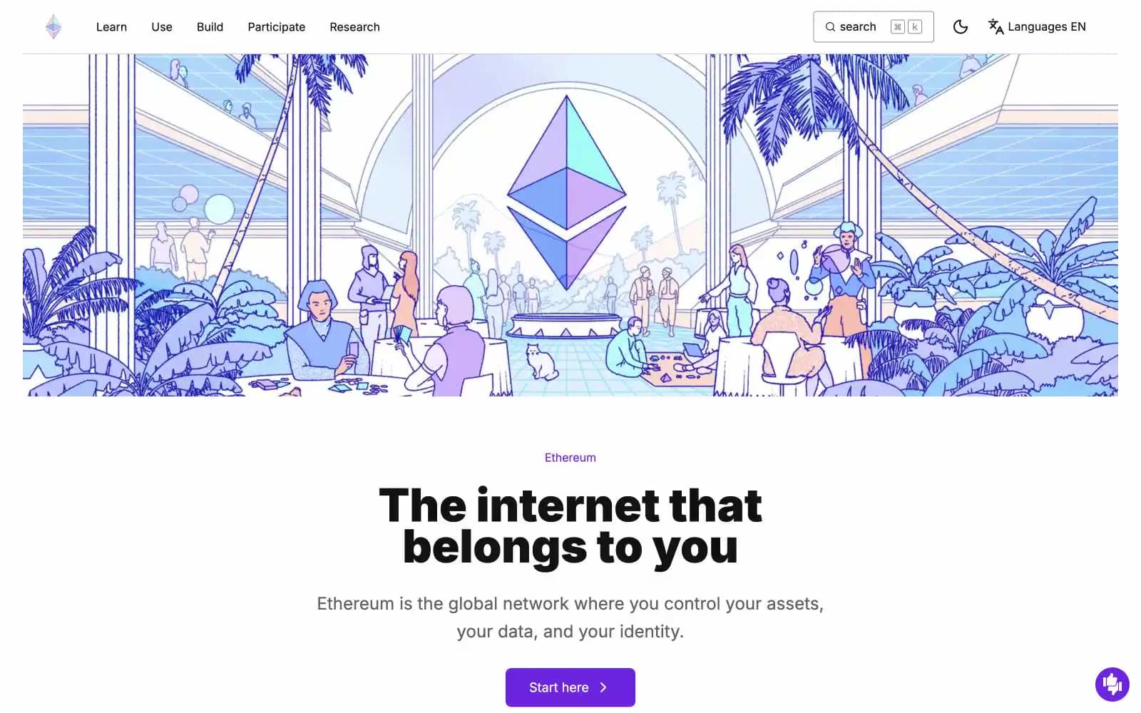
ethereum.org
Crypto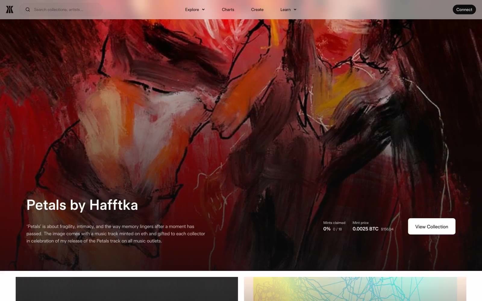
Gamma
Crypto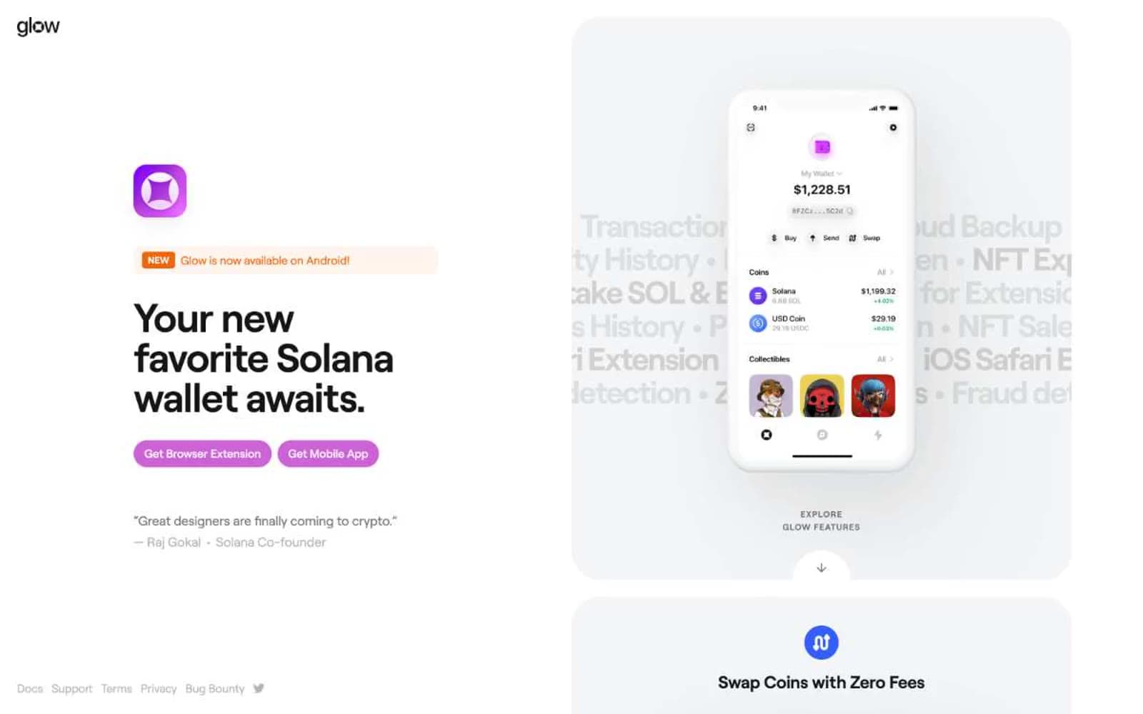
Glow
Crypto
Kraken
Crypto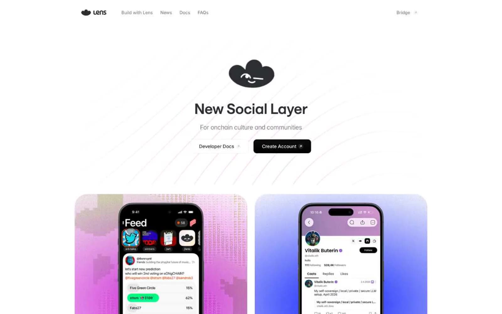
Lens
Crypto


