
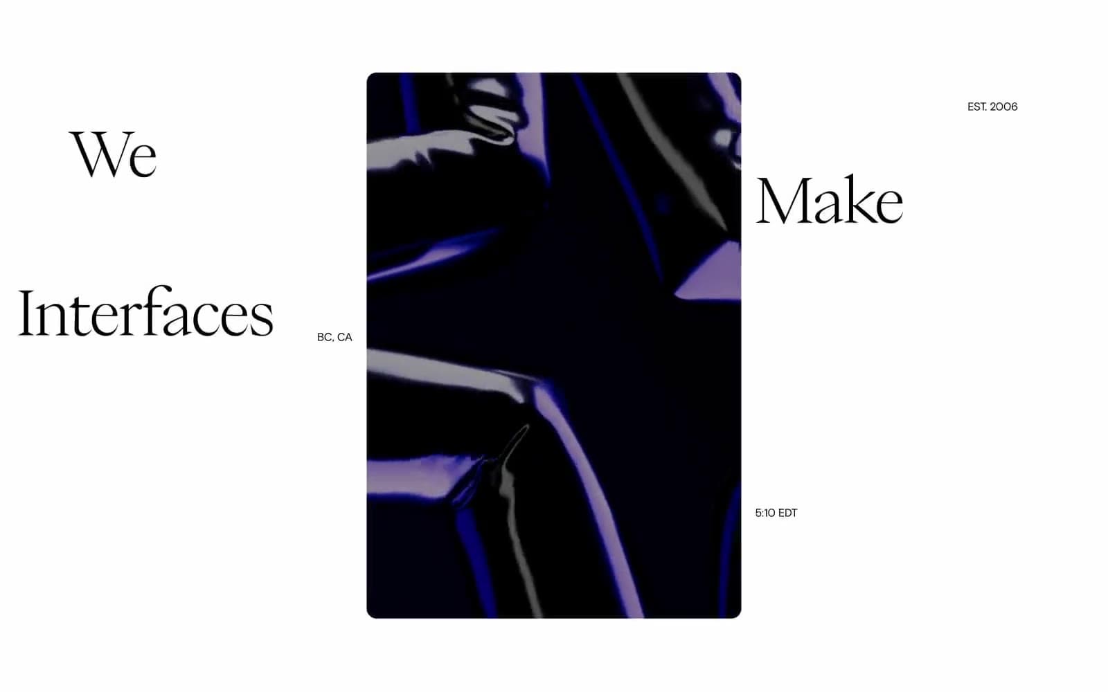
Metalab. A serif headline breathing in void, annotated by a whisper-quiet grotesque.
- Studio
- Dark theme
- 3 colors
- 3 typefaces
Metalab operates in a black-canvas editorial mode: a design agency that lets typography and negative space do the entire performance. Two custom typefaces share the stage — an ultra-light display serif (PP Eiko) at commanding sizes, and a quiet grotesque (Basis Grotesque Pro) for all functional copy — creating a dialogue between a whispering serif headline and a precise sans-serif annotation layer. The interface is achromatic by conviction: no accent color exists, no decorative gradient, no brand chromatic mark. Information is structured purely through scale contrast, micro-typography, and metadata labels (dates, times, coordinates) that float beside content like editorial marginalia. Components are sparse and oversized — a single dark elevated card, a pill toggle, and very little else. The system reads less like a product UI and more like the masthead of a design publication.
Metalab design system

Neutrals3
Page canvas, primary surface, heading text on light zones — the dominant black that absorbs all surrounding elements
Supporting neutral for secondary UI, dividers, and muted labels. Do not promote it to the primary CTA color
Inverse text on dark surfaces, hairline borders on dark zones, contrast punctuation against the black canvas
Try a pairing
Pick any two colors from the palette to check whether text stays readable on top.
Aa
Bone on Void
21.00 : 1 contrast
- Body textPasses AA 4.5
- Large textPasses AA 3
- StrictPasses AAA 7
More DESIGN.md files. Same web, different personalities.

Basement Studio
Studio
Production Portugal
Studio
Active Theory
Studio
Adnaut
Studio
Agence K72
Studio
Akash Tyagi
Studio
Analogue
Studio
Athletics
Studio
BAM Photographers
Studio
Bareis + Nicolaus
Studio
Becklyn
Studio
Branding
Studio


