
LottieFiles. Bright motion studio with teal accent.
- Brand
- Light theme
- 14 colors
- 2 typefaces
LottieFiles operates as a playful motion marketplace: a near-white canvas with confident near-black headlines, soft warm-gray surfaces, and a single signature teal that marks every primary action. Typography pairs Inter for utility and DM Sans for display, with aggressive negative letter-spacing at large sizes that pulls characters into tight, poster-like compositions. The system is built on generous rounded corners (16px–24px dominate) with minimal elevation, letting animated content and illustrations carry visual weight rather than chrome or shadows. Color is used sparingly — teal for action, near-black for text, warm gray for surfaces, and a curated handful of pastel cards (yellow, mint, blush) as categorical accents. The result feels like a well-organized creative studio: quiet structural chrome that recedes so motion can lead.
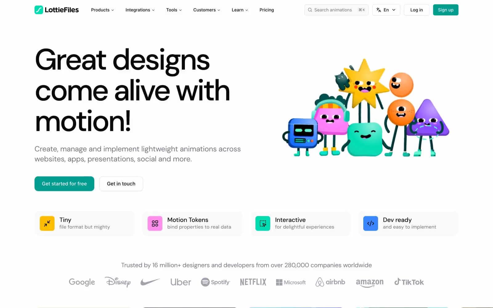
LottieFiles design system

Brand1
Teal action color for filled buttons, selected navigation states, and focused conversion moments.
Accent4
Yellow wash for highlight backgrounds, decorative bands, and soft emphasis behind content. Do not promote it to the primary CTA color
Soft decorative fill in illustration/illustration-adjacent graphics
Bright decorative fill used in hero illustration characters and supporting graphics
Orange wash for highlight backgrounds, decorative bands, and soft emphasis behind content. Use as a supporting accent, not as a status color
Neutrals9
Primary text, headings, dark card surfaces, footer background, icon strokes — near-black with a barely-perceptible cool cast
Dark card backgrounds, elevated dark surfaces, strong icon strokes, secondary dark UI blocks
Dark muted surfaces and inverse muted backgrounds
Muted body text, secondary copy, icon fills, helper labels — sits between the primary ink and lighter grays
Subtle text, tertiary metadata, low-priority descriptions
Hairline borders, input outlines, subtle dividers between UI sections
Largest-volume border color across the UI; subtle separators, input borders, form outlines
Page canvas and soft card surfaces — the dominant background tone beneath white
Pure white surfaces: raised cards, button fills, content containers on top of warm-gray canvas
Try a pairing
Pick any two colors from the palette to check whether text stays readable on top.
Aa
Ink on Lottie Teal
5.91 : 1 contrast
- Body textPasses AA 4.5
- Large textPasses AA 3
- StrictFails AAA 7
More DESIGN.md files. Same web, different personalities.
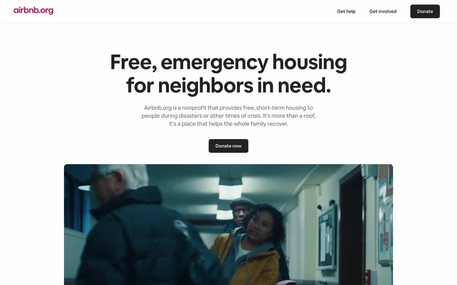
Airbnb
Brand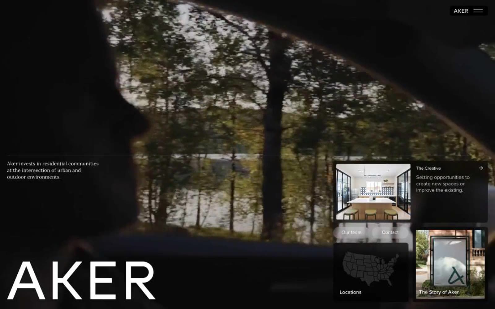
Aker
Brand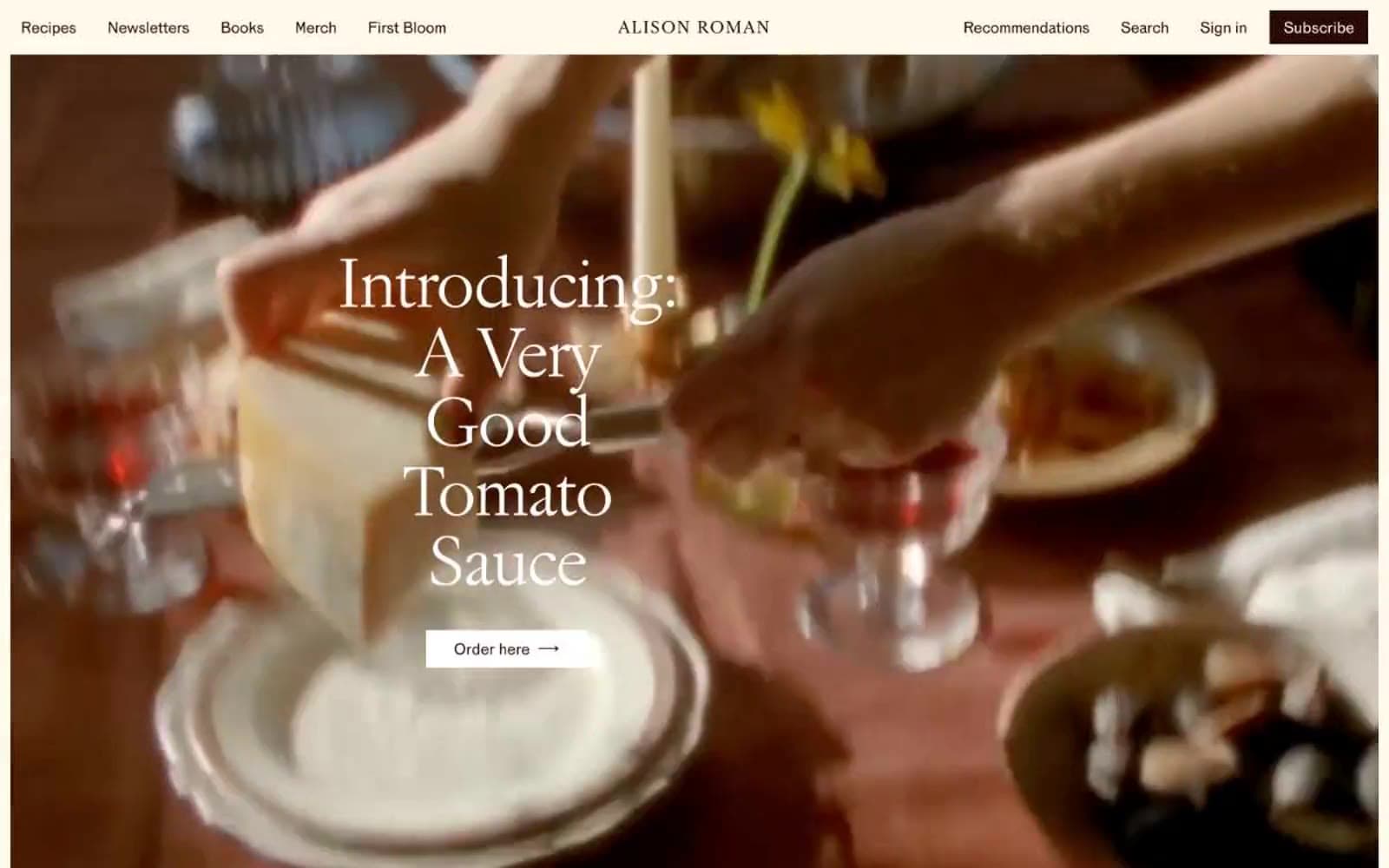
Alison Roman
Brand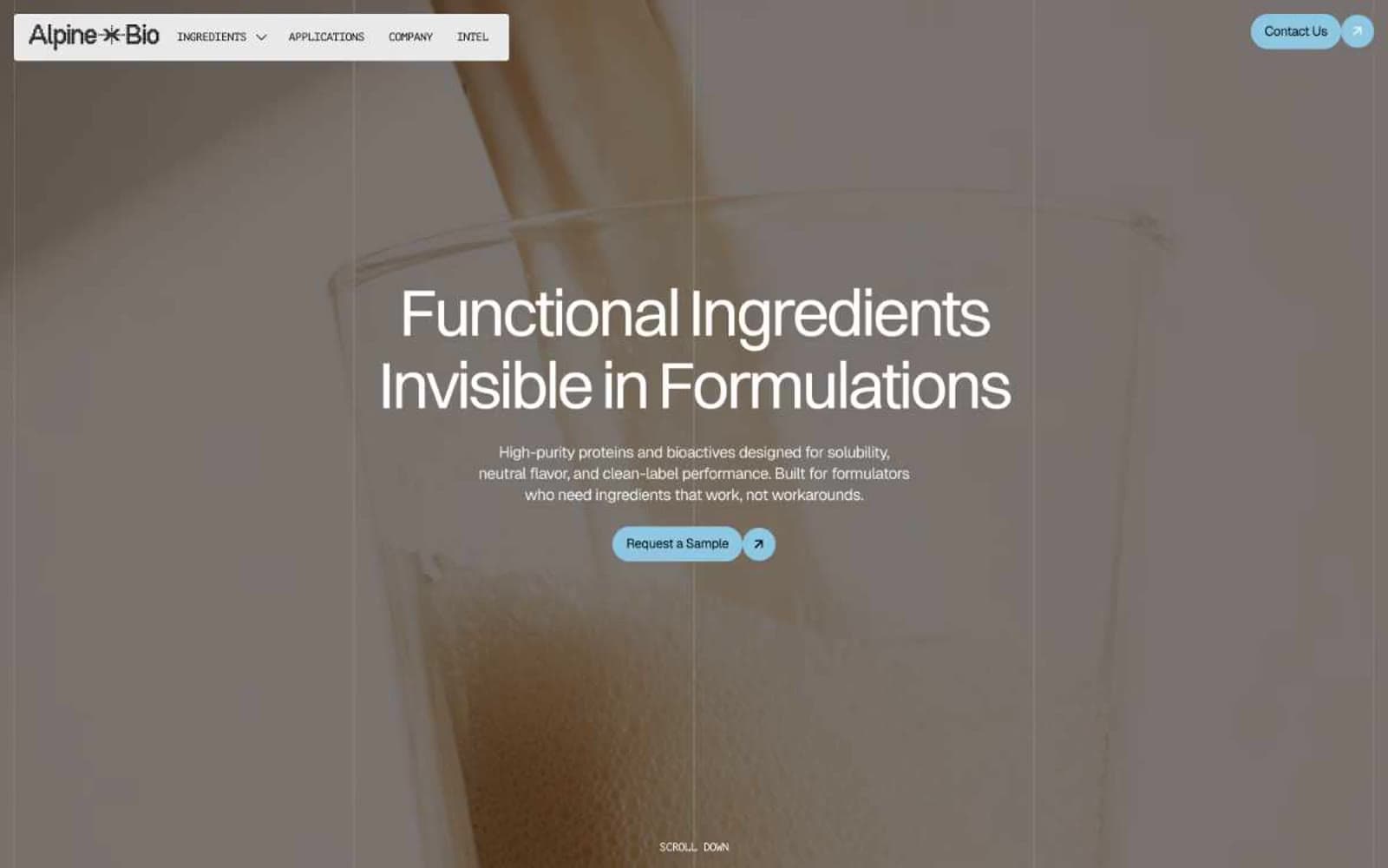
Alpine Bio
Brand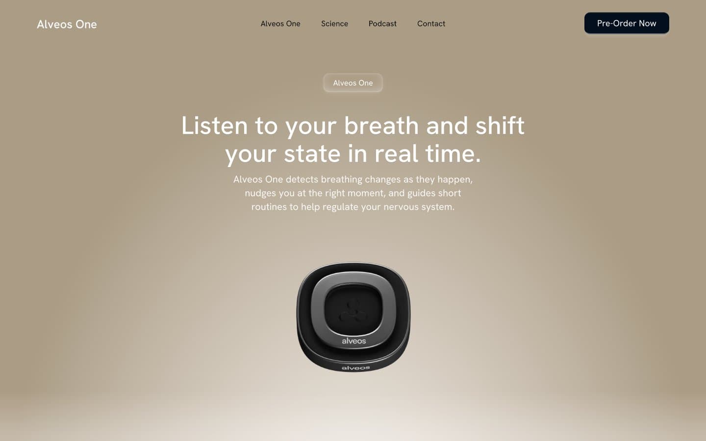
Alveos One
Brand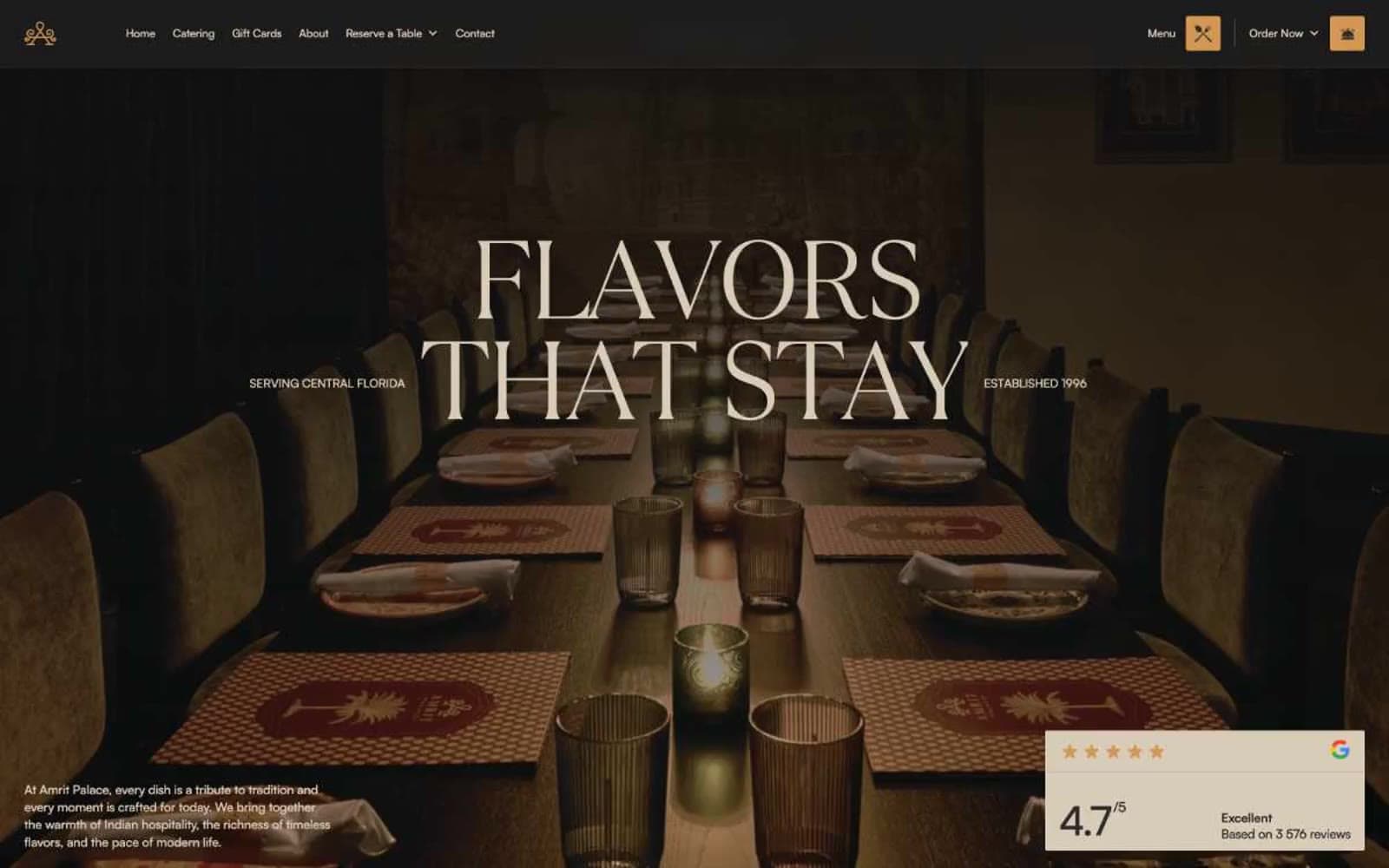
Amrit Palace
Brand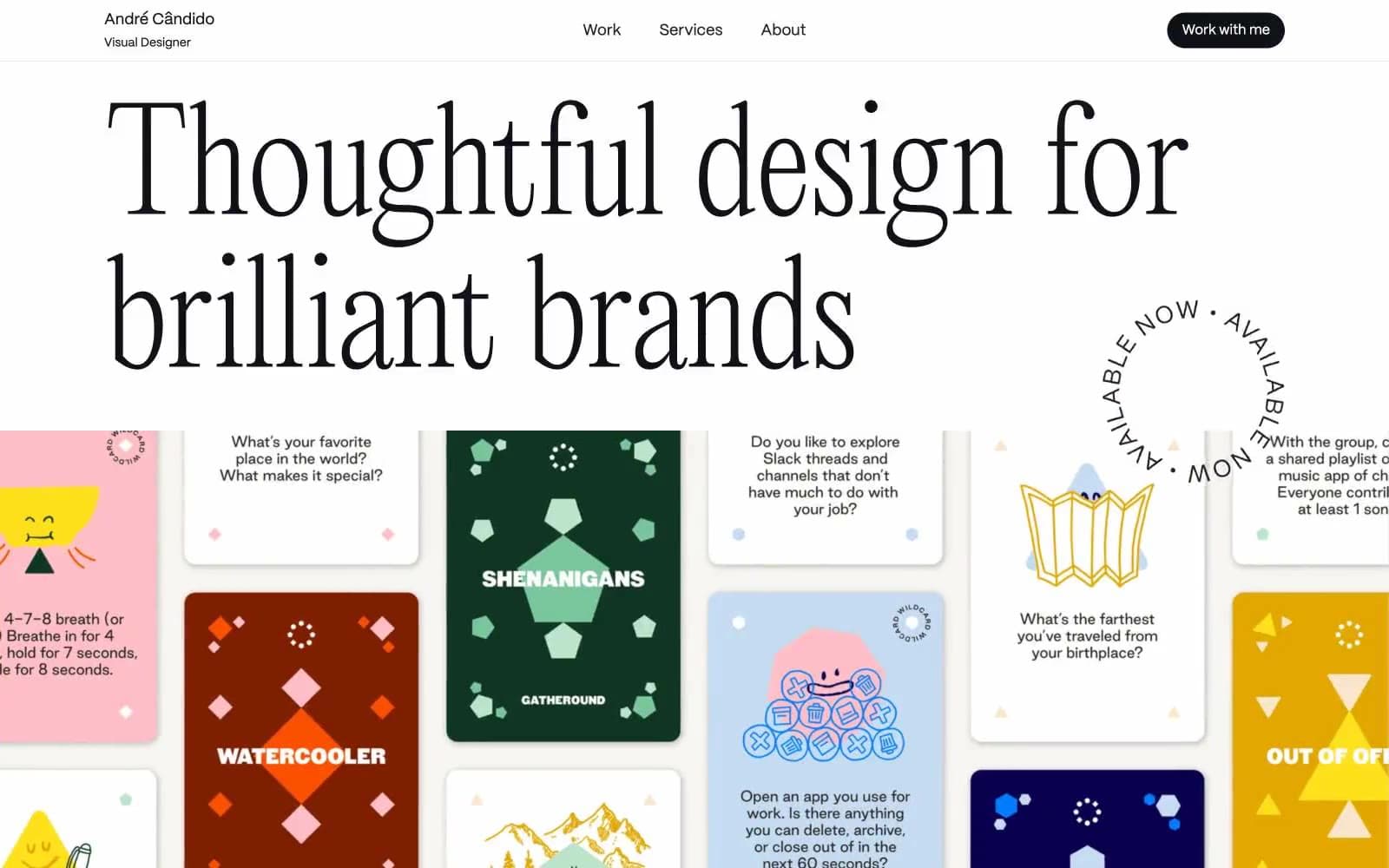
André Cândido
Brand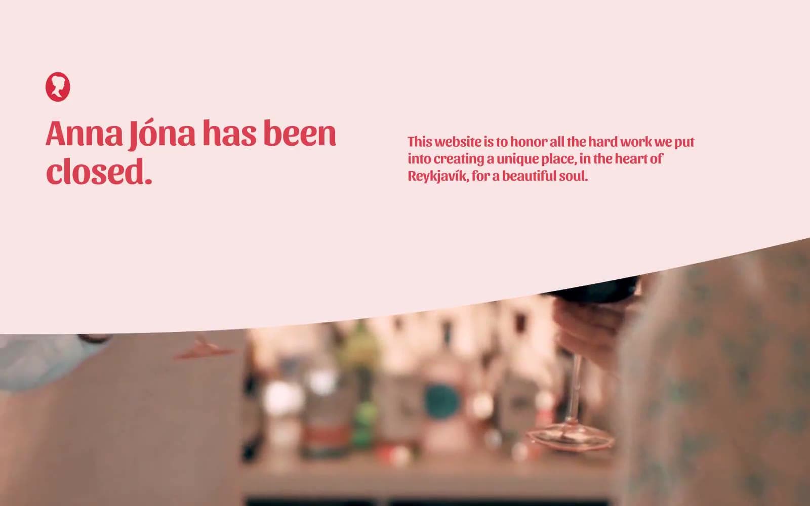
Anna Jóna
Brand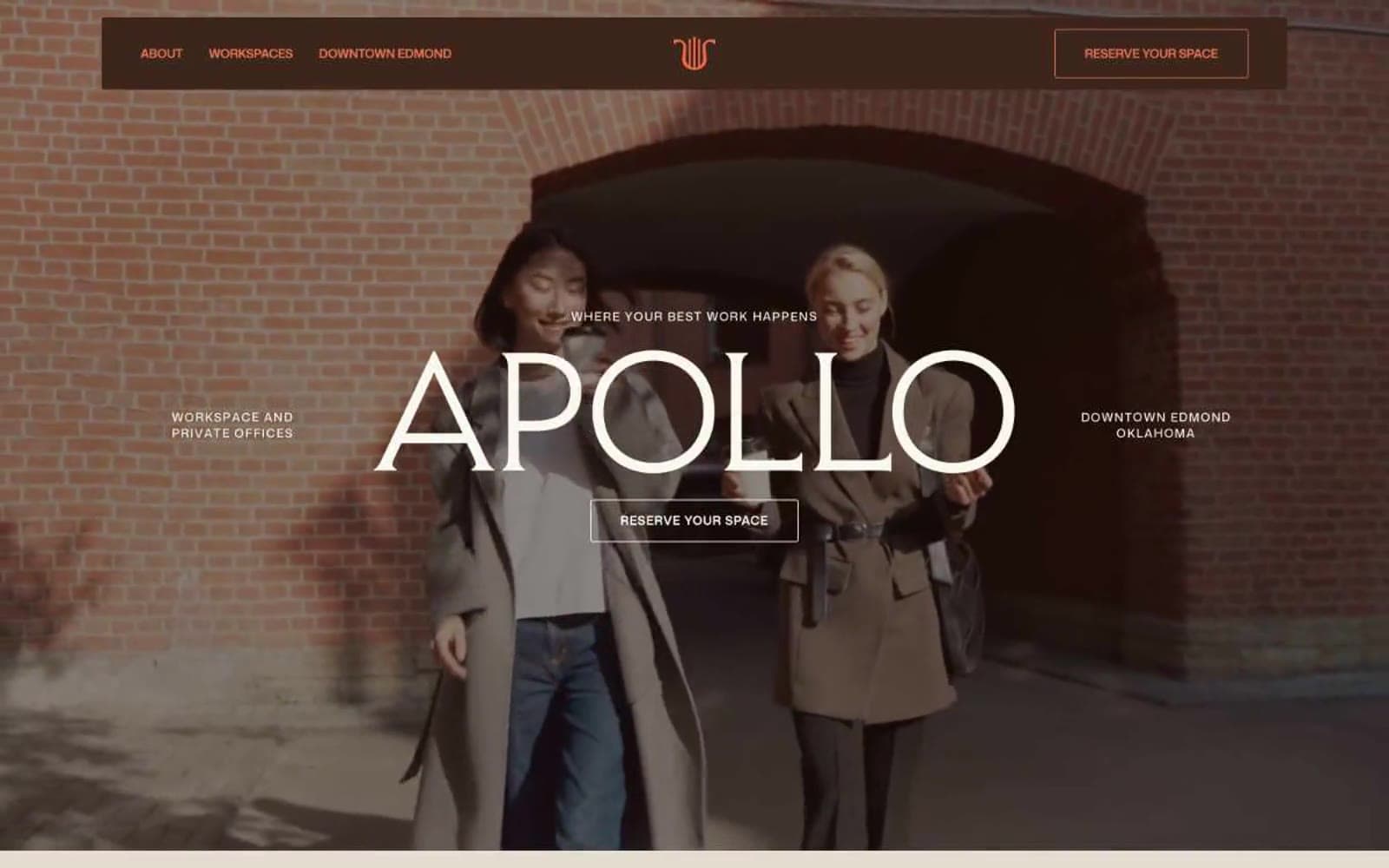
Apollo
Brand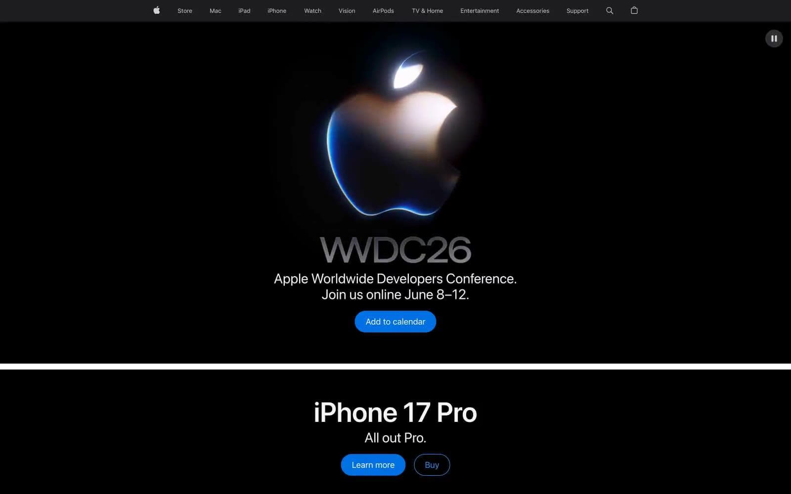
Apple
Brand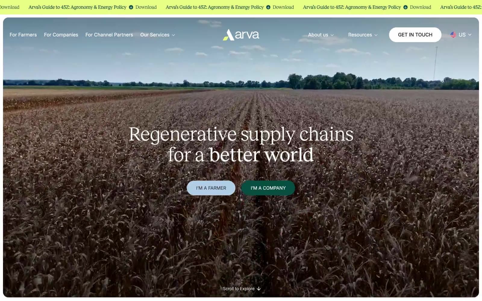
Arva
Brand
Ashton Bespoke
Brand


