
Liveblocks. Neon vapor trapped in obsidian.
- Developer tools
- Dark theme
- 20 colors
- 2 typefaces
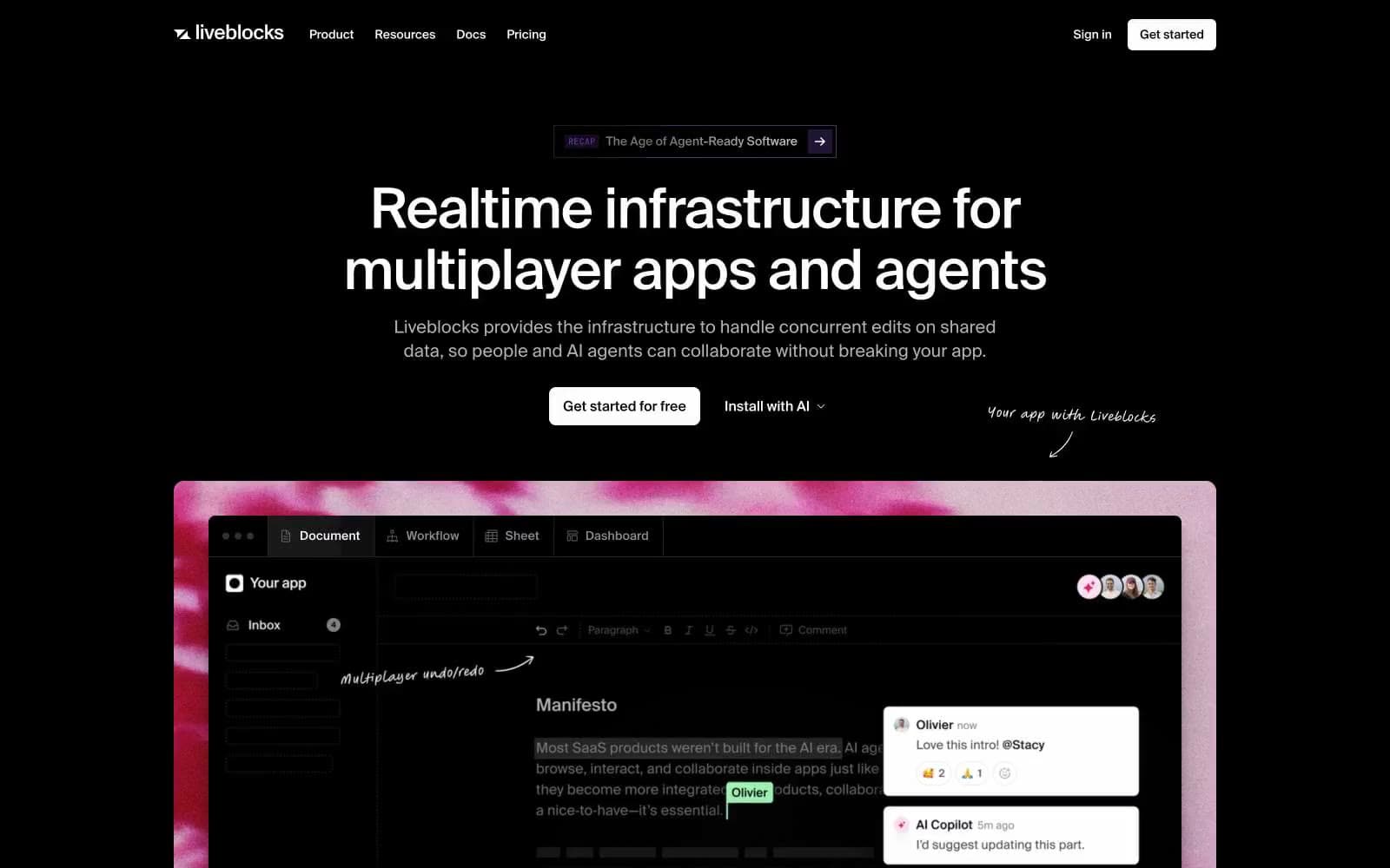
Liveblocks runs on an obsidian-canvas logic: pure black backgrounds, a single clinical grotesque (Suisse) doing all typographic work, and color rationed to two narrow reserves — a vivid violet-magenta used as brand soul, and a broader neon palette (teal, electric blue, pink) that only ignites inside the product editor and code samples. The interface stays almost monastic — white type on black, hairline 1px borders, tiny 4px radii, no shadows, no gradients. Then a single dramatic magenta cloud texture erupts behind the hero product mockup, breaking the grid like ink dropped in water. Hand-drawn brush annotations float over screenshots, sketching human commentary onto the otherwise Swiss-precise system.
Liveblocks design system

Brand3
Primary brand accent — underlines, brand glow, active states, the signature chromatic note
Secondary brand violet, code syntax keywords, badge fills, gradient partner with Plasma Violet
Deeper violet for hover states, brand gradients, emphasis borders
Accent7
Red supporting accent for decorative details and low-frequency emphasis; The signature magenta smoke texture erupting behind the hero product mockup — radial wash from #f76e99 through pinks to deep crimson
Code syntax strings, live cursors in multiplayer UI, data-viz highlights
Teal supporting accent for decorative details and low-frequency emphasis
Softer teal for secondary presence states, comment thread highlights
Code syntax types, link accents, comment thread timestamp markers
Blue supporting accent for decorative details and low-frequency emphasis. Do not promote it to the primary CTA color
Near-white blue tint used in shadow glows behind key elements
Neutrals10
Page background, hero backdrop, product mockup canvas
Dark supporting neutral for text, icons, and strong contrast. Do not promote it to the primary CTA color
Secondary surface level, nested panels, code editor background
Product UI inner panels, inbox sidebar, tabbed editor frames
Hairline 1px borders on cards, inputs, dividers — the only visible separation in a no-shadow system
Deeper dividers, inactive tab underlines, icon outlines at rest
Muted body text, secondary labels, nav items, partner logo washes
Helper text, icon strokes, tertiary metadata
Primary body text at 400 weight, the high-contrast default on void canvas
Headlines at full weight, button text on dark fills, emphasis runs
Try a pairing
Pick any two colors from the palette to check whether text stays readable on top.
Aa
Void Canvas on Plasma Violet
7.69 : 1 contrast
- Body textPasses AA 4.5
- Large textPasses AA 3
- StrictPasses AAA 7
More DESIGN.md files. Same web, different personalities.

Railway
Developer tools
Nuxt
Developer tools
Astro
Developer tools
Authkit
Developer tools
Axiom
Developer tools
BaseHub
Developer tools
Better Stack
Developer tools
Bun
Developer tools
Checkly
Developer tools
ClickHouse
Developer tools
Depot
Developer tools
dope.security
Developer tools


