
Lithic. Confident, earthy, deliberate.
- Finance
- Light theme
- 13 colors
- 1 typeface
Lithic operates as a warm briefing room for card-issuing architects: cream marble surfaces, a single confident sans-serif, and three deliberate accent colors that each carry distinct semantic weight. The page alternates a deep black hero — a vault-like stage for physical card imagery and concentric arc patterns — with generously spaced warm-neutral sections where orange, violet, and green act as functional punctuation rather than decoration. Components feel editorial: thin hairline borders, 24px rounded corners, deep floating shadows on elevated cards, and cream-tinted surfaces that stack into a quiet hierarchy. Density is comfortable, rhythm is built from 8px and 24px increments, and the single Monument Grotesk family at weights 400/500 is allowed to carry every tonal shift from whisper to emphasis through size and tracking alone.
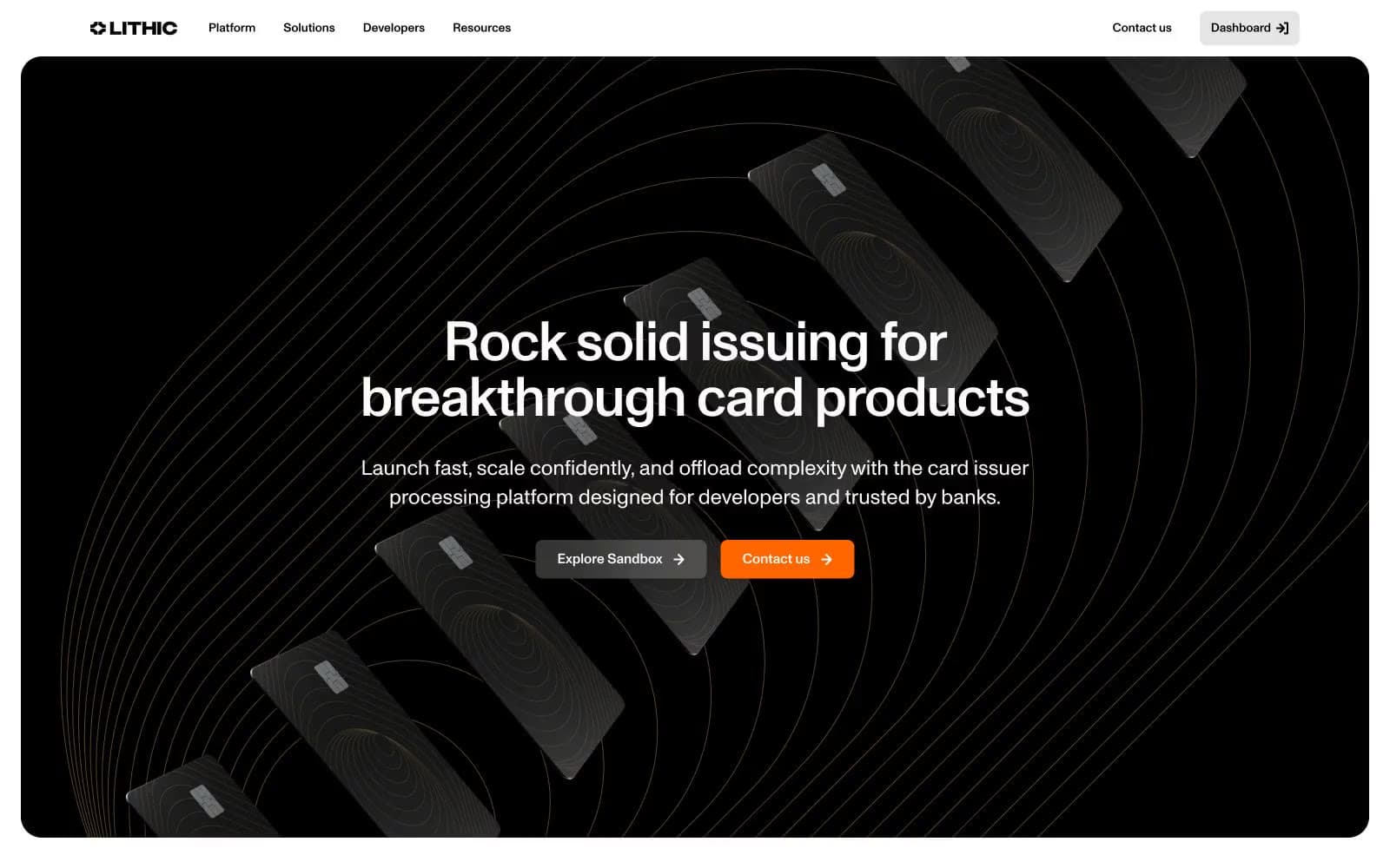
Lithic design system

Brand2
Primary action fill on CTA buttons, contact links, and key navigation entry points — warm saturated orange against cream and black grounds commands without feeling aggressive
Decorative stroke and border accent for feature panels, concentric arc illustrations, and iconography — deep saturated violet that frames content without competing with orange CTAs
Accent4
Green outline accent for tags, dividers, and focused UI edges. Use as a supporting accent, not as a status color
Muted warm stroke and illustration tone used in decorative arc patterns, card imagery borders, and secondary outline accents
Darker warm tone for card-surface strokes, secondary illustration fills, and text-adjacent decorative borders
Lighter warm fill for icon strokes and card accent borders — sits between the muted sandstone and the cream surfaces
Neutrals7
Primary text, hero canvas, deep card-image borders, ghost-button outlines — the structural anchor color
Secondary body text, muted link borders, and disabled-state iconography
Hairline border on light neutral buttons and tertiary dividers
Primary warm card and panel surface — the default elevated neutral for feature blocks and content containers
Cool-tinted feature panel surface used to break rhythm on alternating sections — pairs with the violet accent
Primary page canvas and white card surfaces
Page canvas, card surfaces, primary text on dark grounds, button text on orange fills
Try a pairing
Pick any two colors from the palette to check whether text stays readable on top.
Aa
Obsidian on Ember Orange
7.15 : 1 contrast
- Body textPasses AA 4.5
- Large textPasses AA 3
- StrictPasses AAA 7
More DESIGN.md files. Same web, different personalities.
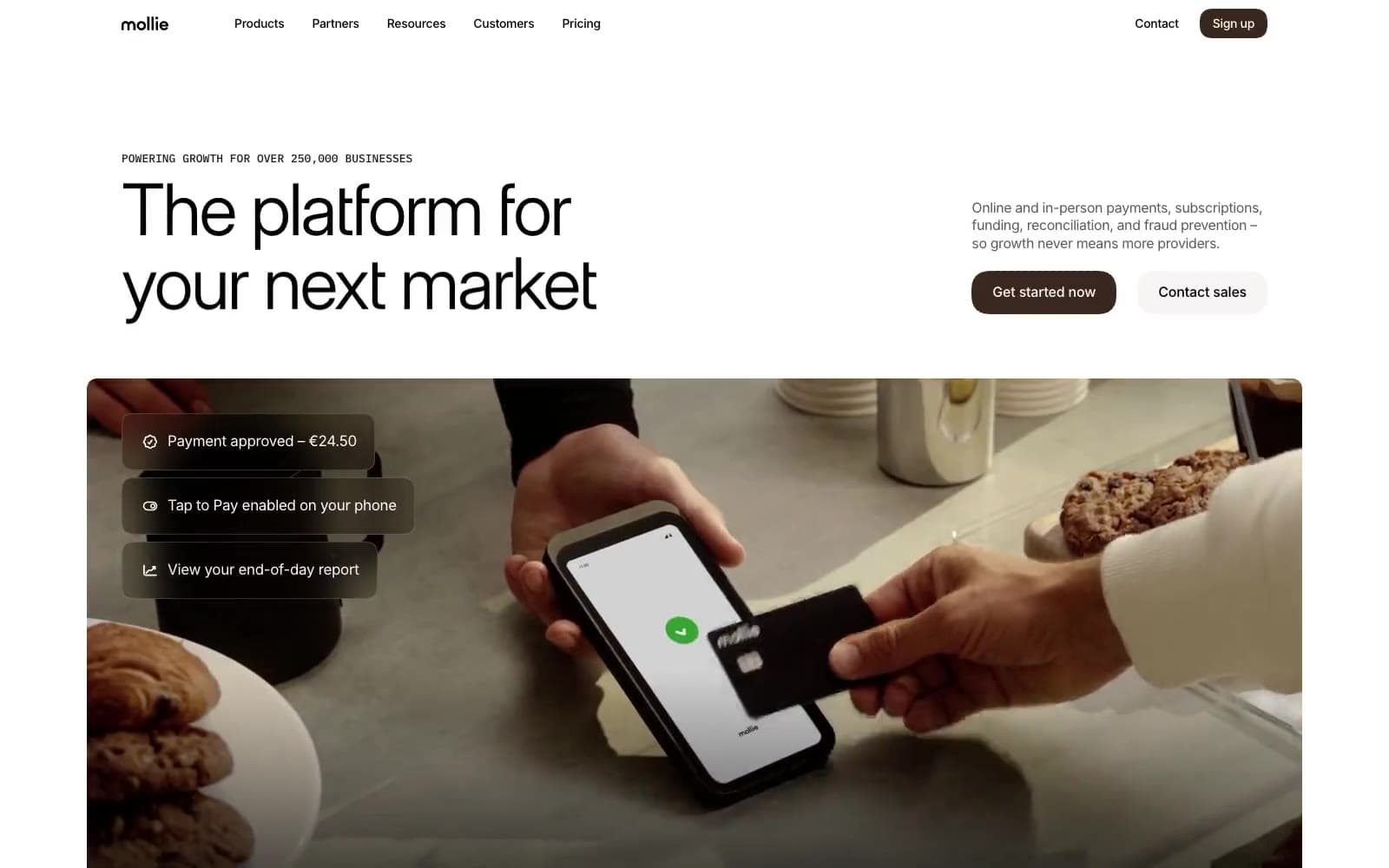
Mollie
Finance
a16z speedrun
Finance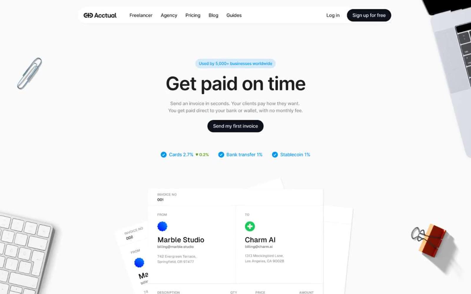
Acctual
Finance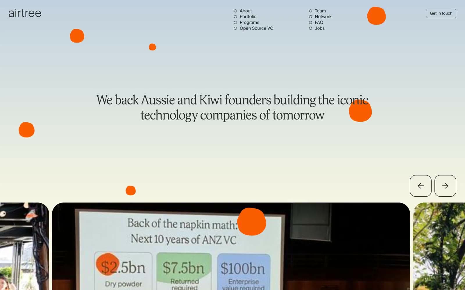
Airtree
Finance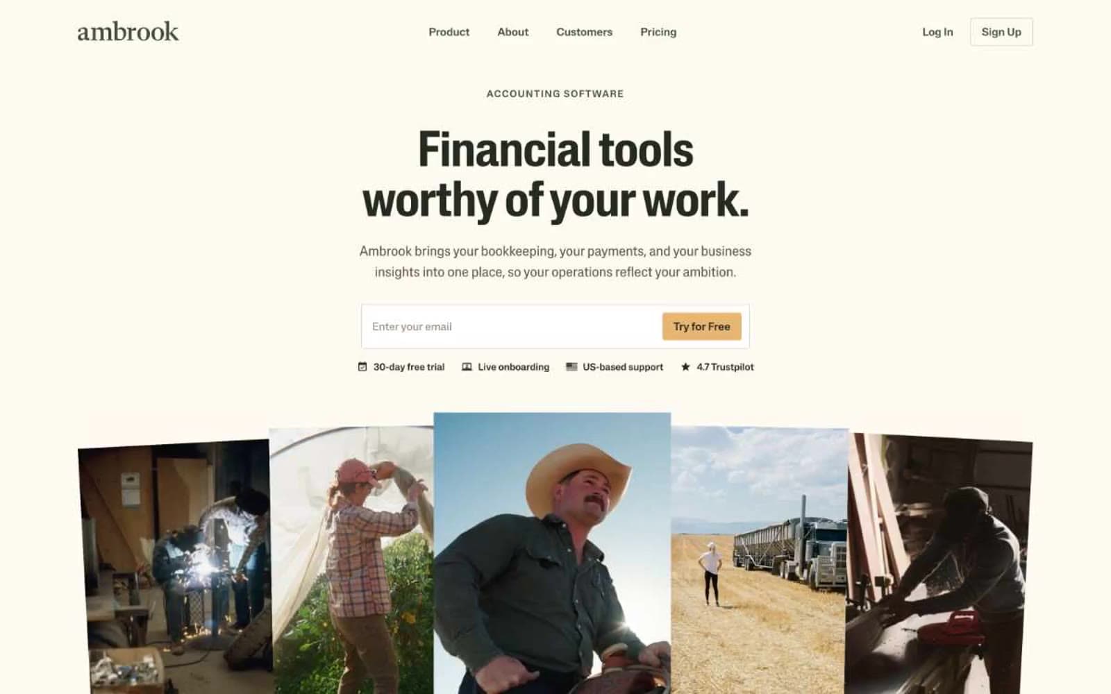
Ambrook
Finance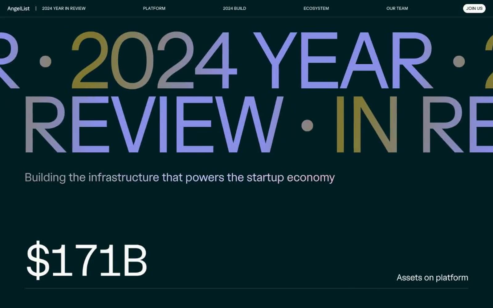
Angellist 2024
Finance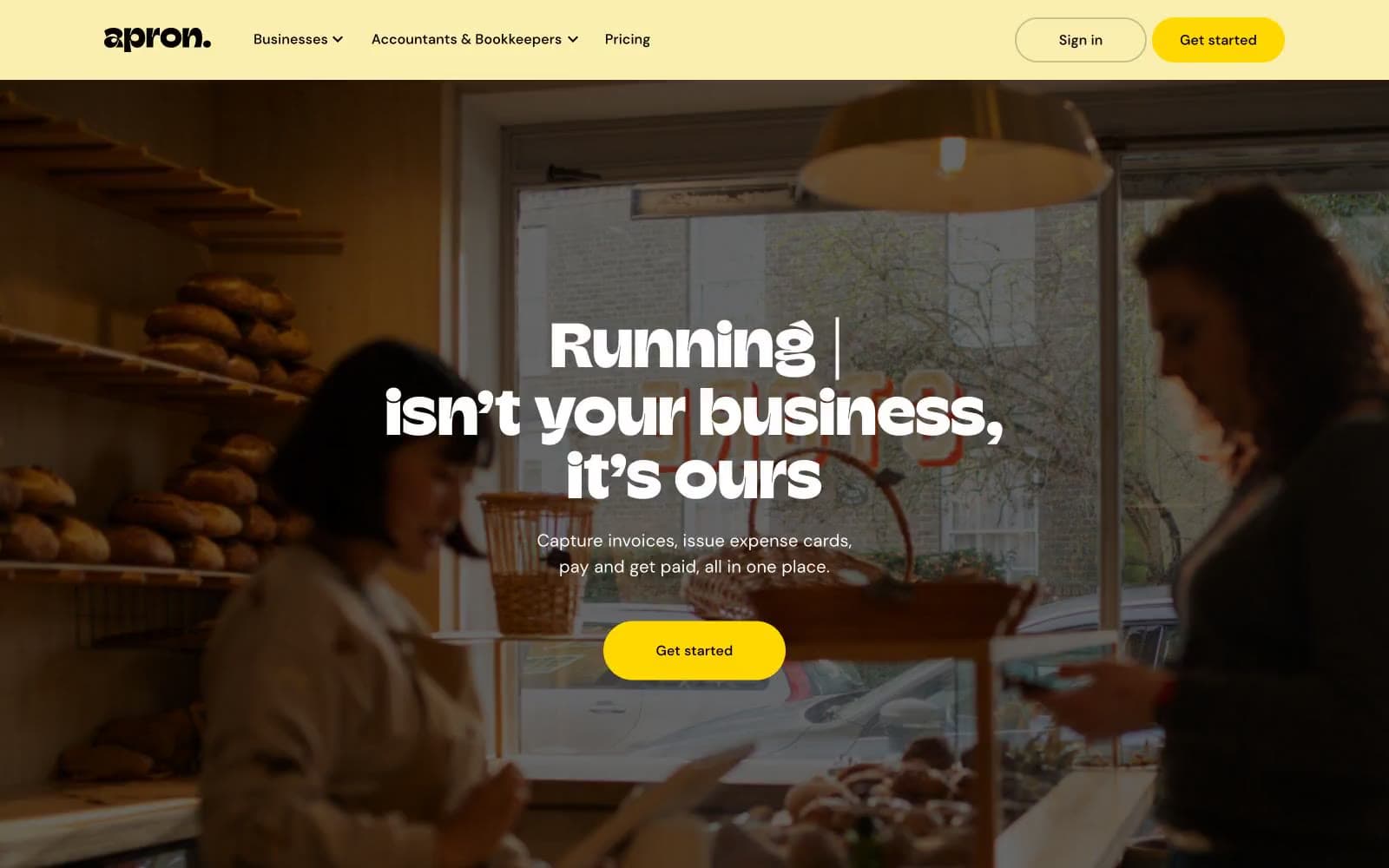
Apron
Finance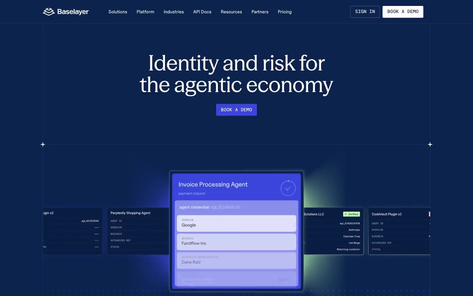
Baselayer
Finance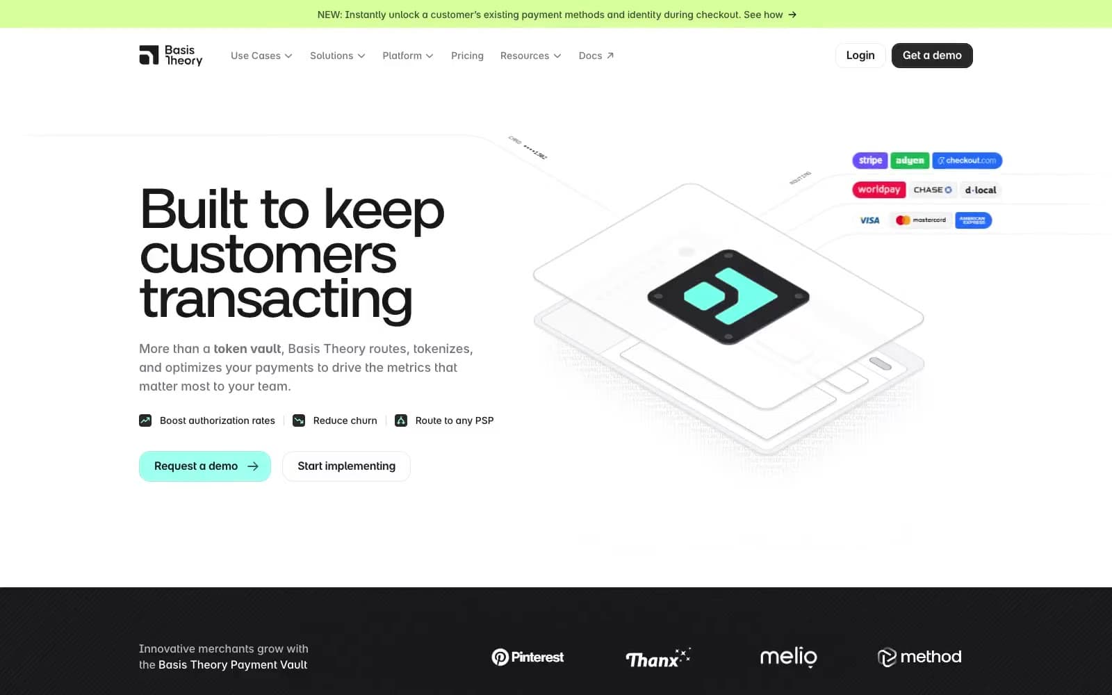
Basis Theory
Finance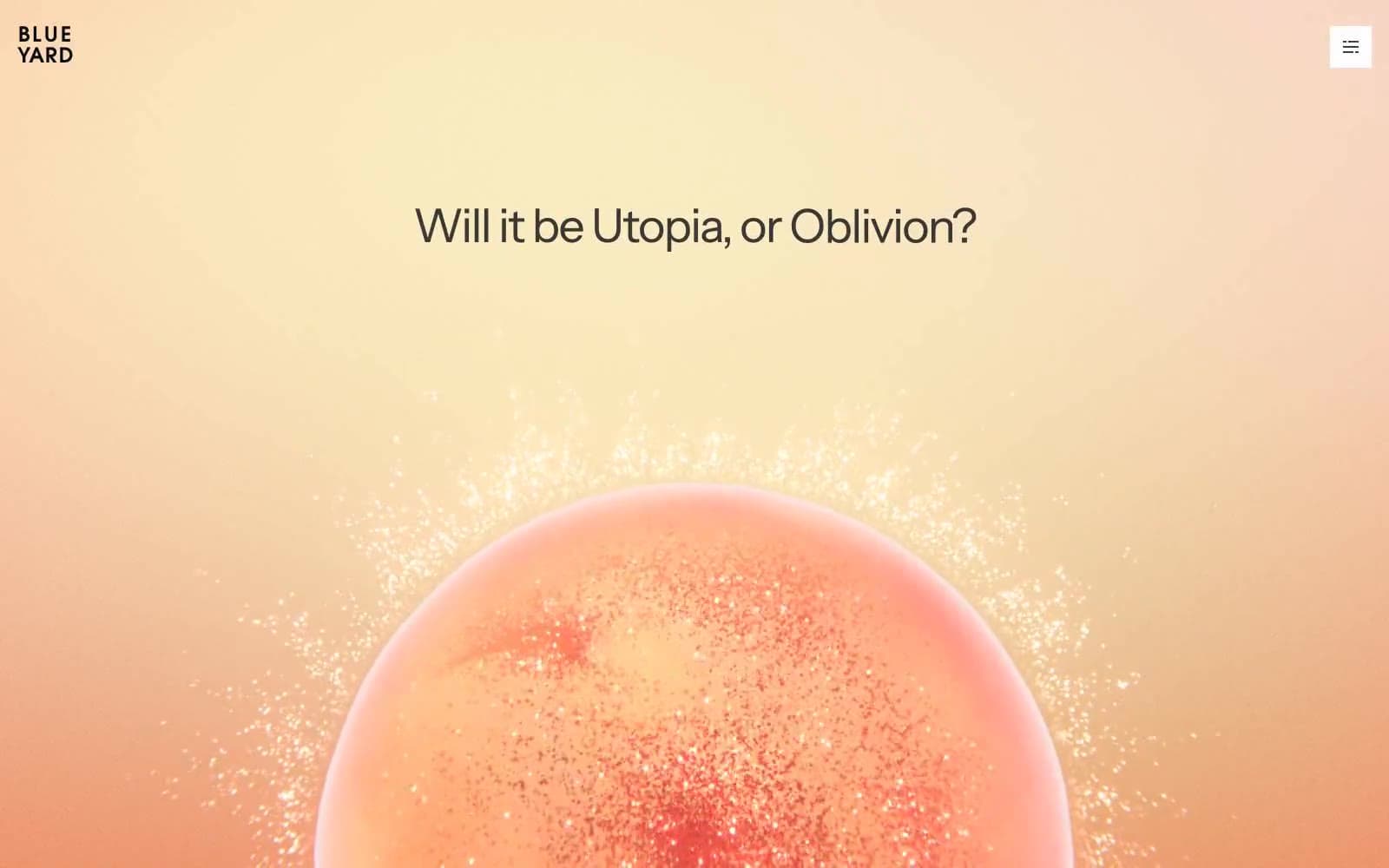
BlueYard Capital
Finance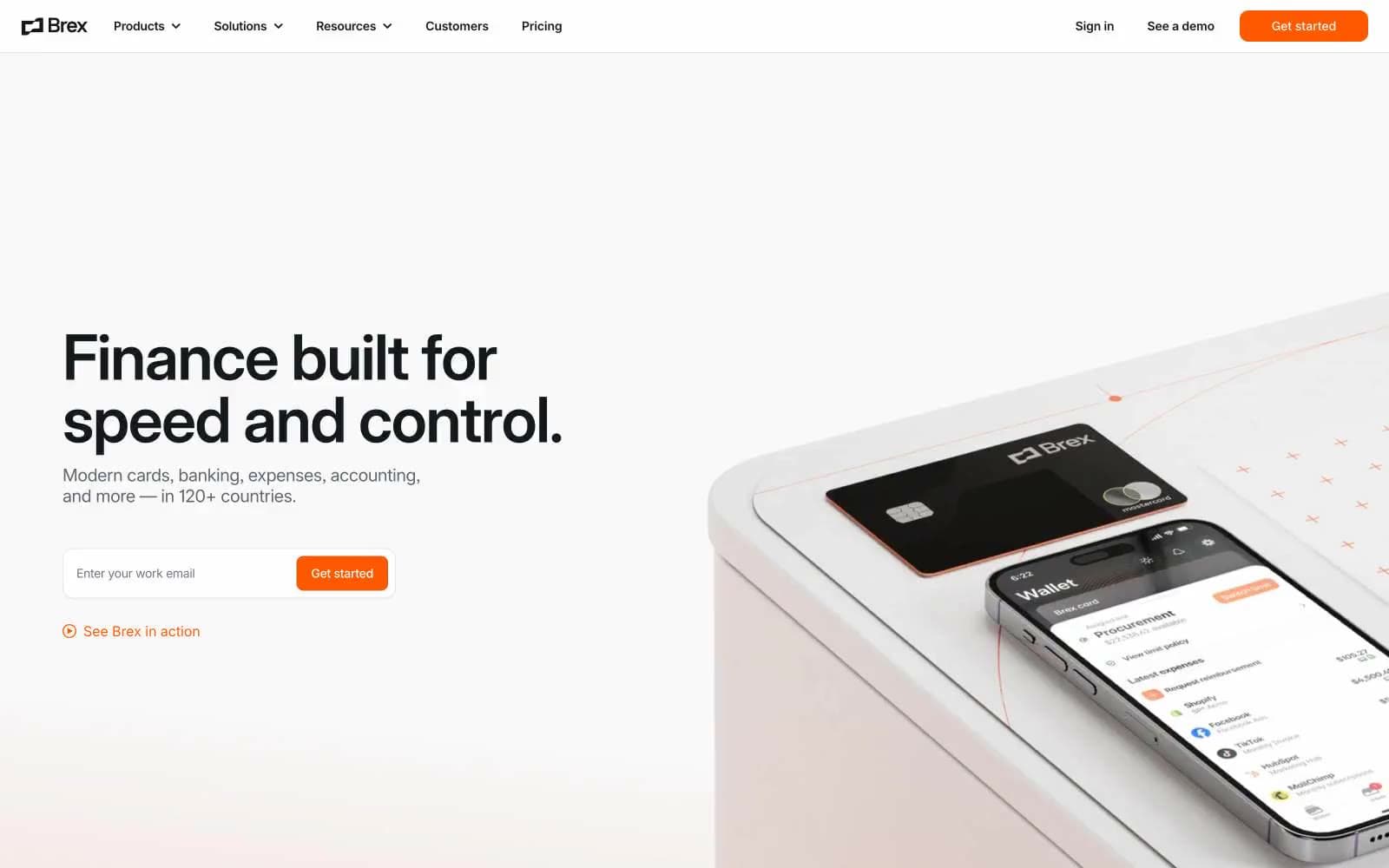
Brex
Finance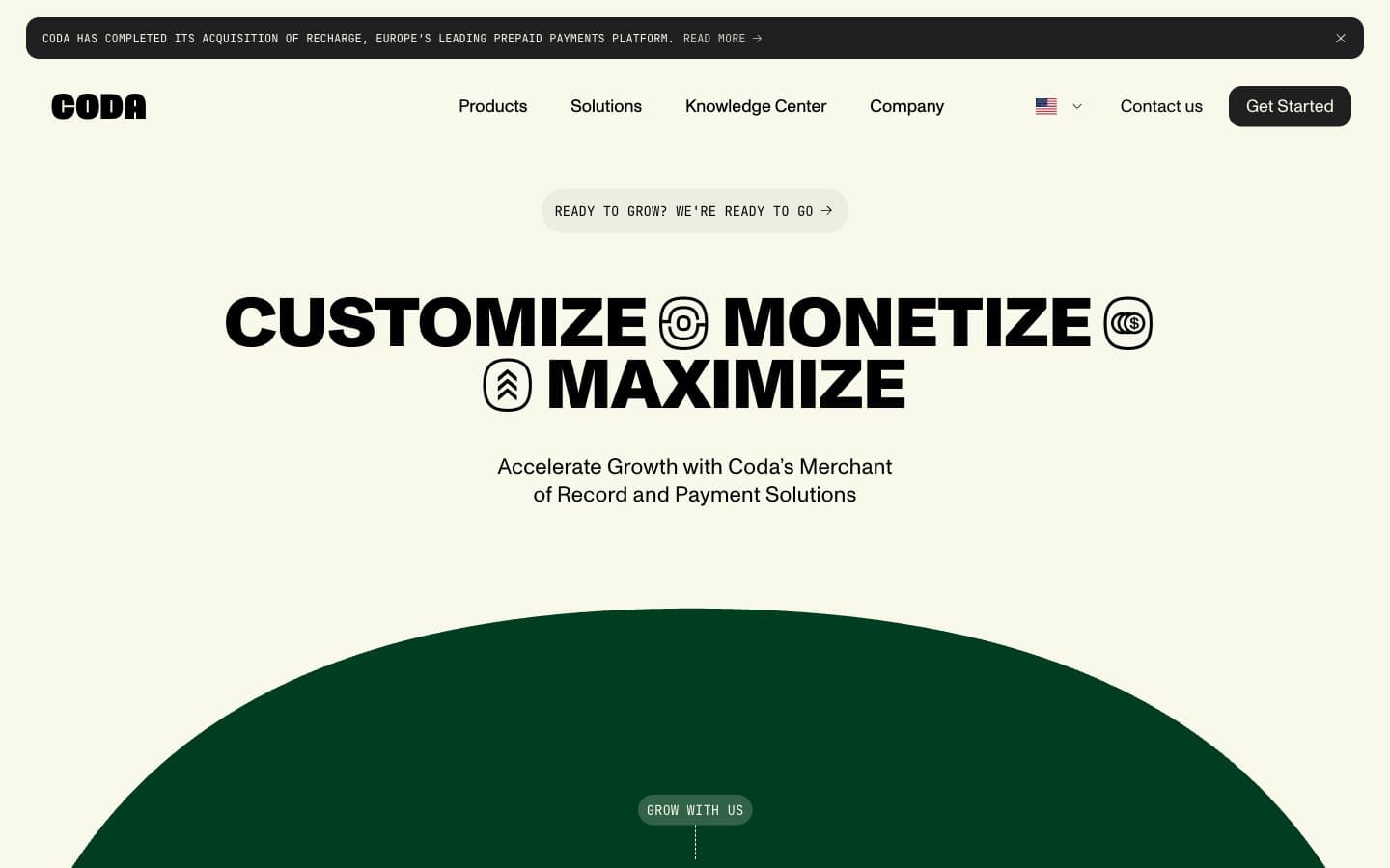
Coda
Finance


