
Linear. Midnight precision instrument.
- Developer tools
- Dark theme
- 16 colors
- 2 typefaces
Linear's design system is a midnight command center built on near-black surfaces (#08090a) with paper-white type and one electric acid-lime accent (#e4f222) that functions as a functional flashlight — small, high-contrast, and used sparingly to signal action. The interface treats darkness as a substrate rather than a theme: text is crisp white at tight tracking (-0.022em), weights sit in a low 400–510 band rather than bold, and borders are hairline-thin (0.5px) to let geometry do the work that shadows usually would. Components feel precision-machined — 6px and 12px radii, compact 8–12px paddings, and almost no decorative ornament — letting the product UI (issue cards, kanban boards, AI agent panels) be the only visual texture in an otherwise quiet system.
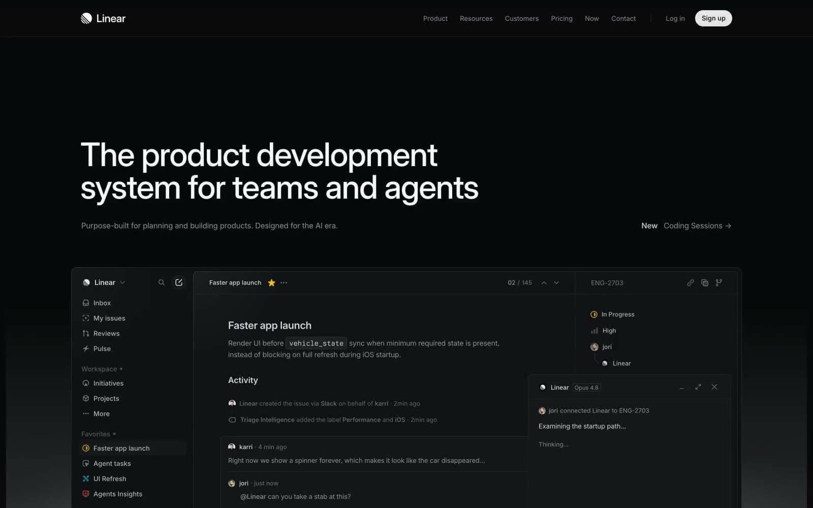
Linear design system

Brand1
Primary action buttons, active nav indicators — electric accent that breaks the monochrome system
Accent5
Green outline accent for tags, dividers, and focused UI edges. Use as a supporting accent, not as a status color
Red wash for highlight backgrounds, decorative bands, and soft emphasis behind content. Use as a supporting accent, not as a status color
Decorative accent, informational icon fills
Tag/badge fills — soft chromatic punctuation on tags and labels
Secondary tag fills, category indicators
Neutrals10
Page canvas, full-bleed backgrounds — the default everything sits on
Card surfaces, nav bars — one step above canvas for contained content
Elevated surfaces, deeper card panels
Subtle borders, dividers, ghost button outlines — low-contrast structural edges
Hairline borders at higher contrast than graphite — section separators
Muted body text, inactive icons, secondary metadata
Tertiary text, placeholder copy, icon fills
Secondary headings, button text on dark surfaces
Near-white surface fills, high-contrast button text
Primary headings, hero type, max-contrast emphasis text
Try a pairing
Pick any two colors from the palette to check whether text stays readable on top.
Aa
Void on Acid Lime
16.15 : 1 contrast
- Body textPasses AA 4.5
- Large textPasses AA 3
- StrictPasses AAA 7
More DESIGN.md files. Same web, different personalities.

Railway
Developer tools
Nuxt
Developer tools
Astro
Developer tools
Authkit
Developer tools
Axiom
Developer tools
BaseHub
Developer tools
Better Stack
Developer tools
Bun
Developer tools
Checkly
Developer tools
ClickHouse
Developer tools
Depot
Developer tools
dope.security
Developer tools


