
Sequence. The interface is the product, and purple is the only power color.
- Crypto
- Light theme
- 13 colors
- 1 typeface
Sequence presents a light, developer-first visual language built on white surfaces, a confident sans-serif type system, and a single dominant purple that acts as the only serious brand signal on the page. The aesthetic reads like a modern API platform — generous whitespace, compact card grids, hairline borders, and soft elevation rather than heavy shadows or dark mode theatrics. Color is rationed: pages stay largely monochromatic, with purple reserved for primary actions, the logo, and a signature gradient that powers hero treatments and the dashboard call-to-action. Decorative accents in green, blue, and pink appear inside product illustrations and mockups, not in the chrome — they signal 'crypto-native' without competing with the brand. Components are flat and functional, leaning on geometry (8px button radius, 20px card radius, 24px soft shadow) rather than decoration to create rhythm and trust.
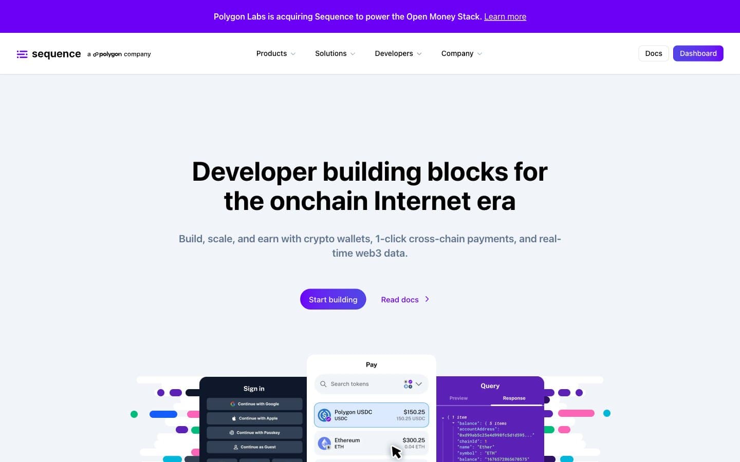
Sequence design system

Brand3
Violet text accent for links, tags, and emphasized short phrases. Do not promote it to the primary CTA color
Violet text accent for links, tags, and emphasized short phrases. Do not promote it to the primary CTA color
Gradient terminus — pairs with Electric Iris to create the right-leaning purple-to-indigo gradient on CTAs and hero accents
Accent3
Decorative product-mockup accent — used in illustrations, code editor UI, and inline highlights inside screenshots, not in chrome
Decorative product-mockup accent — appears in wallet/payment UI illustrations to signal connected or live data states
Decorative product-mockup accent — pink wash on feature-card backgrounds and illustration shadows to add warmth to the otherwise cool palette
Neutrals7
Near-black button text and icon glyphs — used as the foreground on filled purple CTAs to maximize contrast without true black
Primary text, dark surface fills, logo mark, and icon strokes — the heaviest neutral in the system
Dark UI borders, secondary dark surfaces, and high-contrast dividers where a softer gray reads too faint
Muted helper text, nav icons, and low-emphasis stroke work — the bridge between white canvas and primary text
Default hairline border, card dividers, and the most common neutral surface tone — carries the structural skeleton of every layout
Subtle surface tint for alt-row cards, input backgrounds, and section bands that need a whisper of separation from the white canvas
Page canvas, card surface, and button text on purple fills — the bright base everything floats on
Try a pairing
Pick any two colors from the palette to check whether text stays readable on top.
Aa
White on Bright Violet
5.89 : 1 contrast
- Body textPasses AA 4.5
- Large textPasses AA 3
- StrictFails AAA 7
More DESIGN.md files. Same web, different personalities.
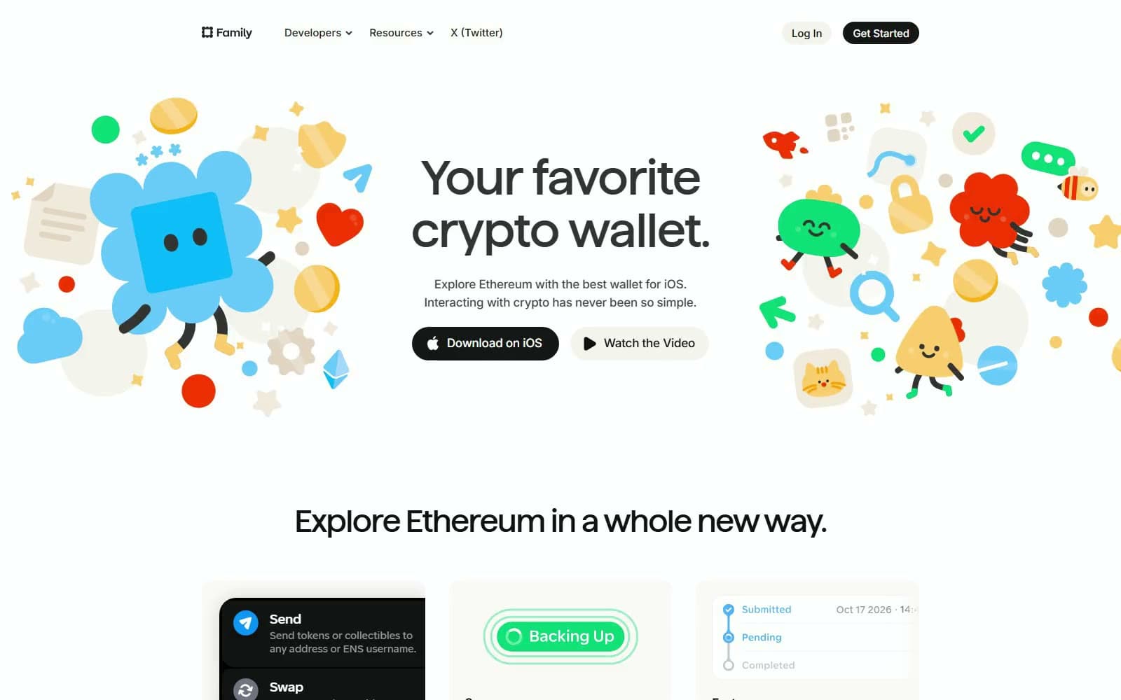
Family
Crypto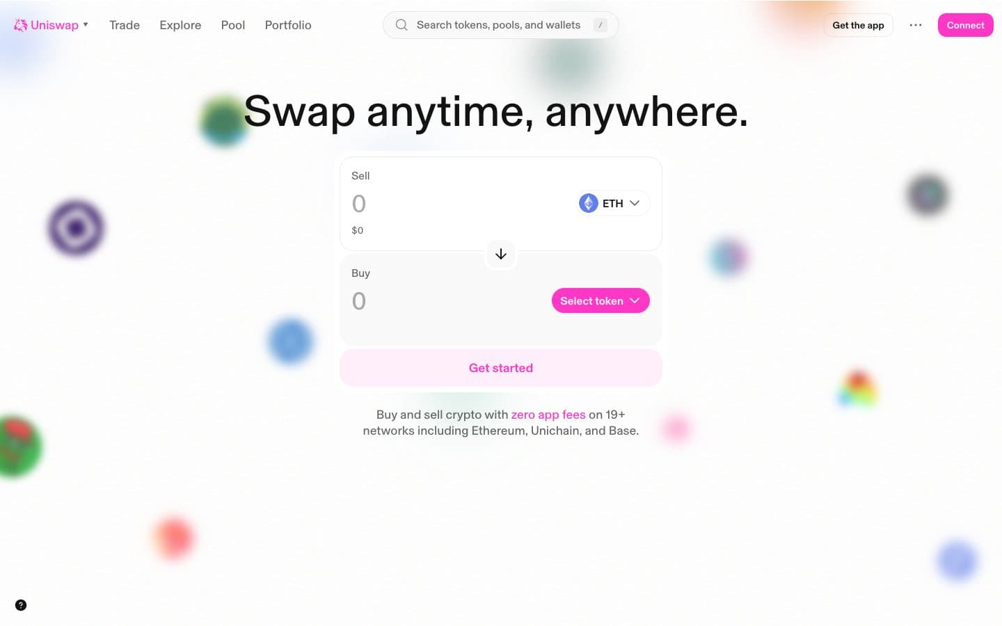
Uniswap
Crypto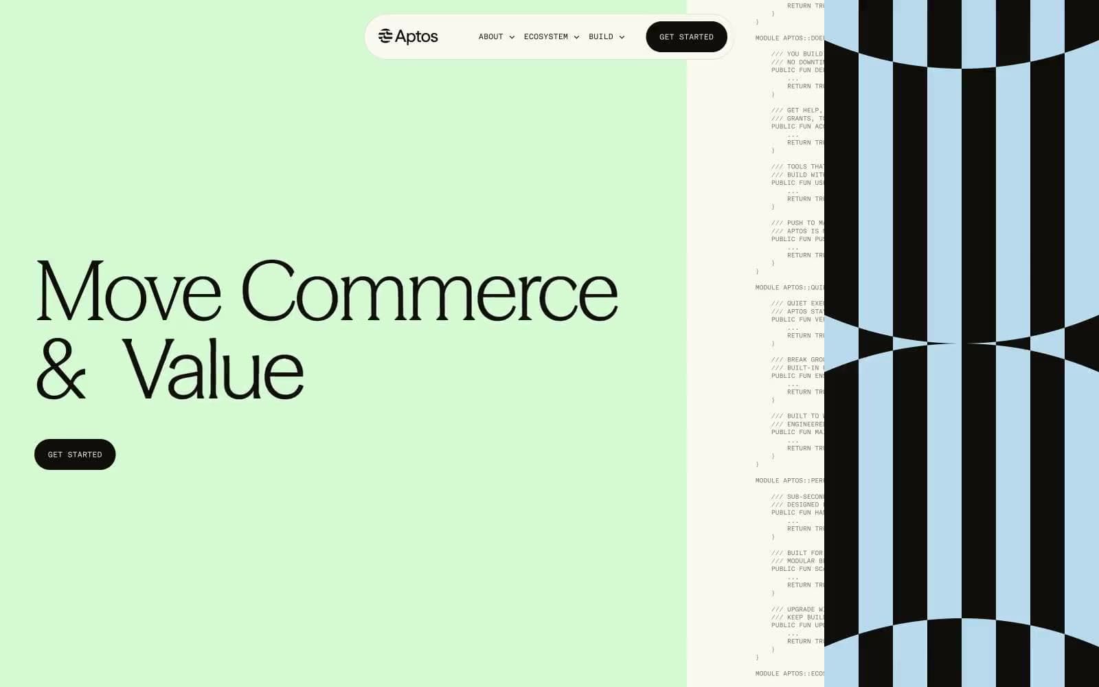
Aptos Network
Crypto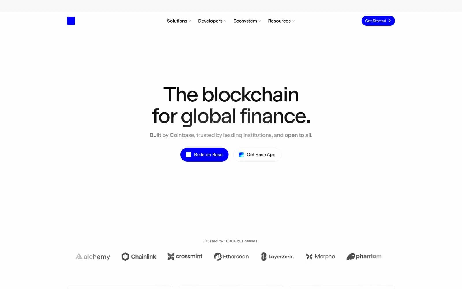
Base
Crypto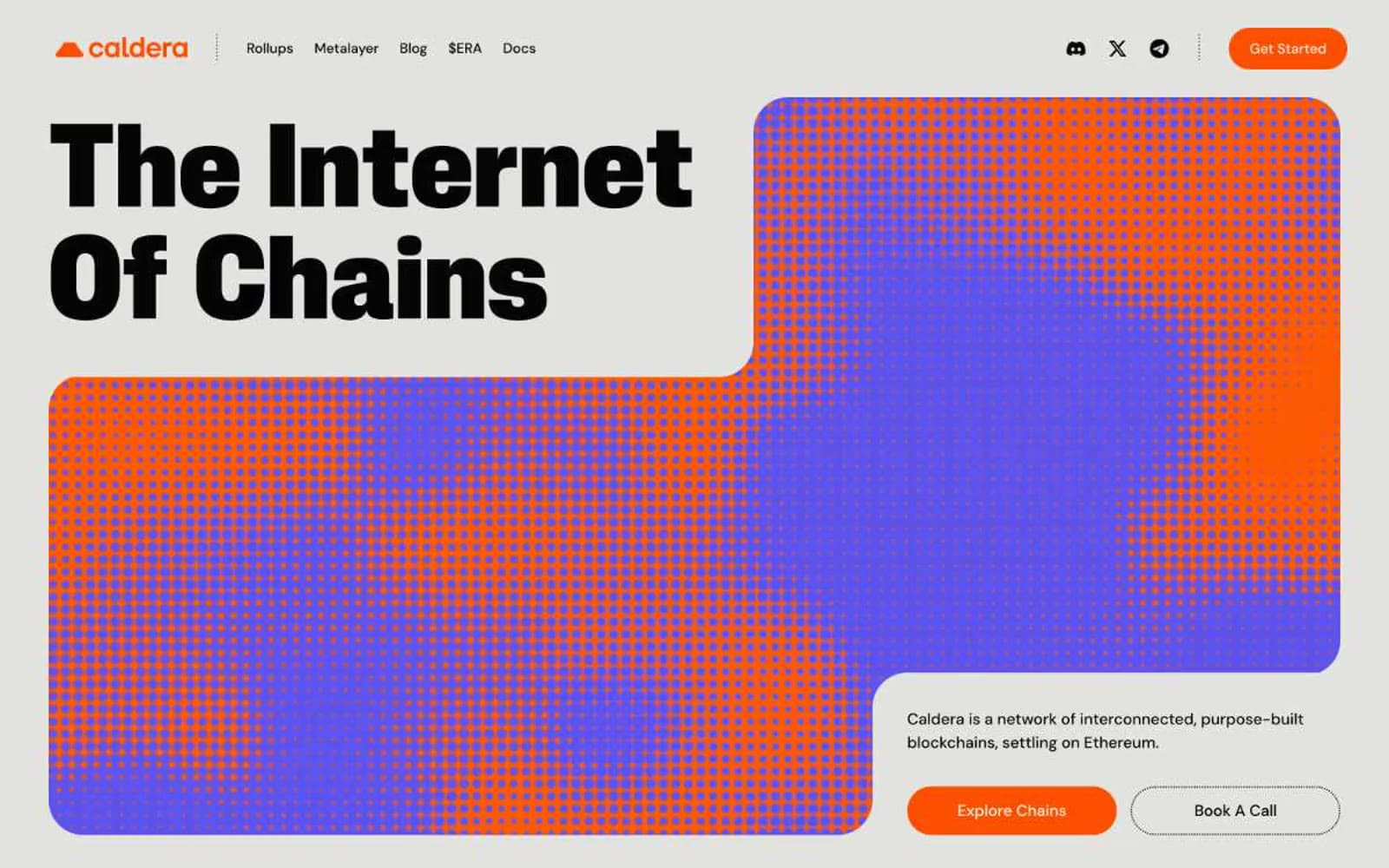
Caldera
Crypto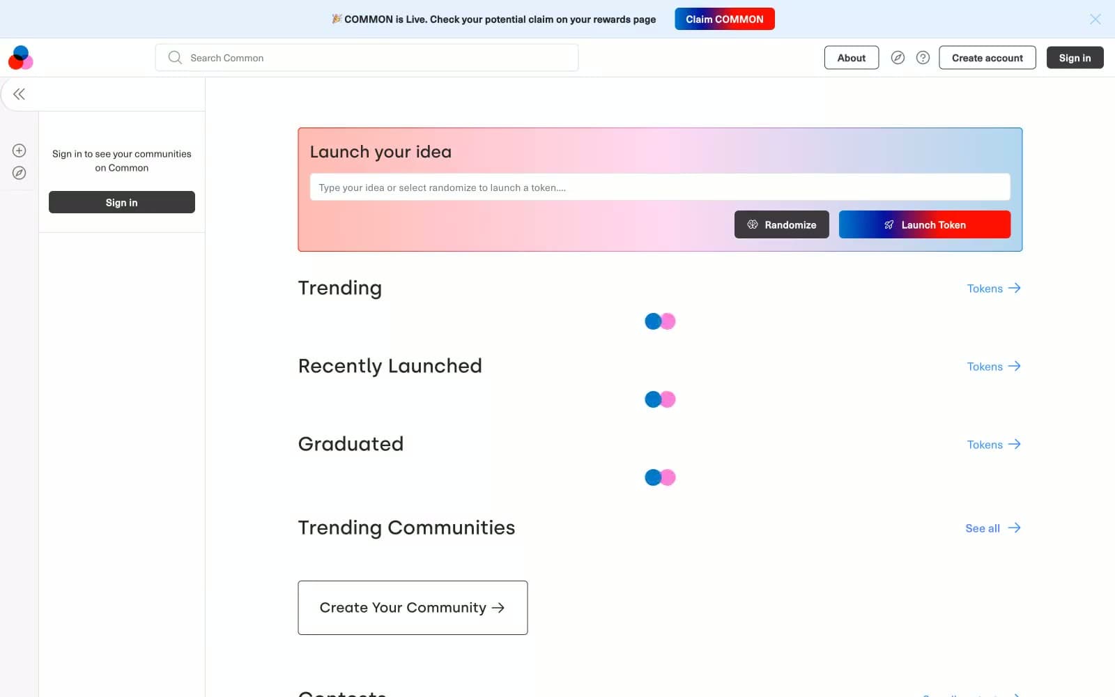
Common
Crypto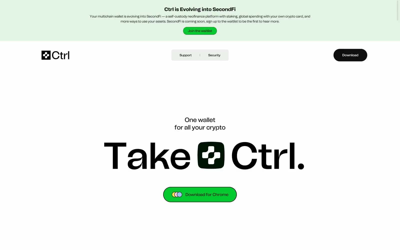
Ctrl Wallet
Crypto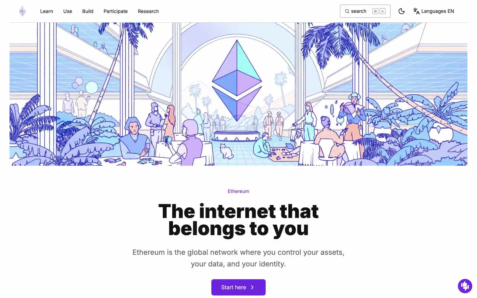
ethereum.org
Crypto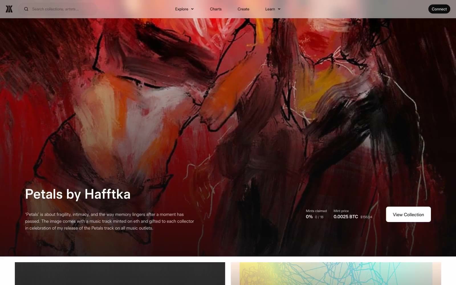
Gamma
Crypto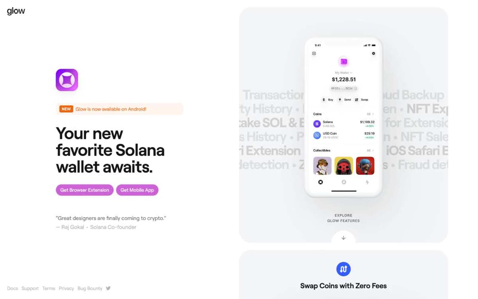
Glow
Crypto
Kraken
Crypto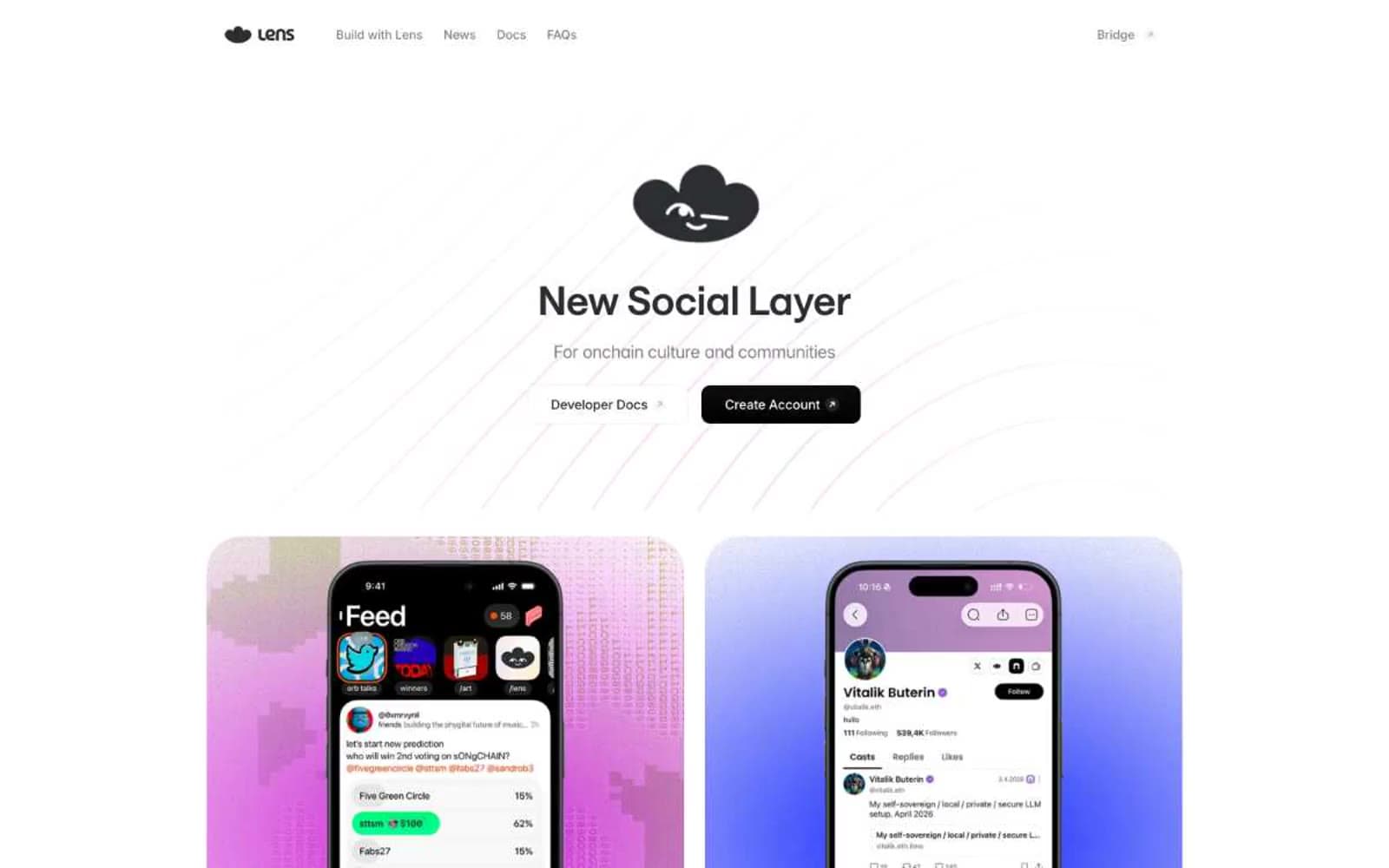
Lens
Crypto


