
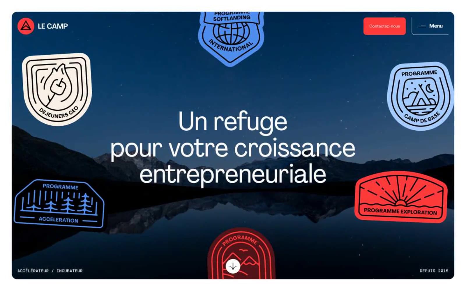
LE CAMP. A field command post where one red signal flare cuts through mountain twilight, and everything else is topo-line restraint.
- Brand
- Light theme
- 4 colors
- 3 typefaces
LE CAMP reads as an alpine expedition outpost translated into a digital surface: a near-monochrome canvas pierced by a single flare-red accent, where the brand speaks through dramatic photographic scale and badge-style illustration rather than through decoration. The design system is ruthlessly reduced — two achromatic values and one chromatic — letting Agrandir's distinctive geometric display voice carry hierarchy while DM Sans handles utility text in the background. Components are confident and flat: pill-radius CTAs in signal red, thin hairline borders, uppercase mono labels acting as wayfinding tags, and shield-shaped program patches that function like scout merit badges scattered across a topographic hero. Sections alternate between full-bleed drama (the dark mountain photograph) and quiet white/cream expanses, creating a rhythm of base camp and summit. The single red accent earns its weight through scarcity — it appears only where a decision is being asked for or a category is being defined.
LE CAMP design system

Brand1
Primary CTA fill, nav active state, brand logo, emphasis body text, accent box-shadows on interactive elements — the single chromatic voice of the system, reserved for moments of decision and identity
Neutrals3
Primary text, heading text on light surfaces, icon strokes, nav text, button text, all structural borders and dividers
Input border, subtle form dividers — the only non-black neutral, used where a softer boundary is needed without losing contrast
Primary page canvas, card surface, button text on red, input fill, nav background, hero foreground text on dark imagery
Try a pairing
Pick any two colors from the palette to check whether text stays readable on top.
Aa
Carbon Ink on Signal Red
5.88 : 1 contrast
- Body textPasses AA 4.5
- Large textPasses AA 3
- StrictFails AAA 7
More DESIGN.md files. Same web, different personalities.

Airbnb
Brand
Aker
Brand
Alison Roman
Brand
Alpine Bio
Brand
Alveos One
Brand
Amrit Palace
Brand
André Cândido
Brand
Anna Jóna
Brand
Apollo
Brand
Apple
Brand
Arva
Brand
Ashton Bespoke
Brand


