ldd. A single sheet of warm stock, overprinted once with massive black type and nothing else.
- Brand
- Light theme
- 3 colors
- 2 typefaces
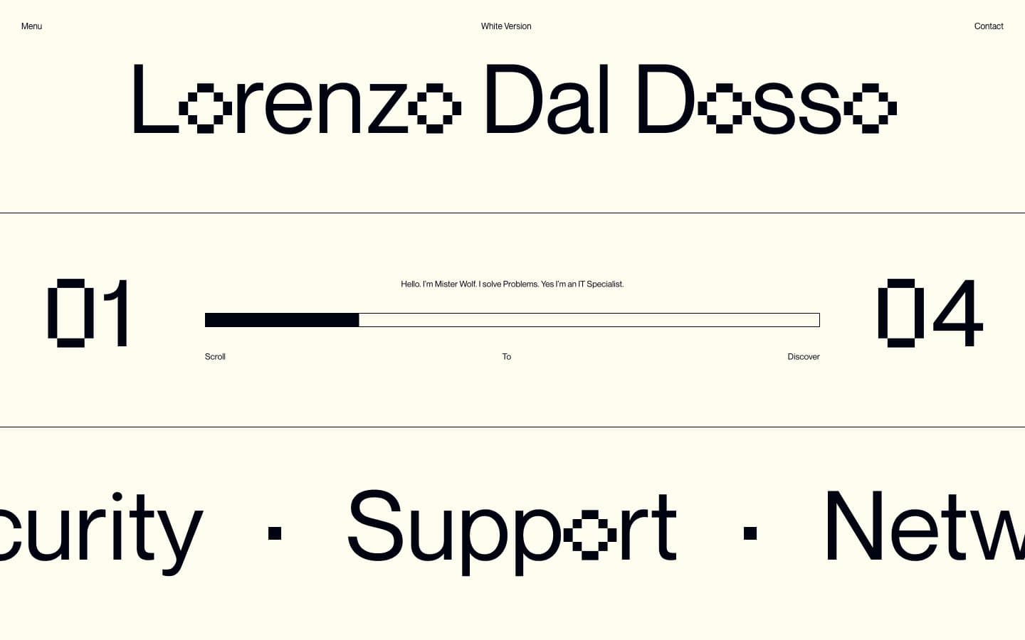
A two-color broadsheet: warm cream canvas (#fffcf0), near-black ink (#000310) with a faint blue undertone, and zero decoration. Drama is generated entirely by scale — a custom 135px display face (LDD) with dot-matrix character treatments fights against a tiny neo-grotesque body face (NeueMontreal at 12–16px, line-height 1.0) for the screen's attention. The interface behaves less like a website and more like a printed zine: horizontal rules divide the page, oversized section numbers (01, 04) punctuate the rhythm, and a labeled scroll-progress bar (Scroll / To / Discover) replaces all conventional CTAs. 200px margins between sections create gallery-hung breathing room. No shadows, no gradients, no rounded corners, no color punctuation — every accent a designer might be tempted to add has been removed on purpose.
ldd design system
Neutrals3
Secondary text, nav labels, fine details — true black used sparingly for maximum contrast accents against the midnight ink
Primary text, borders, section rules, dark-section backgrounds — near-black with a barely-perceptible blue undertone that distinguishes it from flat #000000 and keeps the palette from feeling like a photocopy
Page canvas, card surfaces, section backgrounds — a warm off-white that reads as paper, not screen, and prevents pure-white harshness while giving the near-black type a slight warm push
Try a pairing
Pick any two colors from the palette to check whether text stays readable on top.
Aa
Cream Paper on Pure Press
20.43 : 1 contrast
- Body textPasses AA 4.5
- Large textPasses AA 3
- StrictPasses AAA 7
More DESIGN.md files. Same web, different personalities.

Airbnb
Brand
Aker
Brand
Alison Roman
Brand
Alpine Bio
Brand
Alveos One
Brand
Amrit Palace
Brand
André Cândido
Brand
Anna Jóna
Brand
Apollo
Brand
Apple
Brand
Arva
Brand
Ashton Bespoke
Brand


