
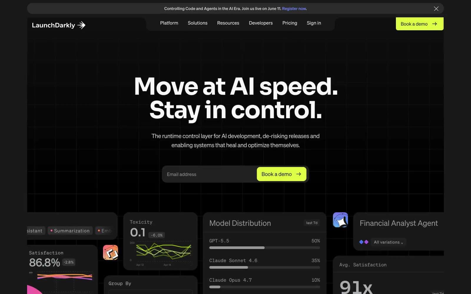
LaunchDarkly. A dark cockpit where violet signals pulse through charcoal panels.
- Developer tools
- Dark theme
- 12 colors
- 7 typefaces
LaunchDarkly is a midnight control room: deep charcoal canvas, cool violet-blue as the only chromatic voice, and white type that cuts through like console output. The interface is dense and technical without feeling cluttered — it borrows the visual language of developer tools (monospace code, panel grids, pill-shaped inputs) and wraps it in a confident marketing skin. The violet→blue gradient (#405bff → #7084ff) acts as the brand's electronic pulse, appearing in glows, hero text, active states, and decorative washes rather than flat fills. Components are pill-soft (30-60px radii dominate), borders are hairline-white on near-black, and elevation is communicated through glow rather than shadow.
LaunchDarkly design system

Brand2
Hero text accent, link underlines, icon glows, decorative gradient endpoint — the brand's chromatic signature; used as paint, not fill; Hero ambient washes, card glow halos, decorative background floods
Violet outline accent for tags, dividers, and focused UI edges. Do not promote it to the primary CTA color
Accent1
Secondary gradient endpoint — used sparingly in radial glows for atmospheric warmth
Neutrals9
Page canvas, deepest background layer
Surface level 1 — nav pill, card backgrounds, button fills, footer
List dividers, row separators in dense tables
Surface level 2 — elevated panels, card borders, secondary surfaces
Input borders, inactive form fields
Muted helper text, disabled labels
Secondary text, subtle borders, placeholder copy
Tertiary text, icon strokes, list dividers
Primary text, heading fills, icon strokes, card backgrounds in product-screenshot panels
Try a pairing
Pick any two colors from the palette to check whether text stays readable on top.
Aa
Paper on Voltage Blue
5.05 : 1 contrast
- Body textPasses AA 4.5
- Large textPasses AA 3
- StrictFails AAA 7
More DESIGN.md files. Same web, different personalities.

Railway
Developer tools
Nuxt
Developer tools
Astro
Developer tools
Authkit
Developer tools
Axiom
Developer tools
BaseHub
Developer tools
Better Stack
Developer tools
Bun
Developer tools
Checkly
Developer tools
ClickHouse
Developer tools
Depot
Developer tools
dope.security
Developer tools


