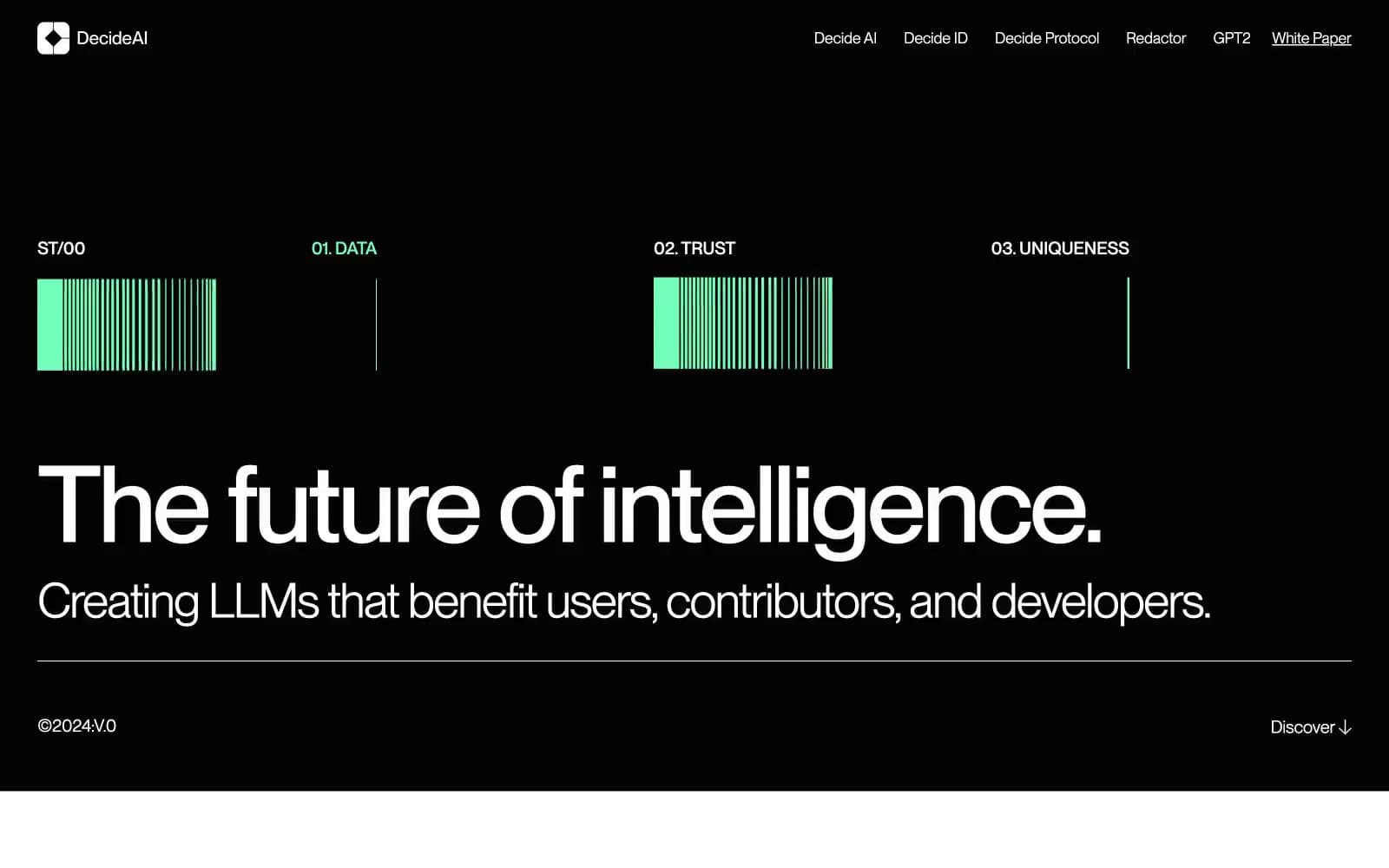
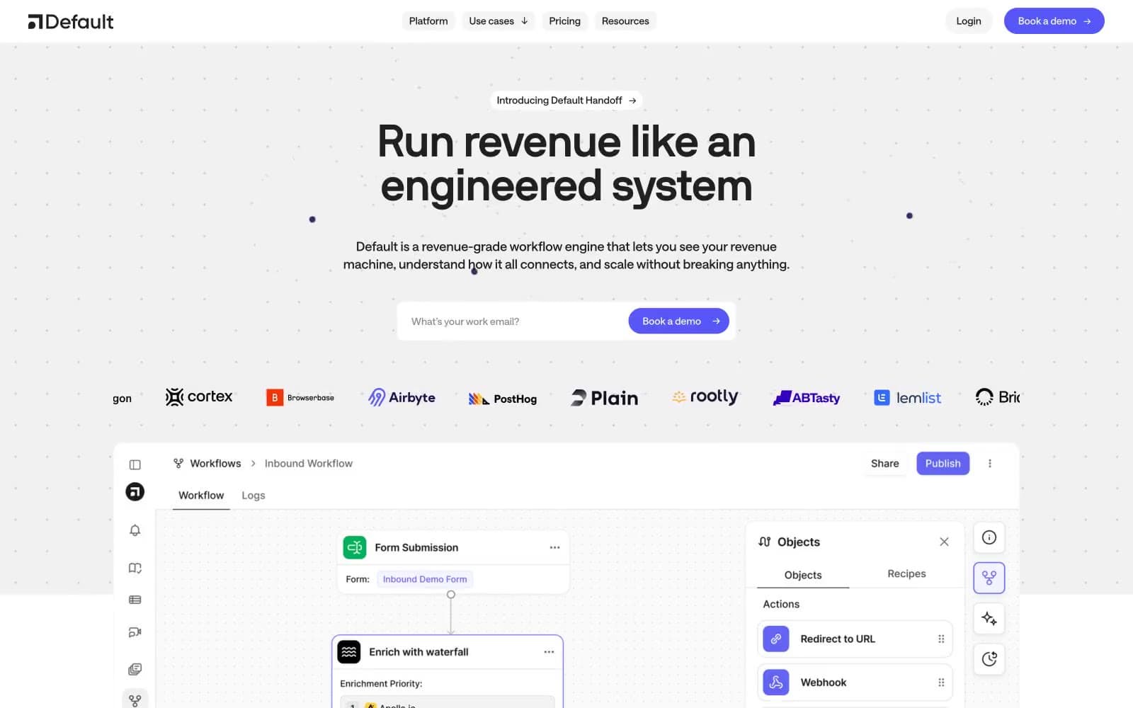
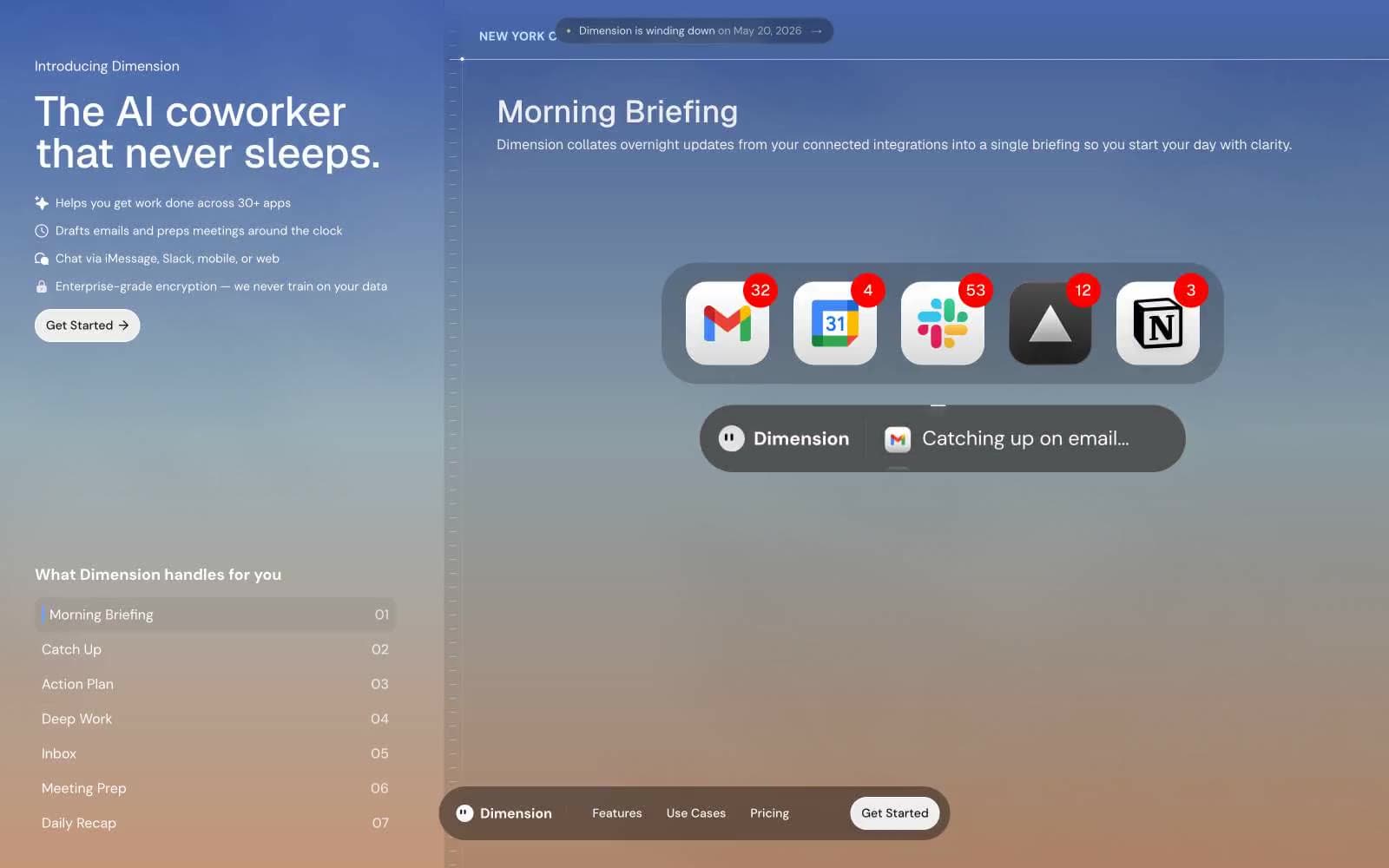
Langbase. Midnight aurora console.
- AI
- Dark theme
- 11 colors
- 2 typefaces
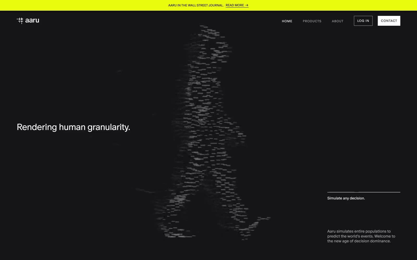
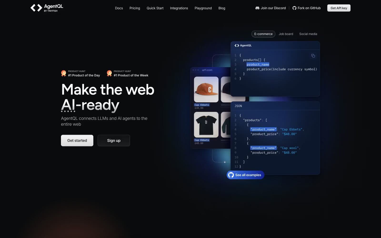
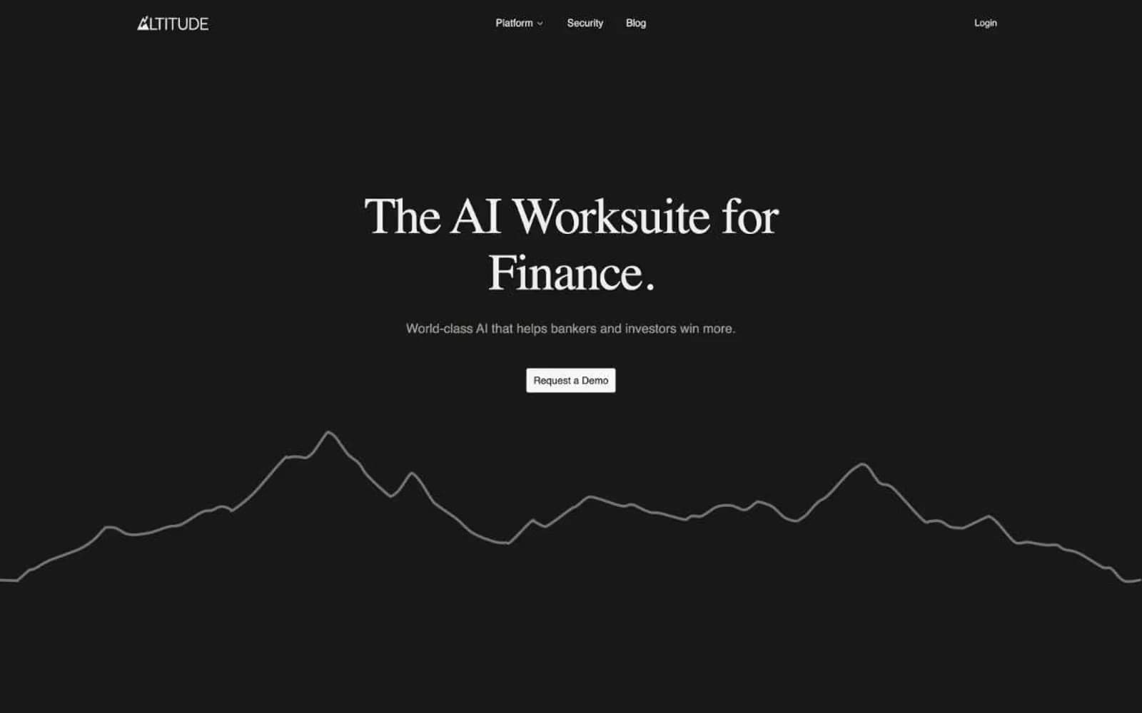
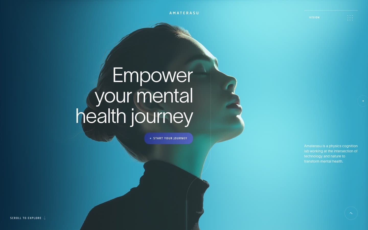
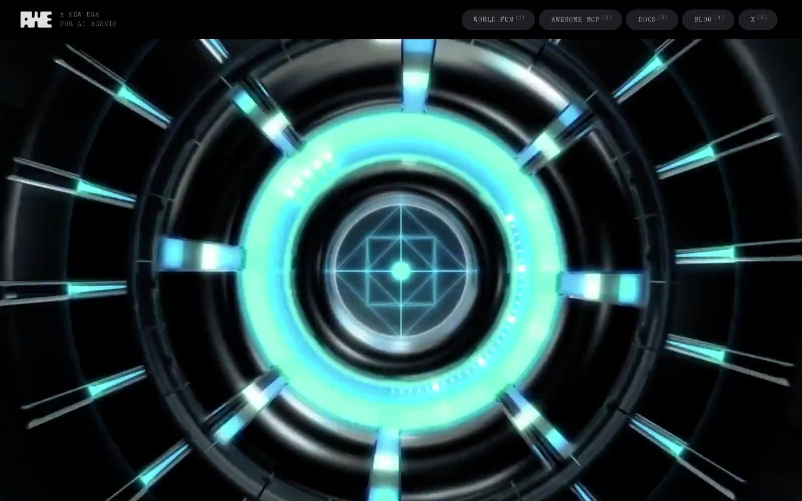
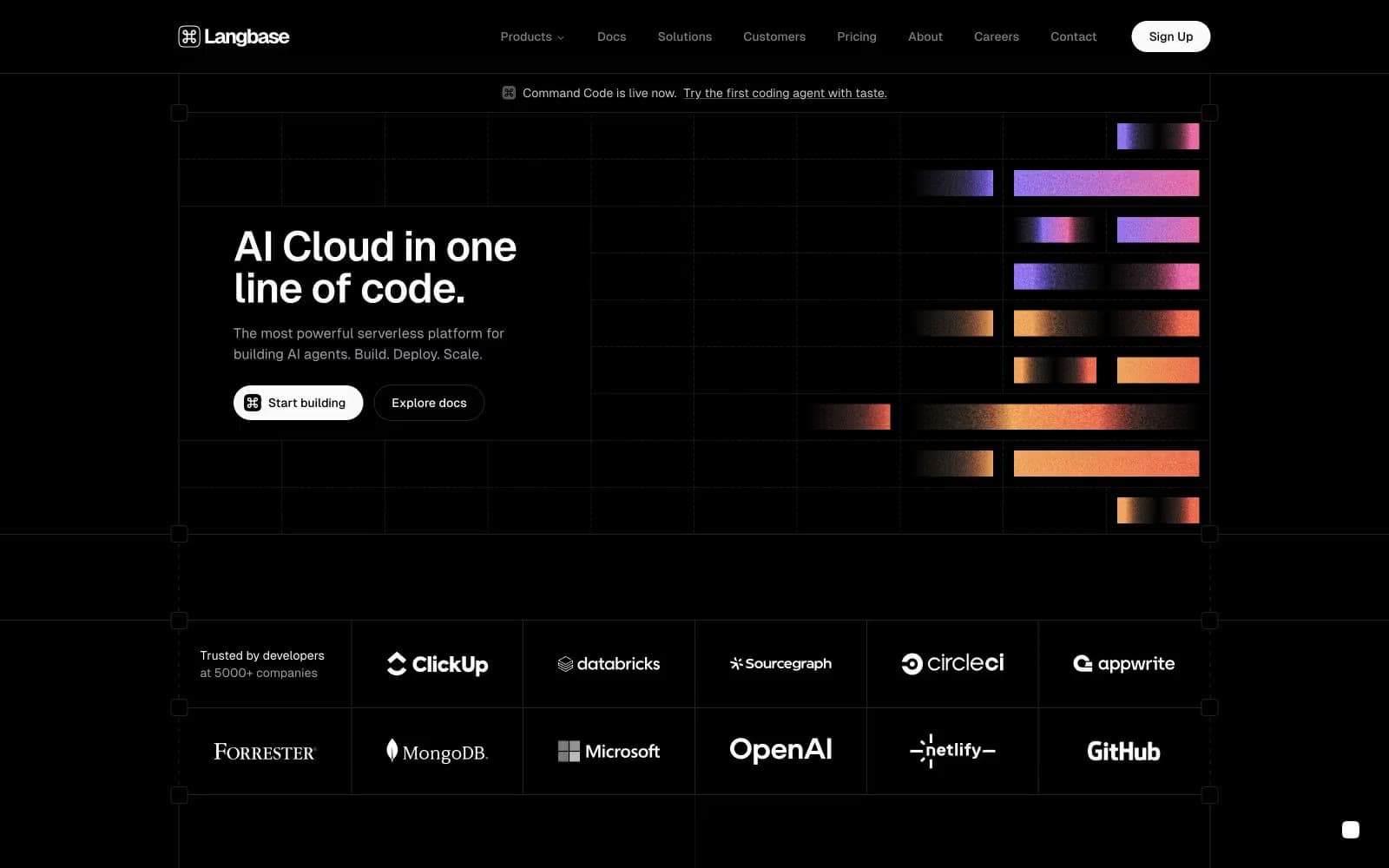
Langbase is a midnight developer console where a single chromatic aurora is the only color in an otherwise pure dark-gray world. The canvas is #232324 — a near-black charcoal — structured by hairline borders at #232324 and #5c5c61 that create an architectural blueprint grid visible behind the hero. The interface reads as a terminal: GeistSans provides clean geometric UI, GeistMono adds the developer identity at display sizes, and CTAs are achromatic pills (white-on-dark) so the multi-hue gradient — peach, pink, violet, mint, sky — becomes the sole emotional accent. Components stay flat and lightweight: no decorative shadows, no colorful buttons, no rounded-everything softness. The only color is the aurora, and it appears as fragmented horizontal bars beside the hero — decorative spectacle, never functional chrome.
Langbase design system

Accent1
Supporting palette color for small decorative accents when the core palette needs contrast. Do not promote it to the primary CTA color
Neutrals10
Deepest surface tone for the darkest interactive states and the reverse-text base inside white CTA buttons. Used sparingly — never as the page background
Navigation bar background — the only surface darker than the canvas, anchoring the top of the page as a distinct horizontal band
High-contrast neutral action fill for primary buttons on light surfaces.
Dominant page canvas, structural hairline borders, and the visible grid backdrop behind the hero. The single most-used color in the system; defines the near-black field that everything else sits on
Muted body text and the mid-tone of the neutral scale. Quieter than #a1a1aa for de-emphasized copy
Hairline borders, icon strokes, and the dividing lines between content sections. The 1px wire that holds the console together
Quietest readable gray for tertiary metadata and timestamps
Muted helper text, nav links, and secondary icon strokes. The readable-but-quiet gray that supports body copy without claiming focus
Slightly warmer white for secondary text and subtle emphasis where #fafafa would feel too clinical
Primary text, primary action fill, and the bright pole of the system. White-on-charcoal carries all the hierarchy; nothing else is allowed to compete
Try a pairing
Pick any two colors from the palette to check whether text stays readable on top.
Aa
Bone White on True Black
20.12 : 1 contrast
- Body textPasses AA 4.5
- Large textPasses AA 3
- StrictPasses AAA 7