
Lama Lama. Midnight studio with a frozen-white spotlight.
- Studio
- Dark theme
- 3 colors
- 2 typefaces
Lama Lama is a cinematic, near-monochrome editorial agency site: the canvas is almost pure black, the foreground is a single pale ice-cyan white used for every word on the page, and the only color punctuation is the same ice-white flipping into a full-bleed inverted panel at the foot of the page. Typography is a Swiss grotesque (Suisse Int'l) at whisper-light weights — 300 for hero and section headlines — which reads as confident, unfussy, and editorial rather than loud. Layout is asymmetric and full-bleed: short text columns anchored to the viewport's left margin, generous gutters of 40–48px, and large editorial photographs or video frames occupying the remaining width. There are almost no filled buttons; navigation, links, and calls to action are all ghost text with thin underlines, which makes the interface feel like a magazine spread rather than a product UI.
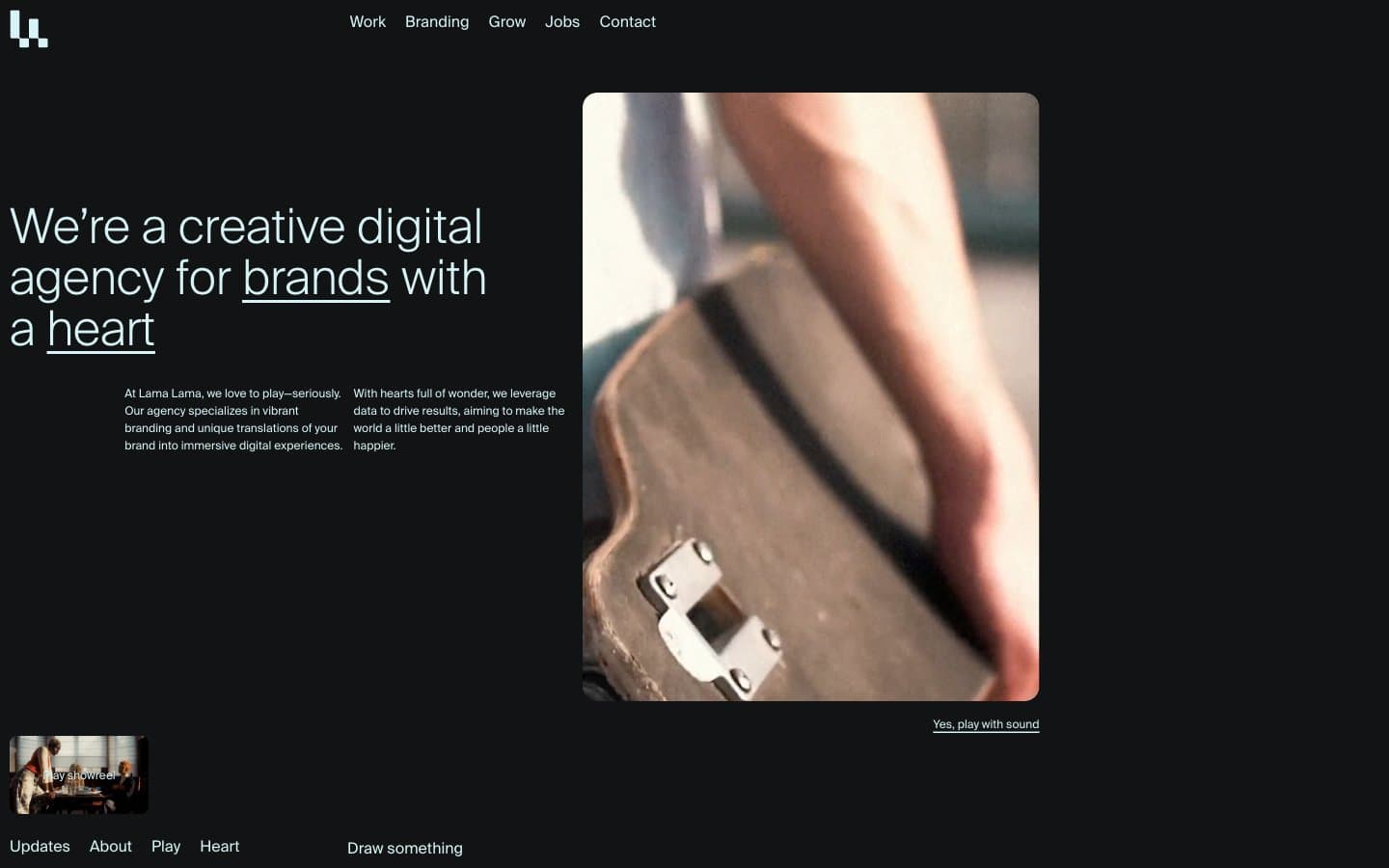
Lama Lama design system

Brand1
All foreground text, underlined link strokes, hairline borders, and the full-bleed inverted surface at the page foot — the only chromatic element in the system, used to make every readable word and every interactive affordance feel like it shares one voice
Neutrals2
Page background and deepest canvas layer — near-pure black with a barely-perceptible cool tint that makes Ice Cyan read slightly blue
Elevated card surface, section backdrop, and subtle horizontal divider band — one step lighter than Void to lift project cards and content blocks without breaking the dark mood
Try a pairing
Pick any two colors from the palette to check whether text stays readable on top.
Aa
Void on Ice Cyan
17.80 : 1 contrast
- Body textPasses AA 4.5
- Large textPasses AA 3
- StrictPasses AAA 7
More DESIGN.md files. Same web, different personalities.

Basement Studio
Studio
Production Portugal
Studio
Active Theory
Studio
Adnaut
Studio
Agence K72
Studio
Akash Tyagi
Studio
Analogue
Studio
Athletics
Studio
BAM Photographers
Studio
Bareis + Nicolaus
Studio
Becklyn
Studio
Branding
Studio


