Krea. Noir gallery at midnight.
- AI
- Dark theme
- 12 colors
- 1 typeface
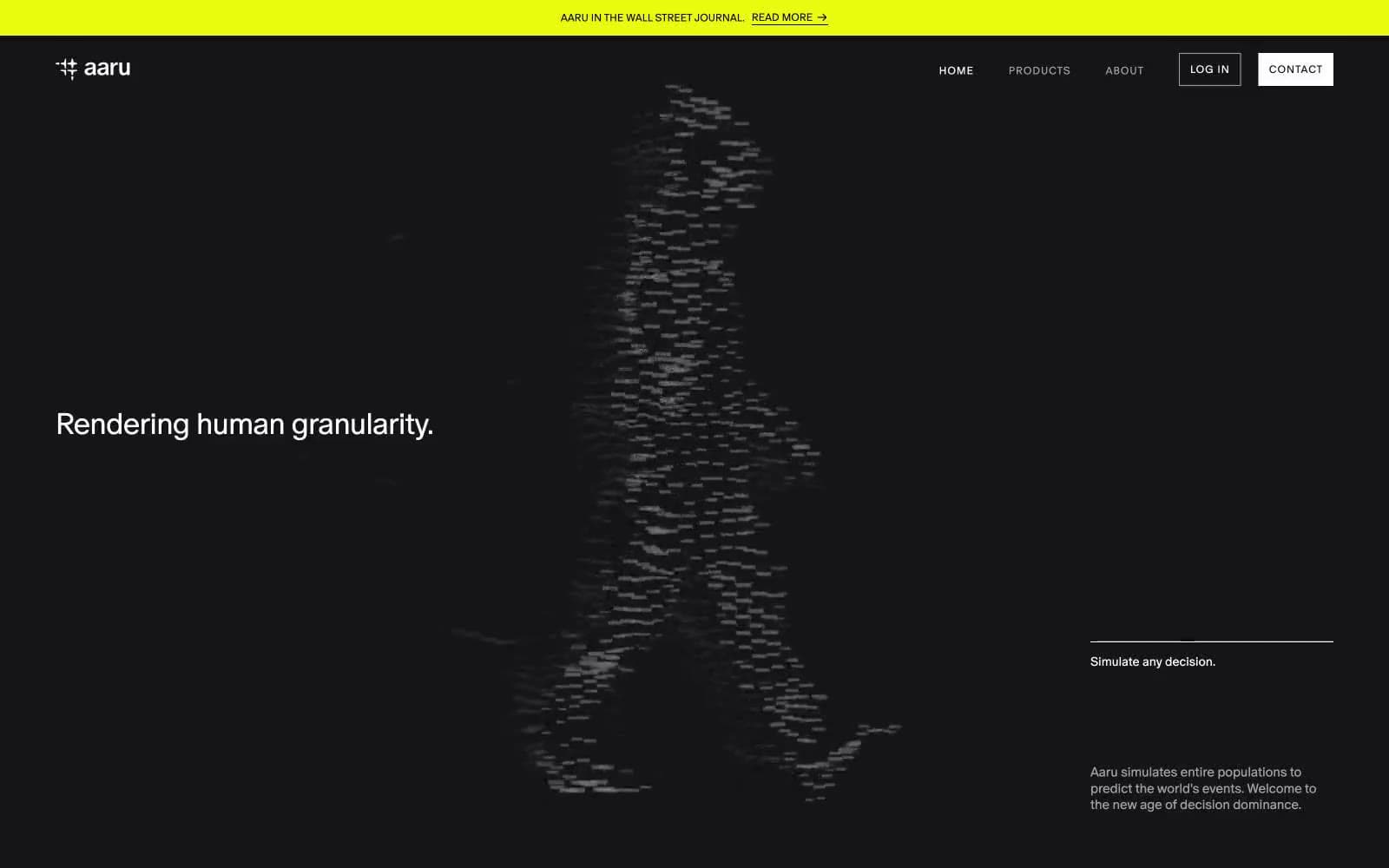
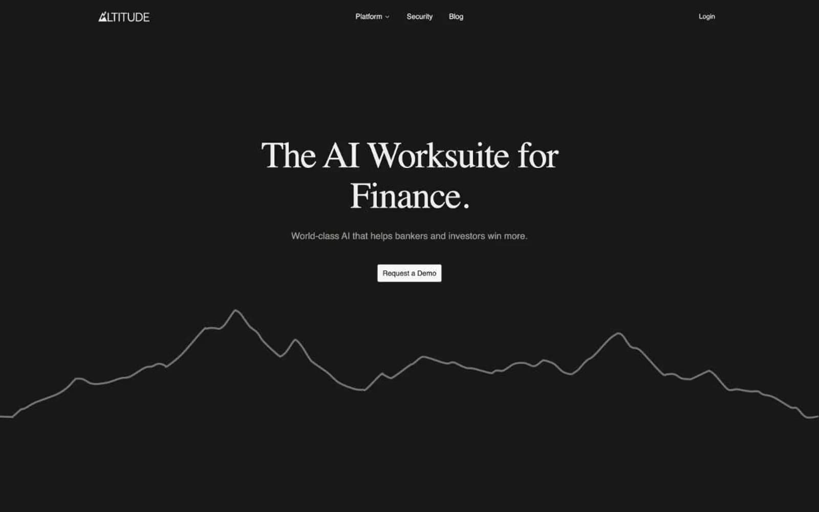
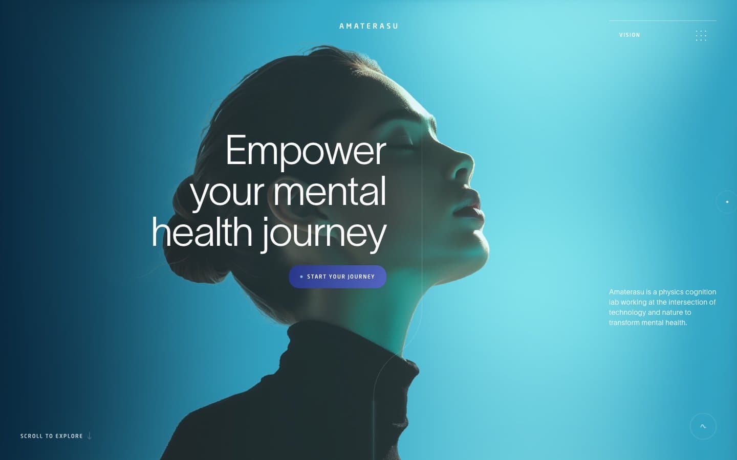
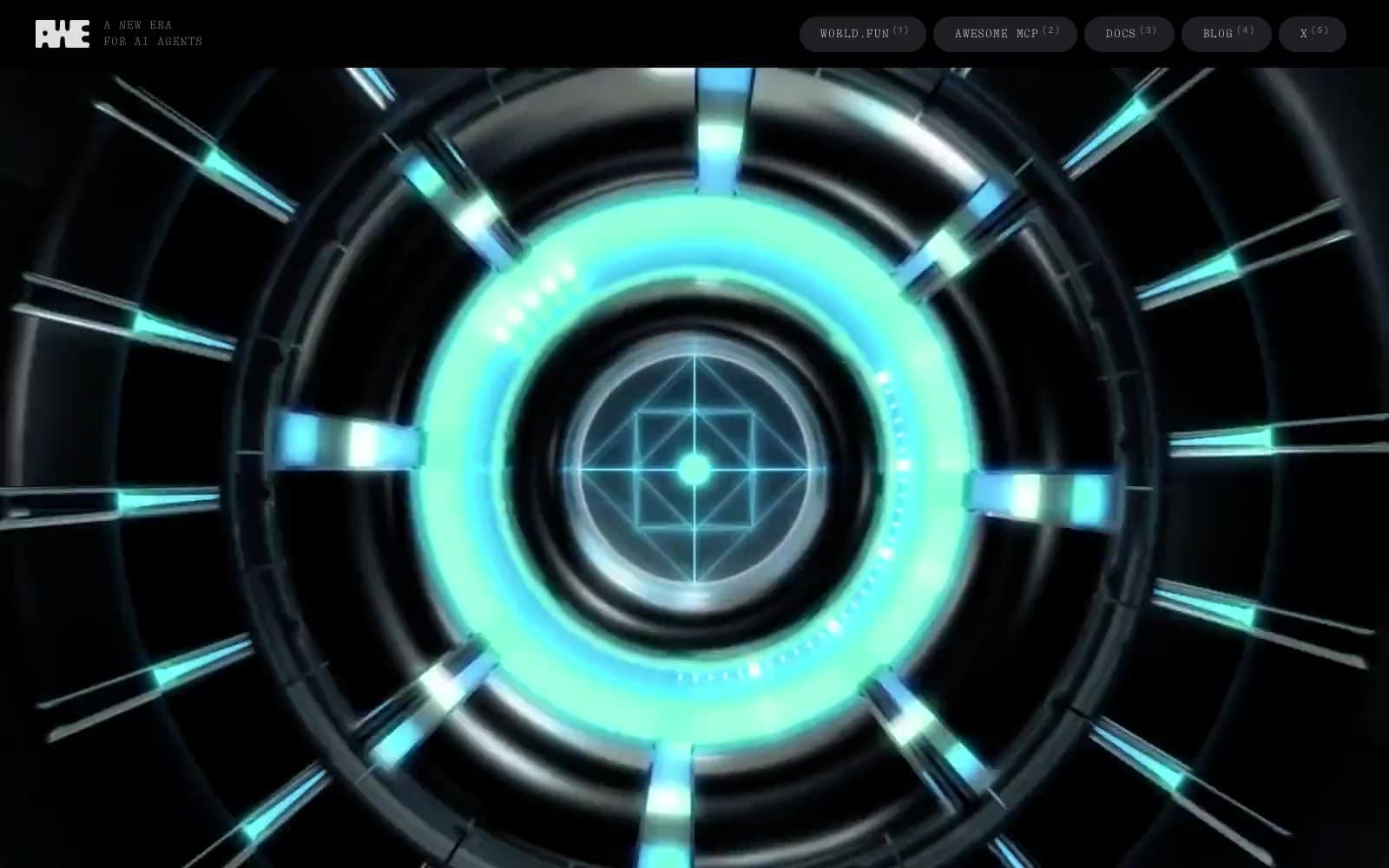
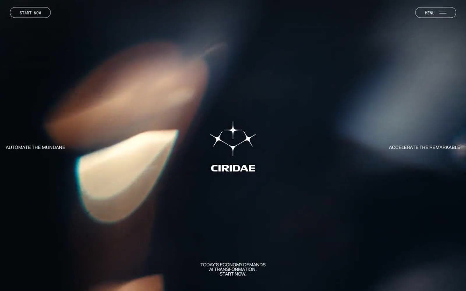
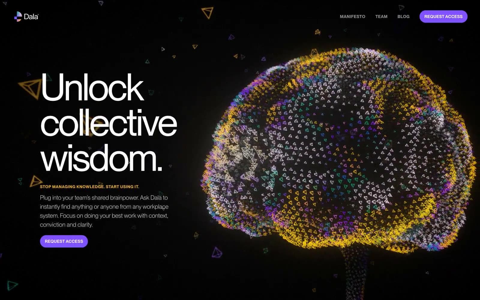
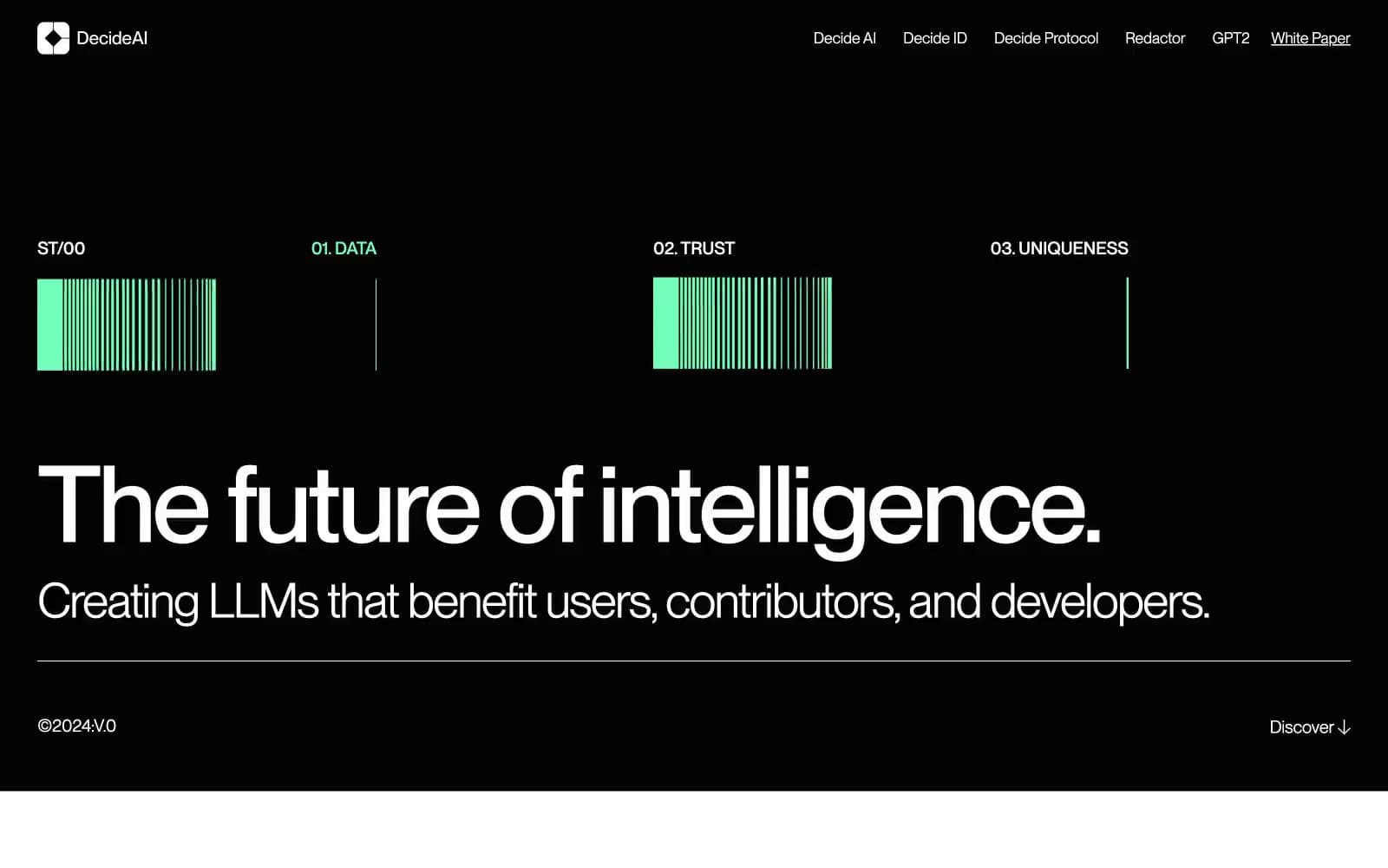
Krea operates as a cinematic monochrome stage: pure black canvases, surgically tight Suisse Intl type, and zero chromatic noise compete for attention with the AI-generated imagery itself. The interface dissolves into atmosphere — the product floats on darkness rather than sitting on a surface. Buttons toggle between white-fill and ghost-outline pills, never introducing color. Typography does all the heavy lifting: compressed display weights at 96px/72px pull the eye down into the page, while sub-1.0 line-heights on heroes create an almost film-credit density. Spacing is generous but never airy — 80–96px section gaps with 12–20px element rhythm keeps things composed, not floaty.

Krea design system

Neutrals12
Primary page background, hero canvas, image void — the default stage everything sits on
Hero ambient and large image containers — a near-black with the faintest blue undertone that keeps the void from looking flat
Elevated card surfaces, hover state for ghost buttons, secondary panels that need to lift off Obsidian
Supporting neutral for secondary UI, dividers, and muted labels. Do not promote it to the primary CTA color
Muted body text, inactive icon strokes, decorative dividers in dense blocks
Secondary supporting text, caption-level annotations, tertiary iconography
Tertiary text, helper copy, less-prominent metadata
Secondary body text and sub-labels that still need readability over dark surfaces
Hairline borders, subtle stroke dividers, ghost button outlines
Light divider lines on dark surfaces where higher contrast isn't needed
Light surface reserved for inverted sections or content blocks that demand brightness
Light supporting surface for subtle backgrounds and section separation. Do not promote it to the primary CTA color
Try a pairing
Pick any two colors from the palette to check whether text stays readable on top.
Aa
Pure White on Obsidian
21.00 : 1 contrast
- Body textPasses AA 4.5
- Large textPasses AA 3
- StrictPasses AAA 7