
Koto. Obsidian gallery at midnight.
- Studio
- Dark theme
- 8 colors
- 2 typefaces
Koto is a creative agency site that feels like an empty gallery at midnight: a near-totally achromatic canvas where custom condensed type carries all the personality. The sole chromatic moment is the yellow logo mark — everything else is a disciplined gradient of grays against near-black, structured as sparse typographic waypoints rather than information-dense blocks. Navigation is whisper-quiet, whitespace is architectural, and components sit flat on the canvas with no shadows or gradients. The density is compact at the micro-level (tight padding, small type) but breathes generously between sections, creating a rhythm of typographic statements separated by void.
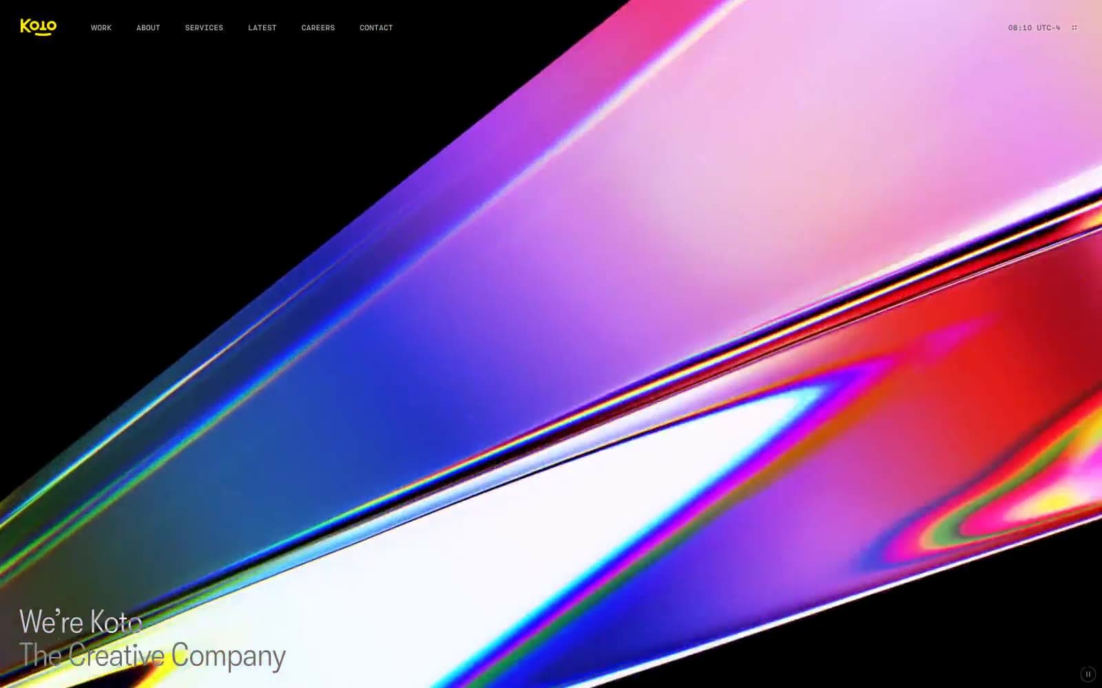
Koto design system

Brand1
Yellow decorative accent for icons, marks, and small graphic details.
Neutrals7
Primary page canvas — the dominant background where all content floats; not pure black, but a warmthless near-black that keeps contrast at AAA
Elevated card and icon backgrounds — one step lighter than canvas, used to subtly separate surfaces without breaking the dark mood
Hairline borders and dividers — barely visible structural lines that define regions without adding visual weight
Muted text and secondary borders — body text at reduced emphasis, footer meta, tertiary labels
Secondary body text and medium-emphasis borders — the most-used neutral after white, for body copy and structural outlines
Light body text — softer than white for inline body content where pure white would feel too sharp
Primary text, heading strokes, and all key borders — the brightest mark in the system, reserved for content that must read first
Try a pairing
Pick any two colors from the palette to check whether text stays readable on top.
Aa
Void Black on Signal Yellow
16.20 : 1 contrast
- Body textPasses AA 4.5
- Large textPasses AA 3
- StrictPasses AAA 7
More DESIGN.md files. Same web, different personalities.

Basement Studio
Studio
Production Portugal
Studio
Active Theory
Studio
Adnaut
Studio
Agence K72
Studio
Akash Tyagi
Studio
Analogue
Studio
Athletics
Studio
BAM Photographers
Studio
Bareis + Nicolaus
Studio
Becklyn
Studio
Branding
Studio


