
Kobu. Monochrome travel gazette on warm parchment.
- Brand
- Light theme
- 7 colors
- 3 typefaces
Kobu operates as an editorial travel portfolio: a warm cream canvas, almost zero chromatic noise, and photography as the only color. The massive display wordmark KOBU stretches nearly edge-to-edge — the brand name itself is the visual statement, not a logo mark. Everything else recedes: a humanist Gill Sans sets a literary, guidebook tone while Fira Mono handles small uppercase labels that read as printed museum tags. Cards live on the page edge with hairline borders, no shadows, no fills, and 5px-rounded badges floating in the top-left corner of each photograph. The system is deliberately austere — no CTAs, no accent colors, no gradients — so that the architecture and landscapes in the photography become the only expressive element on screen.
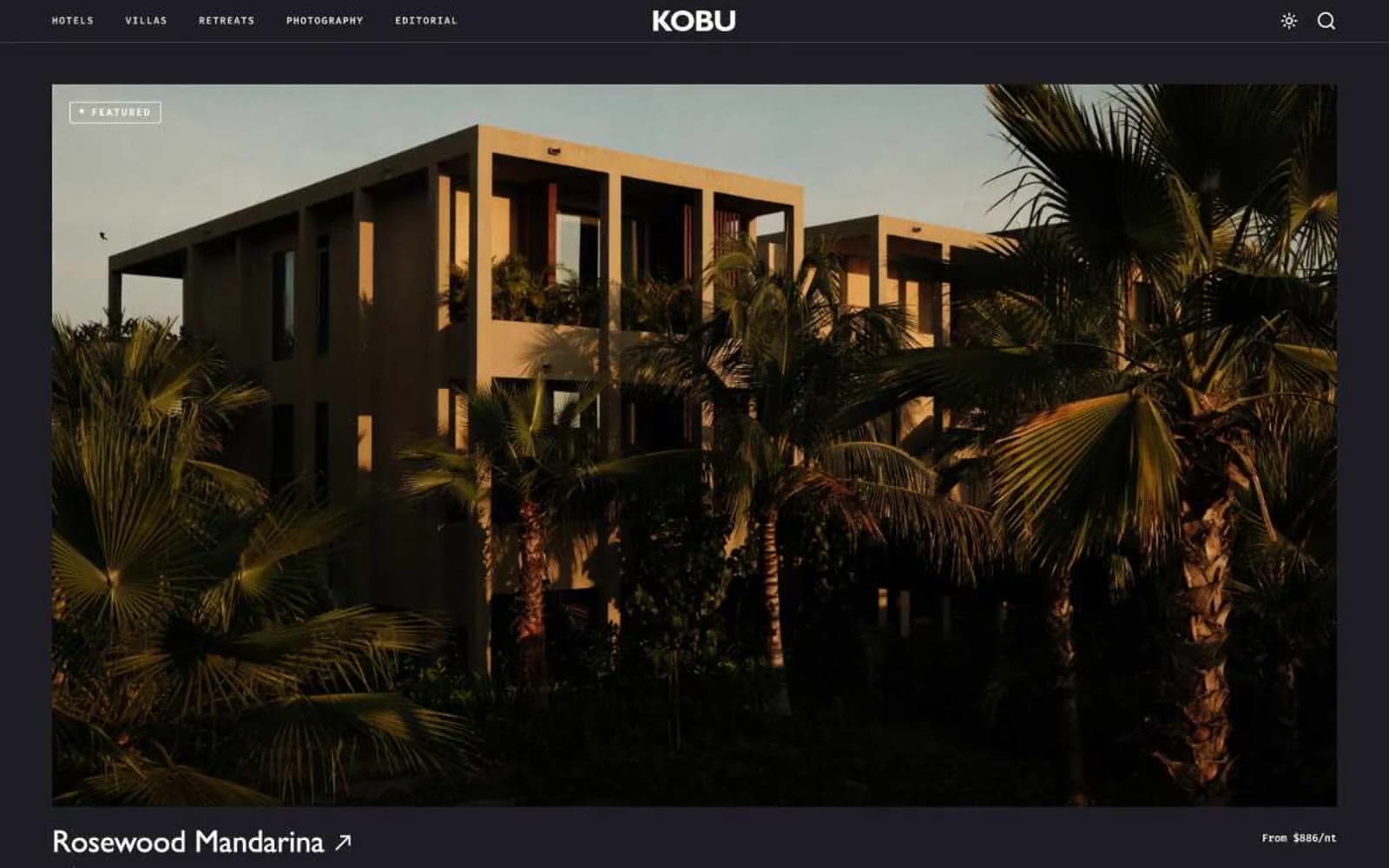
Kobu design system

Neutrals7
Headings, navigation borders, and high-contrast typographic moments where maximum weight is needed
Reserved for the heaviest display headlines where a hair more density than Ink Black is desired
Primary text, icon strokes, hairline borders across the system — the workhorse dark that replaces pure black for a slightly warmer read
Body text, card metadata, and list items — softer than Obsidian for secondary reading copy
Muted heading accent and de-emphasized text — the quietest neutral, used for location subtitles and tertiary labels
Page canvas, hero and footer backgrounds — warm off-white that signals editorial paper rather than digital default
Card surfaces, image borders, badge backgrounds — the brighter neutral used to lift content off the parchment
Try a pairing
Pick any two colors from the palette to check whether text stays readable on top.
Aa
Gallery White on Ink Black
21.00 : 1 contrast
- Body textPasses AA 4.5
- Large textPasses AA 3
- StrictPasses AAA 7
More DESIGN.md files. Same web, different personalities.

Airbnb
Brand
Aker
Brand
Alison Roman
Brand
Alpine Bio
Brand
Alveos One
Brand
Amrit Palace
Brand
André Cândido
Brand
Anna Jóna
Brand
Apollo
Brand
Apple
Brand
Arva
Brand
Ashton Bespoke
Brand


