
Klarna ES. A near-black plum void opens onto a warm bone-white floor scattered with vibrant product cards, anchored by oversized geometric type and pill-shaped controls.
- Finance
- Light theme
- 12 colors
- 3 typefaces
Klarna's visual system is a confident dark-meets-light duality: a near-black plum (#0b051d) anchors brand presence across the hero and display type, set against a warm bone-white canvas (#f9f8f5) that keeps content sections approachable rather than clinical. Oversized custom display typography at 90px commands the hero, while compact body text at 16px stays quiet and legible. Playful accent colors — bubblegum pink, lavender, lime, deep plum — appear as small punctuation on cards and CTAs, never as structural or background elements. Generous rounded corners (16-32px on cards, pill-shaped buttons), near-zero shadows, and hairline borders create a premium, almost gallery-like feel where depth comes from color contrast and scale, not from elevation.
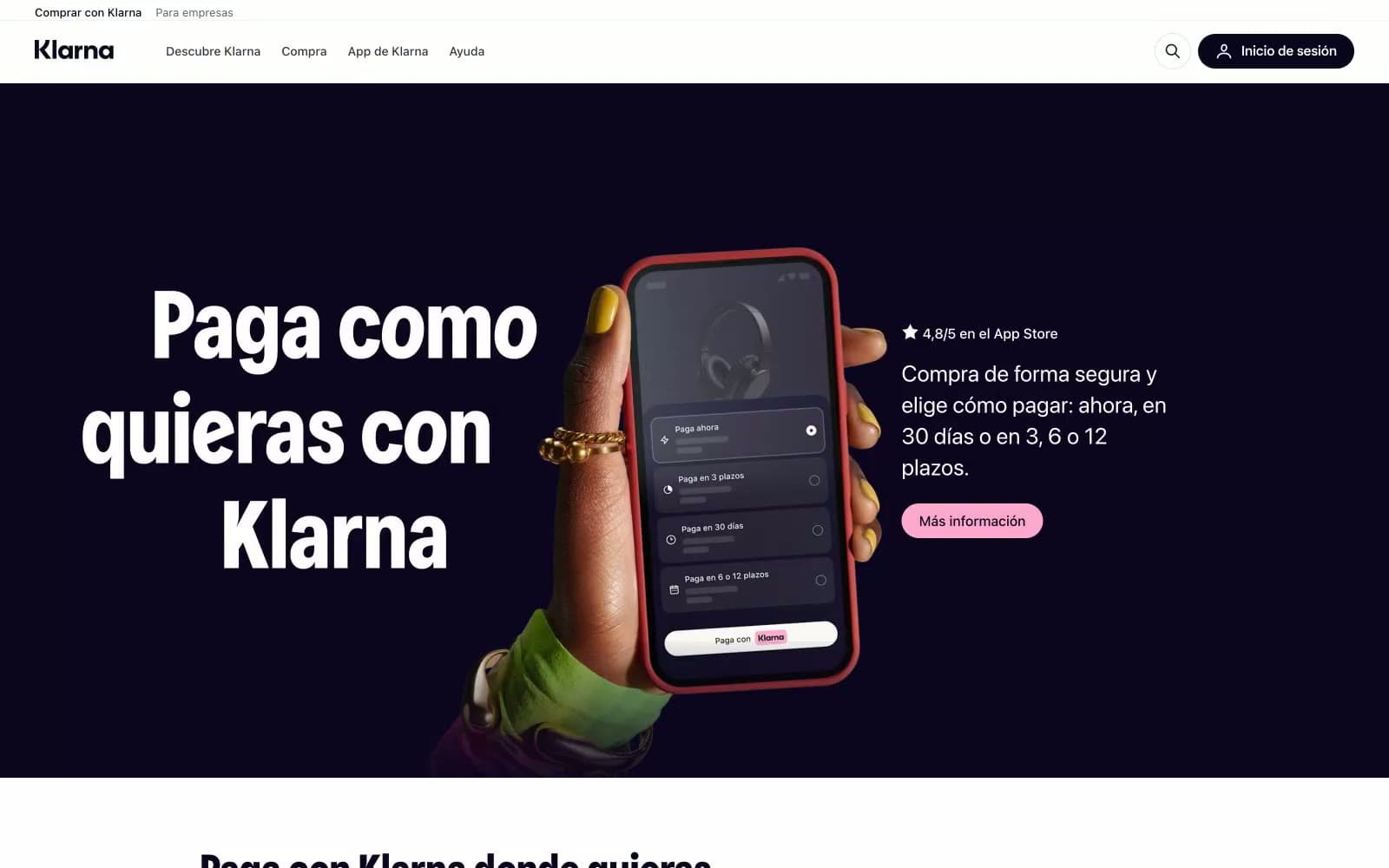
Klarna ES design system

Brand1
Violet supporting accent for decorative details and low-frequency emphasis.
Accent4
Accent card background — a slightly lifted version of Midnight Plum, used for dark-themed product/feature cards to create tonal variation within the dark family
Violet supporting accent for decorative details and low-frequency emphasis
Accent card background — high-key lime used as a rotating card surface color. High contrast against Midnight Plum text makes it ideal for dark-on-light product cards
Red supporting accent for decorative details and low-frequency emphasis. Do not promote it to the primary CTA color
Neutrals7
Dark UI text and button borders — used on pill buttons and nav controls where a softer dark than Midnight Plum is needed
Primary muted text — body copy, nav links, secondary descriptions. Near-gray with a slight cool violet undertone matching the brand
Secondary text — captions, helper text, fine print, and less prominent body copy
Tertiary neutral — placeholder text, disabled states, and very low-emphasis UI elements
Hairline borders, input outlines, and card edge definition. Also functions as the inset shadow color on buttons (rgb(228, 227, 223) inset ring)
Page canvas — the warm off-white that fills the body of every content section. Slightly cream-toned to feel inviting rather than clinical
Card surfaces and nav background — used for elevated cards on the Warm Bone canvas, and for the sticky top navigation bar
Try a pairing
Pick any two colors from the palette to check whether text stays readable on top.
Aa
Pure White on Midnight Plum
19.93 : 1 contrast
- Body textPasses AA 4.5
- Large textPasses AA 3
- StrictPasses AAA 7
More DESIGN.md files. Same web, different personalities.
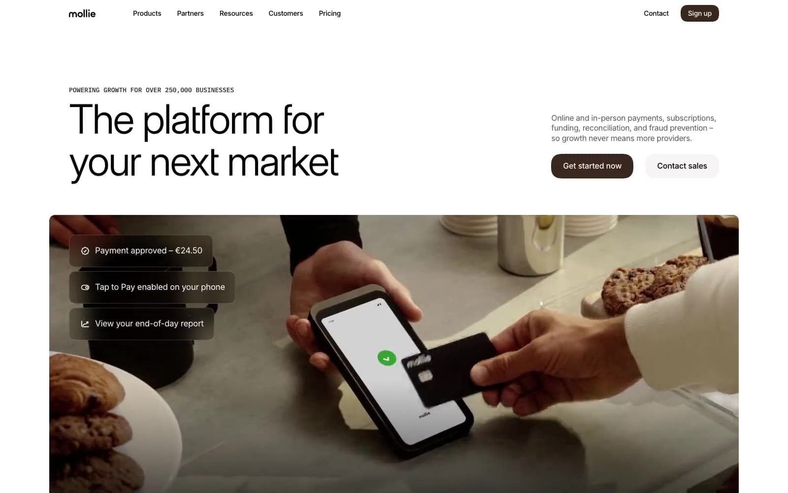
Mollie
Finance
a16z speedrun
Finance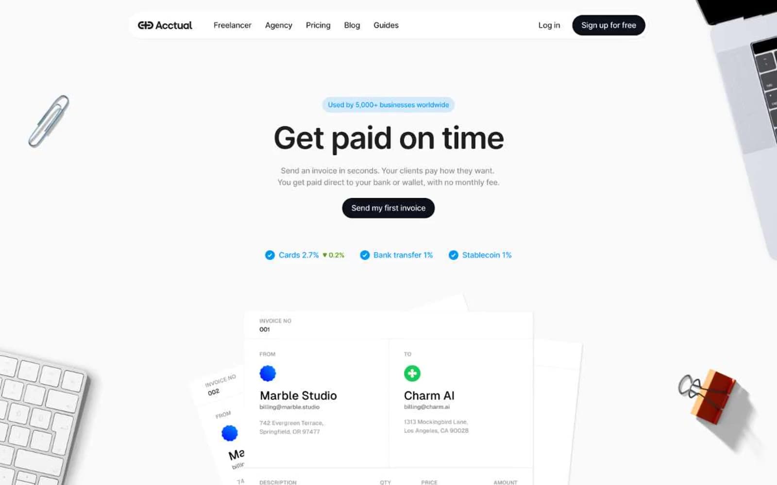
Acctual
Finance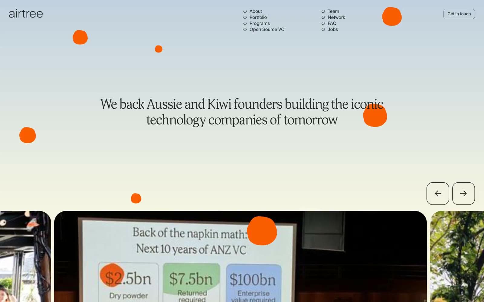
Airtree
Finance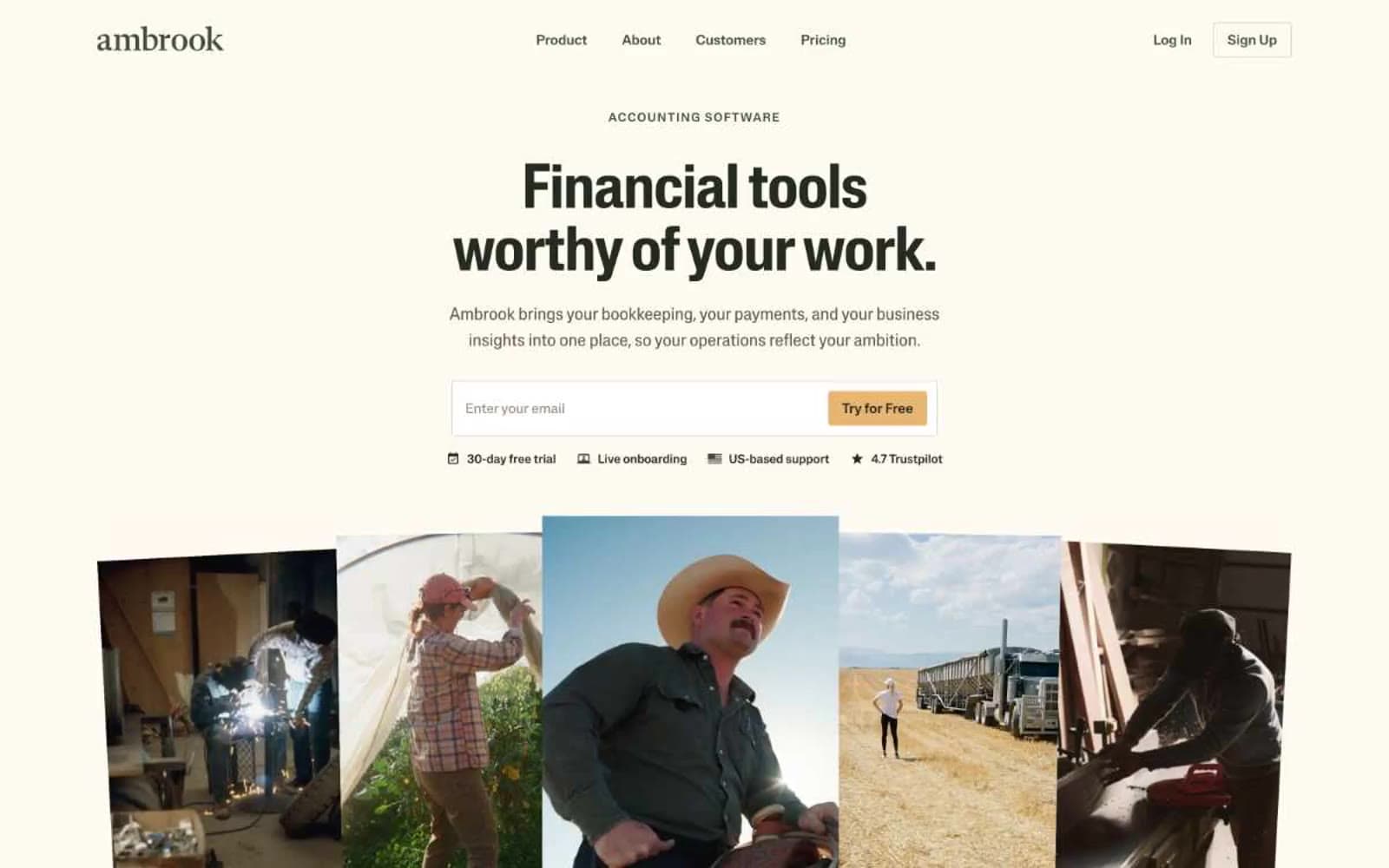
Ambrook
Finance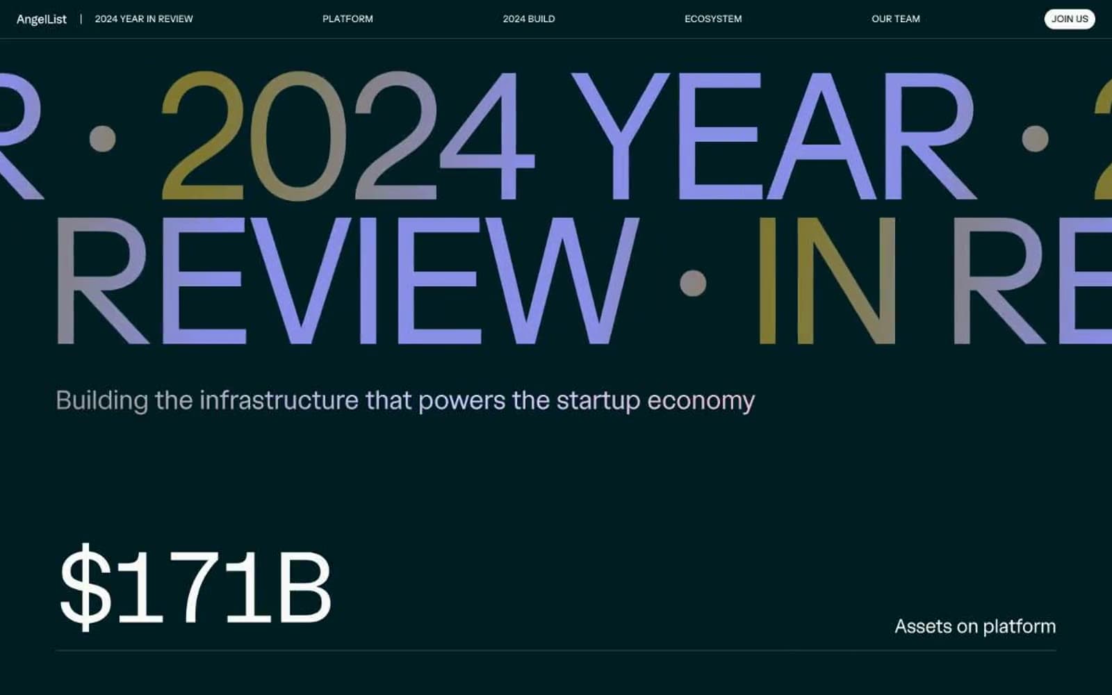
Angellist 2024
Finance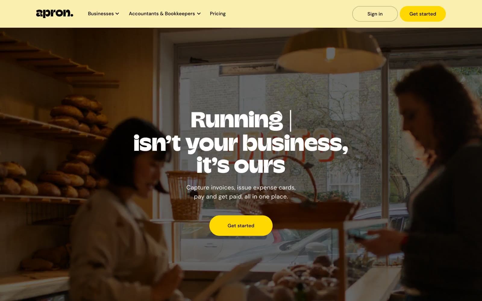
Apron
Finance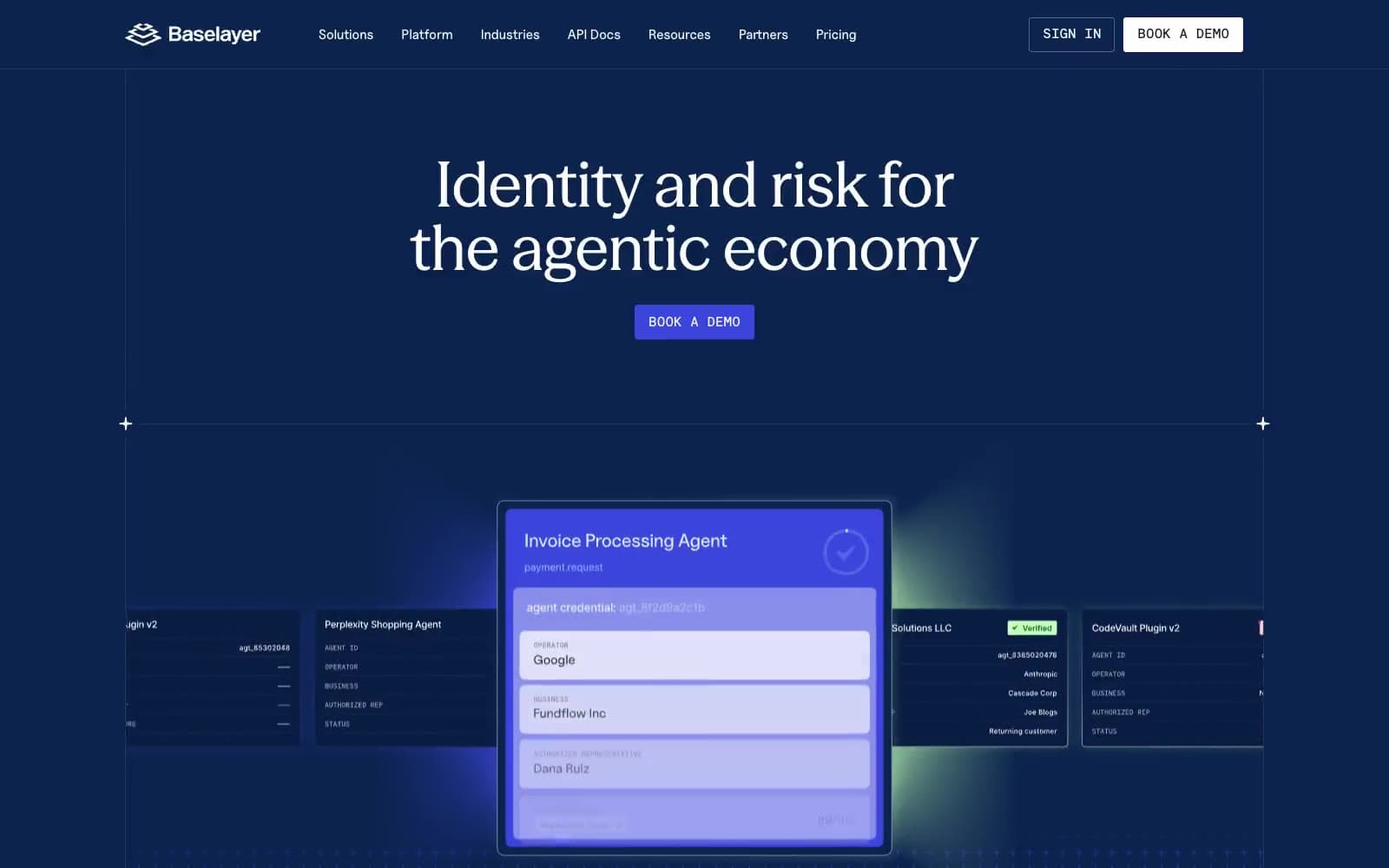
Baselayer
Finance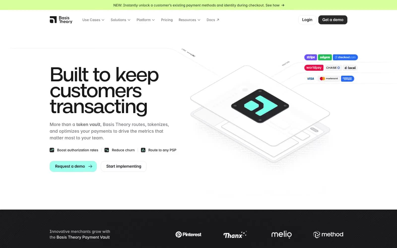
Basis Theory
Finance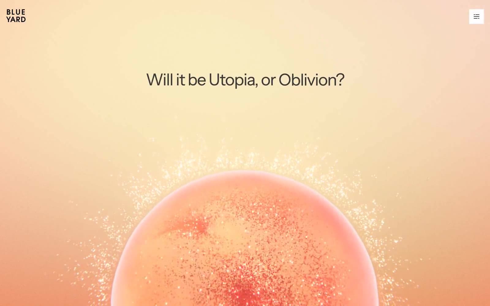
BlueYard Capital
Finance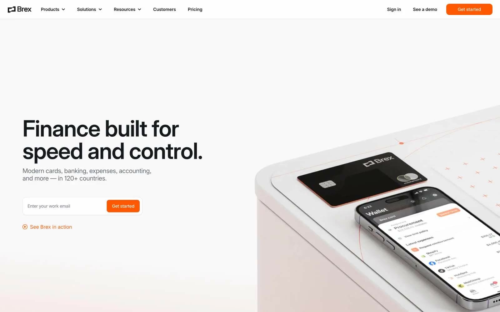
Brex
Finance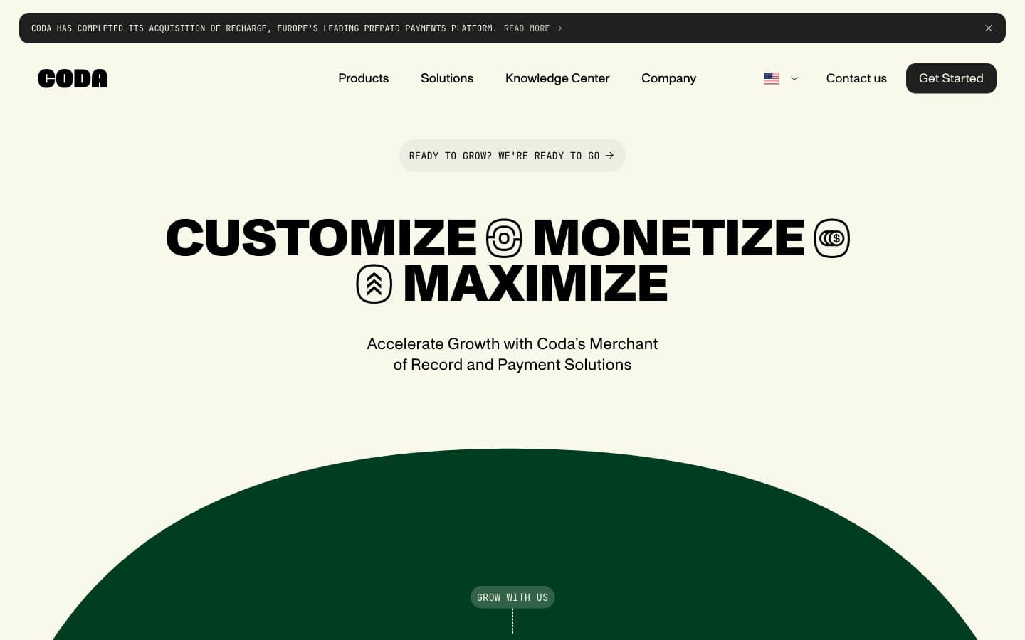
Coda
Finance


