
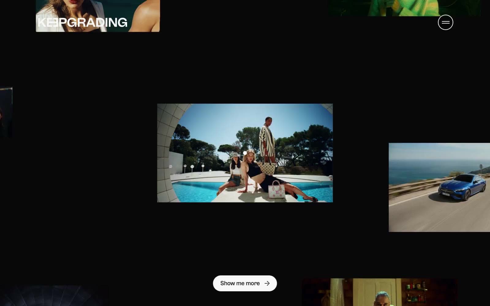
KeepGrading. Polaroids scattered in a darkroom.
- Studio
- Dark theme
- 5 colors
- 2 typefaces
KeepGrading is a black-room editorial portfolio: a near-total monochrome canvas where photographs float as scattered frames in deep void. The UI is deliberately quiet so imagery does the talking — only the Cabinet Grotesk display type, white hairline borders, and one pill-shaped ghost control surface as interface elements. No chromatic accents, no gradients, no shadows; the entire visual hierarchy is carried by contrast, scale, and whitespace between photographs. Density is comfortable but vertical rhythm is loose, with 48px breathing room between bands and frames held in place by a single 1px white border. Components are skeletal — a circular nav toggle, a wordmark logo, floating image cards with soft 160px corners, and pill buttons with 9999px radius — letting the photography dominate the experience.
KeepGrading design system

Neutrals5
SVG icon fills, deepest surface layer for inline graphics and decorative marks
Page canvas, behind-everything background, image frame fills between photographs
Low-contrast dividers and inactive frame edges that recede against the void
Soft secondary text and supporting hairline strokes when pure white feels too clinical
Primary text, ghost-button borders, image-frame outlines, nav icon strokes — the single light voice in a dark room
Try a pairing
Pick any two colors from the palette to check whether text stays readable on top.
Aa
Studio White on Pure Black
19.77 : 1 contrast
- Body textPasses AA 4.5
- Large textPasses AA 3
- StrictPasses AAA 7
More DESIGN.md files. Same web, different personalities.

Basement Studio
Studio
Production Portugal
Studio
Active Theory
Studio
Adnaut
Studio
Agence K72
Studio
Akash Tyagi
Studio
Analogue
Studio
Athletics
Studio
BAM Photographers
Studio
Bareis + Nicolaus
Studio
Becklyn
Studio
Branding
Studio


