
Josephmark. Midnight editorial gallery.
- Studio
- Dark theme
- 7 colors
- 1 typeface
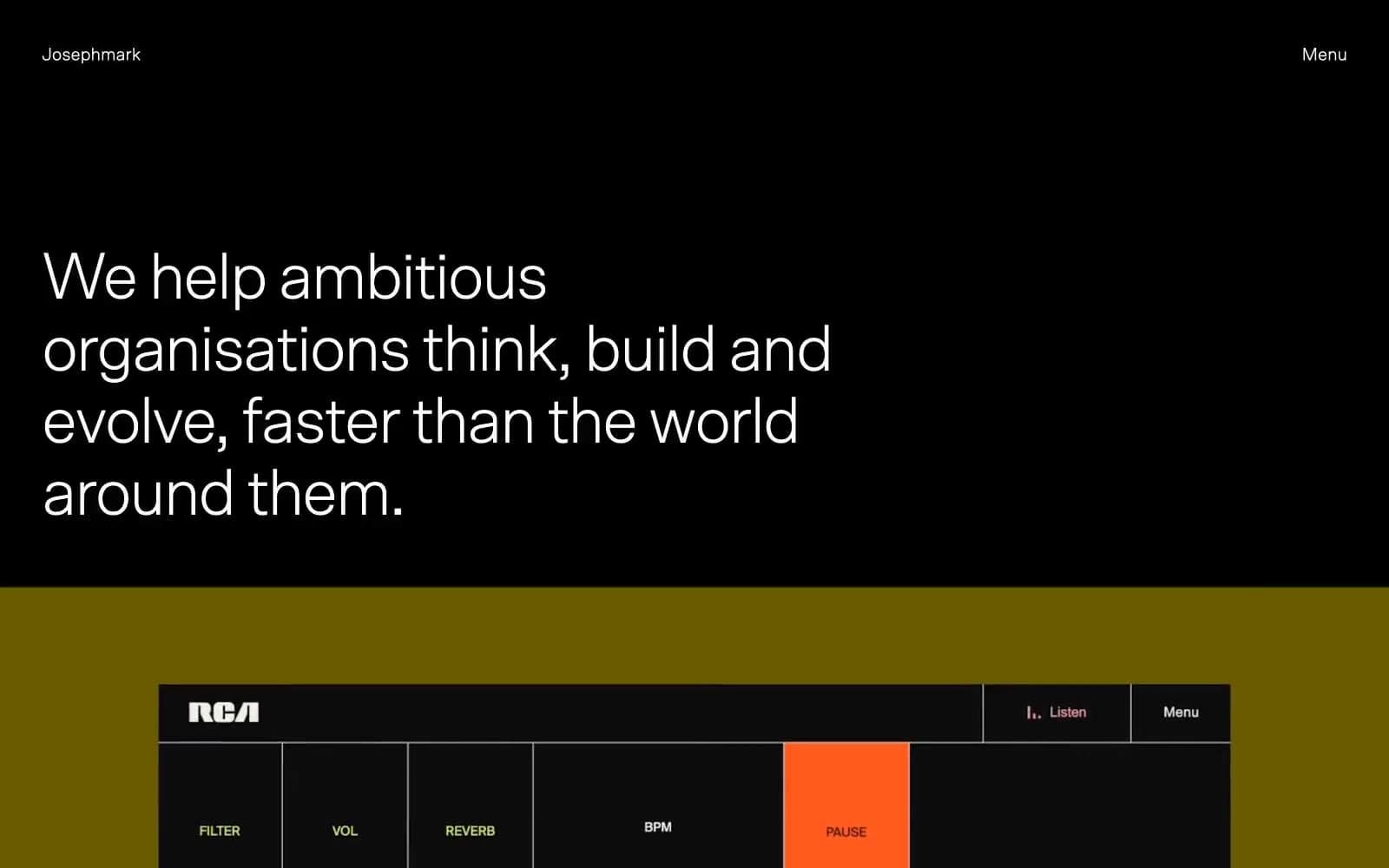
Josephmark operates as a midnight editorial gallery for digital craftsmanship: dark-dominant canvases, oversized Scto Grotesk set tight with aggressive negative tracking, and an almost entirely achromatic palette where a single warm taupe (#a9a498) acts as the only chromatic relief. The system prizes restraint over decoration — flat surfaces, hairline borders, pill-shaped buttons, zero shadows, and text that does the heavy lifting through scale and weight rather than color. Screens alternate between deep charcoal stages and cream-paper inserts, creating a rhythm of dark void and quiet warmth. Content is allowed to be loud (the case study artwork, the orange RCA piece, the Walking Dead illustration) while the chrome around it stays nearly invisible — a museum wall, not a website chrome.
Josephmark design system

Accent1
The system's sole warm chromatic note — muted link states, secondary surface tints, paper-like card backgrounds that soften the black-to-gray transitions
Neutrals6
Primary dark canvas — hero backgrounds, full-bleed section stages, base for the editorial atmosphere
Body text on light surfaces — a desaturated dark olive that reads warmer than pure black, the only hue-leaning neutral in the system
Mid-tone text — secondary headings, supporting copy, metadata that needs presence without competing with primary type
Hairline borders, dividers, list separators, subtle structural lines — the 999-occurrence border color that defines spatial relationships without visual weight
Warm off-white surface — secondary card and panel backgrounds, breaks the clinical feel of pure white and echoes the studio's paper-based brand collateral
Inverse text on dark canvases, form field backgrounds, button text on filled dark elements
Try a pairing
Pick any two colors from the palette to check whether text stays readable on top.
Aa
Carbon Black on Stone Taupe
8.45 : 1 contrast
- Body textPasses AA 4.5
- Large textPasses AA 3
- StrictPasses AAA 7
More DESIGN.md files. Same web, different personalities.

Basement Studio
Studio
Production Portugal
Studio
Active Theory
Studio
Adnaut
Studio
Agence K72
Studio
Akash Tyagi
Studio
Analogue
Studio
Athletics
Studio
BAM Photographers
Studio
Bareis + Nicolaus
Studio
Becklyn
Studio
Branding
Studio


