
Join Parker. White paper, electric blue ink, one italic flourish that rewrites the headline.
- Finance
- Light theme
- 11 colors
- 3 typefaces
Parker operates as a confident fintech command center: white parchment canvas, single electric-blue primary, and a quiet italic serif that interrupts the all-sans orthodoxy. The dual-typeface system — Inter for everything functional, Gambetta italic for a single word of emphasis — is the signature: a sans headline reads as utility, but 'Powers Your Growth' in italic serif turns the value prop into editorial copy. Components are generously rounded (24px cards, 9999px pills) giving the dense financial UI a soft, approachable feel. A full-bleed electric-blue feature section breaks the white rhythm and re-establishes the brand as the visual anchor. Color is used sparingly and functionally: blue for action and brand surfaces, orange for one conversion-critical CTA, warm parchment and sand for soft surfaces that keep the page from feeling sterile.
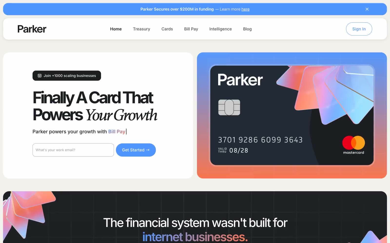
Join Parker design system

Brand1
Primary brand color — filled CTAs, full-bleed feature section background, icon accents, the credit card product visual's gradient. Carries 80% of brand recognition
Accent1
Orange action color for filled buttons, selected navigation states, and focused conversion moments.
Neutrals9
Secondary text and dark borders when Ink Black feels too heavy in tight contexts
Primary text, dark card surfaces (the credit card mockup, the dark feature section), heavy borders. Not pure black — sits slightly warm
Border color for dark elements, secondary dividers on dark surfaces
Muted helper text, quiet borders, icon strokes that need to recede
Muted text and borders on warm surfaces, slightly lighter than Steel for secondary hierarchy
Input default border — the resting state before focus activates the Electric Blue ring
Warm hairline border, parchment-adjacent dividers, subtle card outlines that need warmth without darkness
Warm card surface alternative — used when a card needs to feel softer than pure white, typically for feature blocks or stat panels
Primary canvas, card surfaces, button text, input fills — the bright default that lets blue and orange speak
Try a pairing
Pick any two colors from the palette to check whether text stays readable on top.
Aa
Midnight on Electric Blue
6.04 : 1 contrast
- Body textPasses AA 4.5
- Large textPasses AA 3
- StrictFails AAA 7
More DESIGN.md files. Same web, different personalities.
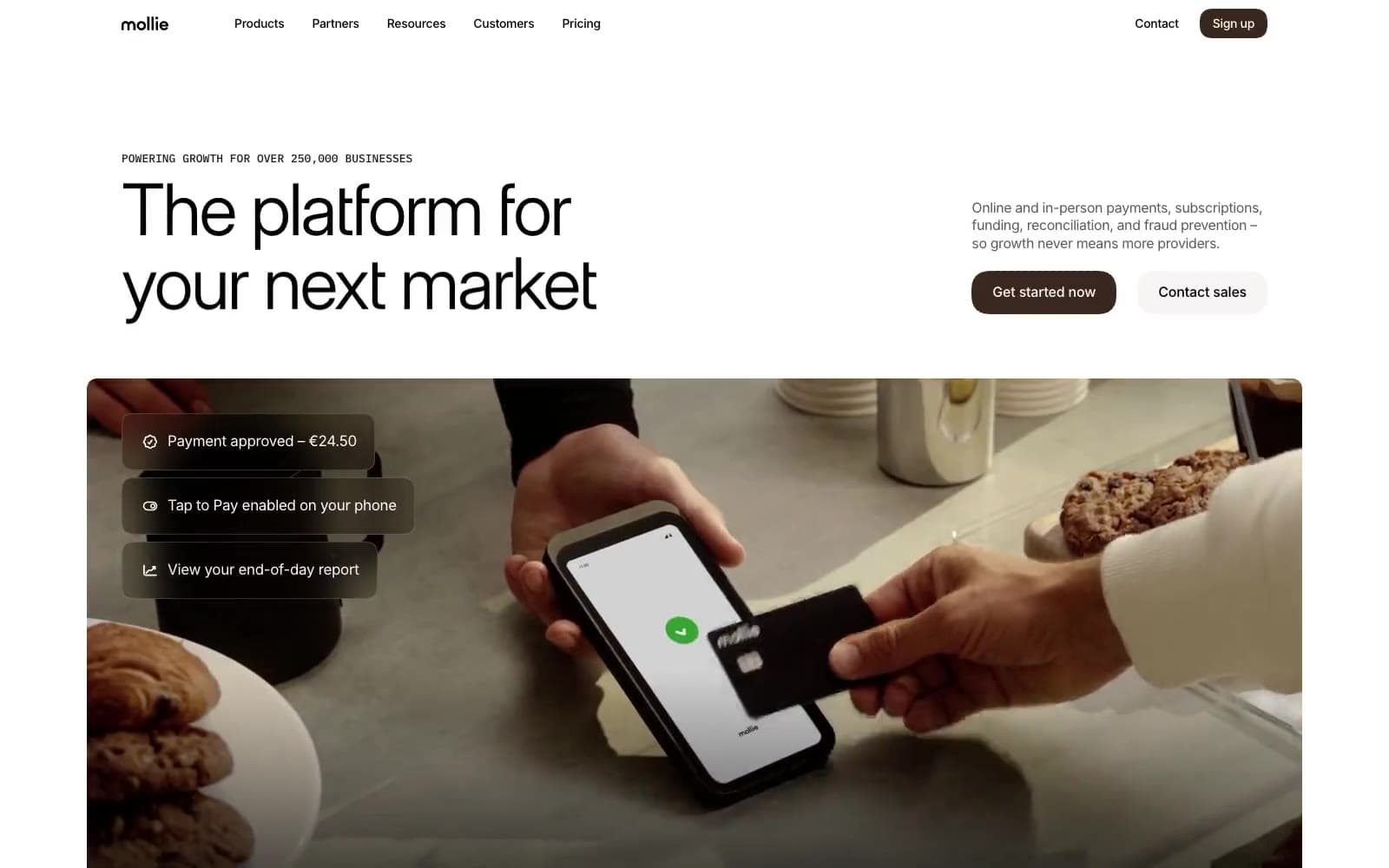
Mollie
Finance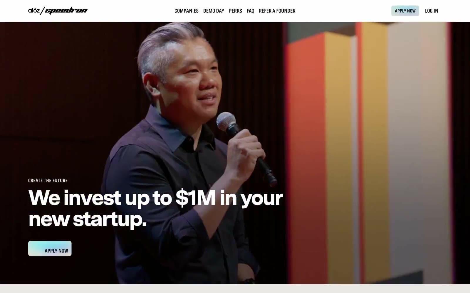
a16z speedrun
Finance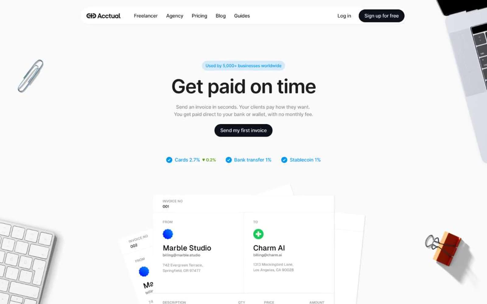
Acctual
Finance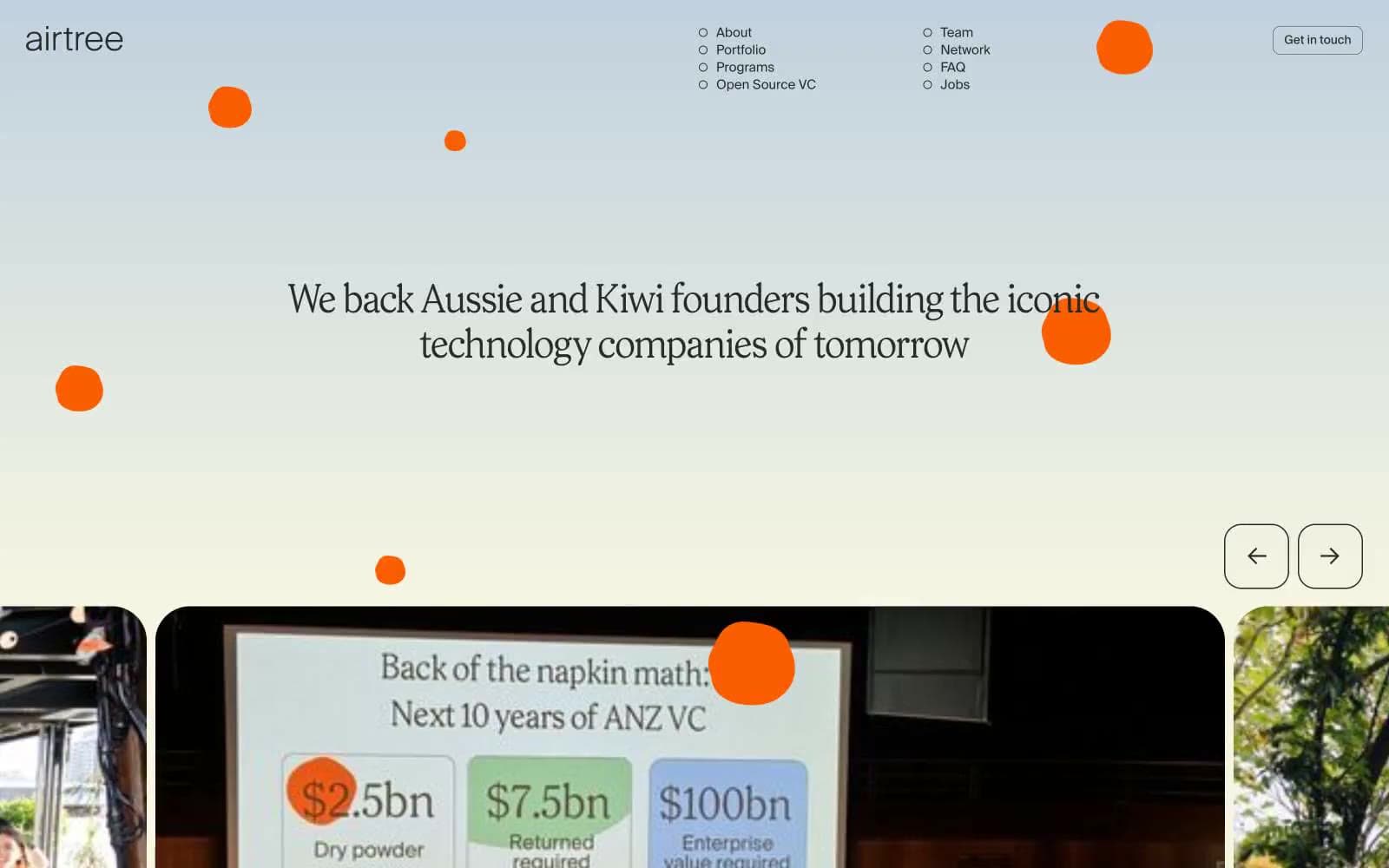
Airtree
Finance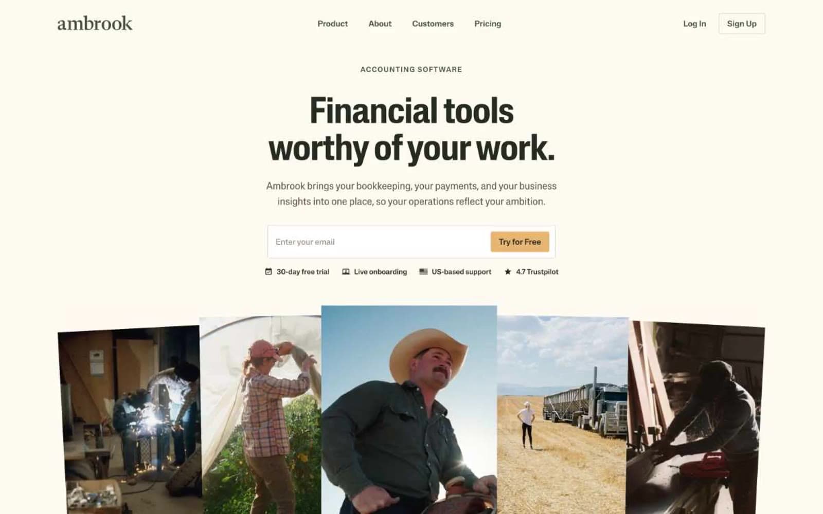
Ambrook
Finance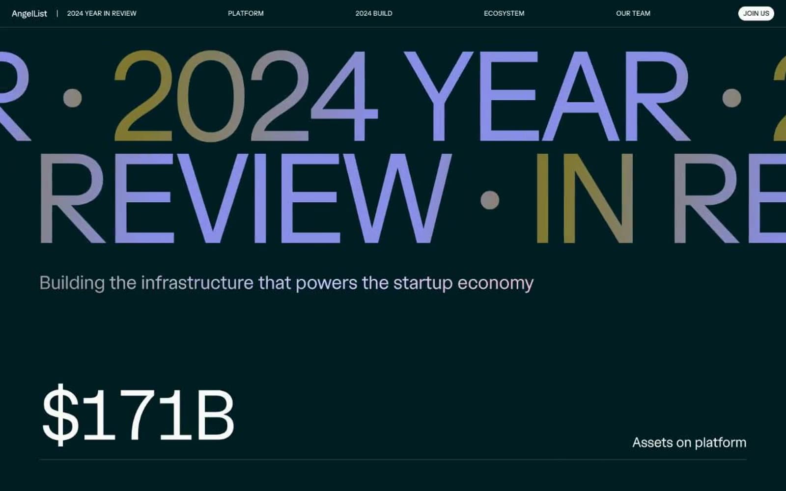
Angellist 2024
Finance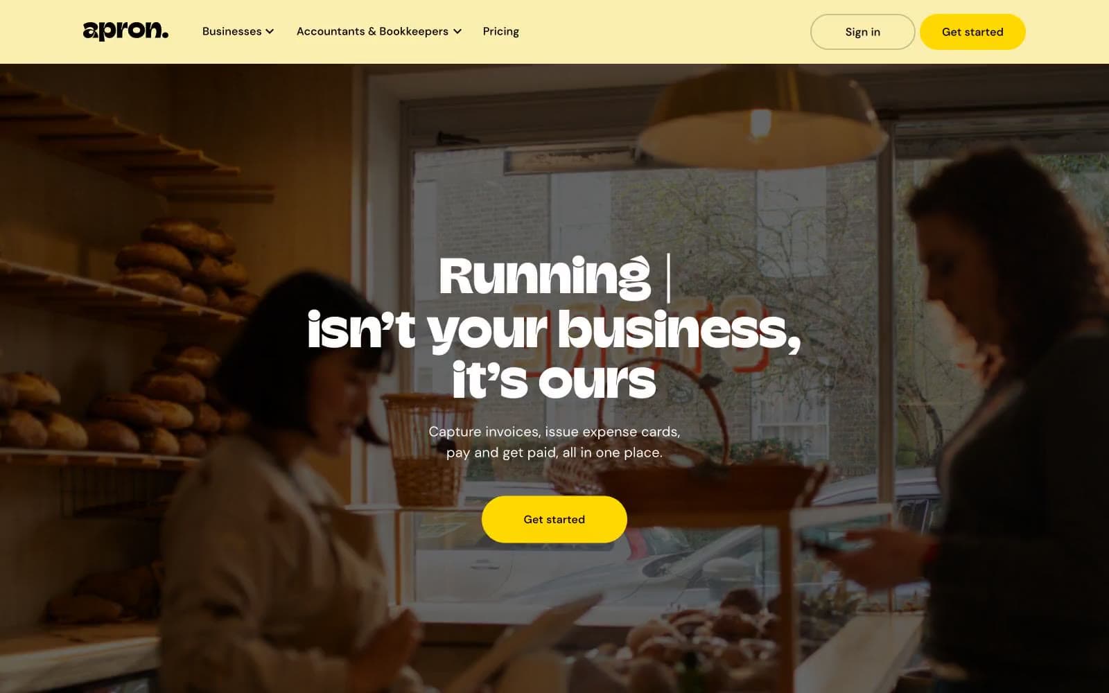
Apron
Finance
Baselayer
Finance
Basis Theory
Finance
BlueYard Capital
Finance
Brex
Finance
Coda
Finance


