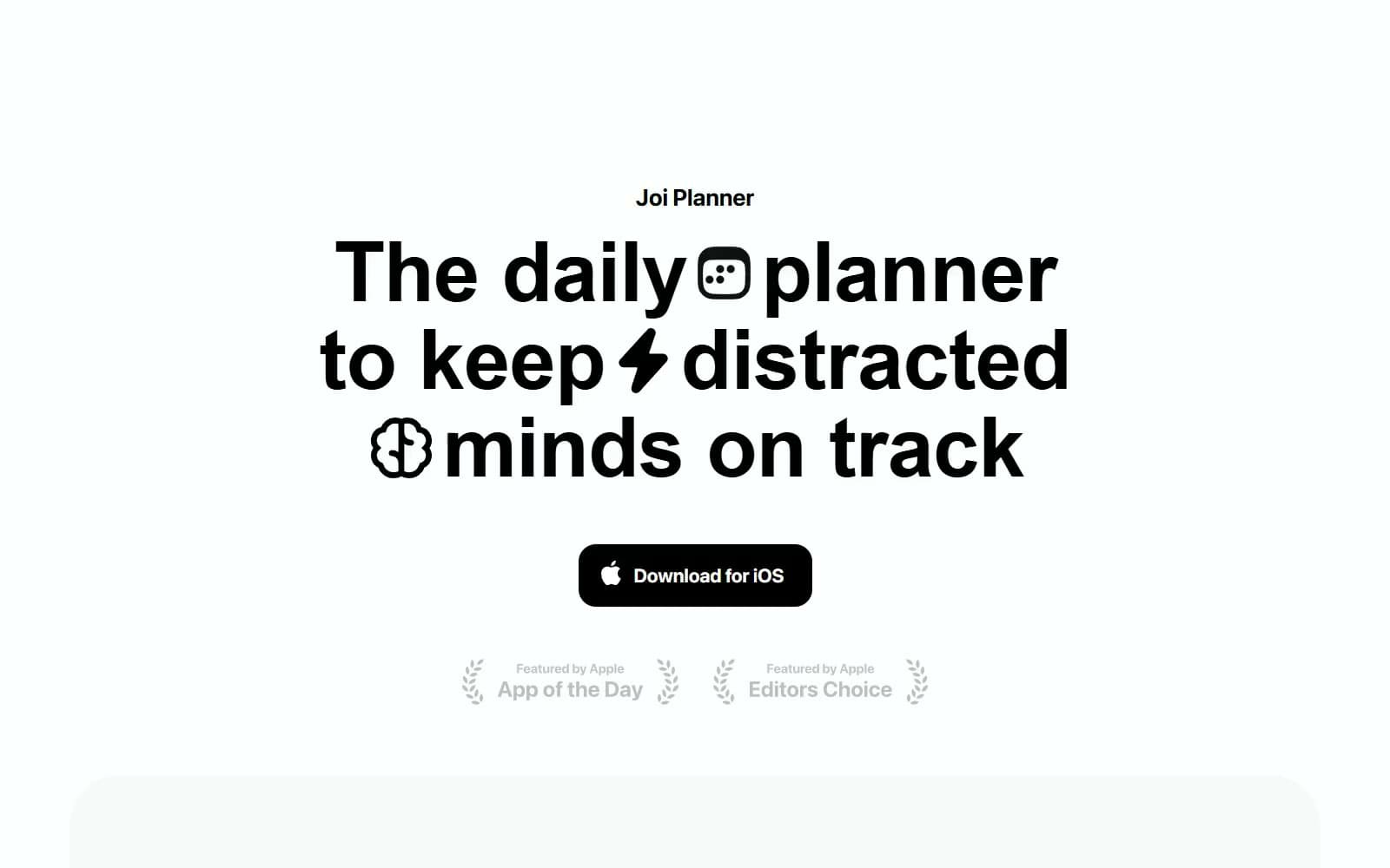
Joi. Felt-tip headlines on a blank notepad.
- Productivity
- Light theme
- 6 colors
- 2 typefaces
Joi is a near-monochrome iOS planner page that reads like a single sheet of paper: Paper #ffffff canvas, Planner Black #000000 type, and almost nothing else. Everything sits on one centred axis, from the 96px semibold SF Pro Display headline with small black glyph icons dropped between its words, to the Showcase Mist #fafafa panel where a hand holds the phone, to 78px statements that sharpen from blurred grey to solid black as they scroll in. The only filled colour is the black Download for iOS button; secondary text fades to 30% black, and the footer whispers in Faded Graphite #b3b3b3.
Joi design system

Brand1
Headlines, the wordmark, inline headline glyphs and both Download for iOS buttons — pure black is the whole brand, with no hue anywhere in the chrome
Neutrals5
Page canvas, the floating navigation capsule and button labels on black
The 60px-radius product panel behind the phone photograph — a barely-there step off Paper
The 1px rgba(34, 34, 34, 0.05) outline around the floating navigation capsule
Footer links and Apple award captions at 30% black — secondary text recedes rather than changes colour
Small vector glyph fills inside the headline icons and award laurels
Try a pairing
Pick any two colors from the palette to check whether text stays readable on top.
Aa
Paper on Planner Black
21.00 : 1 contrast
- Body textPasses AA 4.5
- Large textPasses AA 3
- StrictPasses AAA 7