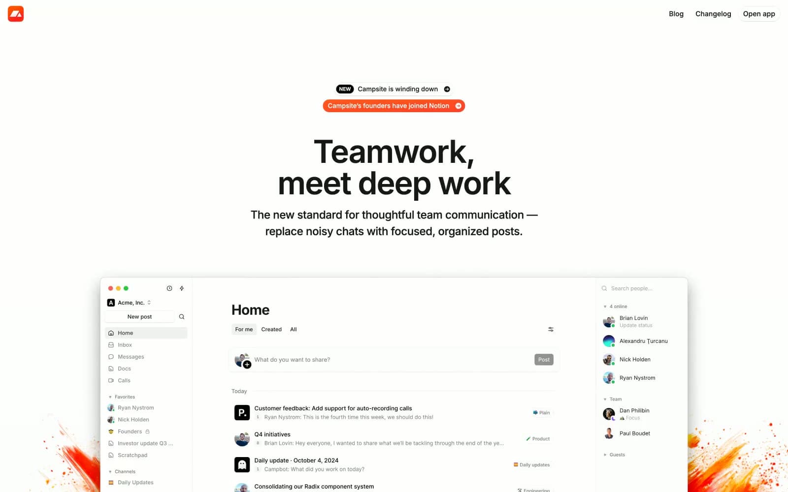
Campsite. Quiet, cream, and product-forward.
- Productivity
- Light theme
- 13 colors
- 3 typefaces
Campsite runs on warm minimalism: a cream-white canvas (#fffdf9) that feels like paper, paired with near-black text and almost no color. The interface is quiet, compact, and confident — Inter at every size, tight tracking on display sizes, pill-shaped controls, and soft elevation that barely lifts off the page. Color is rationed to functional punctuation: green for resolved states, a warm yellow wash for highlights, and a single dark-orange tone that lives in decorative paint-splash branding rather than in the UI itself. The product mockup is the hero — large, full-bleed, and dominant — while surrounding copy stays small and restrained, letting the product speak.

Campsite design system

Brand1
Decorative branding — paint-splash illustrations and brand-icon accents that frame content edges
Accent3
Green action color for filled buttons, selected navigation states, and focused conversion moments. Use as a supporting accent, not as a status color
Soft warm-yellow background for highlighted callouts and quote blocks
Red action color for filled buttons, selected navigation states, and focused conversion moments. Use as a supporting accent, not as a status color
Neutrals9
Primary text, icons, and headings — near-black warmth rather than pure black
Dark-mode product card surface shown in feature sections
Secondary text and metadata
Tertiary text, timestamps, and helper labels
Muted text, placeholders, and inactive icon fills
Tertiary surface for nested elements, dividers, and inactive states
Secondary surface for subtle differentiation — post bodies, sidebar items, input fields
Page background — a warm off-white that gives the entire site its paper-like quality
Card surfaces, elevated panels, and product-screenshot backgrounds
Try a pairing
Pick any two colors from the palette to check whether text stays readable on top.
Aa
Pure White on Sienna Brand
14.98 : 1 contrast
- Body textPasses AA 4.5
- Large textPasses AA 3
- StrictPasses AAA 7