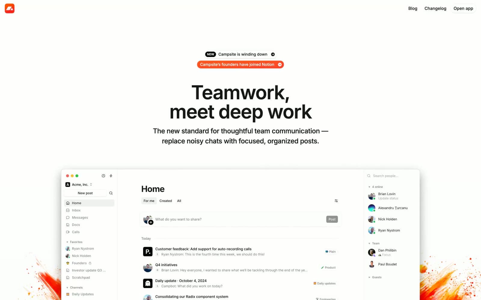
Balsa. Engineering notebook on white drafting paper.
- Productivity
- Light theme
- 10 colors
- 9 typefaces
Balsa's design language is an engineering notebook on white drafting paper: an almost exclusively achromatic canvas interrupted only by amber highlighter-pen annotations and one deep purple accent. The hero voice is Van Condensed Pro Bold set uppercase at extreme negative tracking (-0.047em at 48px) — industrial, compressed, shouting in a whisper. Inter handles every secondary voice at compact sizes (11–18px), with the entire interface reading as product-first: a large embedded product screenshot is the real hero, flanked by floating yellow callout cards that explain the screenshot like margin notes. Black filled buttons with 6px radius and 12px-radius flat white cards with hairline borders carry the entire component vocabulary. Shadows are barely there (0.5px black at 10% or a single 1px line at 5%), the palette does almost no decorative work, and the layout breathes with generous 60–80px section gaps so each annotation card and product crop can do its job.

Balsa design system

Accent3
Annotation callout cards, highlight washes, tag pills — the single chromatic accent that mimics yellow highlighter on paper, used sparingly as functional punctuation not decoration
Pink outline accent for tags, dividers, and focused UI edges.
Outlined link borders and underlined text links — a classic editorial link blue, used only for inline hyperlink elements
Neutrals7
Primary text, filled action buttons, icons — the only assertive color in the system carries all interactive and typographic weight
Secondary headings and body emphasis, slightly softer than pure black for hierarchical depth
Muted helper text, inactive metadata, subtle icon fills, soft borders on secondary surfaces
Tertiary caption text, very subtle annotation labels
Disabled state surfaces, ultra-quiet dividers, placeholder card backgrounds
Page canvas, the base surface every component sits on; sets the off-white tone that makes cards read as elevated without shadow
Card surfaces, product screenshot backgrounds, button labels on filled buttons
Try a pairing
Pick any two colors from the palette to check whether text stays readable on top.
Aa
Carbon Black on Highlighter Amber
12.03 : 1 contrast
- Body textPasses AA 4.5
- Large textPasses AA 3
- StrictPasses AAA 7