
Gabriel Valdivia. Gallery wall, quiet ink.
- Studio
- Light theme
- 11 colors
- 3 typefaces
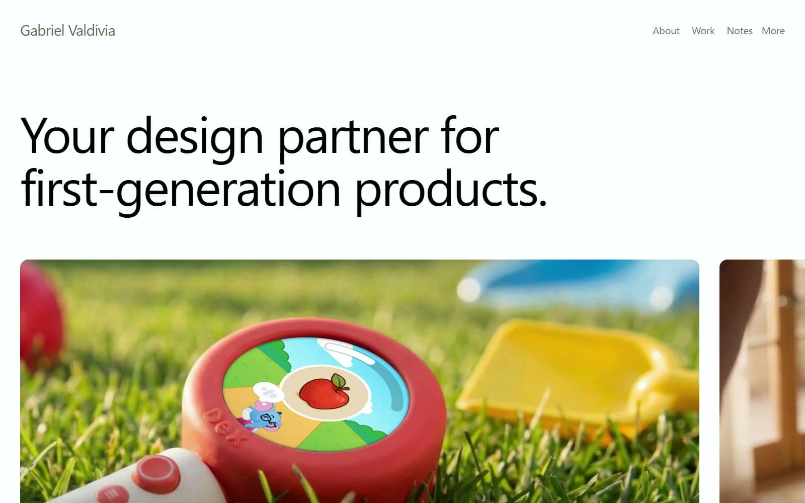
Gabriel Valdivia is a white-wall portfolio where the only colour comes from the work itself. Ink #000000 headlines in Inter Display run at weight 400 even at 100px, tracked to -3px, so the voice reads calm and assured rather than loud. Below the hero, a rail of 16px-rounded product films carries smoke-glass quote panels and white-outlined mono tags, then the page settles into wide unruled white: a portrait intro, a numbered approach list split by single gray rules, and a Mist Wash #f7f7f7 mail form with a 40px radius. Gray is the whole secondary system: Graphite Muted #666666 for navigation and labels, Body Ink #191919 for paragraphs, and uppercase SF Mono for the footer and tags.
Gabriel Valdivia design system

Brand1
Every display headline, section title and form value — pure black is the site's only identity colour, so the work supplies the hue
Accent1
Bottom scrim on hero project films, so Paper titles, captions and tag pills stay legible over any footage
Neutrals9
Long paragraphs in the intro and approach rows — black at 90% so reading text sits a half-step under headlines
Wordmark, navigation links, form labels, Copy and See all links, footer mono text and social icons (black at 60%)
Numerals 1–4 in the approach list and other lowest-emphasis marks (black at 40%)
Black at 20% as the quote-panel tint over hero films; the hex is that tint over white, use rgba(0, 0, 0, 0.2) on media
The single 1px dividers between numbered approach rows and the Send pill outline (black at 20%)
1px black-at-5% borders on work cards and the dividers between mail-form rows
Fill of the floating 40px circular menu button that follows the page at top right
Black at 3%: the mail-form panel, work-card backgrounds and media placeholders — the only tonal step off white
The whole page canvas, plus project titles and tag text reversed on hero films
Try a pairing
Pick any two colors from the palette to check whether text stays readable on top.
Aa
Paper on Ink
21.00 : 1 contrast
- Body textPasses AA 4.5
- Large textPasses AA 3
- StrictPasses AAA 7
More DESIGN.md files. Same web, different personalities.
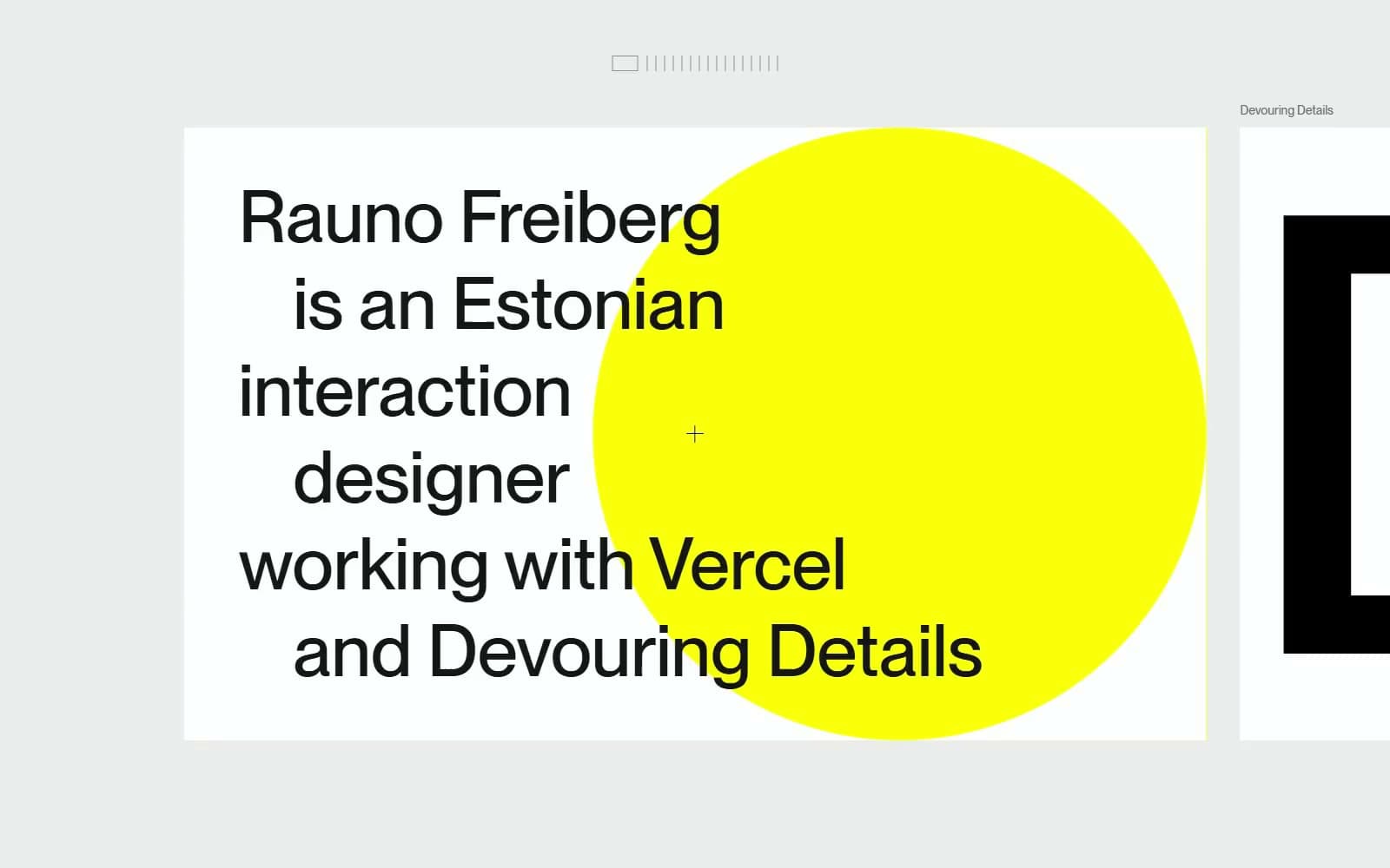
Rauno Freiberg
Studio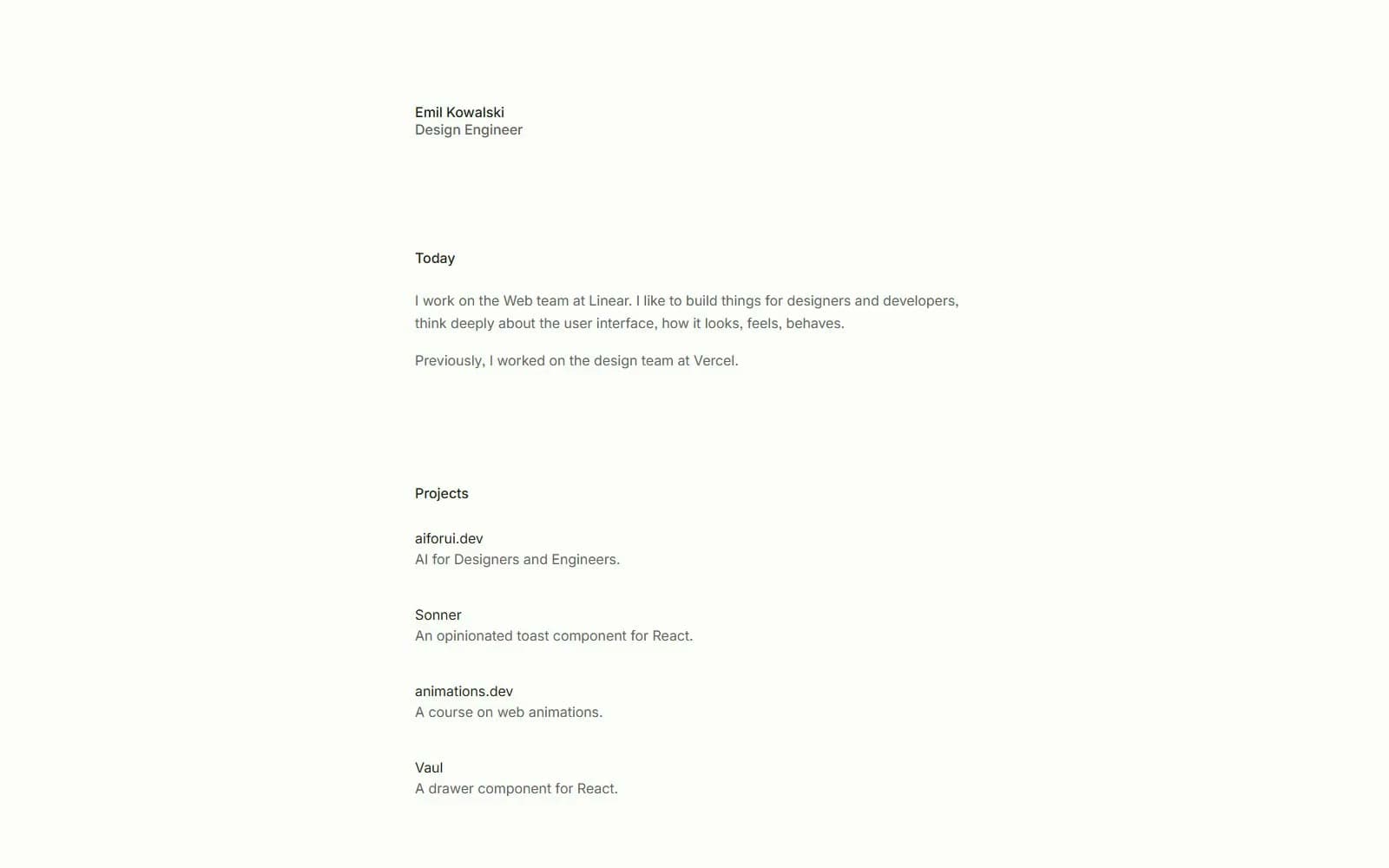
Emil Kowalski
Studio
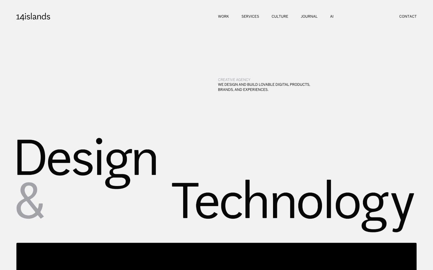
14islands
Studio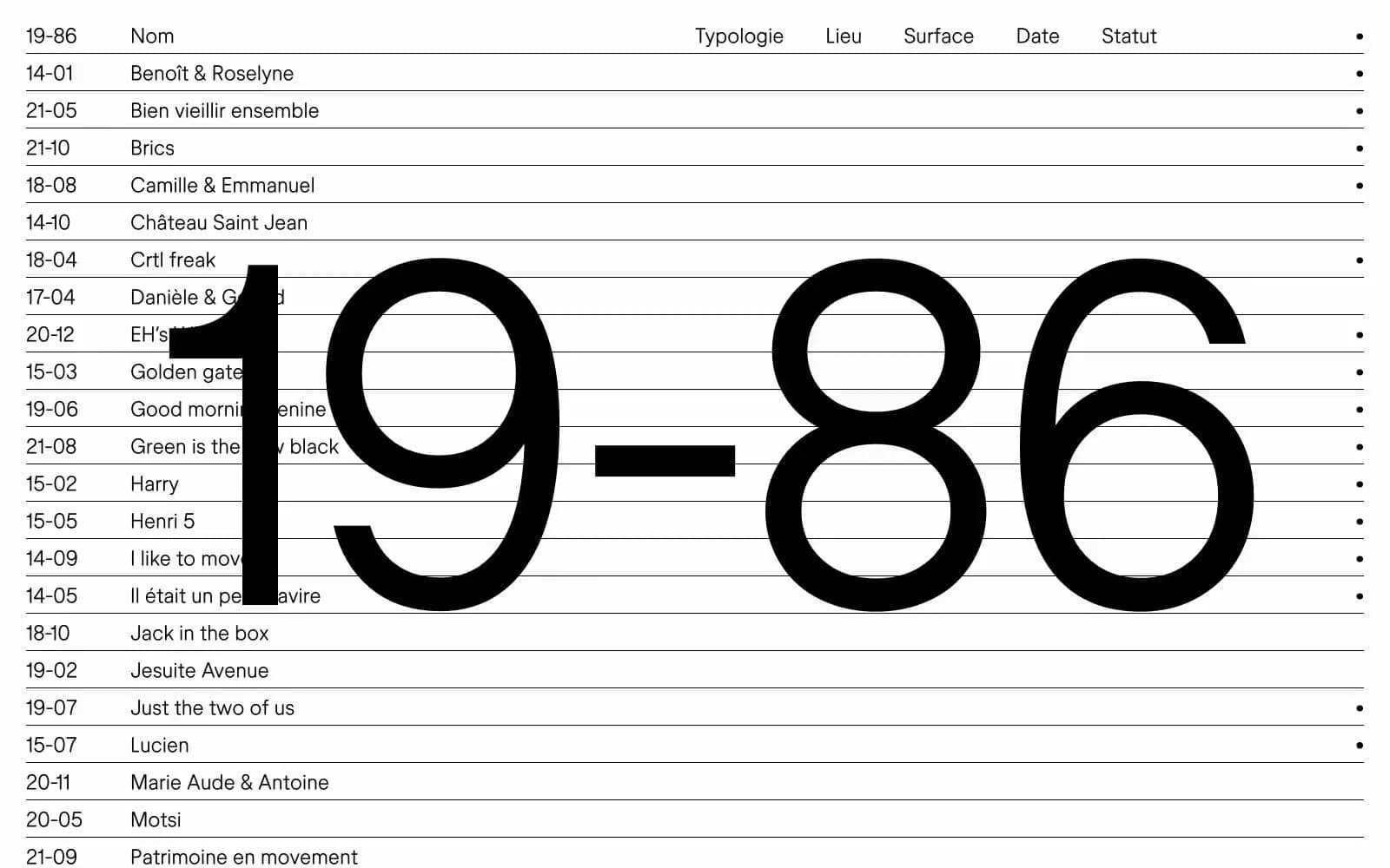
19–86
Studio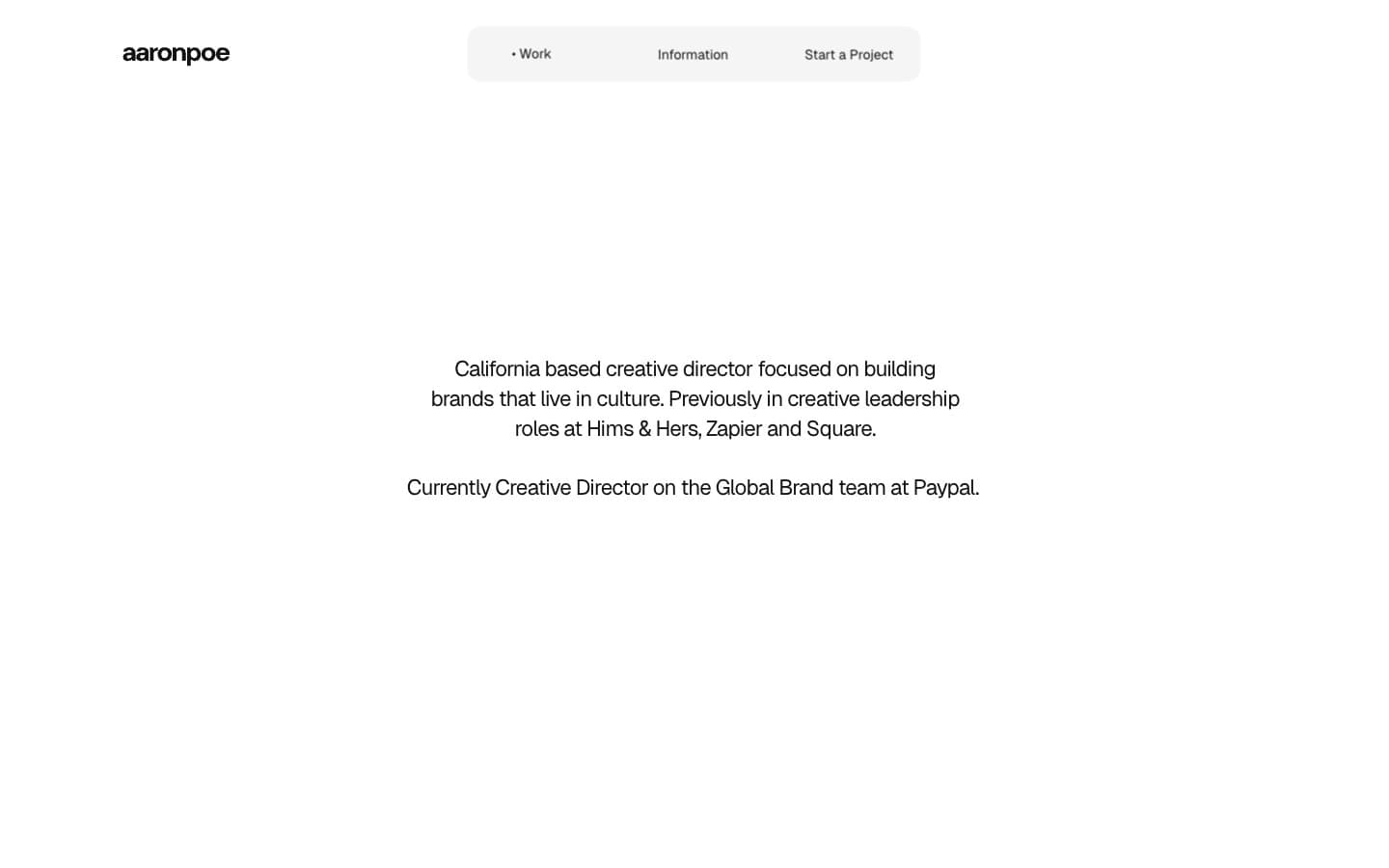
Aaron Poe & Co
Studio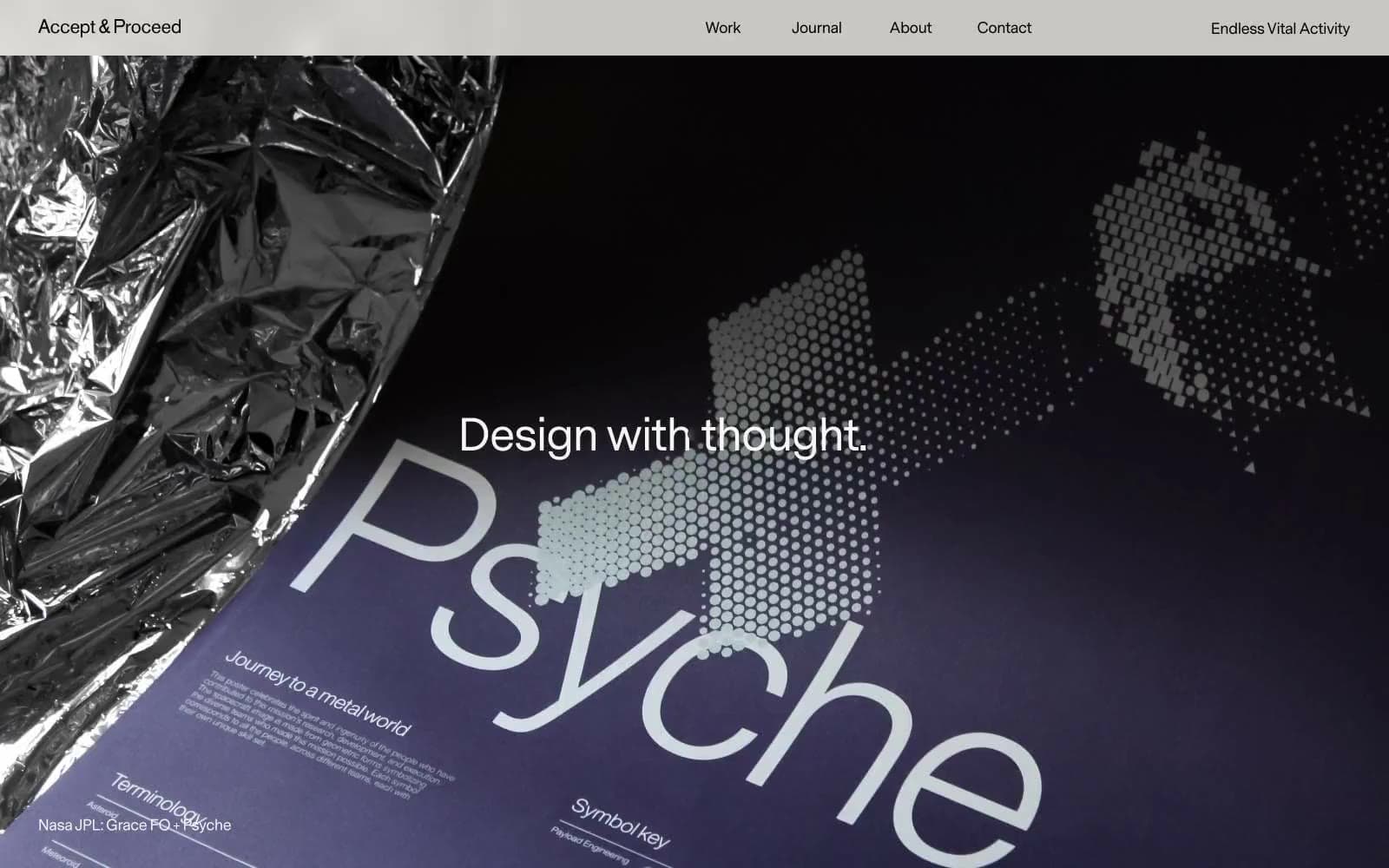
Acceptandproceed
Studio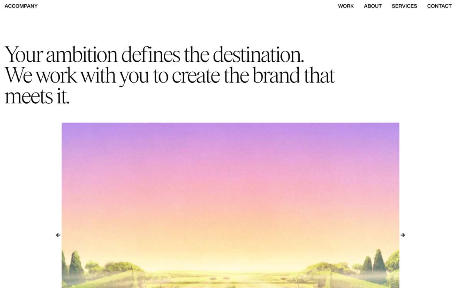
ACCOMPANY
Studio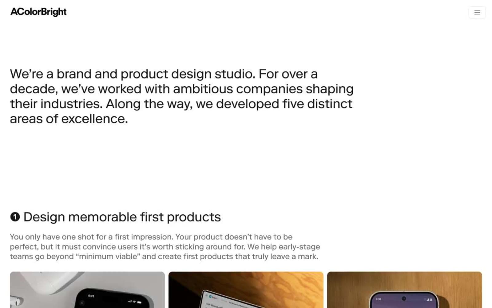
Acolorbright
Studio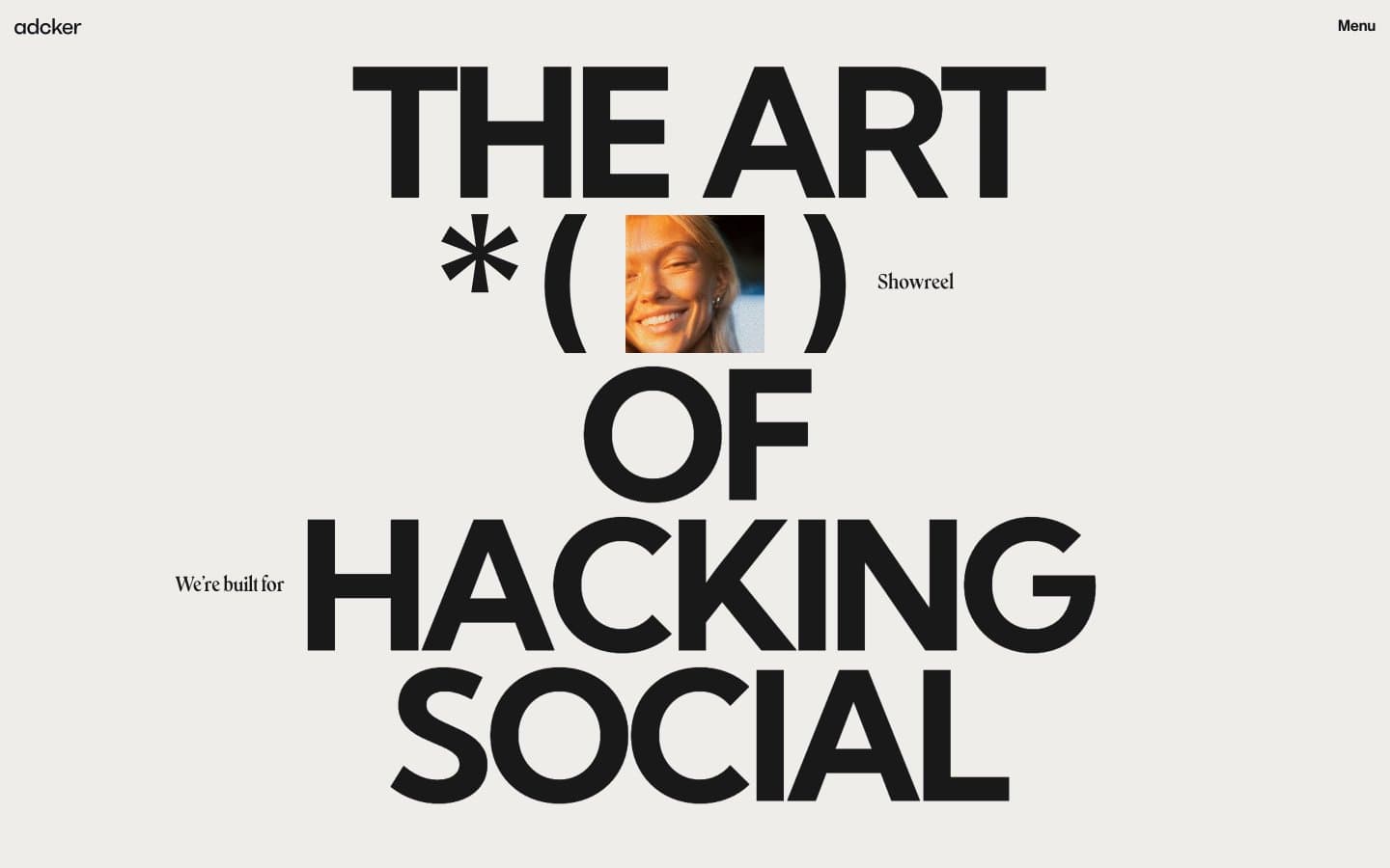
Adcker
Studio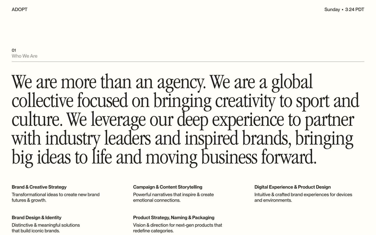
Adopt
Studio
Agence Foudre
Studio


