
Interfere. Aurora haze behind a bug inbox.
- Developer tools
- Light theme
- 16 colors
- 4 typefaces
Interfere is a near-monochrome light canvas that sells an issue tracker by showing it: the hero is a full, working-looking product window with a Berkeley Mono code diff, floating on a 20% orange-pink-violet-blue aurora haze. Everything else is restraint, with Ink #202020 text on Paper #ffffff, Mist Panel #f9f9f9 slabs, hairline rgba(0, 0, 0, 0.06) borders, and one Carbon Black #0d0d0d sign-up button. Inter at weight 500 carries a 56px display tracked to -2px, while 13px UI text and a Heldane Text serif testimonial give the page the calm of a well-made app rather than a launch poster.
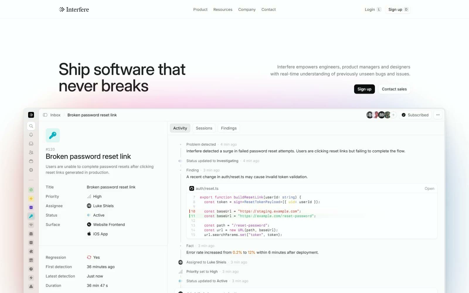
Interfere design system

Brand1
The single filled Sign up button in hero and footer — a 95% black fill is the only solid dark mass on an otherwise whisper-grey page
Accent6
Blurred glow behind the hero window, testimonial and footer CTA — the page's only colour field, held at 20% so it reads as light
Status glyphs in the product mock and the highlighted verb finds in the statement paragraph — the one live-looking accent
Pale chip behind the Signal Blue highlighted word in the scroll-revealed statement
Keywords and function names in the Berkeley Mono code diff — syntax colour, never interface colour
Removed-line diff markers, error-rate figures and the outlined illustration highlight — the colour of the bug being found
Added-line diff markers and the green row tint in code cards — the colour of the fix
Neutrals9
Headings, card titles, button labels and primary UI text — measured as 87.5% black, never pure black
Navigation links, body paragraphs under headings and footer link lists at 60.8% black
Not-yet-revealed words in the statement paragraph, timestamps and the second line of two-tone headings
Code line numbers and the dimmest metadata in product mockups
Active segmented tab fill and avatar placeholders, a 6% black tint
Keyboard-hint keys, neutral word highlights in the statement and soft pill fills
Every 1px border on cards, dividers and tabs, drawn as rgba(0, 0, 0, 0.06) so it melts into any surface
Testimonial and compliance slabs, kanban board frame and footer top — a 2.4% black tint over Paper
Page canvas, navigation, product window, cards and secondary buttons
Try a pairing
Pick any two colors from the palette to check whether text stays readable on top.
Aa
Paper on Carbon Black
19.44 : 1 contrast
- Body textPasses AA 4.5
- Large textPasses AA 3
- StrictPasses AAA 7
More DESIGN.md files. Same web, different personalities.
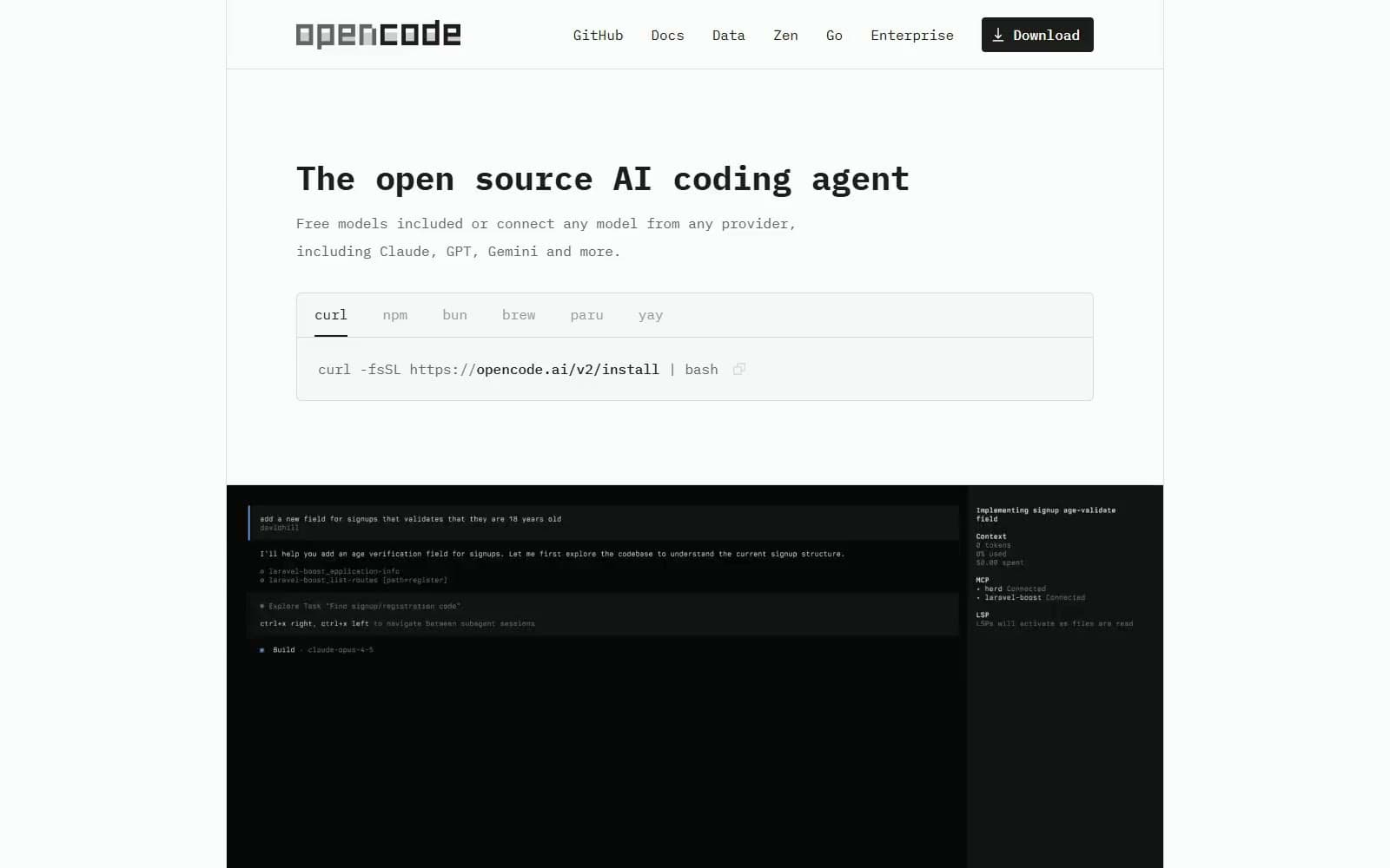
OpenCode
Developer tools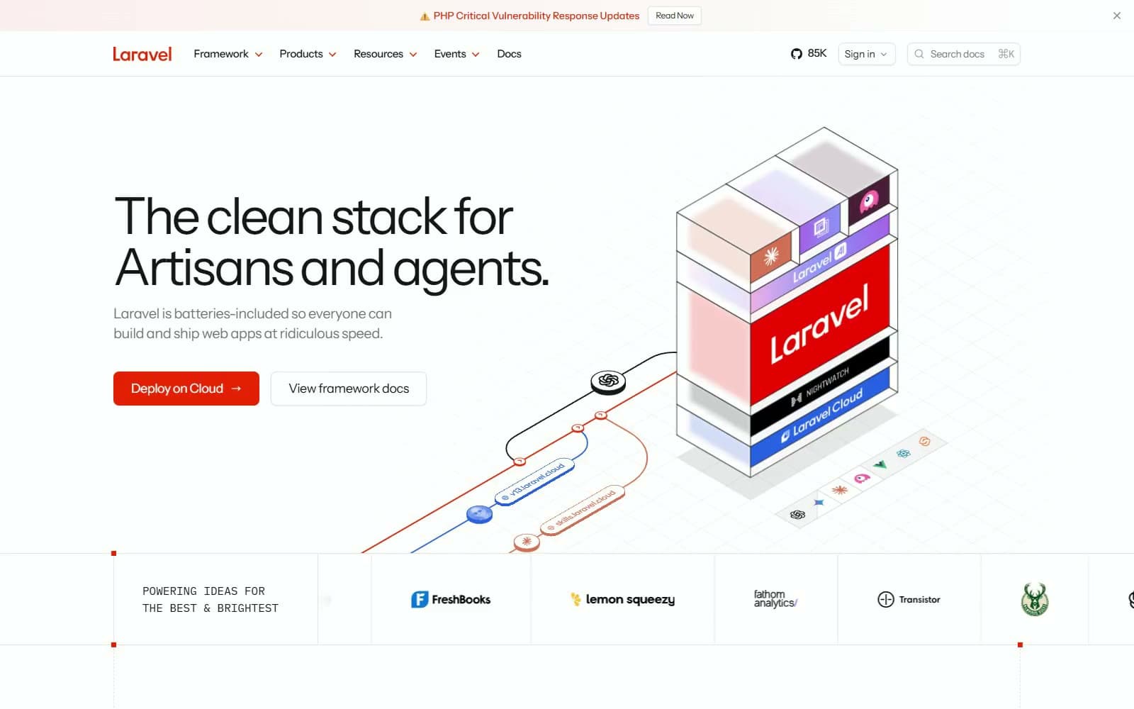
Laravel
Developer tools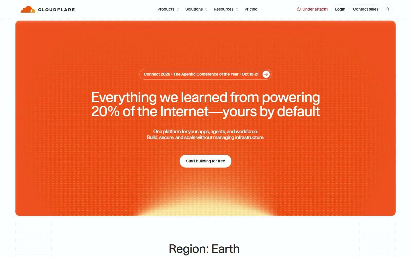
Cloudflare
Developer tools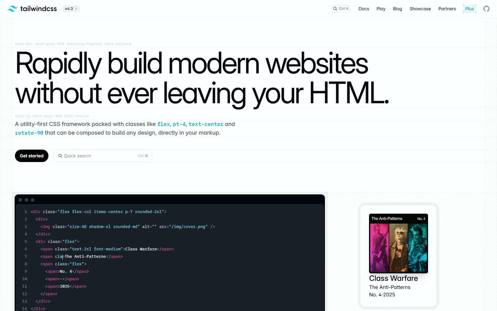
Tailwind CSS
Developer tools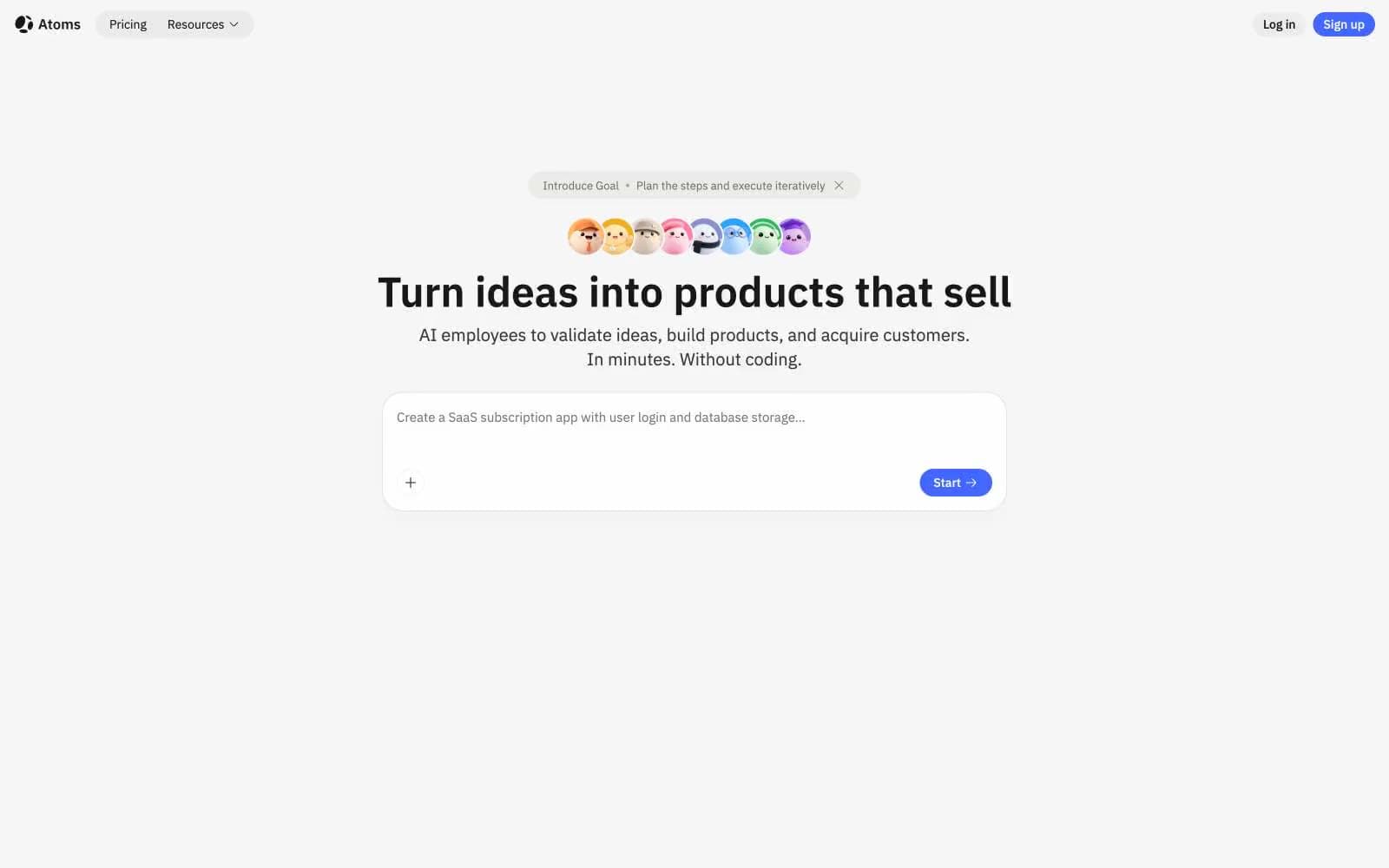
Atoms
Developer tools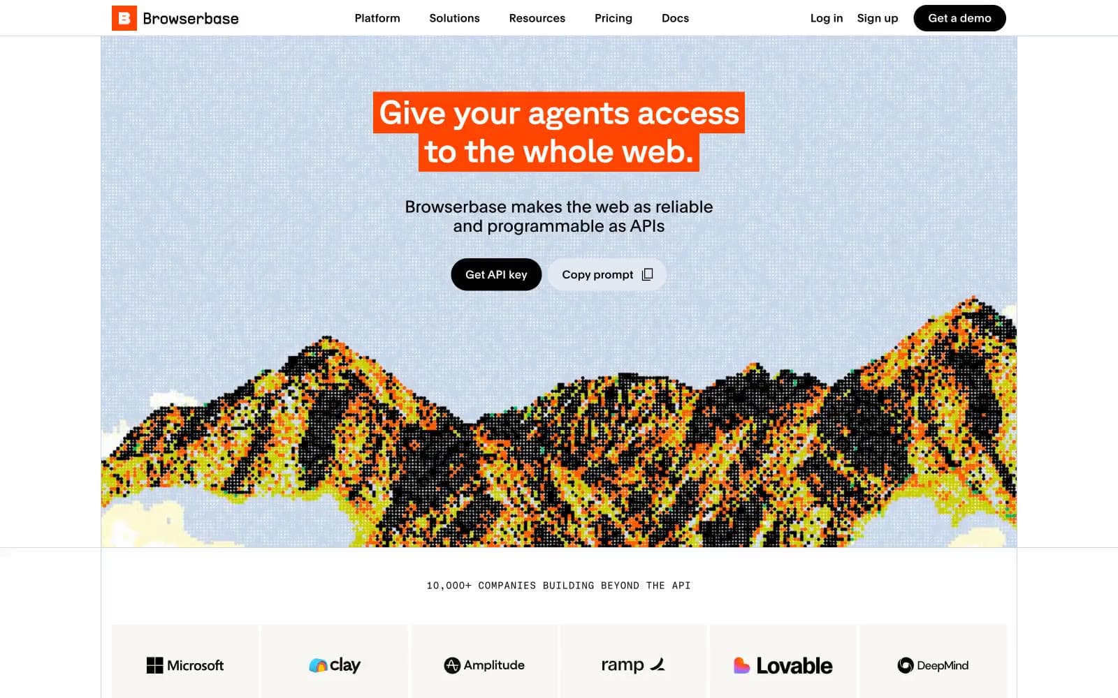
Browserbase
Developer tools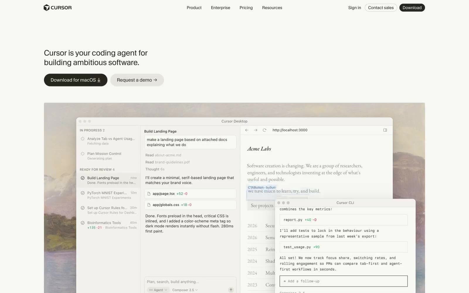
Cursor
Developer tools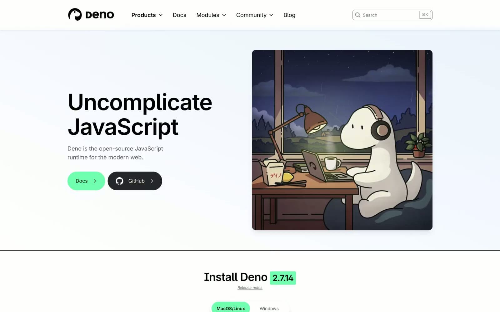
Deno
Developer tools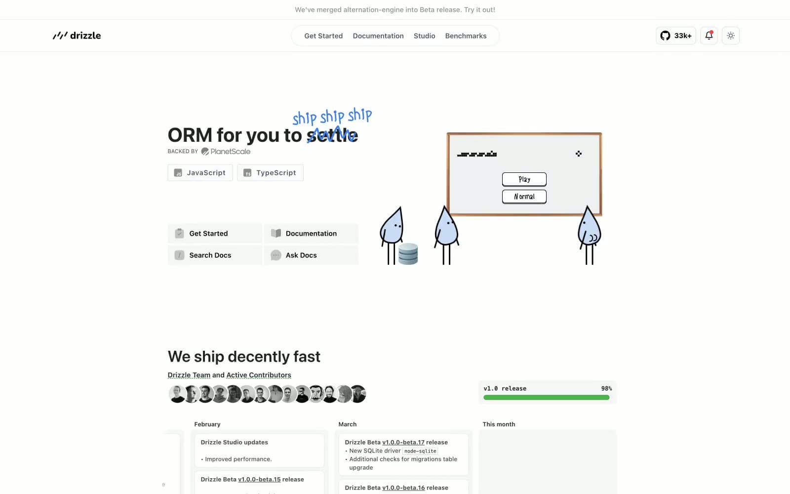
Drizzle ORM
Developer tools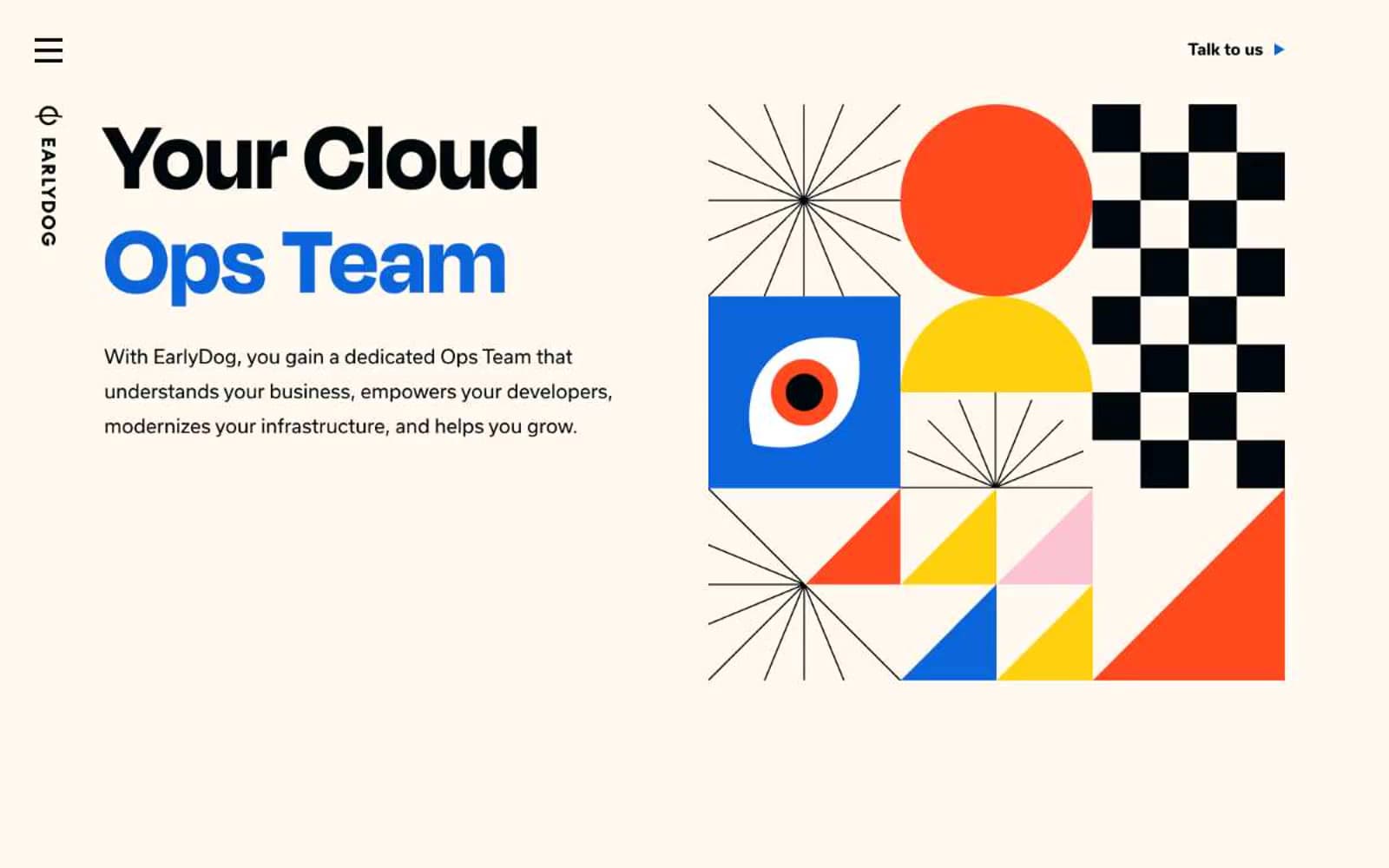
Earlydog
Developer tools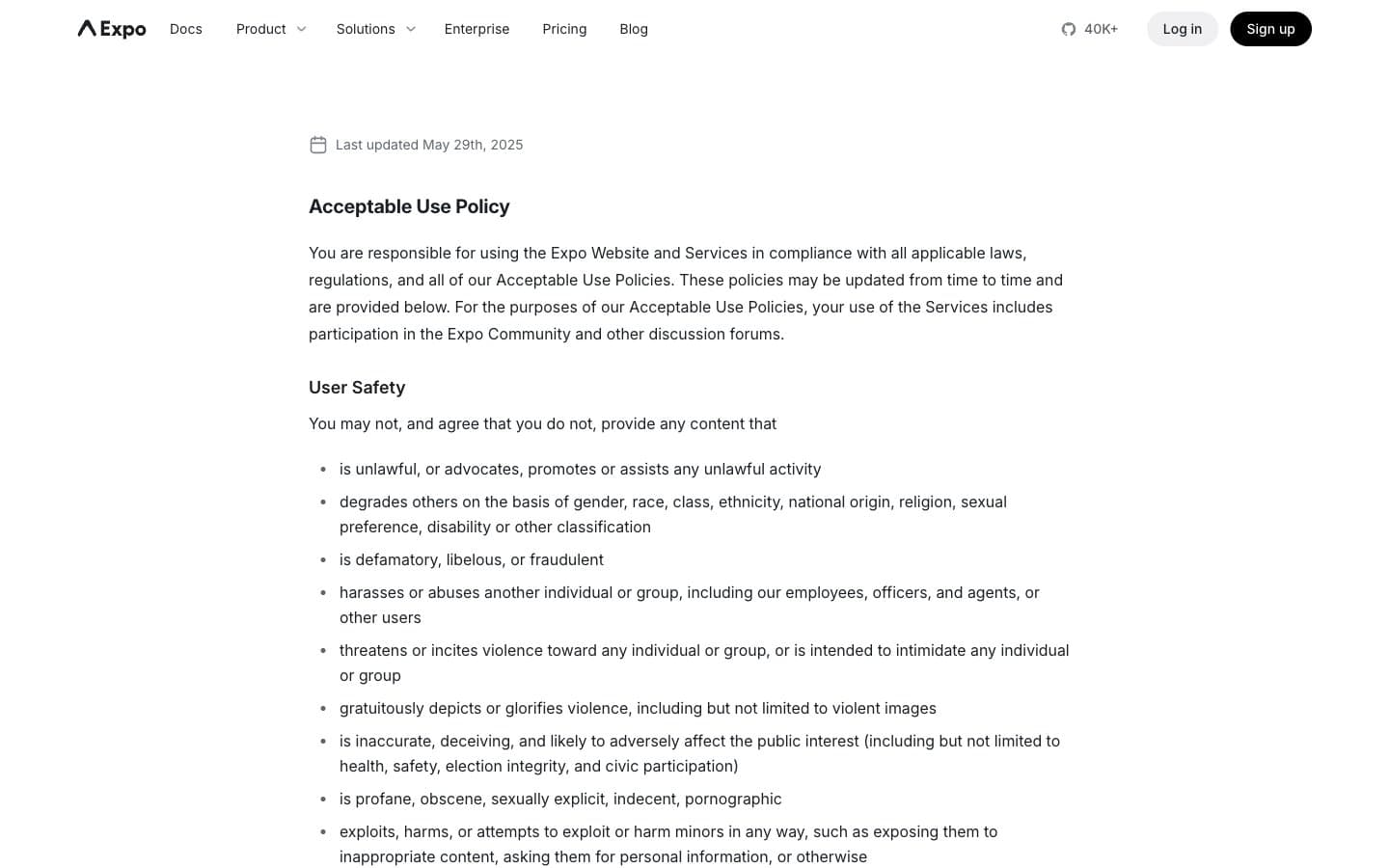
Expo
Developer tools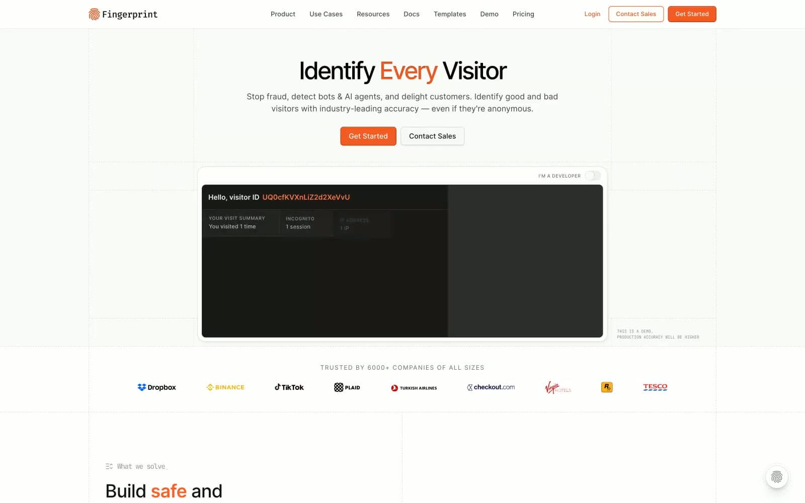
Fingerprint
Developer tools


