
Joby Aviation. Every screen is a window seat.
- Brand
- Light theme
- 10 colors
- 4 typefaces
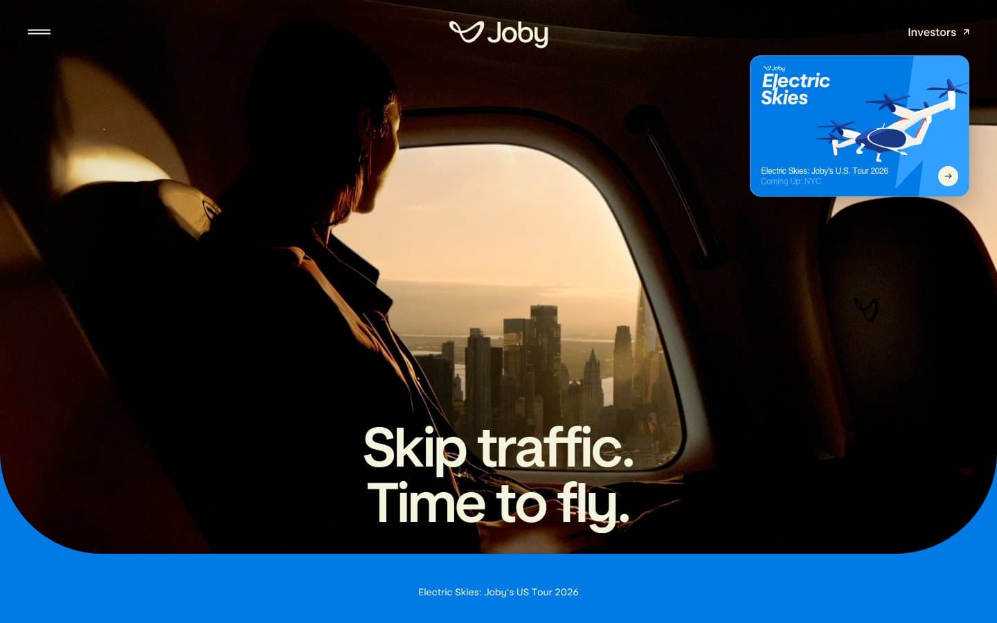
Joby Aviation's design language is cinematic aviation editorial: full-bleed golden-hour photography carries the narrative, with a warm parchment canvas (#f5f4df) and near-black ink (#0e1620) doing all the structural work. The interface stays minimal and almost invisible so the imagery does the persuading — text overlays float over photographs with thin left-border accents rather than boxed containers. Vivid electric blue (#007ae5) appears only as functional punctuation on floating cards, the bottom tour strip, and select icon strokes, while the custom Joby Display type at near-200px sizes whispers the headline rather than shouts it. Components are light, floating, and round; even the tour card and small chips use generous 16px radii, and the navigation is reduced to a centered logomark with a hamburger and a single text link. The system never decorates — every surface is either a photograph, the warm cream canvas, or a single solid blue band.
Joby Aviation design system

Brand3
Blue wash for highlight backgrounds, decorative bands, and soft emphasis behind content. Do not promote it to the primary CTA color
Secondary brand surface for navigation bars and accent fills — darker register of the blue for layering
Blue accent for outlined action borders, linked labels, and lightweight interactive emphasis. Do not promote it to the primary CTA color
Accent3
Warm accent fill for decorative highlights and select illustration elements — echoes the golden-hour photography palette
Soft warm surface accent, peachy wash that harmonizes with the sunset photography
Brighter blue accent for small icon and illustration highlights — lighter pop than the primary Electric Blue
Neutrals4
Body text, headings, hairline borders, icon strokes — near-black with a cool blue undertone that pairs with the cream
Warm gray used in card box-shadow tinting — gives elevation a warm cast rather than a cold blue
Soft secondary surface wash, subtle section backgrounds when cream needs contrast
Page canvas, card surfaces, text color on dark imagery — the warm off-white that keeps photography from feeling cold
Try a pairing
Pick any two colors from the palette to check whether text stays readable on top.
Aa
#111111 on Electric Blue
4.42 : 1 contrast
- Body textFails AA 4.5
- Large textPasses AA 3
- StrictFails AAA 7
More DESIGN.md files. Same web, different personalities.

Airbnb
Brand
Aker
Brand
Alison Roman
Brand
Alpine Bio
Brand
Alveos One
Brand
Amrit Palace
Brand
André Cândido
Brand
Anna Jóna
Brand
Apollo
Brand
Apple
Brand
Arva
Brand
Ashton Bespoke
Brand


