
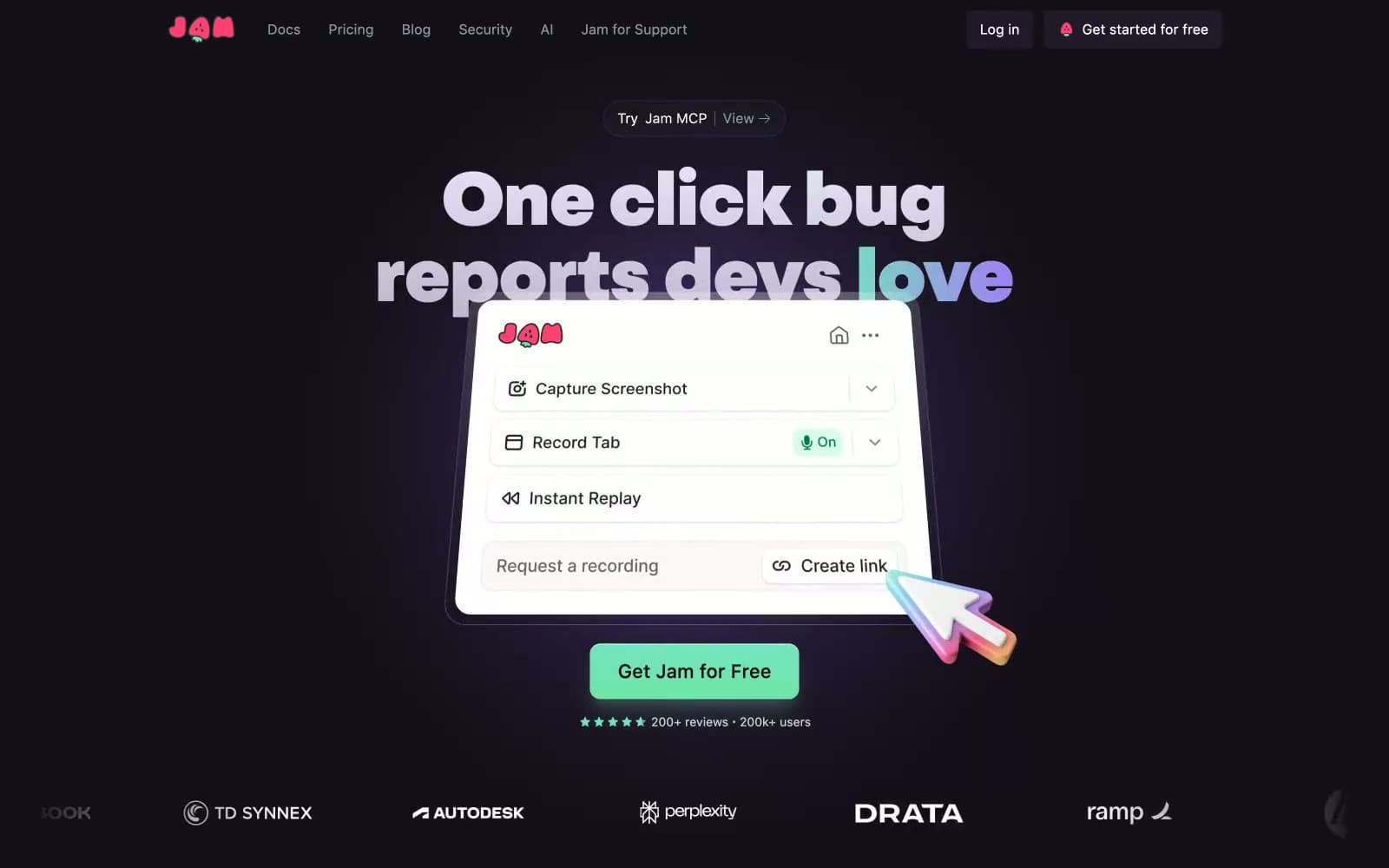
Jam. A near-black interface where one vivid green button glows like a power LED on matte hardware.
- Developer tools
- Dark theme
- 16 colors
- 3 typefaces
Jam is a late-night dev console with a mint signal pulse: a near-black canvas in deep plum-black, massive geometric grotesk headlines that take over the viewport, and a single electric mint accent that marks everything that is on, active, or ready. The interface is deliberately quiet — most surfaces share a tonal near-gray darkness, letting the mint and violet accents do the talking. Cards, pills, and controls are generously rounded (12–24px) and defined by hairline borders rather than heavy shadows, giving the product a lightweight, paper-on-graphite feel. The brand oscillates between three chromatic voices: mint for primary actions and status, violet for secondary icons and gradients, and a hot pink-red for the persistent header CTA and the wordmark — each one a small electric punctuation against the dark.
Jam design system

Brand3
Green text accent for links, tags, and emphasized short phrases
Soft mint highlight wash, inset glow on hero elements, gradient terminator fading to white
Red wash for highlight backgrounds, decorative bands, and soft emphasis behind content. Do not promote it to the primary CTA color
Accent4
Feature pill icons, secondary accents, gradient terminator — the cool counterpart to mint, carries the decorative gradient text
Decorative card fill, gradient start — a deeper violet used sparingly for tonal richness
Light accent text and headings — soft violet for non-body highlights
Muted violet for body text accents and secondary icon strokes
Neutrals9
Page canvas, deepest background — the negative space headlines float on
Card and list surface — one step lifted from the canvas, carries testimonial cards and feature lists
Subtle violet-tinted borders and dividers between elements
Navigation fills and tonal mid-ground blocks
Inner card surface and hairline border on cards — a second elevation step
Body text, nav links, secondary icons — the dominant cool-gray voice for readable but non-emphatic text
Lighter body text variant for de-emphasized content
Hairline borders across the entire system — the connective tissue between every section, card, and list
Light text on dark surfaces, inverse labels, and high-contrast captions. Do not promote it to the primary CTA color
Try a pairing
Pick any two colors from the palette to check whether text stays readable on top.
Aa
Obsidian Plum on Signal Mint
12.34 : 1 contrast
- Body textPasses AA 4.5
- Large textPasses AA 3
- StrictPasses AAA 7
More DESIGN.md files. Same web, different personalities.

Railway
Developer tools
Nuxt
Developer tools
Astro
Developer tools
Authkit
Developer tools
Axiom
Developer tools
BaseHub
Developer tools
Better Stack
Developer tools
Bun
Developer tools
Checkly
Developer tools
ClickHouse
Developer tools
Depot
Developer tools
dope.security
Developer tools


