
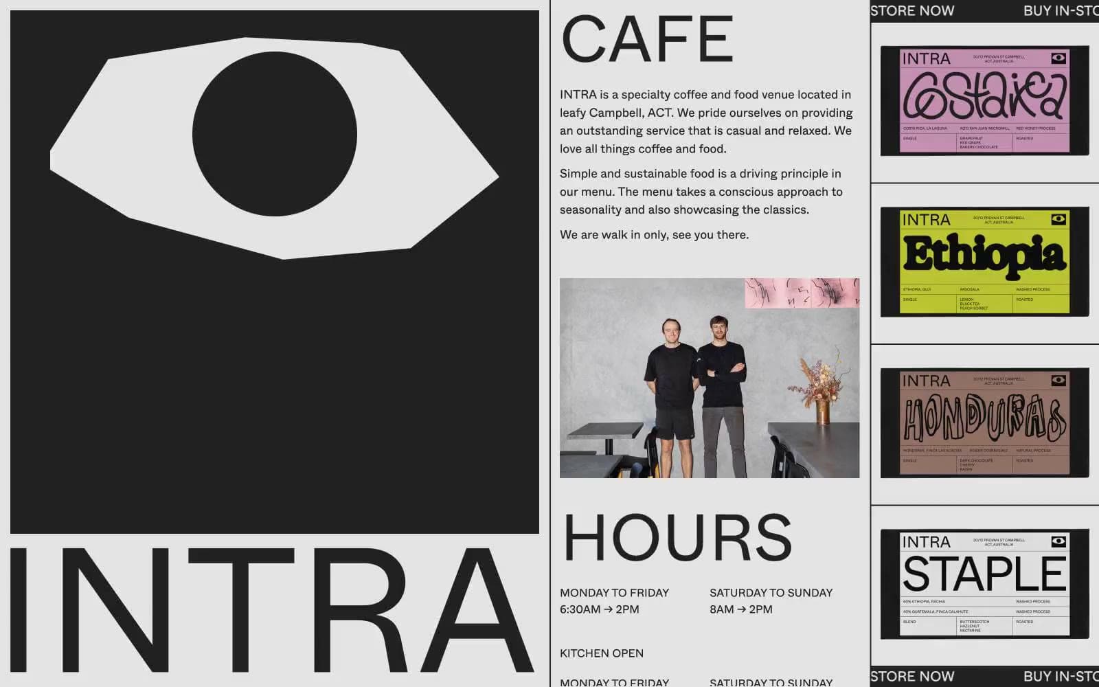
Intra. White-walled gallery placard with one giant black eye.
- Brand
- Light theme
- 4 colors
- 2 typefaces
Intra is a brutally editorial cafe identity: a white canvas dominated by an oversized black eye-mark and gigantic sans-serif wordmarks that read like gallery wall text. Color is almost entirely suppressed — only black, near-black, white, and a single hairline gray — so that the bright packaging of its coffee bags (magenta, lime, terracotta) detonates against the monochrome page like curated art objects. Type is the interface: 95px Whyte at weight 400 does the heavy lifting that buttons and color would do on a conventional site, and every section breathes through generous 100px vertical padding and wide 50px gutters. The aesthetic borrows from Swiss editorial print, brutalist signage, and museum labeling — content is presented as a series of facts, images, and objects rather than wrapped in a product UI.
Intra design system

Neutrals4
Button strokes, logo fill, and the heaviest typographic moments where absolute zero contrast is required
Primary text, bold panels, the dominant non-white surface — carries a barely-perceptible cool tint that softens it from pure #000
Dividers, card borders, image outlines, table rules — the only mid-tone in the system
Page canvas, card surfaces, type knocked out of black panels
Try a pairing
Pick any two colors from the palette to check whether text stays readable on top.
Aa
Paper White on Pure Black
21.00 : 1 contrast
- Body textPasses AA 4.5
- Large textPasses AA 3
- StrictPasses AAA 7
More DESIGN.md files. Same web, different personalities.

Airbnb
Brand
Aker
Brand
Alison Roman
Brand
Alpine Bio
Brand
Alveos One
Brand
Amrit Palace
Brand
André Cândido
Brand
Anna Jóna
Brand
Apollo
Brand
Apple
Brand
Arva
Brand
Ashton Bespoke
Brand


