
International Magic. A single spotlight, a piece of work, and a wall of black velvet.
- Studio
- Dark theme
- 8 colors
- 1 typeface
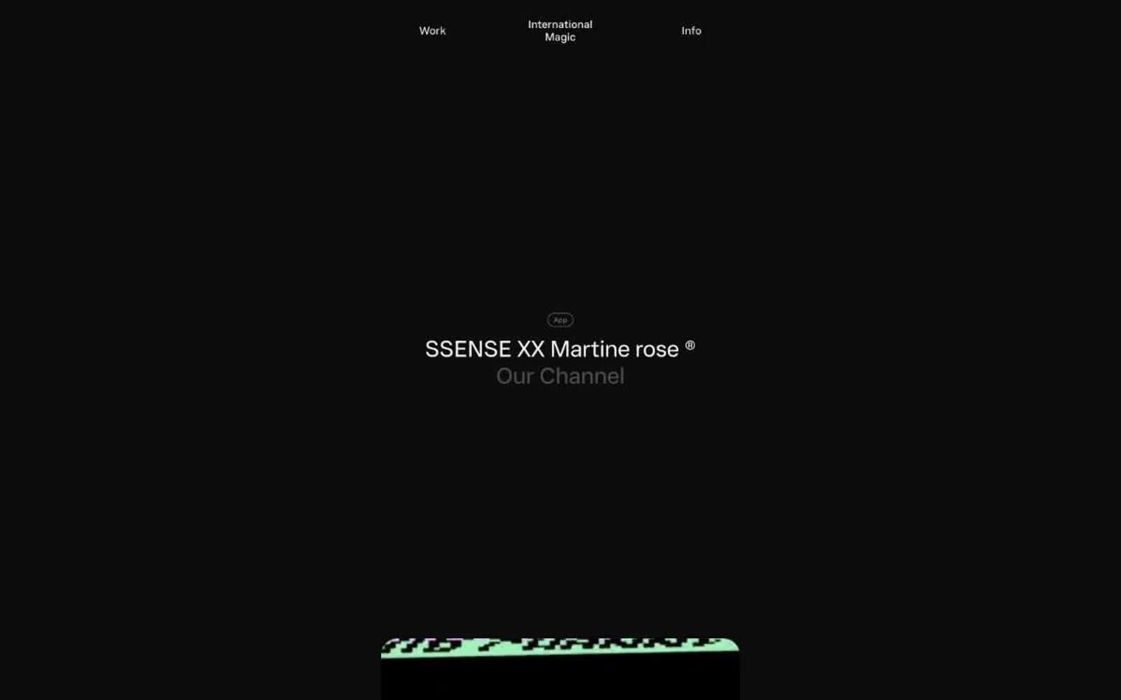
International Magic presents itself inside a near-black void where only the work is allowed to speak. The entire interface is achromatic — off-white type on charcoal canvas, with gray as the only variable — so attention collapses onto whatever the agency is showing. Layouts are sparse, centered, and vertical, with enormous breathing room between sections; navigation sits as three quiet words in a single line at the very top. Components are soft and rounded: 24px on device and work containers, 9999px on buttons and badges, and one large diffuse shadow that gently lifts content from the darkness rather than locking it down with sharp edges. The custom Wand UI Pro typeface carries almost the entire brand voice — its negative tracking at display sizes and slightly widened tracking on micro-labels create the same contrast as the page: quiet at scale, deliberate at small.
International Magic design system

Neutrals8
Page background, primary canvas — the dark field that holds every piece of work
Heading borders and low-emphasis heading text — darker mid-gray that recedes behind primary Chalk type
Elevated surface for the single neutral filled button — barely lighter than Void so the button whispers rather than shouts
Badge borders — paired with Smoke text for outlined tag affordance
Badge text — sits between Ash and Charcoal, calm and unreadable as ornament
Secondary link and body text, subdued dividers — mid-gray for de-emphasized type that still needs to read
Button labels and button borders — marginally warmer than Chalk, used on neutral pill buttons to feel pressed but not clinical
Hairline borders, dividers, input outlines, and card edges on light surfaces. Do not promote it to the primary CTA color
Try a pairing
Pick any two colors from the palette to check whether text stays readable on top.
Aa
Chalk on Void
18.48 : 1 contrast
- Body textPasses AA 4.5
- Large textPasses AA 3
- StrictPasses AAA 7
More DESIGN.md files. Same web, different personalities.

Basement Studio
Studio
Production Portugal
Studio
Active Theory
Studio
Adnaut
Studio
Agence K72
Studio
Akash Tyagi
Studio
Analogue
Studio
Athletics
Studio
BAM Photographers
Studio
Bareis + Nicolaus
Studio
Becklyn
Studio
Branding
Studio


