
Inngest. Quiet, instrument-grade, lit by a single amber pilot light.
- Developer tools
- Dark theme
- 14 colors
- 4 typefaces
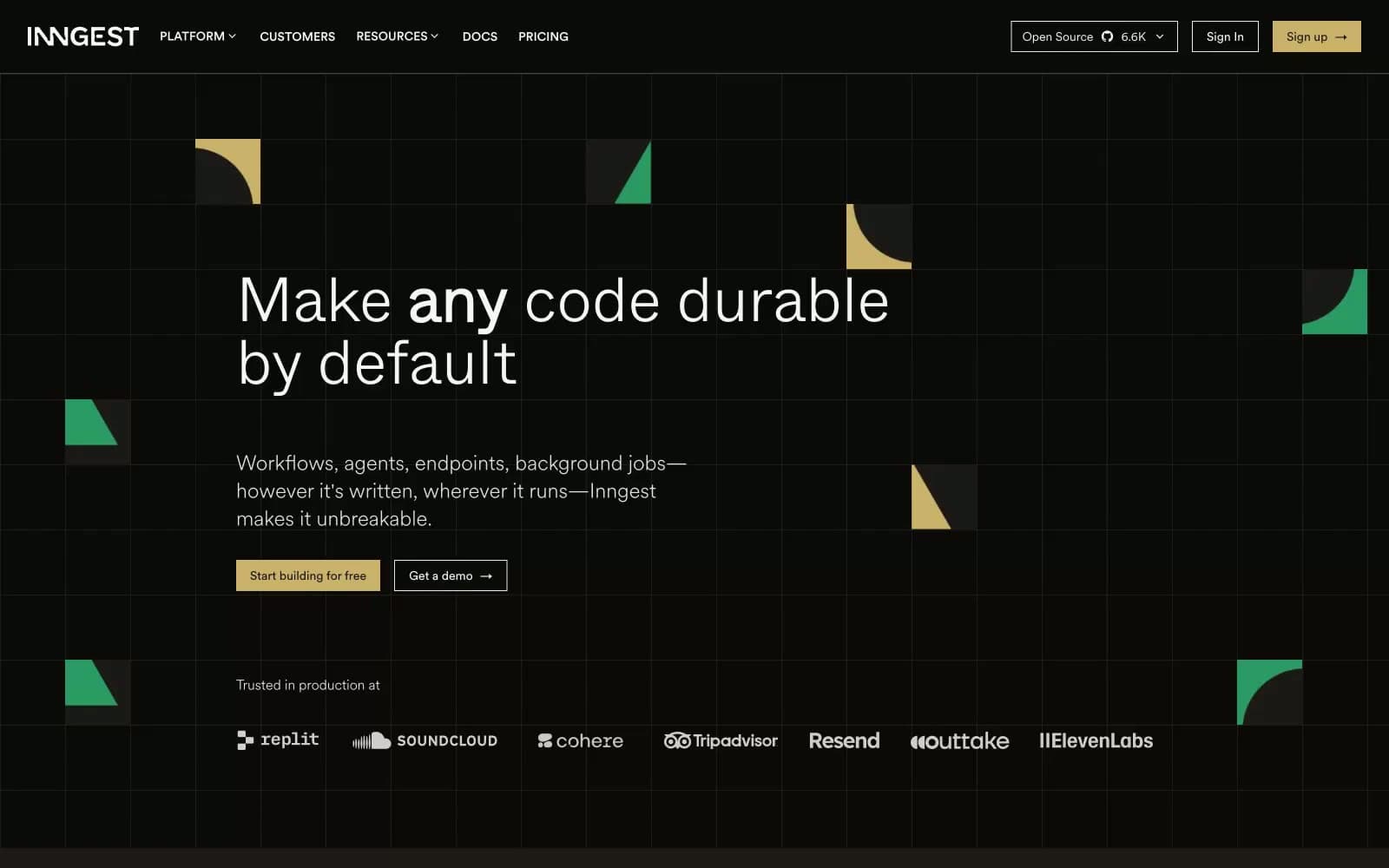
Inngest operates in a dim, warm-toned command-center idiom: near-black canvas with a faint umber undertone, hairline borders instead of shadows, and geometry scattered like circuit-board fragments across negative space. Type does the heavy lifting — a humanist sans (CircularXX) at 300/400 weight keeps the UI conversational while a display cut (Whyte) at 300 weight with extreme negative tracking whispers rather than shouts headlines. A single muted gold (#cab16a) is the only chromatic accent reserved for primary actions; green, red, and gold appear as decorative punctuation in floating geometric shapes, never on functional UI. Surfaces stack through four warm-tinted grays (#0c0a09 → #1c1917 → #292524 → #44403c) so cards and elevated panels read as luminance shifts, not color shifts.
Inngest design system

Brand1
Yellow supporting accent for decorative details and low-frequency emphasis
Accent2
Decorative geometry only — floating triangle/quarter-circle accents in hero and section backgrounds; never used on buttons or states
Red supporting accent for decorative details and low-frequency emphasis
Neutrals11
Page background, hero canvas, base surface — carries a warm umber undertone rather than neutral black so the page reads as lit, not void
Card surface, elevated panels, nav bar, footer — one step lighter than canvas to create depth without color shift
Higher elevation surfaces, input fields, nested cards — second step in the surface stack
Tertiary surface, hover states on dark panels, subtle dividers in dense contexts
Supporting neutral for secondary UI, dividers, and muted labels. Do not promote it to the primary CTA color
Muted icon color, secondary metadata text, inactive stroke
Tertiary text, captions, supporting metadata
Secondary text, link hover, subtle icon stroke
Primary text, headings, nav links — the dominant text color across the interface
High-emphasis text, button labels on dark fills, hero headline accent
Maximum contrast text, logo wordmark, high-priority callouts
Try a pairing
Pick any two colors from the palette to check whether text stays readable on top.
Aa
Obsidian on Pilot Gold
9.42 : 1 contrast
- Body textPasses AA 4.5
- Large textPasses AA 3
- StrictPasses AAA 7
More DESIGN.md files. Same web, different personalities.

Railway
Developer tools
Nuxt
Developer tools
Astro
Developer tools
Authkit
Developer tools
Axiom
Developer tools
BaseHub
Developer tools
Better Stack
Developer tools
Bun
Developer tools
Checkly
Developer tools
ClickHouse
Developer tools
Depot
Developer tools
dope.security
Developer tools


