
Index. A stark black-and-white printed publication where #ffd600 marks the only point of emphasis.
- Brand
- Light theme
- 3 colors
- 4 typefaces
Index reads as an editorial broadsheet translated to the web: near-total achromatic discipline, a single condensed serif for display headlines, and one highlighter-yellow accent used sparingly to mark what matters. Surfaces stay paper-white for most content, but the design flips to full-ink black for announcement bars and feature cards, creating high-contrast plate-like breaks rather than gradients or shadows. Typography does the heavy lifting — light-weight serif at 75–80px with aggressive negative tracking for headlines, a geometric sans for UI, and small uppercase labels with positive tracking as section markers. Components are flat, thin-bordered, and unornamented: links live as outlined text pills, buttons are 6px-radius rectangles, and the only color punctuation is a 16px yellow dot. The world map is rendered as a row of black triangular segments with yellow location pins — graphic, diagrammatic, and never illustrative.
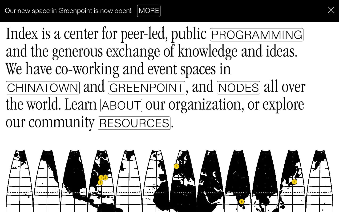
Index design system

Accent1
Yellow wash for highlight backgrounds, decorative bands, and soft emphasis behind content.
Neutrals2
Primary text, announcement bar background, dark feature cards, map silhouettes, hairline borders. The dominant structural color — used where ink would go on a printed page
Page canvas, card surfaces, body backgrounds, inverted text on dark surfaces. The base layer of the entire system
Try a pairing
Pick any two colors from the palette to check whether text stays readable on top.
Aa
Index Ink on Highlighter Yellow
14.87 : 1 contrast
- Body textPasses AA 4.5
- Large textPasses AA 3
- StrictPasses AAA 7
More DESIGN.md files. Same web, different personalities.

Airbnb
Brand
Aker
Brand
Alison Roman
Brand
Alpine Bio
Brand
Alveos One
Brand
Amrit Palace
Brand
André Cândido
Brand
Anna Jóna
Brand
Apollo
Brand
Apple
Brand
Arva
Brand
Ashton Bespoke
Brand


