
Increase. One electric chartreuse stripe cuts the navy calm, mint data signals pulse beneath it.
- Finance
- Light theme
- 12 colors
- 2 typefaces
Increase projects the quiet authority of institutional banking through a disciplined navy-and-paper palette, with chartreuse and mint used as deliberate voltage — the only colors bright enough to stop the eye. Typography is structurally mathematical: a custom grotesque (Untitled Sans) pulled tight with negative tracking pairs with a monospaced companion (Input Mono) for code, creating a typographic handshake between API documentation and product surface. Cards float on a warm off-white canvas with subtle tinted shadows rather than hard borders, while a gradient hero grounds the page in cool-to-warm motion. Buttons are nearly black ink on paper — the action language is gravitas, not energy, leaving the accent colors free to signal features, status, and data flow.
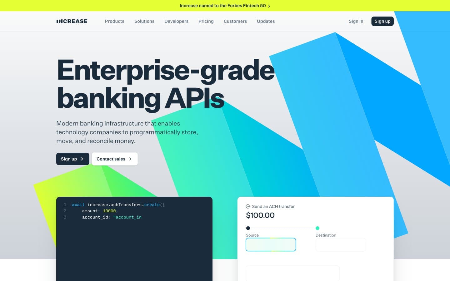
Increase design system

Brand1
Announcement bar, high-attention data highlights, occasional feature accent — the single chromatic punctuation that earns the eye's attention by being used sparingly. Never decorates, always signals
Accent1
Green outline accent for tags, dividers, and focused UI edges
Neutrals10
Dark code-block and terminal surfaces — deeper than Inkwell Navy so syntax highlighting reads with high voltage against the near-black
Primary text, nav text, icon strokes, hairline borders — the structural graphite of every screen. Used as filled button background for primary actions to project institutional weight rather than enthusiasm
Secondary borders and supporting text where Inkwell Navy is too heavy — outlines on cards, tertiary headings, subdued dividers
Muted helper text, inactive nav links, secondary button outlines — recedes so the navy headlines and mint accents can carry the hierarchy
Tertiary text and disabled-state borders — the quietest navy in the scale, used where information is supplementary
Body-level borders, subtle rule lines, the quietest non-white neutral
Hairline dividers, input borders at rest, table separators — the thread that separates without announcing itself
Card edges and subtle surface tints where a second neutral step is needed between white and Fog
Page canvas — the warm off-white that holds all content; section bands alternate with pure white to create quiet vertical rhythm
Card surfaces, form inputs, nav background — the elevated layer that floats above Fog with minimal shadow
Try a pairing
Pick any two colors from the palette to check whether text stays readable on top.
Aa
Abyss on Voltage
15.97 : 1 contrast
- Body textPasses AA 4.5
- Large textPasses AA 3
- StrictPasses AAA 7
More DESIGN.md files. Same web, different personalities.
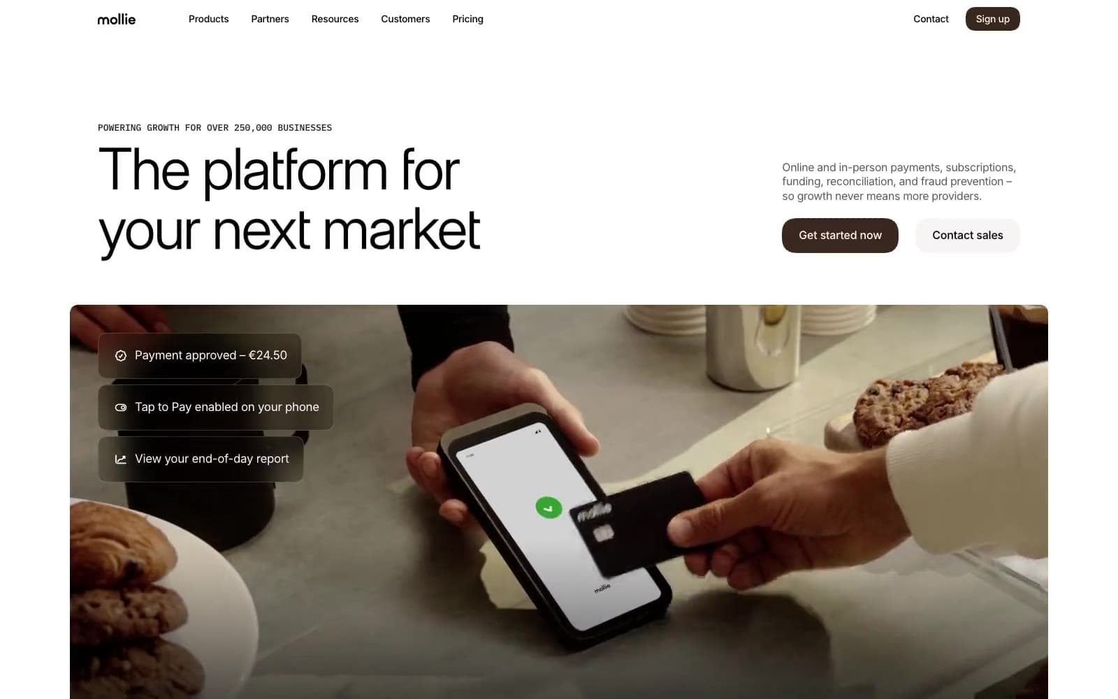
Mollie
Finance
a16z speedrun
Finance
Acctual
Finance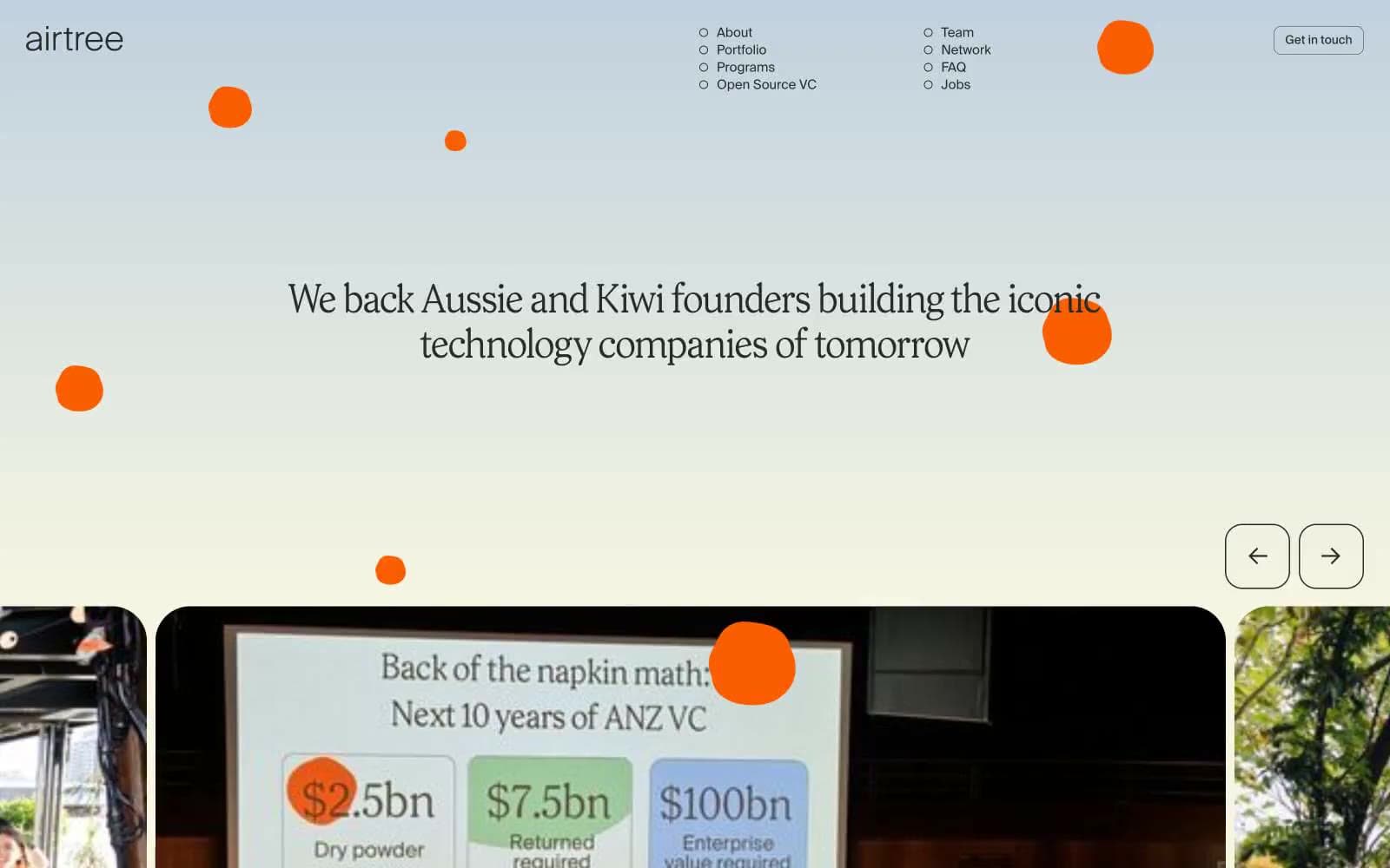
Airtree
Finance
Ambrook
Finance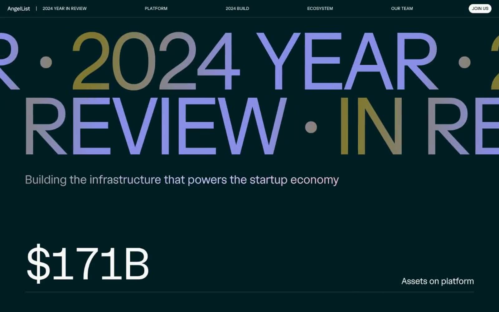
Angellist 2024
Finance
Apron
Finance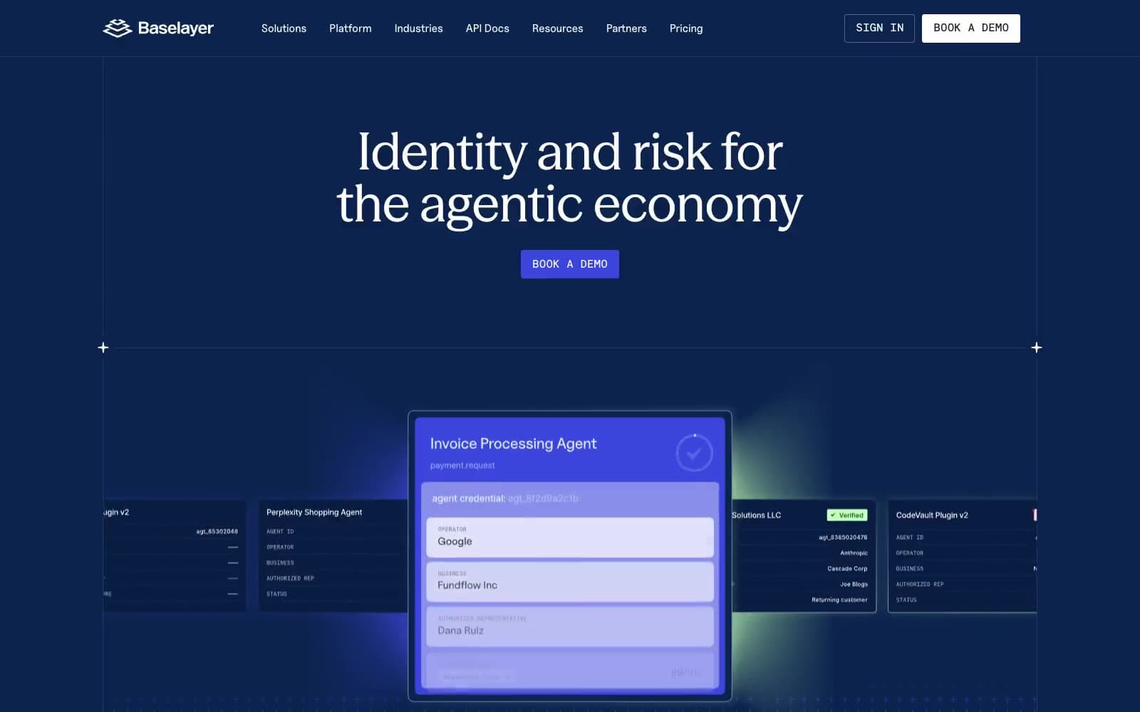
Baselayer
Finance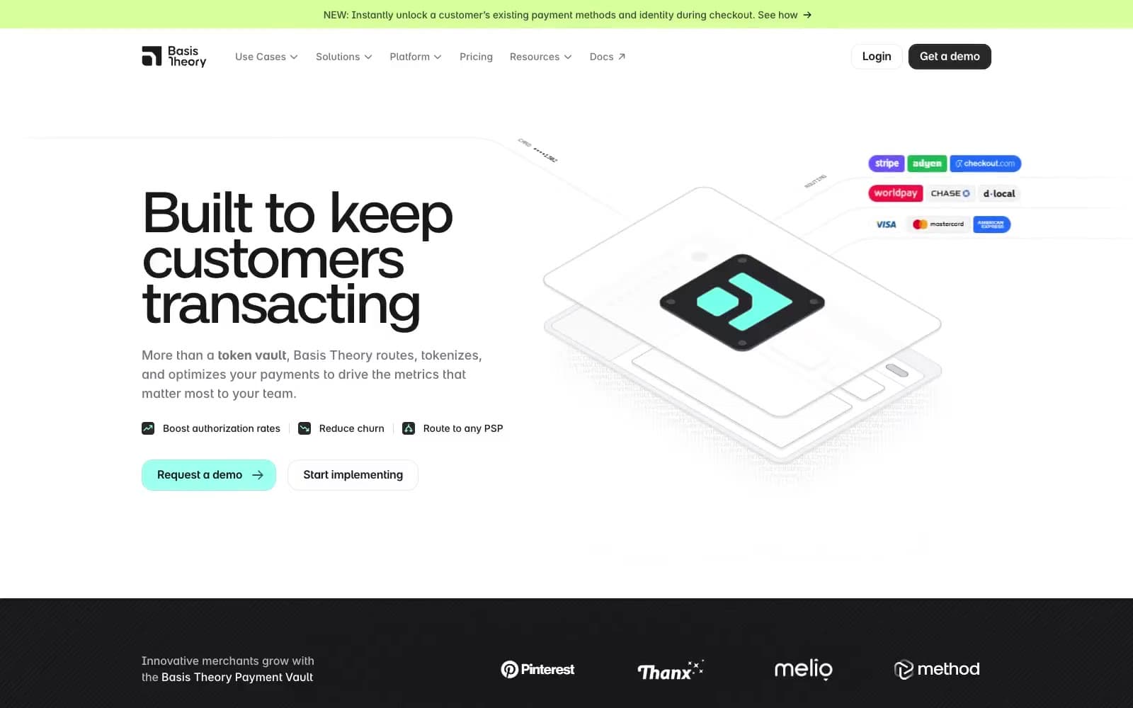
Basis Theory
Finance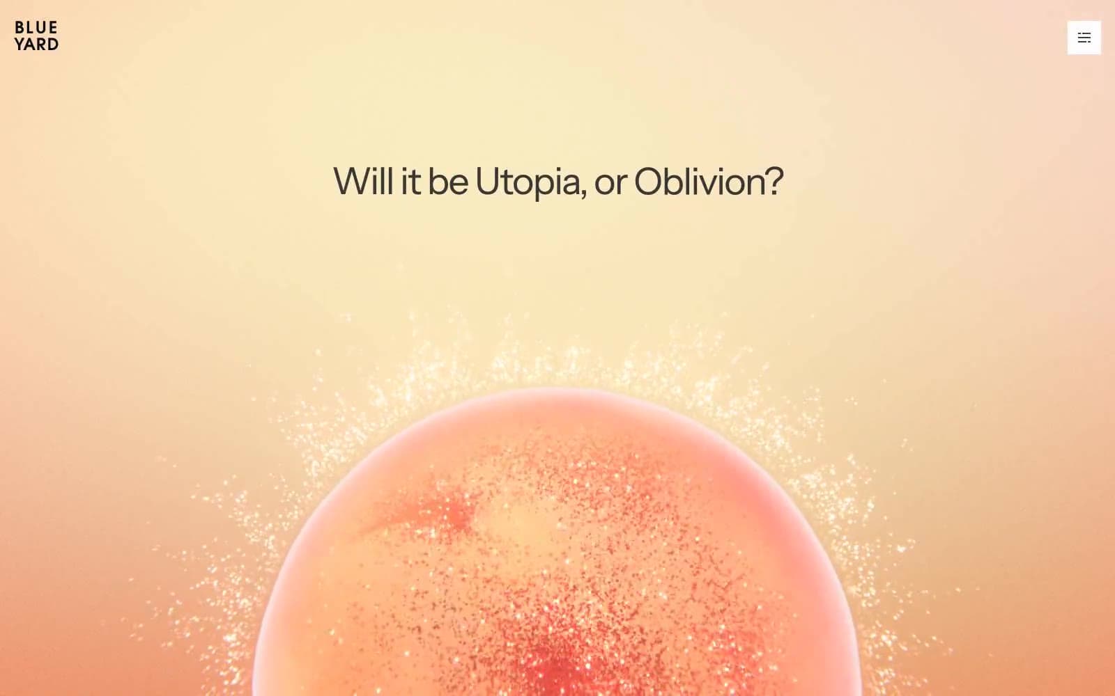
BlueYard Capital
Finance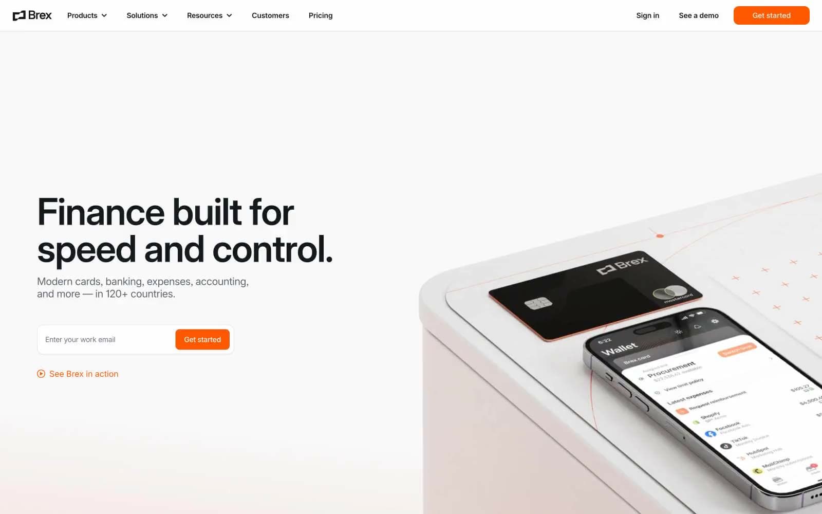
Brex
Finance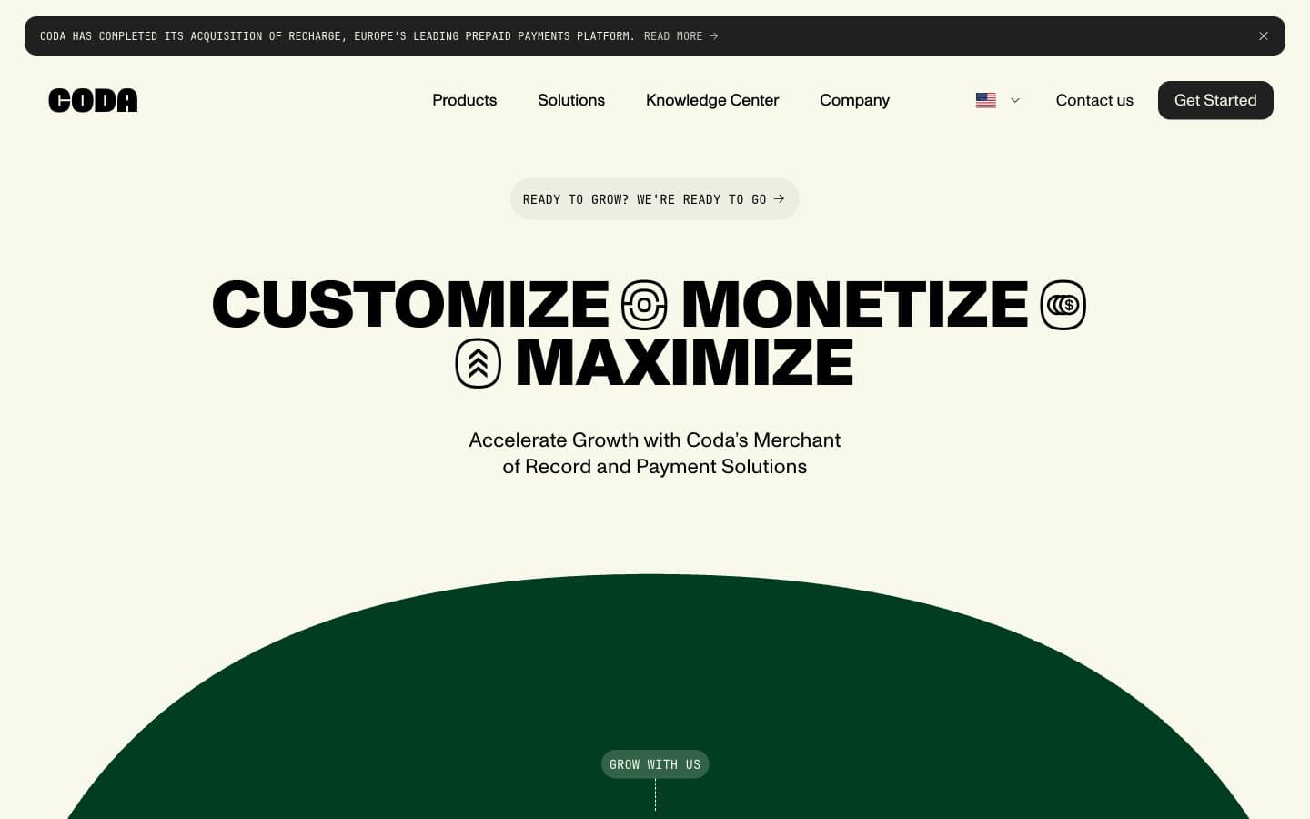
Coda
Finance


