
Impossible Foods. Blood-red punk poster in velvet darkness.
- Commerce
- Dark theme
- 6 colors
- 1 typeface
Impossible Foods runs a dark, wine-dark canvas flooded with blood-red accents — the visual register of a punk-rock manifesto printed on butcher paper. Typography is the loudest voice: display text is enormous, brutally tight (line-height 0.73), and slightly opened in tracking, shouting product names like 'STEAK (FROM PLANTS)' in a custom condensed sans that fills the viewport. The single red (#e10600) carries all action and emphasis, with a soft blush pink (#ffc7c6) providing tonal relief and a near-black burgundy (#4f0423/#260212) for depth. Surfaces are flat, borders are crisp black hairline strokes, and food photography is presented in irregular mask-cut shapes that float around the type rather than inside conventional frames. The overall rhythm is aggressive but disciplined: massive display moments punctuated by compact product grids and pill-shaped toggle controls.
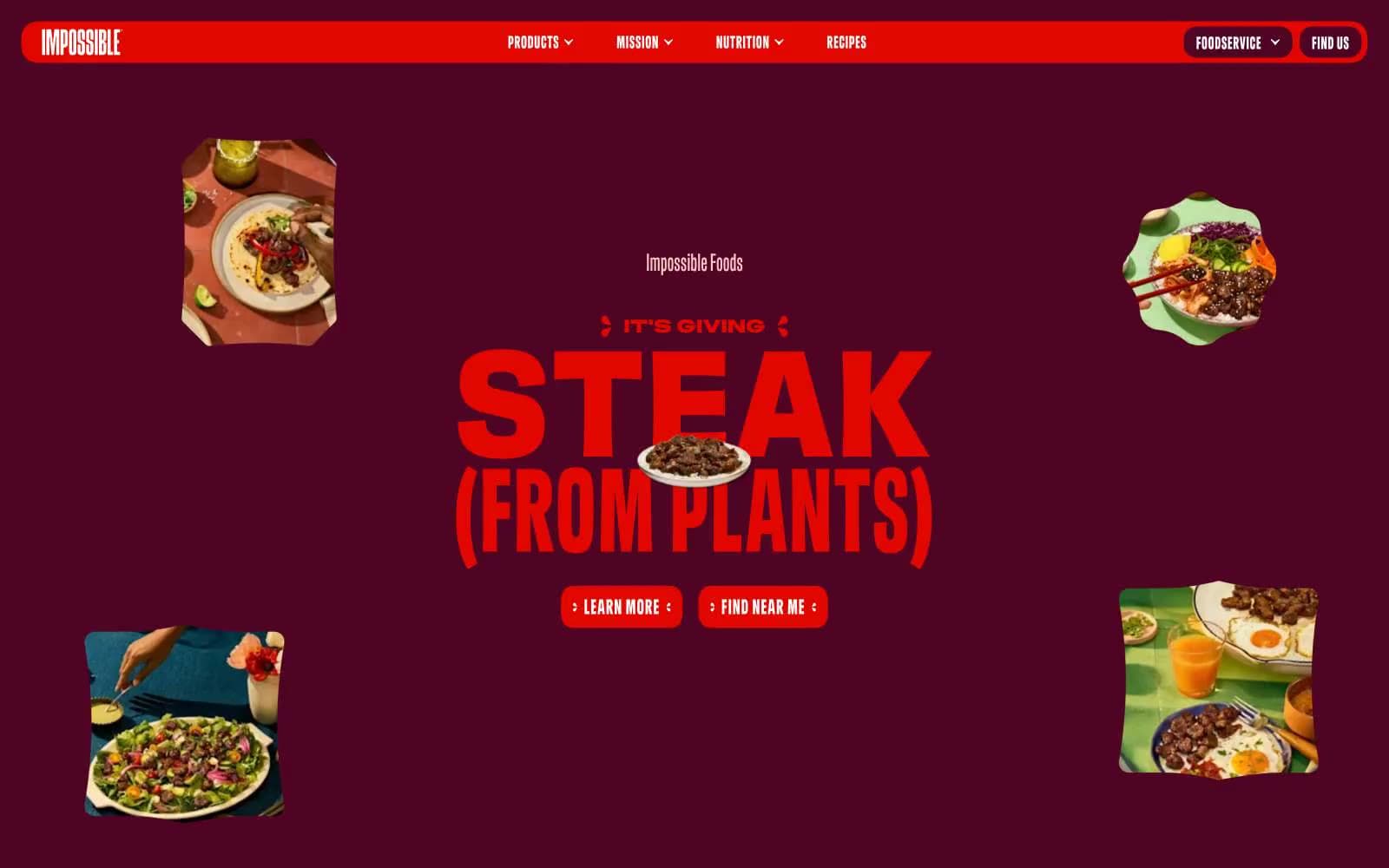
Impossible Foods design system

Brand1
Primary action buttons, active toggles, headline accents, icon emphasis — the single chromatic signal that commands attention
Accent1
Soft secondary text, pill toggles in default state, link hover, tonal counterpoint to the aggressive red
Neutrals4
Top navigation background, hairline borders, card outlines, deep contrast strokes
Page canvas and deepest section background — the floor everything sits on
Section and card surfaces, slightly lifted from the canvas to separate bands of content
Navigation and button text, body copy on dark surfaces, inverted toggle text
Try a pairing
Pick any two colors from the palette to check whether text stays readable on top.
Aa
Bone White on Impossible Red
4.97 : 1 contrast
- Body textPasses AA 4.5
- Large textPasses AA 3
- StrictFails AAA 7
More DESIGN.md files. Same web, different personalities.
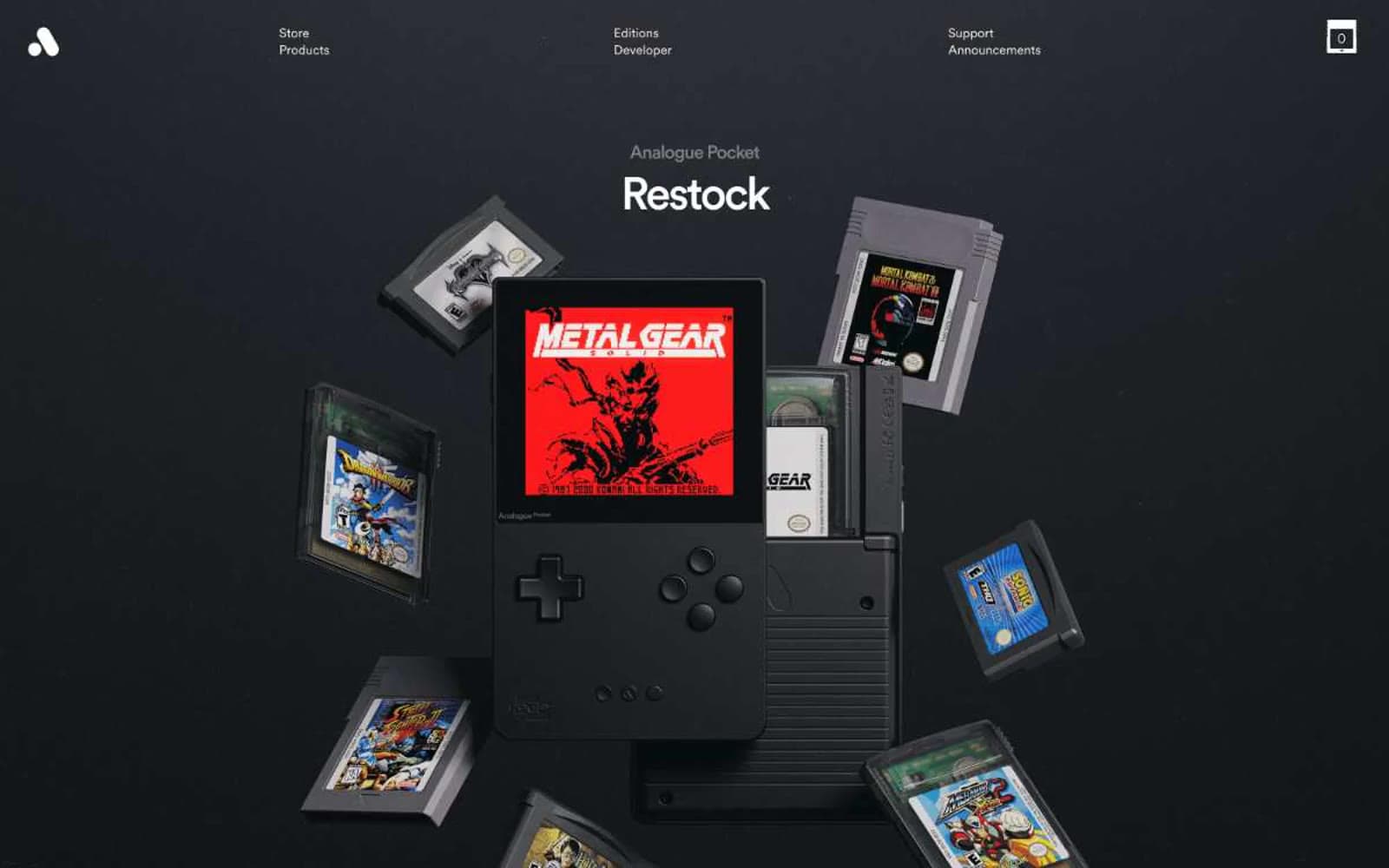
Analogue
Commerce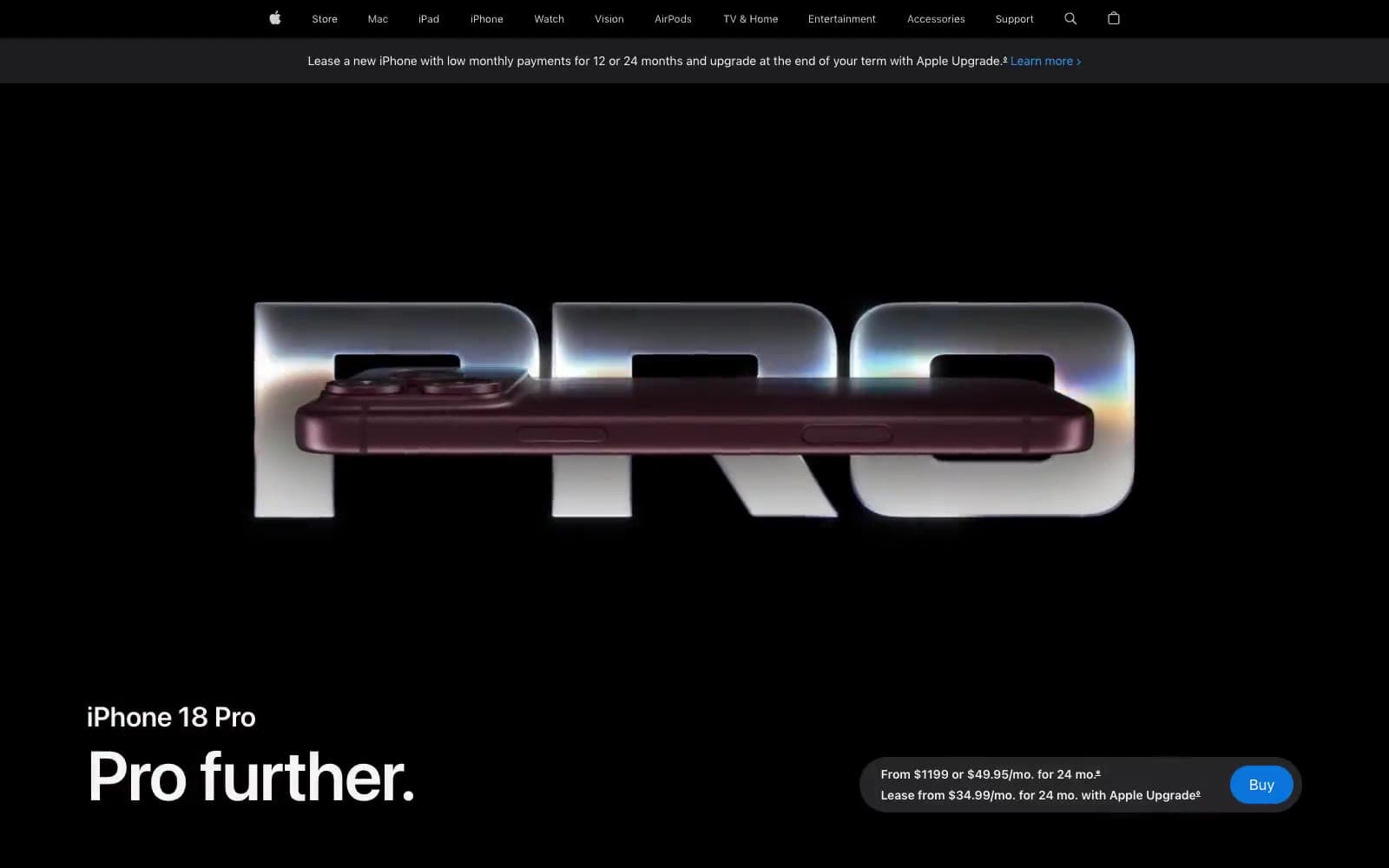
Apple iPhone 18 Pro
Commerce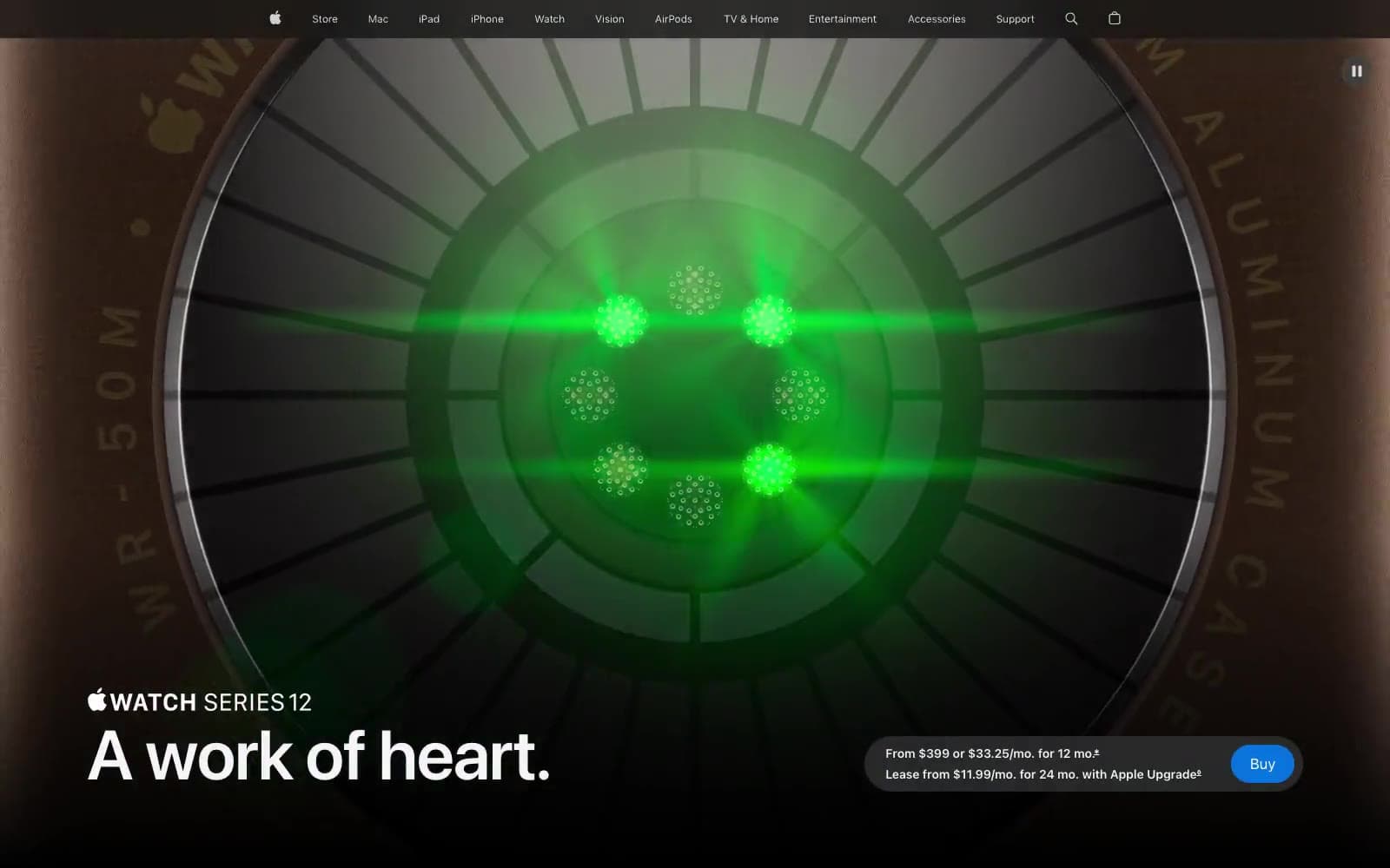
Apple Watch Series 12
Commerce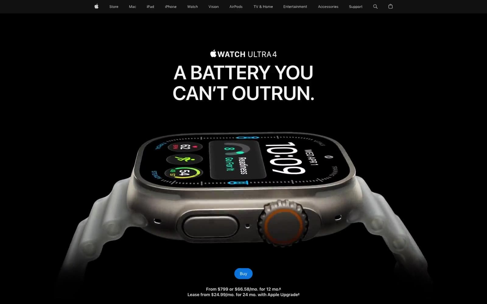
Apple Watch Ultra 4
Commerce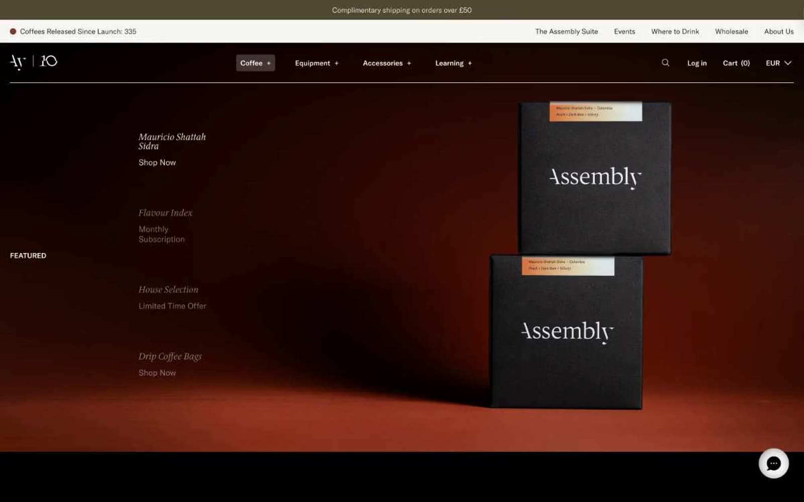
Assembly Coffee London
Commerce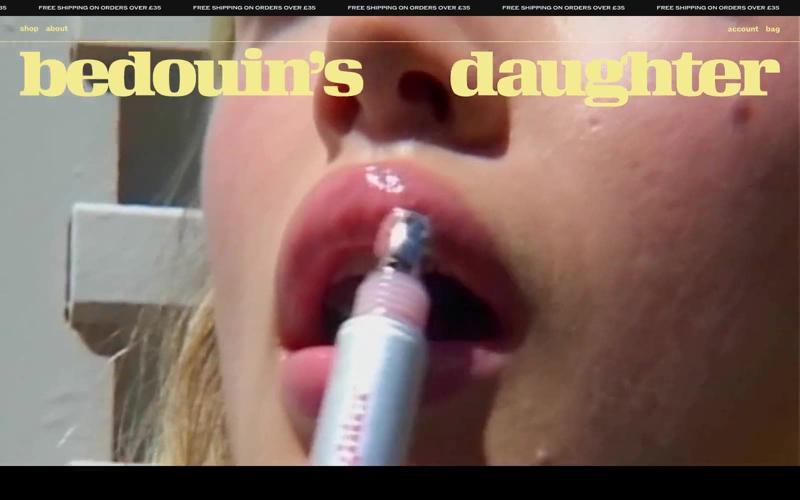
Bedouin's Daughter
Commerce
CHAIBOY
Commerce
Dollar Shave Club
Commerce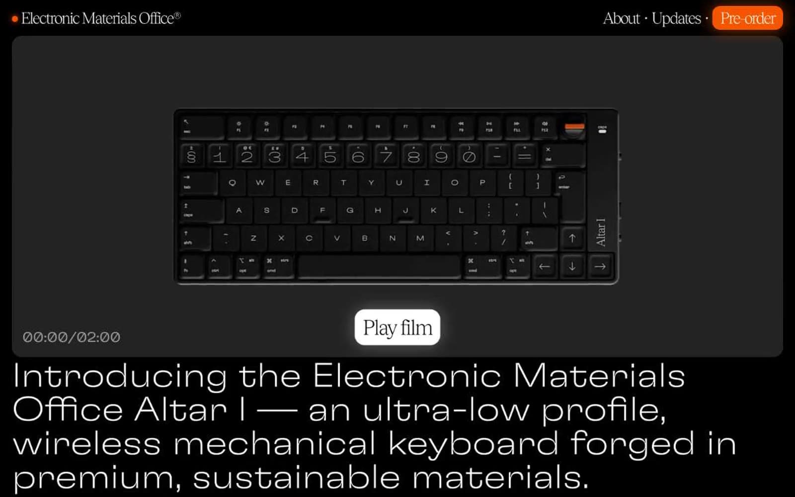
Electronic Materials Office®
Commerce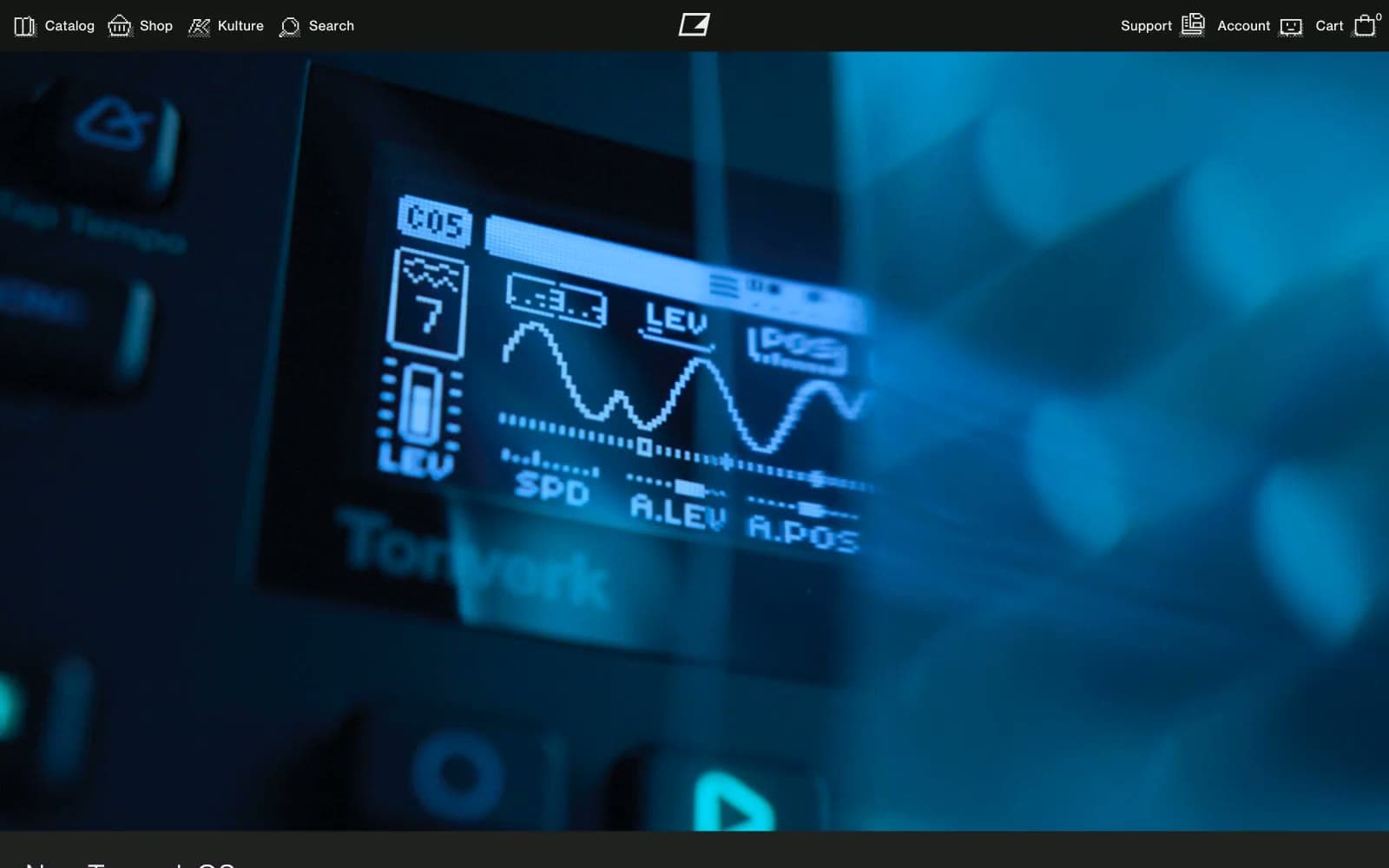
Elektron
Commerce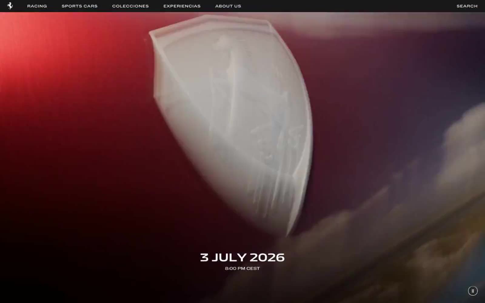
Ferrari
Commerce
Holiday 100
Commerce


