
Hims App. Spa brochure on vellum paper.
- Brand
- Light theme
- 9 colors
- 1 typeface
Hims App operates as a calm, monochrome wellness interface where one violet accent does all the emotional work against an otherwise achromatic canvas. The system is built for breath: oversized type in a custom geometric sans (sofia), generously rounded surfaces (30–52px radii), and long-spread soft shadows that make cards appear to float rather than sit. The hero is photographic and intimate — a hand holding a phone, product color bleeding into real skin — but the surrounding UI stays austere: white canvas, black type, hairline borders. Violet #5d48db is reserved almost exclusively for headlines and occasional borders, never for filled buttons. Components feel like printed editorial spreads: large negative space, no decorative gradients in chrome, and a single type family carrying every weight of meaning.
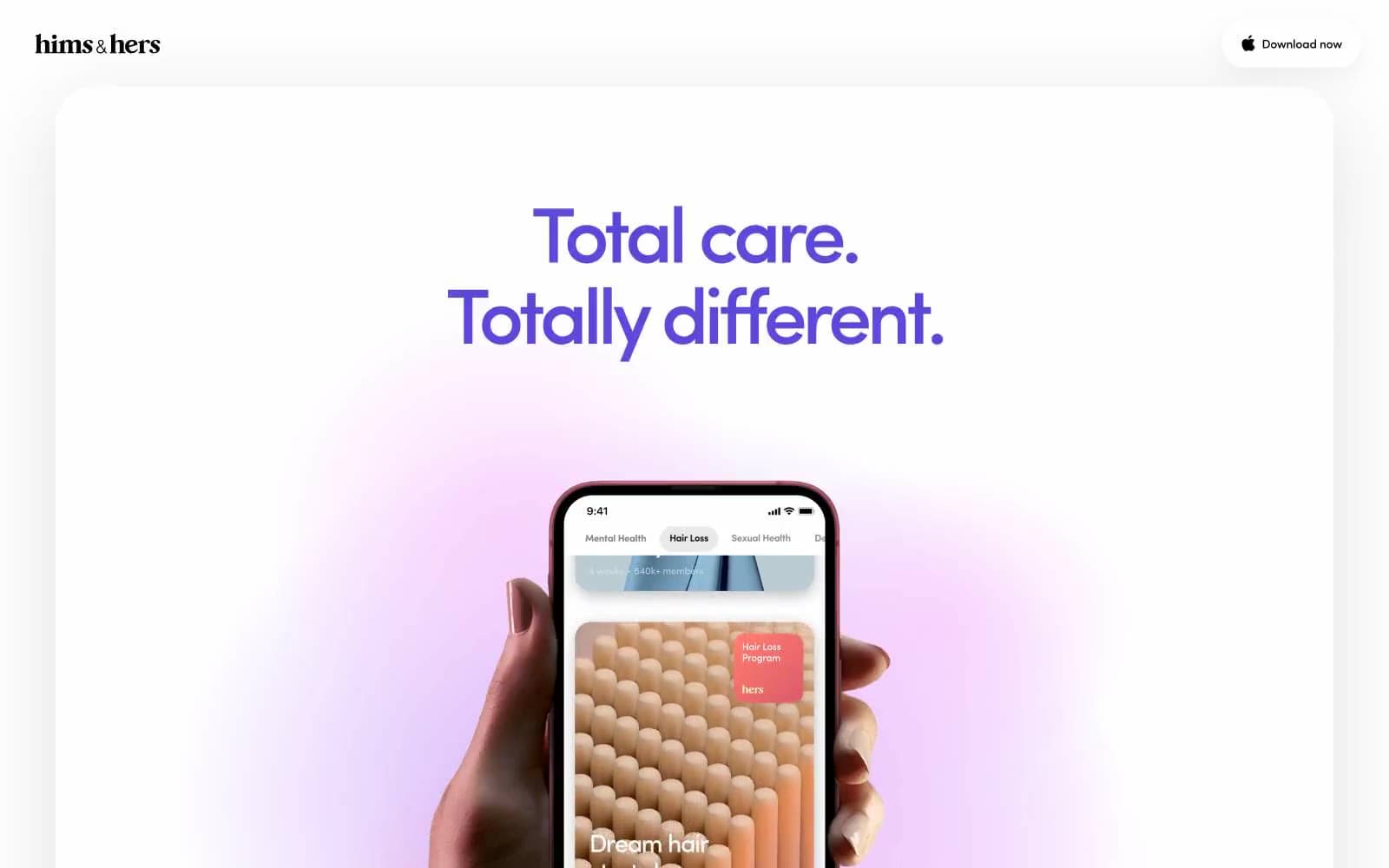
Hims App design system

Brand1
Headline text, display borders, brand accent — the single chromatic voice in an otherwise monochrome system
Accent2
Decorative product accent — appears inside app screenshot tiles (e.g. Acne Program card), not a UI token
Decorative product accent — appears in product gradient washes inside phone mockup content
Neutrals6
Primary text, hairline borders, icon fills, nav dividers — the structural ink of the interface
Secondary heading text, heading borders — slightly softer than pure black for non-display headings
Muted body copy, subdued links, secondary metadata text
Hairline borders, list separators, thin structural strokes
List dividers, subtle row separators, muted list text — the quietest structural neutral
Page canvas, card surfaces, nav background, image backgrounds — the base surface at every elevation level
Try a pairing
Pick any two colors from the palette to check whether text stays readable on top.
Aa
Paper White on Hims Violet
6.15 : 1 contrast
- Body textPasses AA 4.5
- Large textPasses AA 3
- StrictFails AAA 7
More DESIGN.md files. Same web, different personalities.

Airbnb
Brand
Aker
Brand
Alison Roman
Brand
Alpine Bio
Brand
Alveos One
Brand
Amrit Palace
Brand
André Cândido
Brand
Anna Jóna
Brand
Apollo
Brand
Apple
Brand
Arva
Brand
Ashton Bespoke
Brand


