
Heart Aerospace. The brand reads like an engineering manifesto printed on atmosphere.
- Brand
- Light theme
- 4 colors
- 4 typefaces
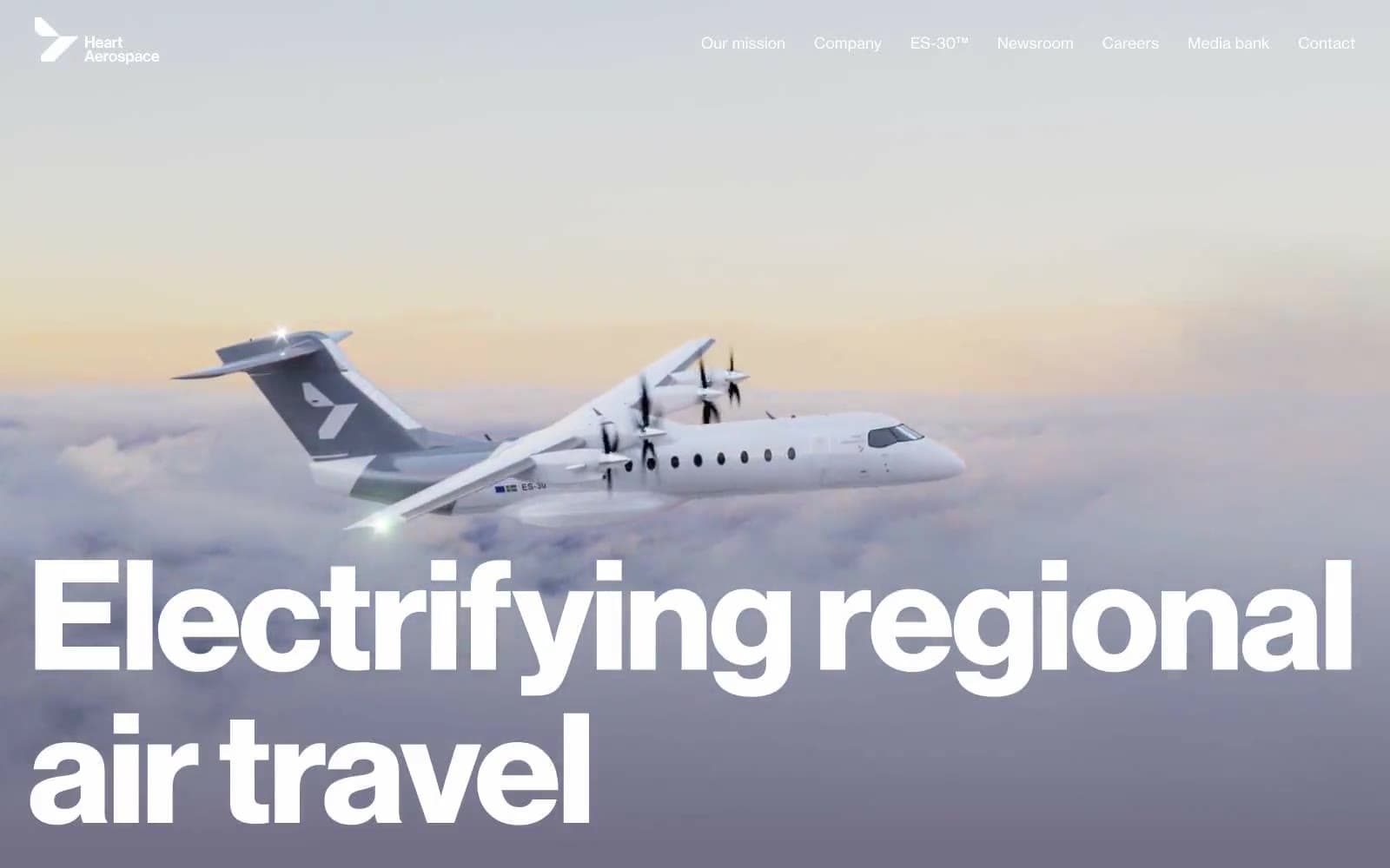
Heart Aerospace uses a monumental-typography-over-atmospheric-sky language: the brand communicates through oversized type and full-bleed aviation photography, with almost no decorative UI chrome. The palette is nearly monochrome — a muted stratosphere purple-gray anchors atmospheric sections, a deep jetstream blue punctuates outlined actions, and black/white carry all structural weight. Every screen should feel like a single composition: type the subject, photography the environment, negative space the luxury. There are no cards, no shadows, no rounded surfaces, no gradients beyond the sky atmosphere — the design earns its restraint by letting a 156px display headline and a photograph do all the work.
Heart Aerospace design system

Brand1
Outlined/ghost action borders, link text, image accent borders — the only chromatic accent, used as outlined-link color and focused-frame treatment, never as a filled button background
Accent1
Hero and section atmospheric backgrounds, sky gradient origin, the signature non-neutral surface that carries brand mood
Neutrals2
Primary text, structural borders, footer background, partner logo fills
Inverse text on dark and gradient backgrounds, content section canvas, navigation text on hero, gradient endpoint
Try a pairing
Pick any two colors from the palette to check whether text stays readable on top.
Aa
Cloud on Jetstream Blue
14.37 : 1 contrast
- Body textPasses AA 4.5
- Large textPasses AA 3
- StrictPasses AAA 7
More DESIGN.md files. Same web, different personalities.

Airbnb
Brand
Aker
Brand
Alison Roman
Brand
Alpine Bio
Brand
Alveos One
Brand
Amrit Palace
Brand
André Cândido
Brand
Anna Jóna
Brand
Apollo
Brand
Apple
Brand
Arva
Brand
Ashton Bespoke
Brand


