
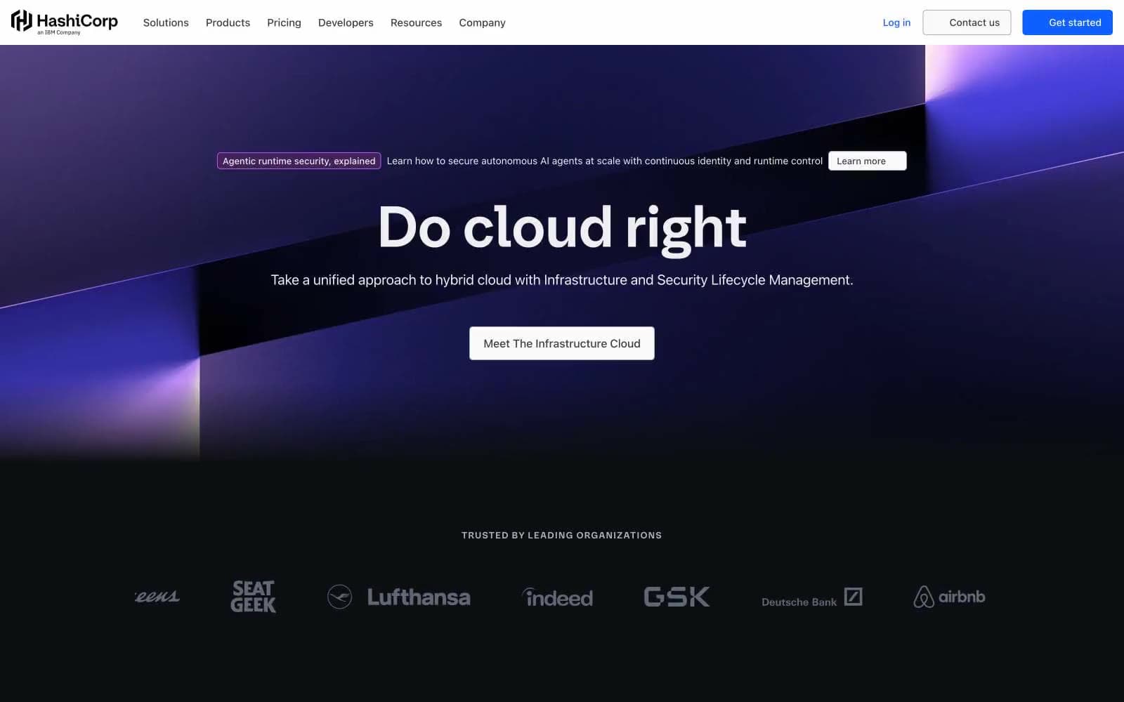
HashiCorp. A dark technical surface where a glowing hexagonal cube serves as the only chromatic anchor.
- Developer tools
- Dark theme
- 17 colors
- 3 typefaces
HashiCorp operates a midnight control-room aesthetic: near-black canvases swallow the page, letting a single electric violet-blue brand signal carry every interactive moment. Headlines use a custom geometric sans at heavy weights with tight negative tracking, giving typography a compressed, confident posture rather than airy elegance. The 3D hexagonal cube render — glowing violet and indigo — is the signature visual, appearing wherever the brand needs to feel tangible. Surfaces stay nearly flat with hairline borders and almost imperceptible shadows; the depth comes from gradient washes, not elevation. Body copy is achromatic, generously sized, and unornamented, letting the brand blue do the work of guiding attention through links, active states, and tab indicators.
HashiCorp design system

Brand3
Primary brand color — active nav items, links, icon fills, tab indicators, the dominant chromatic signal
Blue supporting accent for decorative details and low-frequency emphasis. Do not promote it to the primary CTA color
Violet supporting accent for decorative details and low-frequency emphasis. Do not promote it to the primary CTA color
Accent4
Badge background fill, decorative deep-violet surface for category tags
Badge borders, violet accent strokes, decorative outline highlights
Gradient origin — the cool blue-violet start of the hero and cube illumination
Gradient terminus — warm violet end of the hero gradient, the lighter face of the 3D cube render
Neutrals10
Primary page background, hero foundation, footer base — the near-black void that absorbs all other content
Elevated cards, panels, input fields, secondary surface layer above the void
Highest elevation tier — modals, popovers, overlay containers
Icon strokes, decorative line work, tertiary UI elements
Muted body copy, helper text, metadata, placeholder content
Borders, dividers, inactive control outlines at mid-contrast
High-frequency dividers, light borders, subtle separators, partner logo treatment
Button borders on filled controls, hairline outlines
Primary text on dark surfaces, headings, body copy at highest contrast
Maximum-contrast text, filled button text, the brightest surface accent
Try a pairing
Pick any two colors from the palette to check whether text stays readable on top.
Aa
Pure White on Brand Cobalt
5.44 : 1 contrast
- Body textPasses AA 4.5
- Large textPasses AA 3
- StrictFails AAA 7
More DESIGN.md files. Same web, different personalities.

Railway
Developer tools
Nuxt
Developer tools
Astro
Developer tools
Authkit
Developer tools
Axiom
Developer tools
BaseHub
Developer tools
Better Stack
Developer tools
Bun
Developer tools
Checkly
Developer tools
ClickHouse
Developer tools
Depot
Developer tools
dope.security
Developer tools


