
Hartzler Family Dairy. The products are the type and the type is the room.
- Brand
- Light theme
- 6 colors
- 2 typefaces
Hartzler Family Dairy uses a sunlit country-creamery aesthetic where product photography is the hero and display type does the branding. Massive Work Sans 900 headlines (290–333px) at 0.70 line-height stretch behind and around product photos, acting as architectural color blocks — teal 'DAIRY' and butter-yellow 'FRESH' alternate as section identifiers while a single deep forest green anchors all chrome, logos, and interactive borders. The interface is intentionally sparse: white canvas, minimal nav (just a 'MENU' link), no decorative gradients, no shadows — the bottles, butter sticks, and ice cream scoops are the visual content. Accent colors appear ONLY in oversized display text and small category tags; everything else is charcoal text and forest-green outlines, creating the feel of a vintage dairy billboard stripped of clutter.
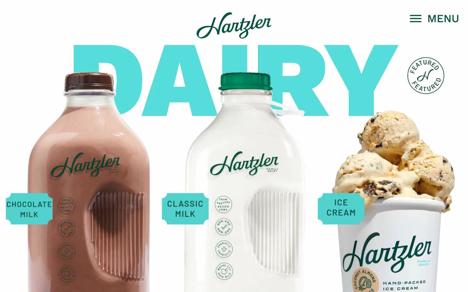
Hartzler Family Dairy design system

Brand2
Teal accent for outlined action borders, linked labels, and lightweight interactive emphasis. Do not promote it to the primary CTA color
Outlined link and button borders, secondary decorative strokes on product imagery. Never a filled background — always a 1–2px stroke that reads as an old-school printed link underline
Accent2
Teal outline accent for tags, dividers, and focused UI edges.
Yellow outline accent for tags, dividers, and focused UI edges.
Neutrals2
Primary text, all UI borders, image outlines. This is the workhorse neutral — the 644 border usages show that almost every edge in the system is charcoal, giving the site a hand-printed, ink-stamped quality
Page canvas, card surfaces, button fills when a neutral surface button is needed. The interface is unapologetically blank — white lets the product photography and oversized colored type do all the work
Try a pairing
Pick any two colors from the palette to check whether text stays readable on top.
Aa
Cream White on Forest Heritage
8.82 : 1 contrast
- Body textPasses AA 4.5
- Large textPasses AA 3
- StrictPasses AAA 7
More DESIGN.md files. Same web, different personalities.

Airbnb
Brand
Aker
Brand
Alison Roman
Brand
Alpine Bio
Brand
Alveos One
Brand
Amrit Palace
Brand
André Cândido
Brand
Anna Jóna
Brand
Apollo
Brand
Apple
Brand
Arva
Brand
Ashton Bespoke
Brand


