
Harness.io. Midnight mission control with phosphor-green accents.
- Developer tools
- Dark theme
- 19 colors
- 3 typefaces
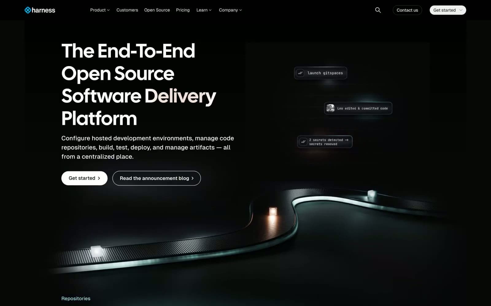
Harness's Gitness surface reads as a nocturnal command deck: near-black canvas (#070707) with stacked card surfaces in marginally lighter shades, oversized display headlines in a condensed Calsans face with positive tracking, and a teal/mint accent (#70dcd3) that surfaces on highlight cards like a phosphor monitor glow. The page stays quiet and high-contrast — white text at AAA contrast on deep neutrals, hairline borders in light gray (not dark) to define edges against the dark canvas, and pill-shaped controls (800px radius) that feel like physical hardware buttons. Color is rationed: one bright blue (#0092e4) for active link borders and one mint (#70dcd3) for accent cards, nothing else. Spacing breathes — generous card padding, comfortable section gaps, and large display sizes that let the type carry the hierarchy rather than color or weight.
Harness.io design system

Brand2
Link borders, active link text, focus accents — the interface's action stroke
Active nav state, selected menu items, current-page indicator
Accent4
Accent card fill, highlight surfaces — the signature brand glow, reserved for featured cards and stat panels
Decorative soft borders, light accent strokes on cards
Green accent for outlined action borders, linked labels, and lightweight interactive emphasis. Use as a supporting accent, not as a status color
Card decorative borders with cool blue-gray tint, secondary card outlines
Neutrals12
Page background, deepest surface — near-black, the floor everything else sits on
Primary card surface, one step above the canvas — the dominant elevated panel
Secondary card surface, code blocks, nested panels
Heavy structural borders, button outlines on dark, nav separators
Mid-tier surface, dividers, hover overlays on dark surfaces
Deep muted text, low-priority links, icon rest state
Nav borders, inactive nav text, structural dividers in chrome
Tertiary body text, subdued labels, disabled-ish state
Body text secondary, muted descriptions, helper text
Card hairline borders — counterintuitively light on the dark canvas, defining card edges by luminosity contrast
Secondary text, soft fills, muted surface highlights
Primary text, filled pill button fill, icon strokes — the only high-luminance neutral
semantic1
Input focus border, form active state, info semantic stroke
Try a pairing
Pick any two colors from the palette to check whether text stays readable on top.
Aa
Void Canvas on Signal Blue
5.98 : 1 contrast
- Body textPasses AA 4.5
- Large textPasses AA 3
- StrictFails AAA 7
More DESIGN.md files. Same web, different personalities.

Railway
Developer tools
Nuxt
Developer tools
Astro
Developer tools
Authkit
Developer tools
Axiom
Developer tools
BaseHub
Developer tools
Better Stack
Developer tools
Bun
Developer tools
Checkly
Developer tools
ClickHouse
Developer tools
Depot
Developer tools
dope.security
Developer tools


