
Gsap. Animated chalkboard in a design studio.
- Developer tools
- Dark theme
- 13 colors
- 1 typeface
GSAP is a dark-canvas design language built for a motion library: a near-black stage where massive cream type, thin outlined pill buttons, and individually color-coded category labels create a typographic showcase rather than a traditional marketing site. The system runs on a single warm cream surface color (#fffce1) against an almost-black background, with category words each wearing their own vivid hue (green for the brand mark, orange for SVG, pink for Scroll, violet for Text, blue for UI) — color functions as taxonomy, not decoration. Typography is the hero: a single sans-serif (Mori) at six weights, pushing to 224px for the main headline with aggressive negative tracking and near-1.0 line-height, so words feel carved rather than laid out. Buttons are almost exclusively ghost-pills with 100px radius and hairline cream borders; there are no filled CTAs, which lets the gradient hero flourish and keeps every interactive element weightless.
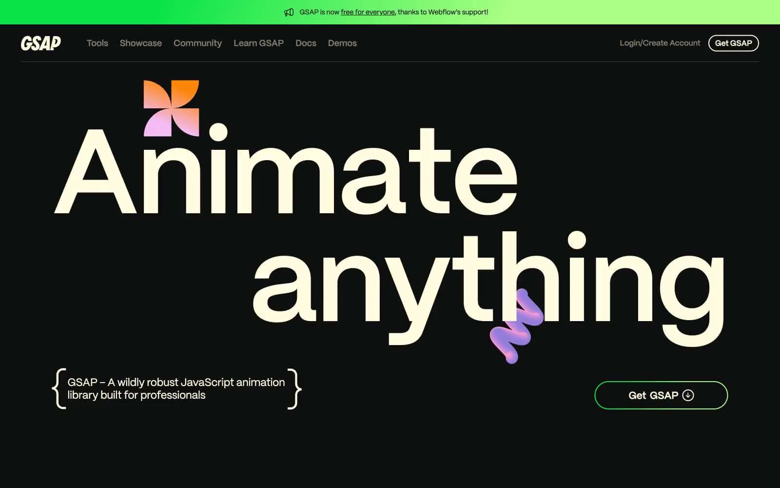
Gsap design system

Brand3
Green text accent for links, tags, and emphasized short phrases. Do not promote it to the primary CTA color
Green text accent for links, tags, and emphasized short phrases. Do not promote it to the primary CTA color
Subtle brand-tinted background washes for feature cards tied to the GSAP core
Accent5
SVG category label, orange-tool icon fills, gradient endpoint in Orange Crush
Scroll category label, decorative splashes, gradient endpoint in Summer Fair
Text category label, thin illustrative strokes, gradient endpoint in Purple Haze
UI category label, gradient endpoint in Skyfall and Emerald City
Deep gradient stop for expressive decorative gradients, not used for text or UI
Neutrals5
Page canvas, footer surface, deep section backgrounds
Alternative dark surface for nested panels and code blocks
Hairline borders, dividers, low-contrast outlines against the black canvas
Muted secondary text, icon fills at rest, subhead annotations, disabled-state labels
Primary text, outlined button borders, nav links, card text, the default surface-light used for ghost controls and headings
Try a pairing
Pick any two colors from the palette to check whether text stays readable on top.
Aa
Just Black on Light Green
15.79 : 1 contrast
- Body textPasses AA 4.5
- Large textPasses AA 3
- StrictPasses AAA 7
More DESIGN.md files. Same web, different personalities.

Railway
Developer tools
Nuxt
Developer tools
Astro
Developer tools
Authkit
Developer tools
Axiom
Developer tools
BaseHub
Developer tools
Better Stack
Developer tools
Bun
Developer tools
Checkly
Developer tools
ClickHouse
Developer tools
Depot
Developer tools
dope.security
Developer tools


