
Going™. Sun-bleached travel journal with electric ink.
- Brand
- Light theme
- 6 colors
- 1 typeface
Going is a warm-paper travel companion: a parchment canvas (#fffef0, never pure white) carries deep lagoon teal body text and pill-shaped electric iris CTAs, with soft mint wash bands organizing content sections. PP Mori's slightly off-axis 475 weight gives paragraphs a friendlier gravity than standard 400, while display sizes push tracking outward (up to 0.10em at 80px) for an editorial-poster feel. Surfaces stack: parchment base → mint wash content bands → ink-bordered cards with a whisper shadow. The design refuses cold SaaS conventions — black is used sparingly as a hairline border accent, not as primary type, and the single violet CTA carries all interactive weight across the page.
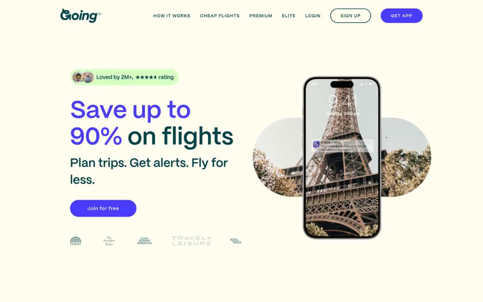
Going™ design system

Brand2
Primary text, body copy, icon strokes, navigation — deep teal replaces black for all running text and primary iconography, lending a warm printed feel rather than digital harshness
Violet action color for filled buttons, selected navigation states, and focused conversion moments.
Accent2
Section backgrounds, testimonial card surfaces, soft highlight bands — pale green wash separates content zones without the heaviness of gray or color blocks
Display headline emphasis, accent strokes on key words, decorative highlight — neon green appears in sparing two-to-five-word bursts to amplify specific display phrases
Neutrals2
Hairline borders, card outlines, structural dividers, footer strokes — used as 1px boundary lines rather than as primary type, creating crispness against the cream base
Page canvas, card surfaces on mint sections, inverted text on dark elements — warm off-white background replaces clinical #ffffff, reducing glare and adding editorial softness
Try a pairing
Pick any two colors from the palette to check whether text stays readable on top.
Aa
Parchment on Deep Lagoon
10.76 : 1 contrast
- Body textPasses AA 4.5
- Large textPasses AA 3
- StrictPasses AAA 7
More DESIGN.md files. Same web, different personalities.

Airbnb
Brand
Aker
Brand
Alison Roman
Brand
Alpine Bio
Brand
Alveos One
Brand
Amrit Palace
Brand
André Cândido
Brand
Anna Jóna
Brand
Apollo
Brand
Apple
Brand
Arva
Brand
Ashton Bespoke
Brand


