
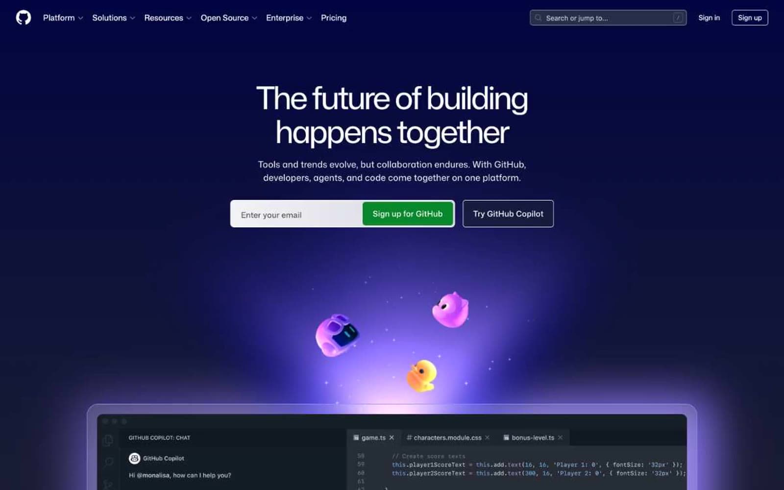
GitHub. A dark, atmospheric workspace where a single green glow marks the path forward.
- Developer tools
- Dark theme
- 18 colors
- 3 typefaces
GitHub operates as a deep-space developer observatory: near-black canvas layered with translucent glass surfaces, bathed in violet radial atmosphere, and punctuated by a single warm-green CTA that reads like a terminal cursor brought into the UI. Mona Sans carries the voice — weight 425 at 64px with -0.035em tracking makes display copy feel engineered rather than marketed, while body text sits at 400/16px with generous 1.5 line-height for code-adjacent readability. Surfaces float through subtle rgba whites (0.06, 0.15, 0.2) rather than raised shadows; borders do the elevation work at #21262d. Pill-shaped navigation and tag elements at 60px radius contrast with the 6px sharp-rectangle buttons, creating a deliberate two-shape vocabulary. Color is used surgically: violet/blue/purple gradients generate ambient depth behind hero sections, bright green signals the one action that matters, and the rest of the page recedes into grayscale.
GitHub design system

Brand2
Primary CTA fill (Sign up for GitHub) — the one warm color in the system, deliberately evokes a terminal cursor
Green wash for highlight backgrounds, decorative bands, and soft emphasis behind content. Do not promote it to the primary CTA color
Accent4
Gray wash for highlight backgrounds, decorative bands, and soft emphasis behind content. Use as a supporting accent, not as a status color
Featured card border accent — signals the selected or highlighted card in a grid
Body text accent, icon fills, link text — the cool companion to warm green, 73 instances making it the second-most-present chromatic color
Link/button accent at low frequency, icon-secondary token — reserved for marketing moments
Neutrals12
Hero section canvas, deepest background layer, terminal/code surfaces
Button surface, near-black accent fill
Page canvas, section backgrounds, footer — the absolute darkness that lets all other layers float
Elevated button surface, card depth, input fields on dark canvas
Hairline borders, card outlines, divider rules — the primary border that does elevation work
Card surface background, subtle elevated panel
Secondary borders, stronger dividers between content blocks
Tertiary headings, low-emphasis section titles that should recede
Muted borders, inactive form outlines
Mid-gray borders, icon strokes at reduced contrast
Body text, secondary copy, muted nav labels, icon fills at 183 instances — the workhorse neutral
Primary headings, primary text, button text, nav labels — the foreground voice
Try a pairing
Pick any two colors from the palette to check whether text stays readable on top.
Aa
Snow on Terminal Green
4.66 : 1 contrast
- Body textPasses AA 4.5
- Large textPasses AA 3
- StrictFails AAA 7
More DESIGN.md files. Same web, different personalities.

Railway
Developer tools
Nuxt
Developer tools
Astro
Developer tools
Authkit
Developer tools
Axiom
Developer tools
BaseHub
Developer tools
Better Stack
Developer tools
Bun
Developer tools
Checkly
Developer tools
ClickHouse
Developer tools
Depot
Developer tools
dope.security
Developer tools


