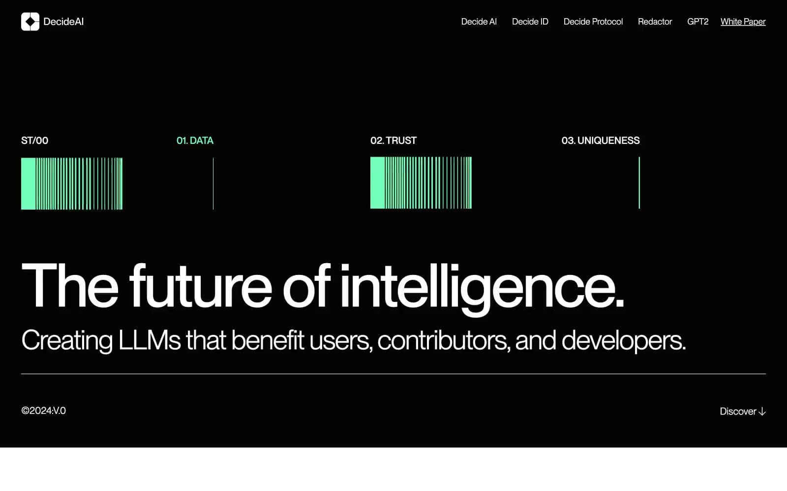
Giga. Midnight horizon above matte obsidian.
- AI
- Dark theme
- 10 colors
- 6 typefaces
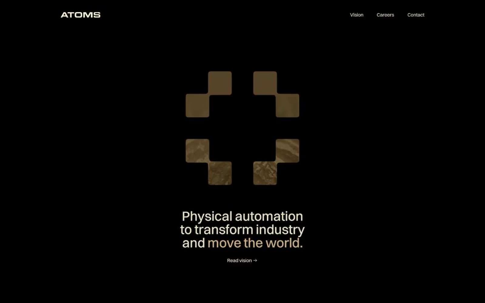
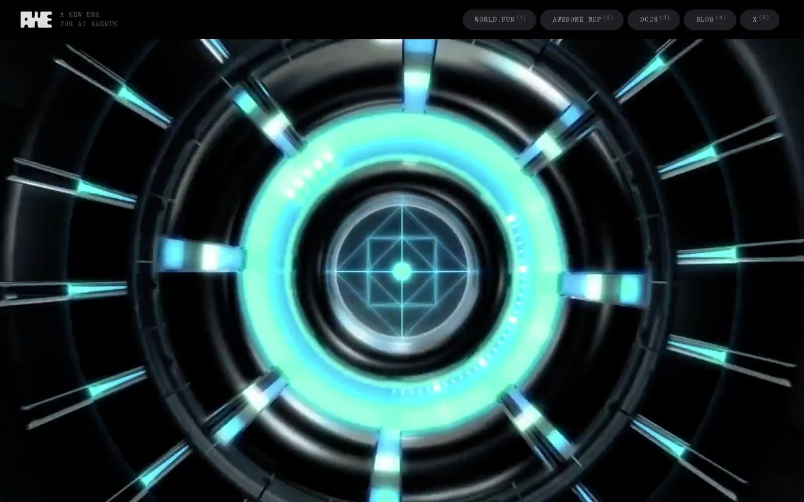
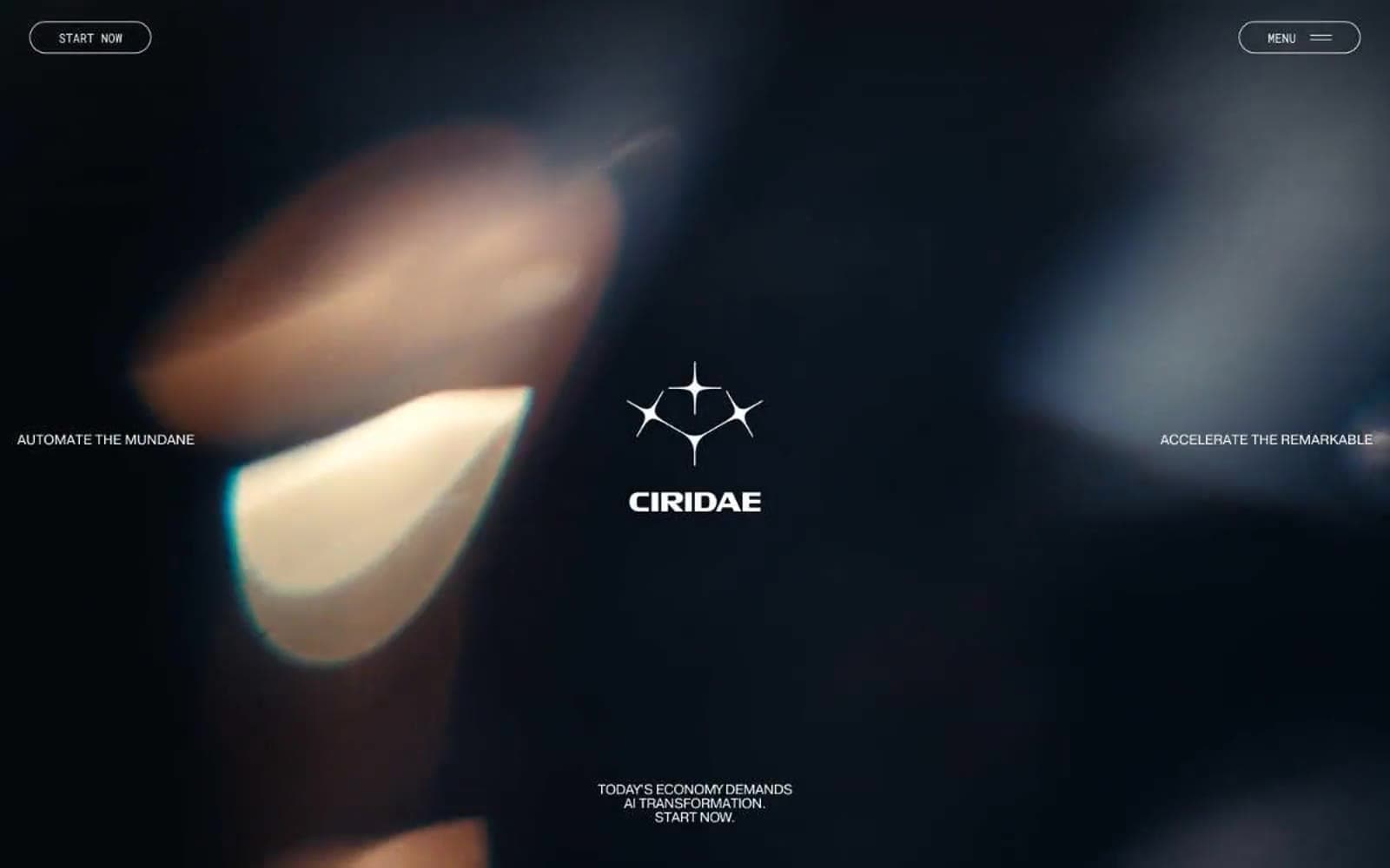
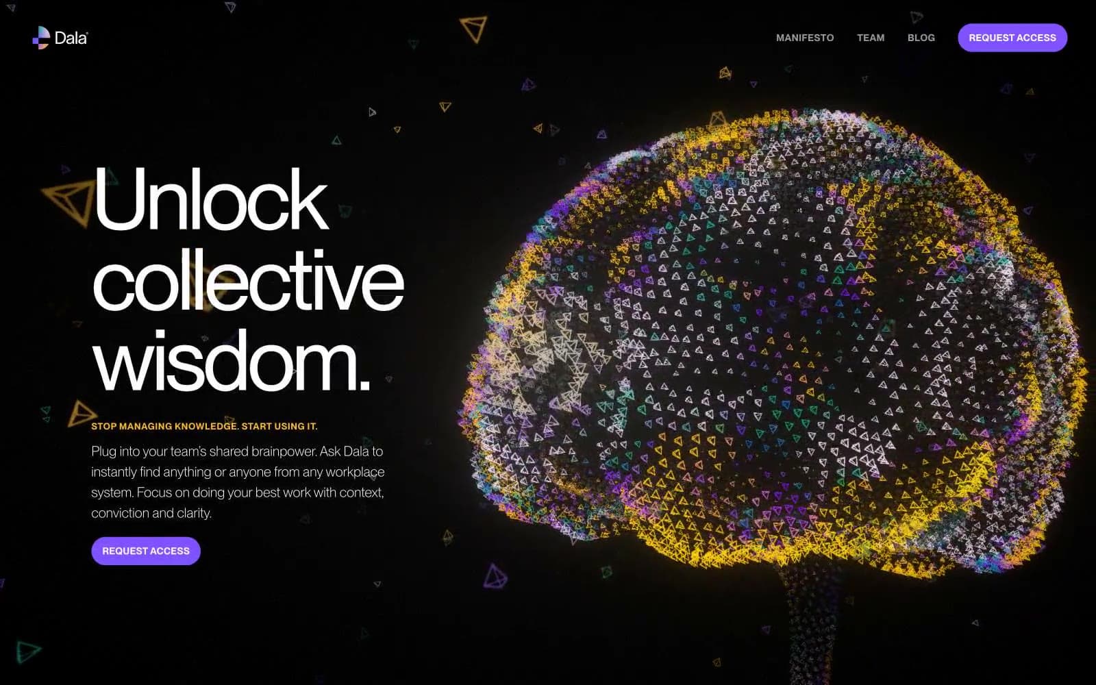
Giga is a cinematic, dark-mode enterprise brand that reads like a luxury watch ad crossed with an AI lab. The canvas is near-black (#0f0d0d) and the type is whisper-thin — emilioDisplay at weight 300 sets a 48–66px headline that floats above full-bleed atmospheric photography with the confidence of a film title card. The interface is restrained and quiet: pill-shaped controls, glass-effect badges, monochrome logo strips, and a single ember-red accent (#fe2c02) that acts as punctuation rather than branding chrome. Every surface feels like it was pulled from a darkened showroom — matte blacks, hairline white-alpha borders, soft 16px card corners, and 9999px button radii that read as physical, not digital. Density is comfortable but the negative space is architectural, not empty: a section gap feels like turning a page in a coffee-table book.
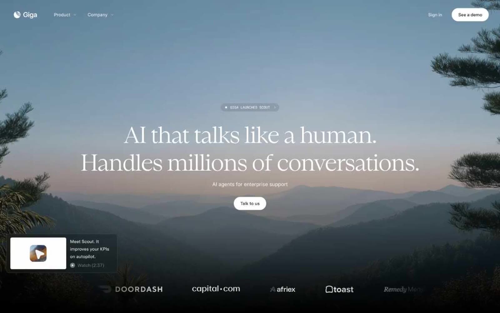
Giga design system

Brand1
Saturated accent for highlight cards and feature panels — the single chromatic punctuation in an otherwise monochrome system, evokes urgency and warmth without aggression
Neutrals9
Deepest background, hero image overlay, footer canvas, shadow base — pure black creates cinematic depth behind atmospheric photography
Near-black used in box-shadow tints and image depth effects — effectively black but with a barely-warm undertone matching Onyx
Primary page canvas (--bg), card surface, default button fill — the warm-tinted near-black that grounds the entire interface
Raised surface, dark button background (--button-dark-bg), elevated cards — one step lighter than the canvas to signal depth without drawing attention
Stepped feature panels, image containers, secondary surface layer — visible in side-by-side comparison modules
Tertiary text, decorative fills, disabled states, muted metadata — low-contrast informational layer
Secondary body text, descriptive copy, helper labels — sits at ~50% luminance, legible without competing with headlines
Mid-tone body text, inline labels, muted paragraph text — the readable middle gray for longer descriptions
Primary text, icons, light button text, filled button surface (--primary) — pure white on near-black achieves 19:1 contrast, the highest readable tier
Try a pairing
Pick any two colors from the palette to check whether text stays readable on top.
Aa
Obsidian on Ember Red
5.58 : 1 contrast
- Body textPasses AA 4.5
- Large textPasses AA 3
- StrictFails AAA 7