
Function. Warm apothecary journal on parchment.
- Brand
- Light theme
- 9 colors
- 3 typefaces
Function reads like a premium editorial wellness journal printed on warm cream paper: a serif display voice (Financier) delivers headlines with quiet authority while a humanist sans (Ftbase) carries the body language of a calm clinician. The canvas is never sterile white — every surface sits in a warm parchment range from #fef9ef to #f5eee1, and a single terracotta accent (#b05a36) punctuates actions, badges, and icon strokes like a wax seal on an apothecary label. Components are rounded generously (24px cards, 40px buttons, 9999px pills) but never feel toy-like because shadows are used sparingly and only at two elevations. Italic serif words mixed with roman serif in the same headline create a typographic rhythm that's the system's strongest signature — health tech that trusts the reader to slow down.
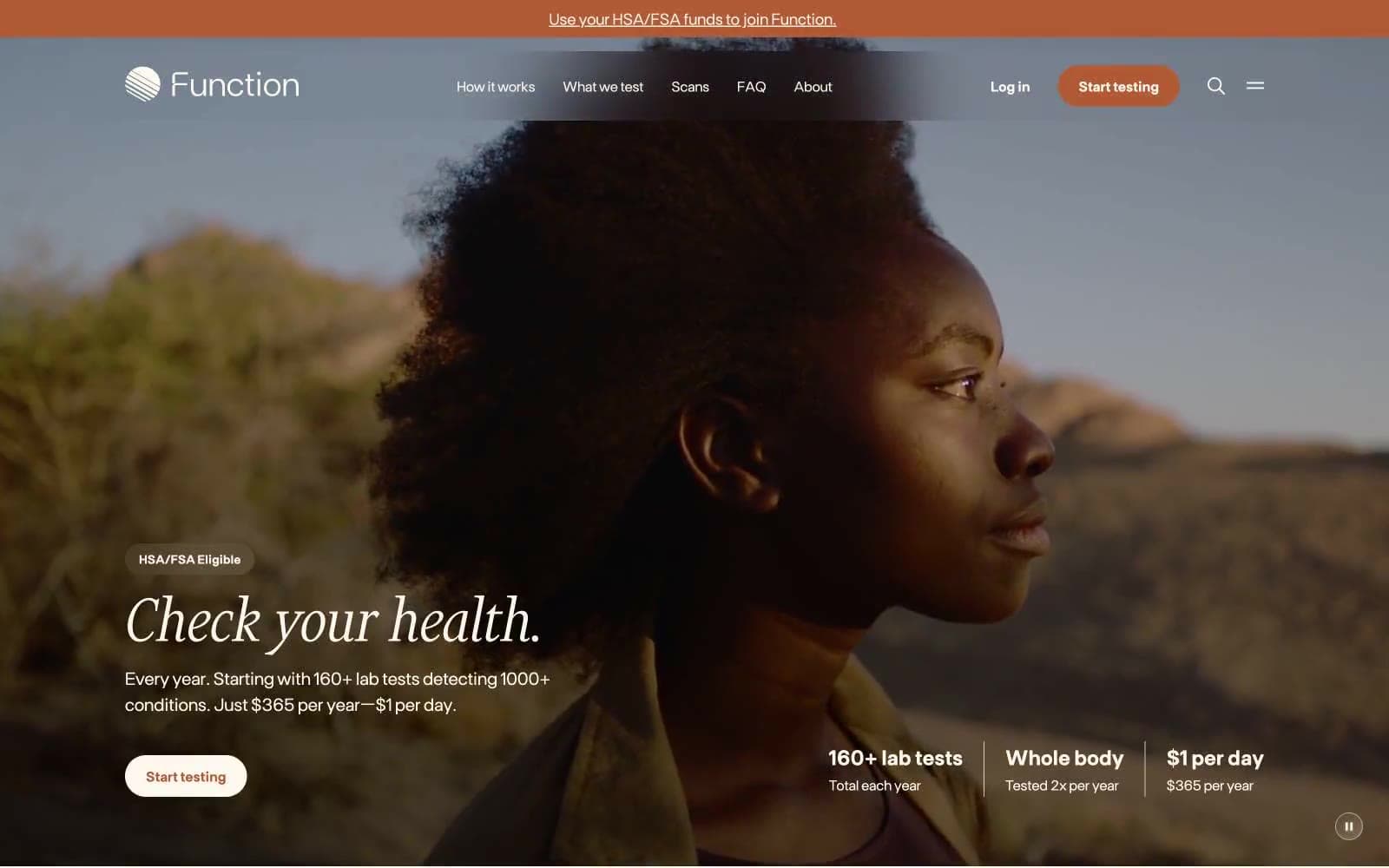
Function design system

Brand1
Primary action buttons, eyebrow labels, active states, icon strokes, key badges — a single warm rust against cream paper, evokes clinical warmth without medical sterility; Subtle hero overlay gradient from terracotta to a lighter tan — used on hero photo treatment and decorative seals, not on UI surfaces
Neutrals8
SVG fill default, logo mark — reserve for vector illustration, never use as text or background
Primary text, heading fills, strong borders — near-black with a barely-warm cast to harmonize with parchment rather than fight it
Secondary text, body copy, default icon fills, structural borders — slightly softer than Ink for reading-length passages
Muted helper text, captions, secondary metadata — never below 14px without sufficient weight to maintain AAA contrast on parchment
Input borders, disabled state outlines, placeholder text — the only cool-leaning neutral, used only on form elements
Hairline borders, divider lines, card outlines — replaces cold gray with a tone that belongs to the cream family
Card and panel surfaces, subtle wash backgrounds — one step deeper than the canvas to create soft elevation without shadows
Page canvas and primary surface — never use pure white; this warm off-white is the system's base tone
Try a pairing
Pick any two colors from the palette to check whether text stays readable on top.
Aa
Parchment on Pure Black
20.01 : 1 contrast
- Body textPasses AA 4.5
- Large textPasses AA 3
- StrictPasses AAA 7
More DESIGN.md files. Same web, different personalities.
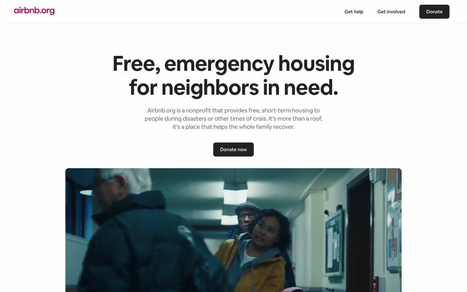
Airbnb
Brand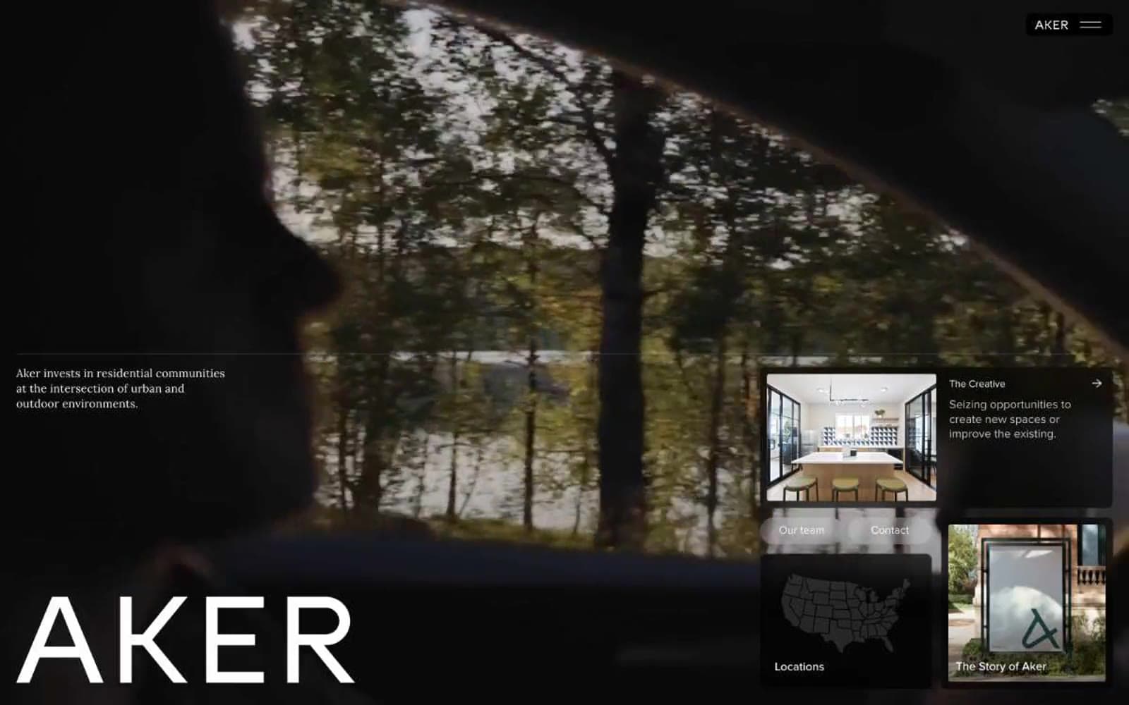
Aker
Brand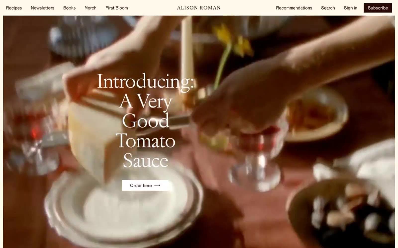
Alison Roman
Brand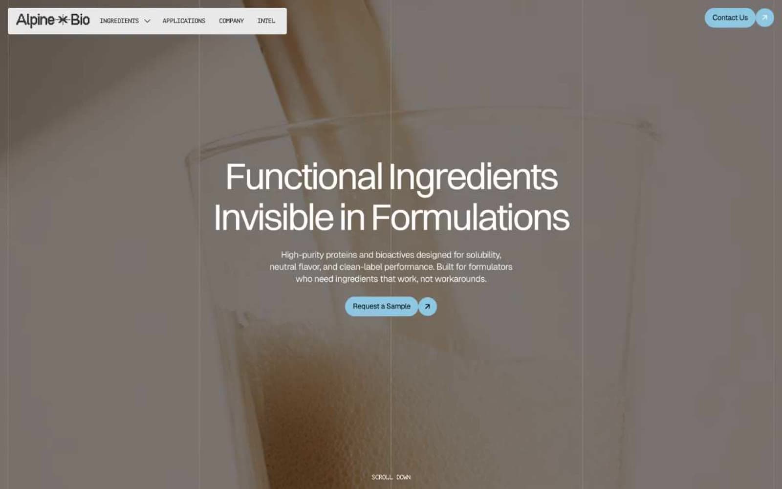
Alpine Bio
Brand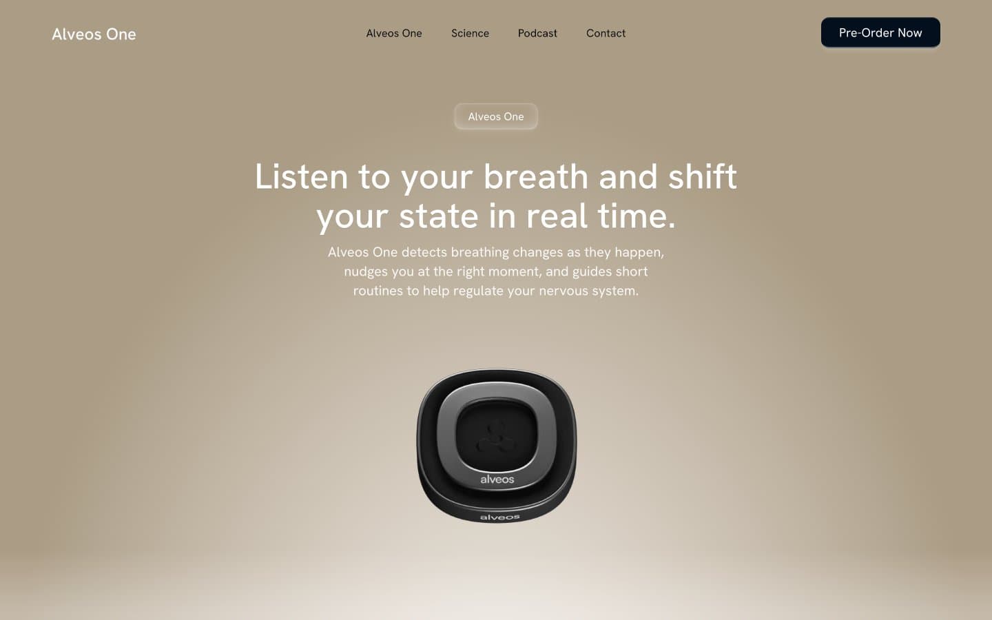
Alveos One
Brand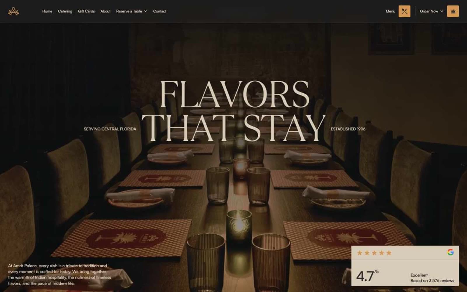
Amrit Palace
Brand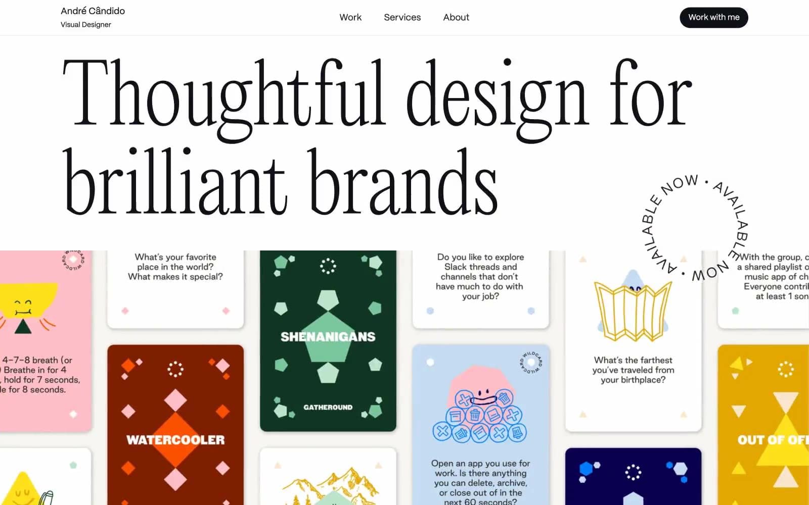
André Cândido
Brand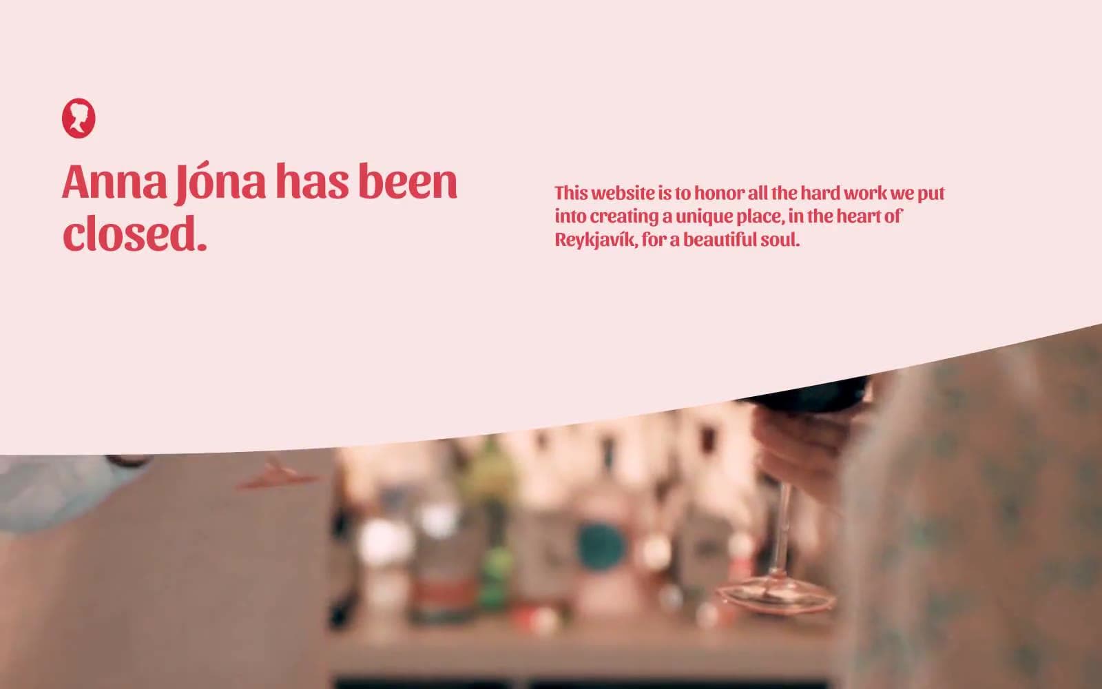
Anna Jóna
Brand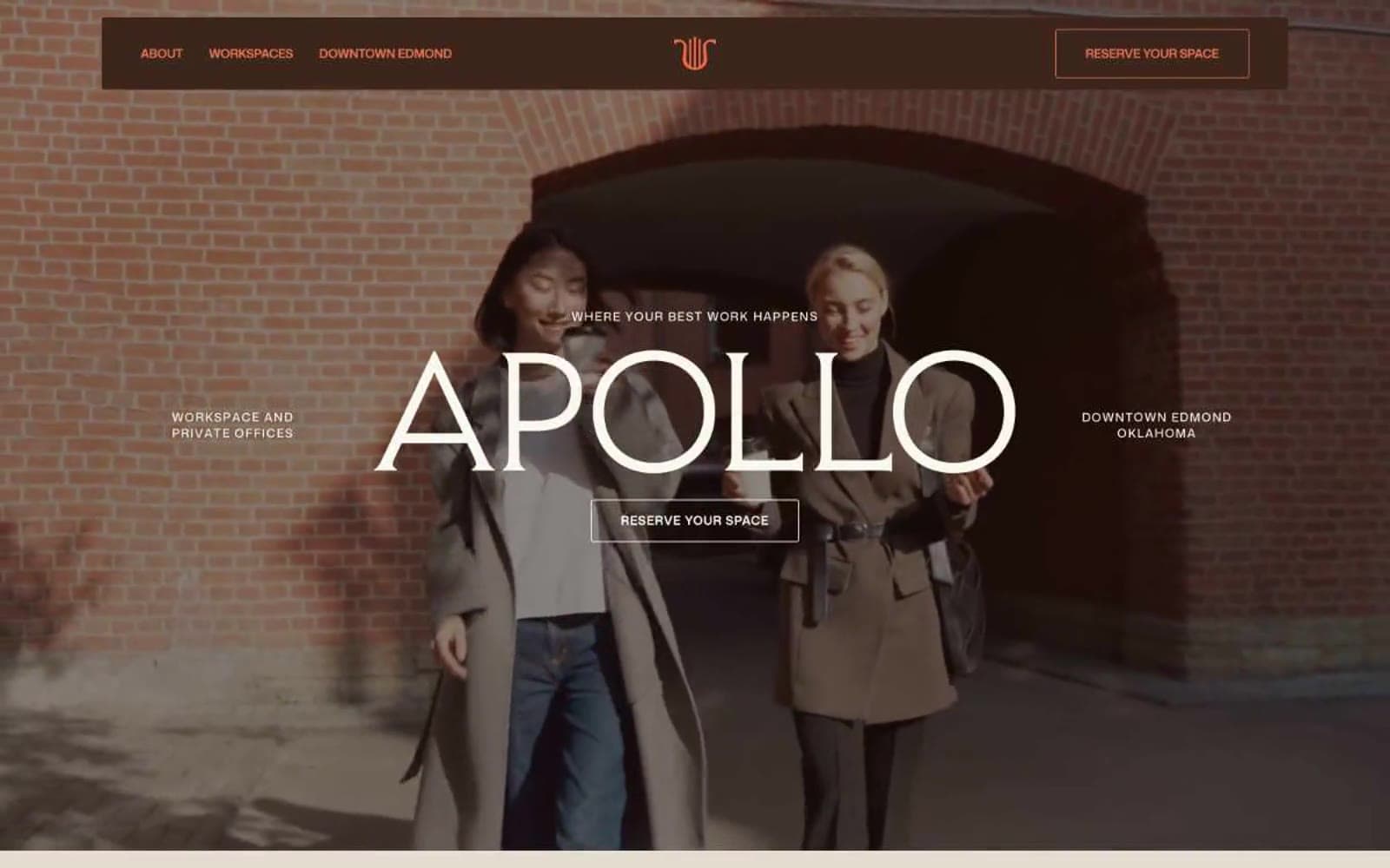
Apollo
Brand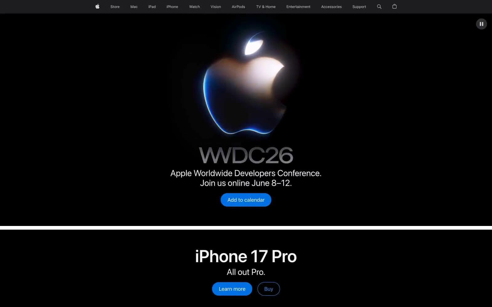
Apple
Brand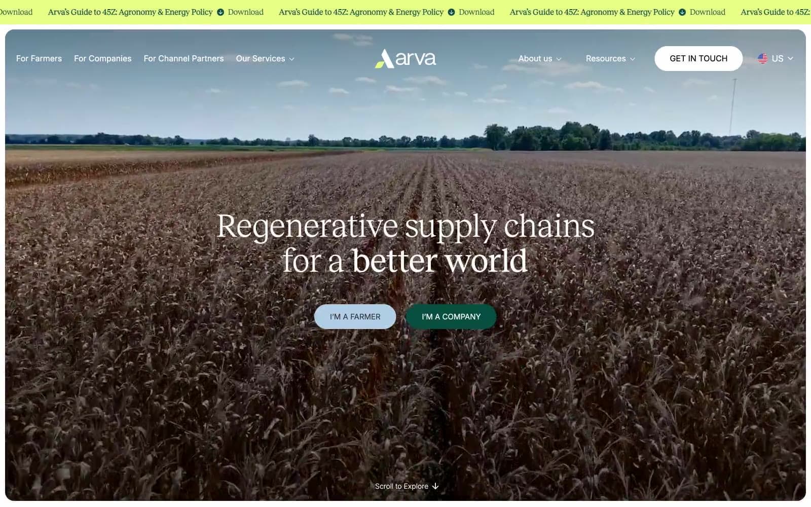
Arva
Brand
Ashton Bespoke
Brand


