
Fruitful. Warm cream surfaces, single deep green accent, botanical softness throughout.
- Finance
- Light theme
- 13 colors
- 1 typeface
Fruitful operates as a sunlit kitchen-table financial practice: warm cream surfaces replace the cold grays of typical fintech, and a single deep forest green acts as the only chromatic voice. Type carries the weight — large, tight-tracked display sizes (up to 91px) that feel hand-set rather than engineered, grounding an otherwise gentle interface. Components are rounded and soft (12px on most containers, 80px on pills), with photographic portraits of real Guides in large rounded frames replacing the abstract product shots common in the category. Elevation is nearly invisible — a single multi-layer shadow reserved for the deepest cards — and borders are thin and quiet. The overall rhythm is: generous whitespace, centered headline bands, 2–3 column card grids, and a warm-but-bright palette that keeps the experience feeling like advice from a friend, not a dashboard.
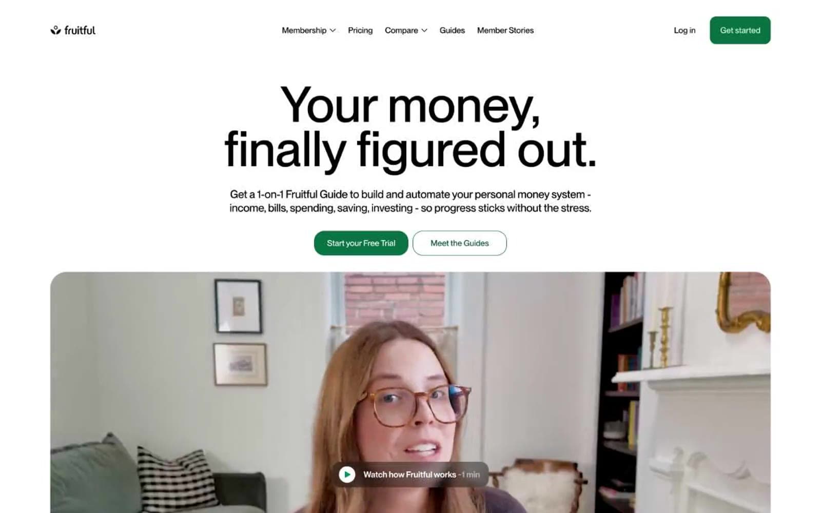
Fruitful design system

Brand2
Primary action buttons, active nav state, brand links — deep green against warm cream creates confident without corporate
Green outline accent for tags, dividers, and focused UI edges. Do not promote it to the primary CTA color
Accent5
Green decorative accent for icons, marks, and small graphic details. Do not promote it to the primary CTA color
Green outline accent for tags, dividers, and focused UI edges
Soft highlight panels, nav dividers, secondary surface washes — pale botanical tint that adds warmth without saturation
Decorative headings, card borders in warm compositions — toasted brown that bridges cream surfaces and deep green CTAs
Decorative icon and card stroke accent in warm layouts — softer sibling of the brown heading color
Neutrals6
Primary headings, body text, hairline borders, icon strokes — the structural baseline across all surfaces
Body copy, helper text, muted descriptions — warm-leaning gray that reads softer than pure black
Dominant card and section background, hero video backdrop — the signature warm canvas that replaces standard gray
Card surfaces on white pages, nav background, secondary panel fill — the only cool neutral, used sparingly
Alternate card surface, image containers — near-white neutral for layering above the cream
Page background, nav surface, inverse text on green CTAs — the base layer beneath all warm washes
Try a pairing
Pick any two colors from the palette to check whether text stays readable on top.
Aa
Paper White on Forest Floor
5.84 : 1 contrast
- Body textPasses AA 4.5
- Large textPasses AA 3
- StrictFails AAA 7
More DESIGN.md files. Same web, different personalities.
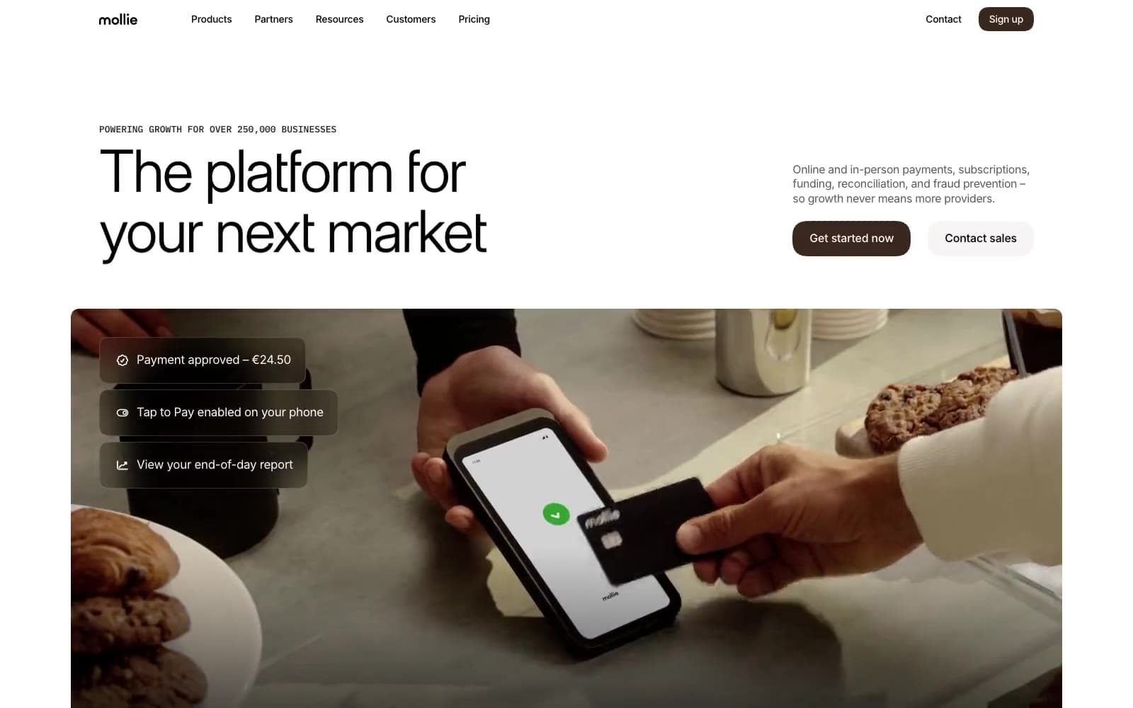
Mollie
Finance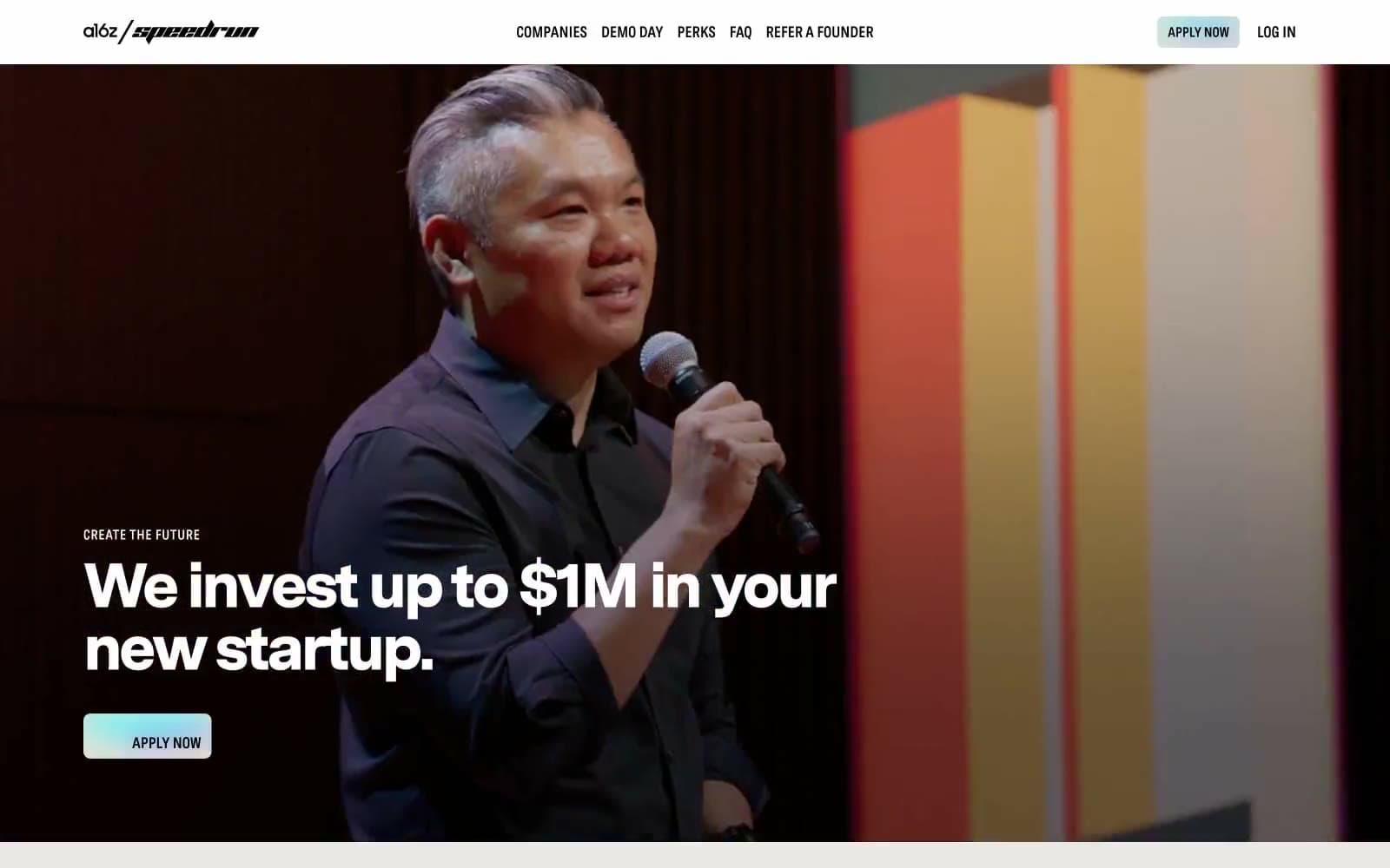
a16z speedrun
Finance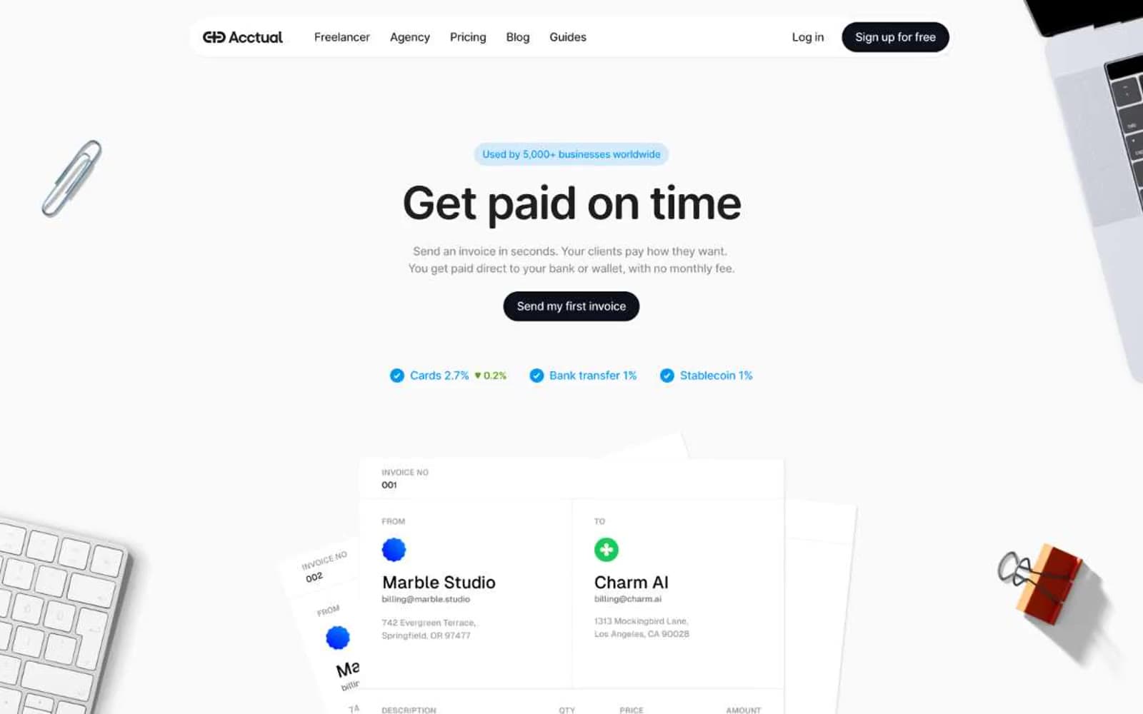
Acctual
Finance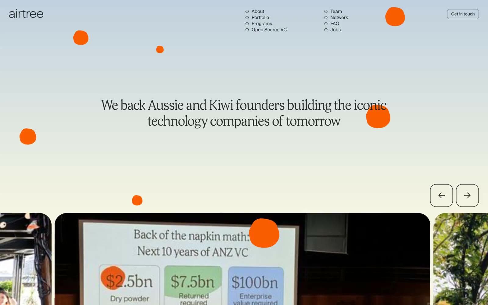
Airtree
Finance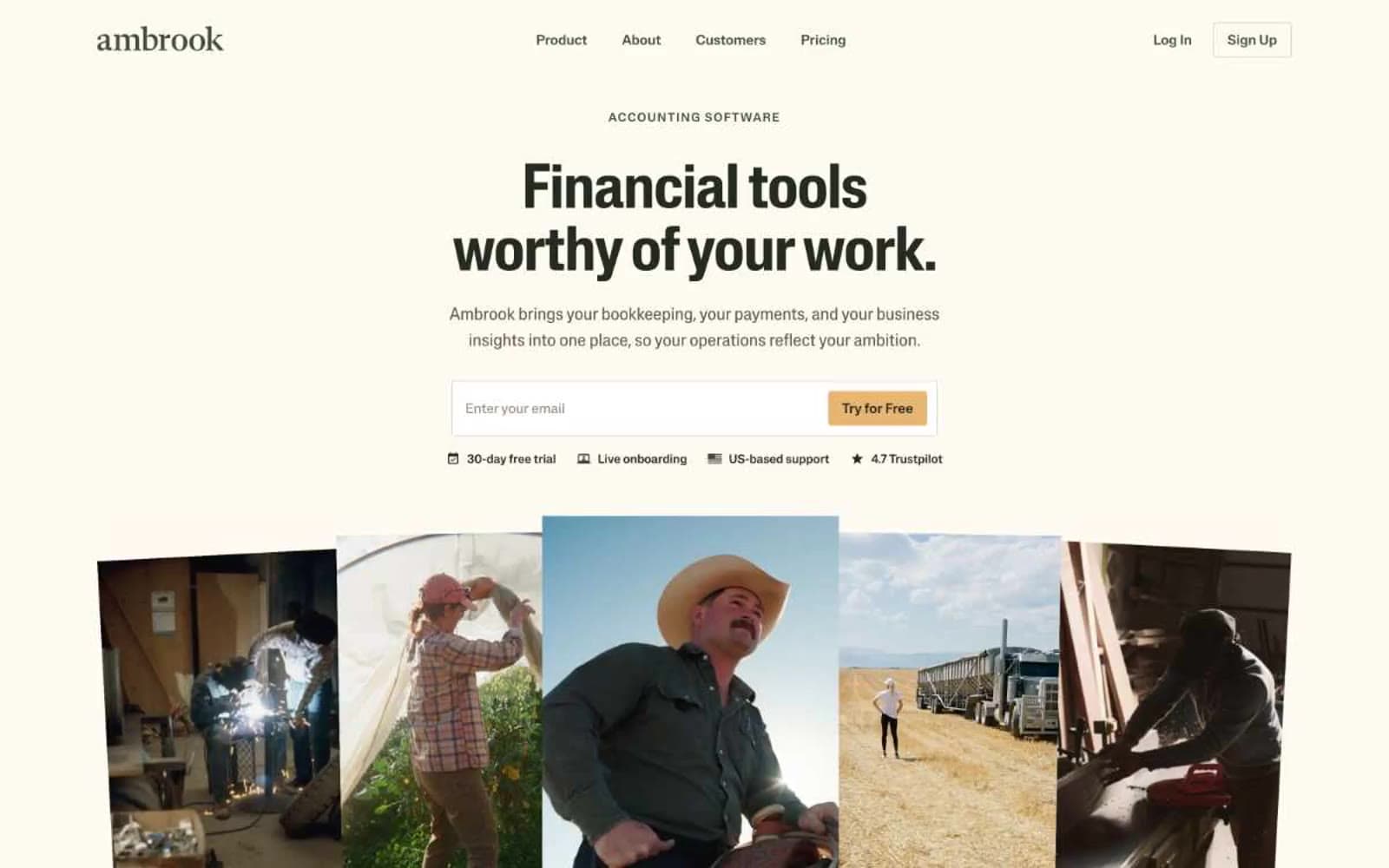
Ambrook
Finance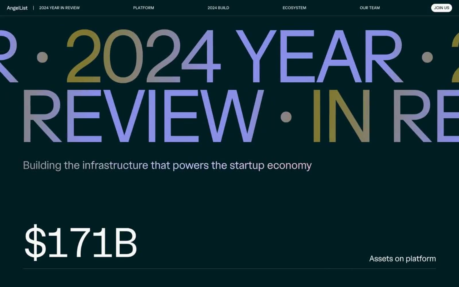
Angellist 2024
Finance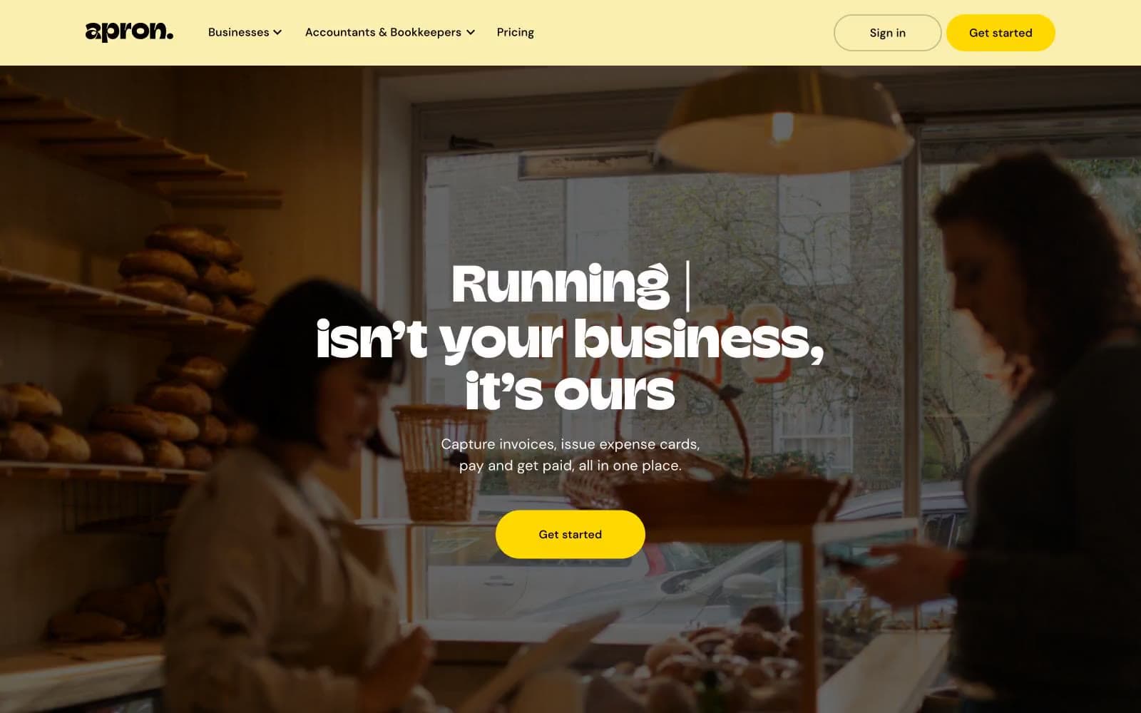
Apron
Finance
Baselayer
Finance
Basis Theory
Finance
BlueYard Capital
Finance
Brex
Finance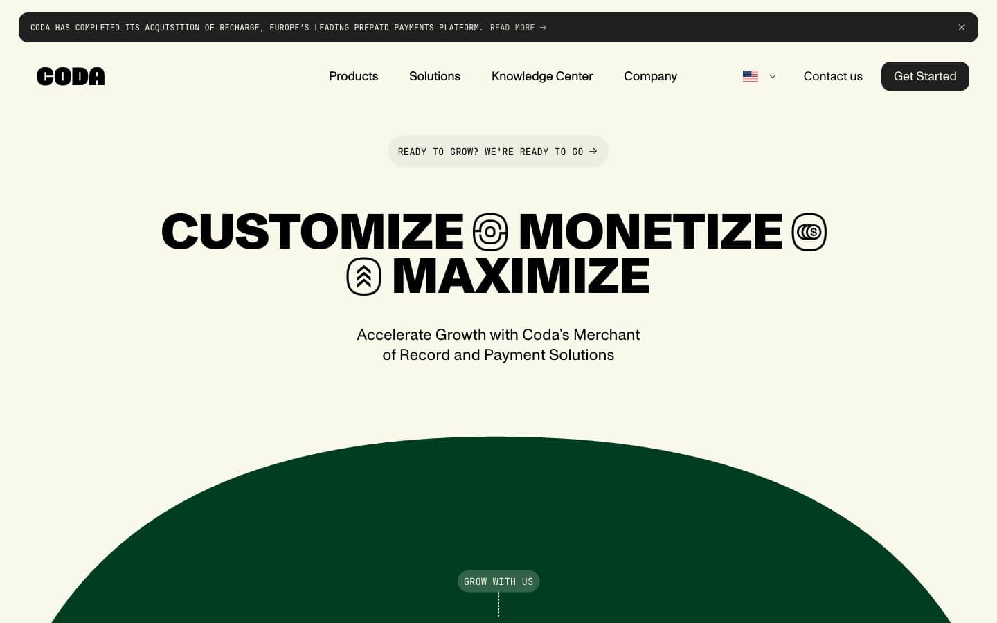
Coda
Finance


