
Fold. Bauhaus poster on fog.
- Finance
- Light theme
- 12 colors
- 2 typefaces
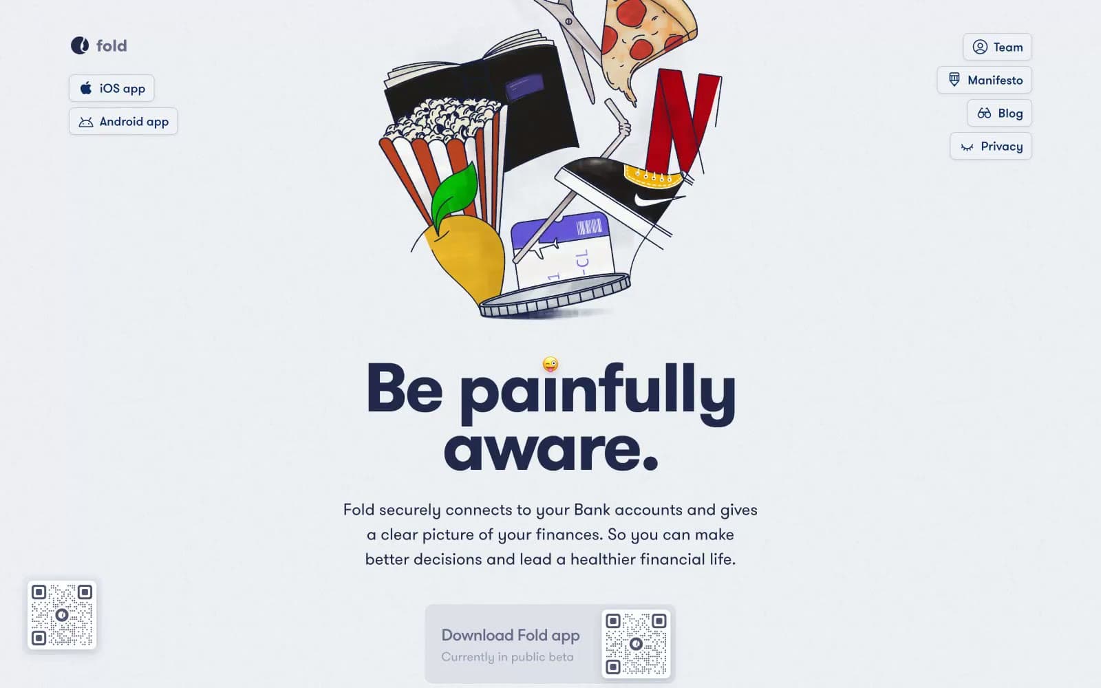
Fold's visual language is a bright, spacious fintech workspace built on a cool-tinted near-white canvas. Deep midnight navy (#20294c) carries the weight of authority in headlines and body text, while a softer cornflower (#375390) handles borders, icons, and secondary surfaces. The interface stays predominantly achromatic with a single electric blue accent (#459af8) for interactive elements and links. Cards float on generous white surfaces with soft, large-radius shadows tinted in navy rather than gray — the shadows themselves are on-brand. Typography is confidently large: the hero headline at 100px with extreme negative tracking makes the page feel like a poster rather than a web app, while everything else stays calm and geometric through GT Walsheim Pro's rounded forms. The mood is honest and confrontational, reinforced by the illustration style of 3D-ish lifestyle objects (pizza, popcorn, phone) rendered with crisp edges and minimal backgrounds.
Fold design system

Brand4
Violet text accent for links, tags, and emphasized short phrases. Do not promote it to the primary CTA color
Borders, icon strokes, secondary text, tag outlines — a desaturated cousin of midnight used for structural elements that recede from primary copy
Deepest accent, used in illustration borders and dark-image frames — almost black but with a navy cast
Outlined action border, rarely used — a lighter cornflower for ghost buttons that need a subtle border presence
Accent2
Inline links, active nav text, small accent dots — the only high-chroma blue, used sparingly to signal clickable moments
Rare highlight on a single featured card or callout — used once or twice per page maximum as a visual shock
Neutrals6
Secondary headings, icon fills in illustrations, mid-weight body — between smoke and midnight for visual rhythm
Light text on dark surfaces, inverse labels, and high-contrast captions.
Hairline borders, inactive dividers, muted list separators — cool-tinted gray that vanishes against fog but defines against white
Soft borders on light cards, subtle background washes — a step between fog and silver for layered surfaces
Page canvas, subtle card fills, list backgrounds, nav backdrop — the off-white base layer that gives the navy its depth
Card surfaces, button text on dark fills, elevated panels — the topmost surface that sits above fog
Try a pairing
Pick any two colors from the palette to check whether text stays readable on top.
Aa
Pure White on Midnight Navy
14.16 : 1 contrast
- Body textPasses AA 4.5
- Large textPasses AA 3
- StrictPasses AAA 7
More DESIGN.md files. Same web, different personalities.

Mollie
Finance
a16z speedrun
Finance
Acctual
Finance
Airtree
Finance
Ambrook
Finance
Angellist 2024
Finance
Apron
Finance
Baselayer
Finance
Basis Theory
Finance
BlueYard Capital
Finance
Brex
Finance
Coda
Finance


