
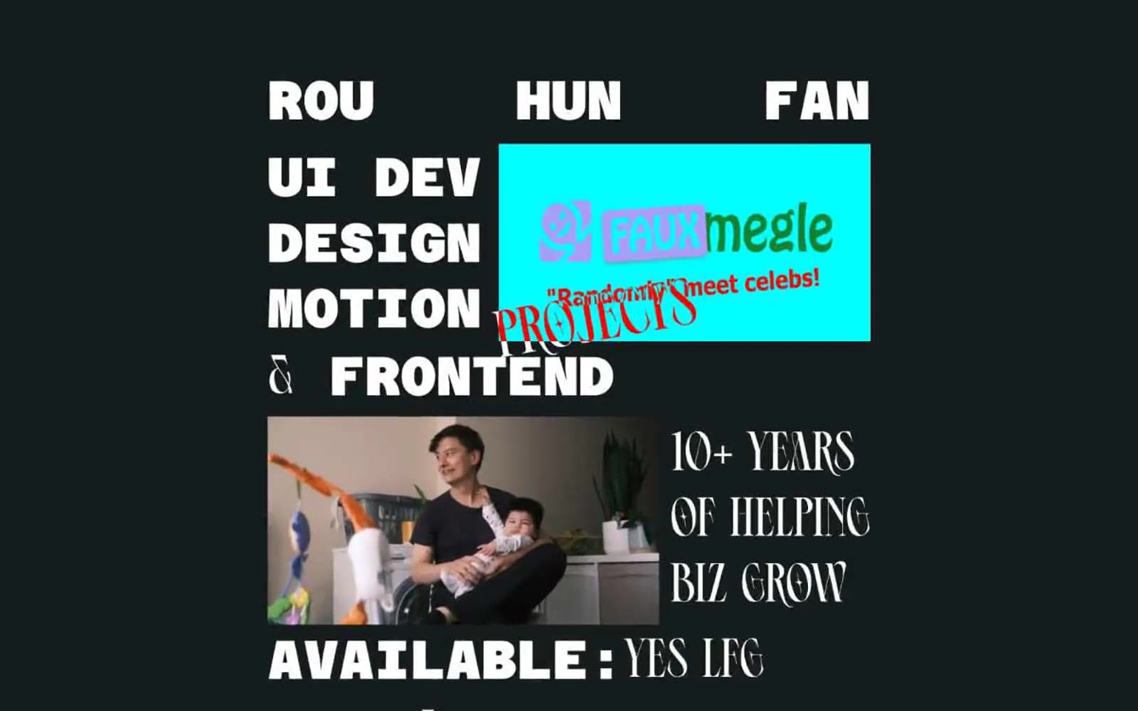
Flowen. Riso-printed zine on black construction paper.
- Studio
- Dark theme
- 5 colors
- 3 typefaces
A brutalist editorial portfolio for an independent frontend developer: near-black canvas, oversized condensed display type, and a single high-saturation accent block that detonates against the void. Layout behaves like a printed magazine spread — text breaks across asymmetric columns, type meets image at hard edges, and whitespace is used as a structural element rather than padding. The signature move is the cyan card with magenta display text that feels pasted onto the page like a sticker, breaking the monochrome discipline. Typography carries all the weight: a monospaced geometric for system voice, a heavy condensed sans for shouting, and a calligraphic script for editorial flourishes that humanize the machine aesthetic.
Flowen design system

Accent3
Accent card backgrounds, highlight panels — flat saturated cyan that screams against the dark canvas, reserved for project cards and editorial callout blocks
Display text on cyan cards, decorative script flourishes — hot pink/magenta used only as ink-on-cyan contrast or as editorial accent
Supporting palette color for small decorative accents when the core palette needs contrast.
Neutrals2
Page canvas and section backgrounds — near-true-black maximizes the contrast pop of white type and saturated accent blocks
Primary text, display headlines, borders, and link strokes — the only voice for the majority of the page
Try a pairing
Pick any two colors from the palette to check whether text stays readable on top.
Aa
Carbon on Voltage Cyan
13.80 : 1 contrast
- Body textPasses AA 4.5
- Large textPasses AA 3
- StrictPasses AAA 7
More DESIGN.md files. Same web, different personalities.

Basement Studio
Studio
Production Portugal
Studio
Active Theory
Studio
Adnaut
Studio
Agence K72
Studio
Akash Tyagi
Studio
Analogue
Studio
Athletics
Studio
BAM Photographers
Studio
Bareis + Nicolaus
Studio
Becklyn
Studio
Branding
Studio


