
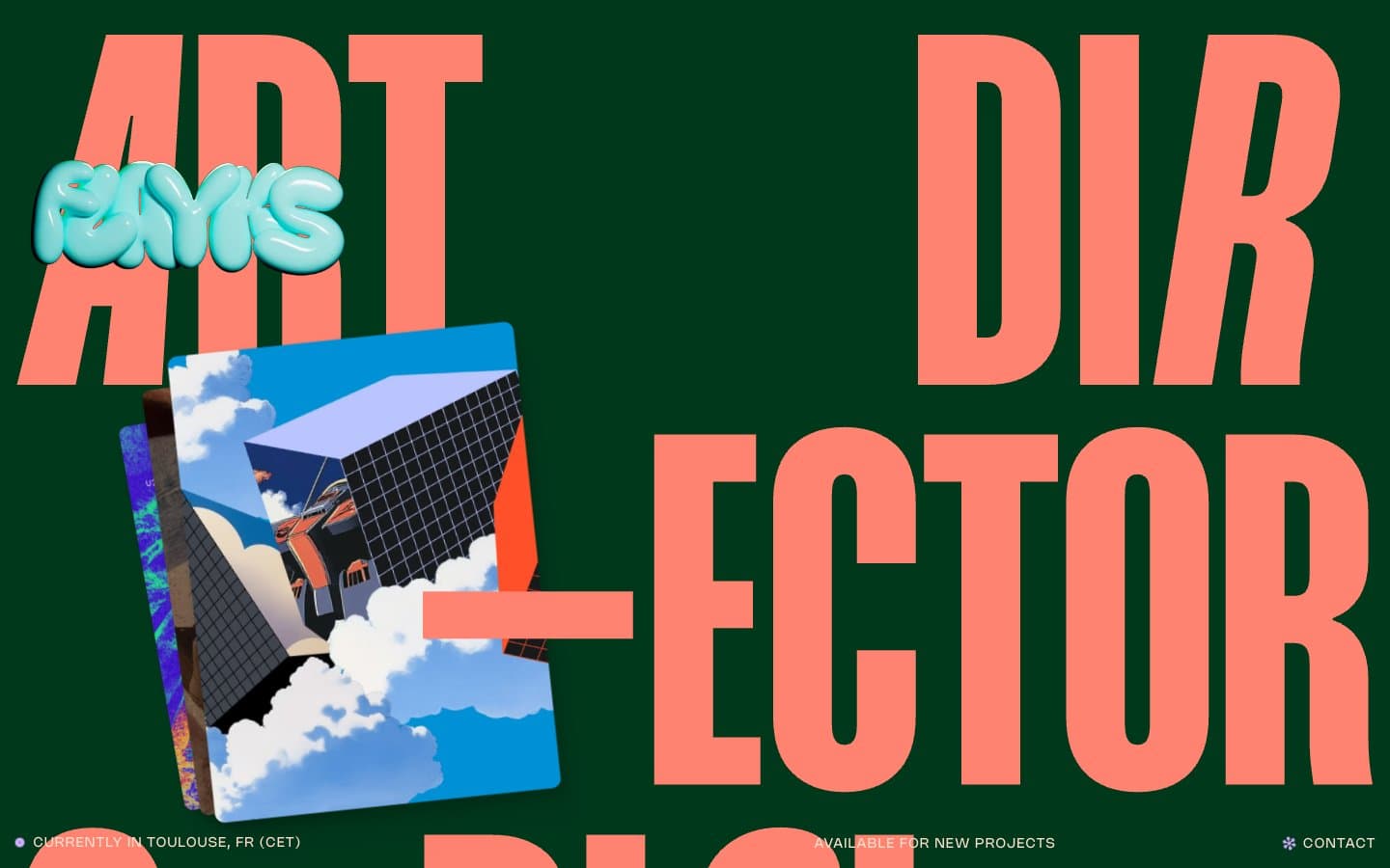
Flayks. Dark forest green page, peach ink headlines bleeding off the page edges, tiny Nohemi caption text anchoring the corners.
- Studio
- Dark theme
- 15 colors
- 3 typefaces
Flayks is a maximalist editorial portfolio that treats every screen like a printed broadsheet: a deep forest-green canvas, oversized compressed display type that intentionally overflows the viewport, and a single warm peach tone as the dominant text and border color. The system pairs two custom typefaces — Mango Grotesque for monumental condensed headlines and Nohemi for the tiny UI chrome — creating an extreme scale contrast that defines the visual rhythm. Accents appear sparingly: coral-orange for emphasis type, lavender-violet for section labels and selected states. Surfaces are flat with a single deep shadow drop pattern on cards; 3D illustration tiles float above the canvas, slightly rotated, giving the page a tactile collage quality rather than a flat app feel.
Flayks design system

Brand2
Page canvas, section backgrounds — deep saturated green creates the base atmosphere; the page reads as forest-green, not black, which warms the dark theme and separates this system from generic dark-mode SaaS
Shadow and recessed surface tone — used in card drop-shadows and inner depth layers, the slightly darker shade of the canvas adds dimension without breaking the monochrome green field
Accent5
Display type accent, link text, emphasis headings — vivid warm orange that dominates the hero typography and section labels; against the green canvas it reads as high-energy poster ink, not a UI CTA color
Violet accent for outlined action borders, linked labels, and lightweight interactive emphasis.
Dramatic card surface for featured work tiles — deep saturated violet as an alternative canvas for highlight cards; high contrast with Peach Cream text
Accent card surface — vivid indigo for occasional card variants that need to feel different from the green field without going warm
Cool card surface — deep blue-teal for cards that need to break from the warm/green field with a cool note
Neutrals8
Deepest surface, button border, text on light card — true black reserved for max-contrast elements and neutral button outlines
Card surface, elevated panels, secondary dark surface — sits one step off pure black, warm enough to harmonize with the green canvas, used for the back-layer of illustrated artwork tiles
Neutral card surface variant for utility panels — cool-tinted alternative to Charcoal for sections that need to feel mechanical rather than warm
Body background panels, list dividers, utility surfaces — desaturated green that sits between Forest Ink and the cream text, used for secondary content blocks and list separators
Muted card surface — dusty violet for low-priority cards and section dividers
Muted neutral card surface — desaturated warm gray for low-emphasis panels
Primary text, hairline borders, outlined-action strokes — the system's only near-gray warm tone; carries the majority of legibility weight and acts as the universal border color across lists, cards, and images. Outlined ghost-button stroke color
Secondary text, decorative stroke and fill accents — a slightly cooler cream for subtle differentiation from Peach Cream without breaking the warm neutrals family
Try a pairing
Pick any two colors from the palette to check whether text stays readable on top.
Aa
Bone on Forest Ink
11.11 : 1 contrast
- Body textPasses AA 4.5
- Large textPasses AA 3
- StrictPasses AAA 7
More DESIGN.md files. Same web, different personalities.
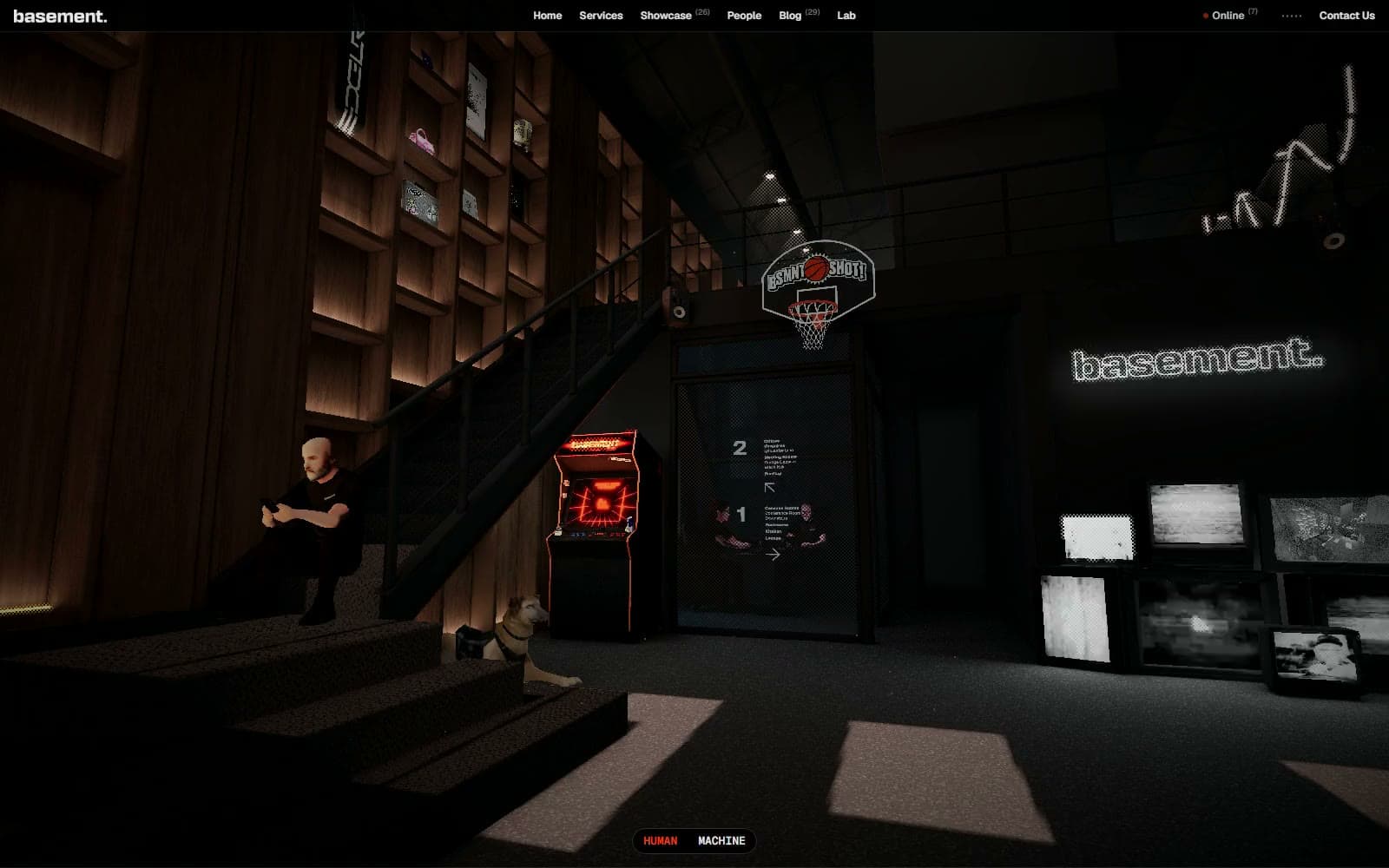
Basement Studio
Studio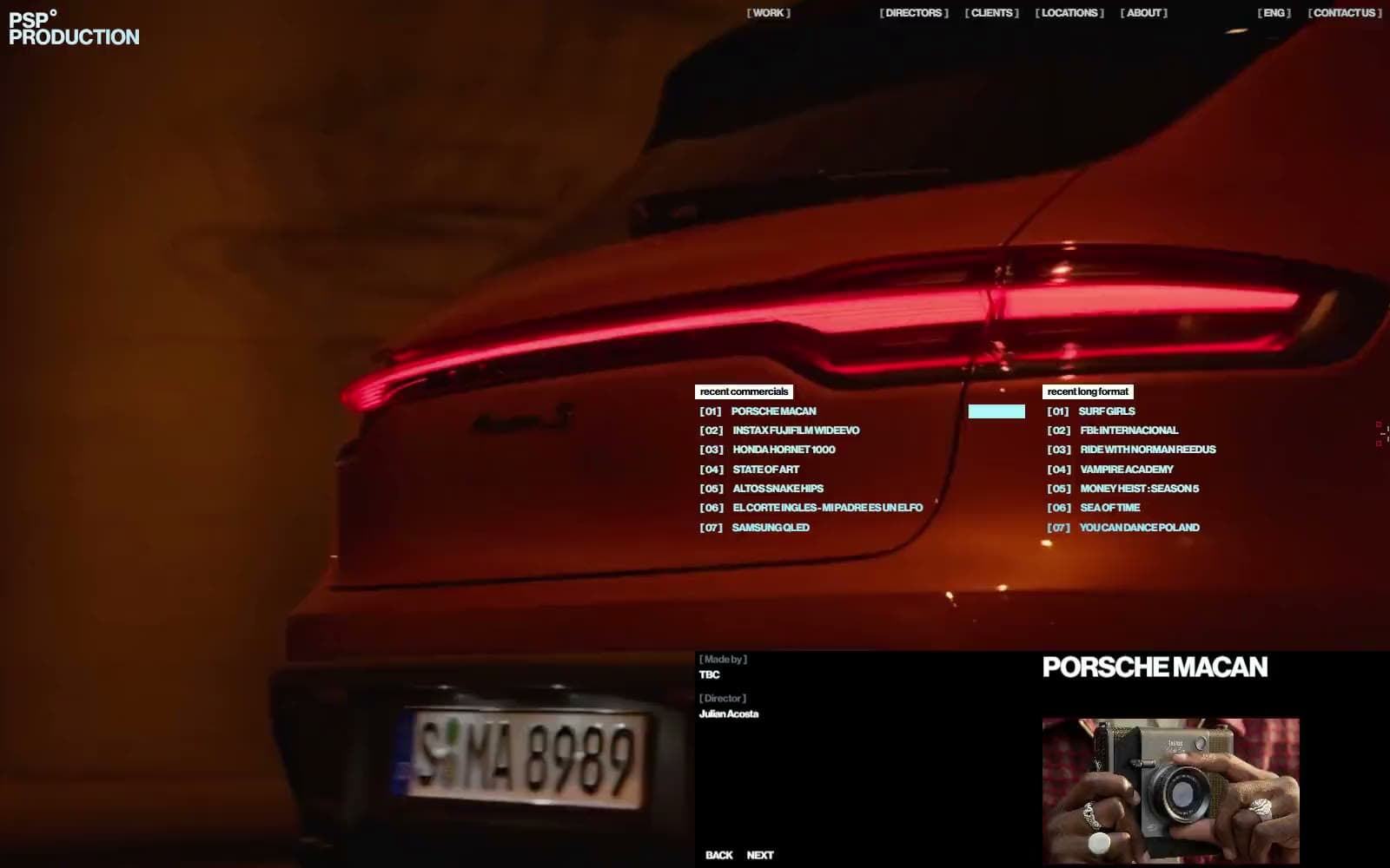
Production Portugal
Studio
Active Theory
Studio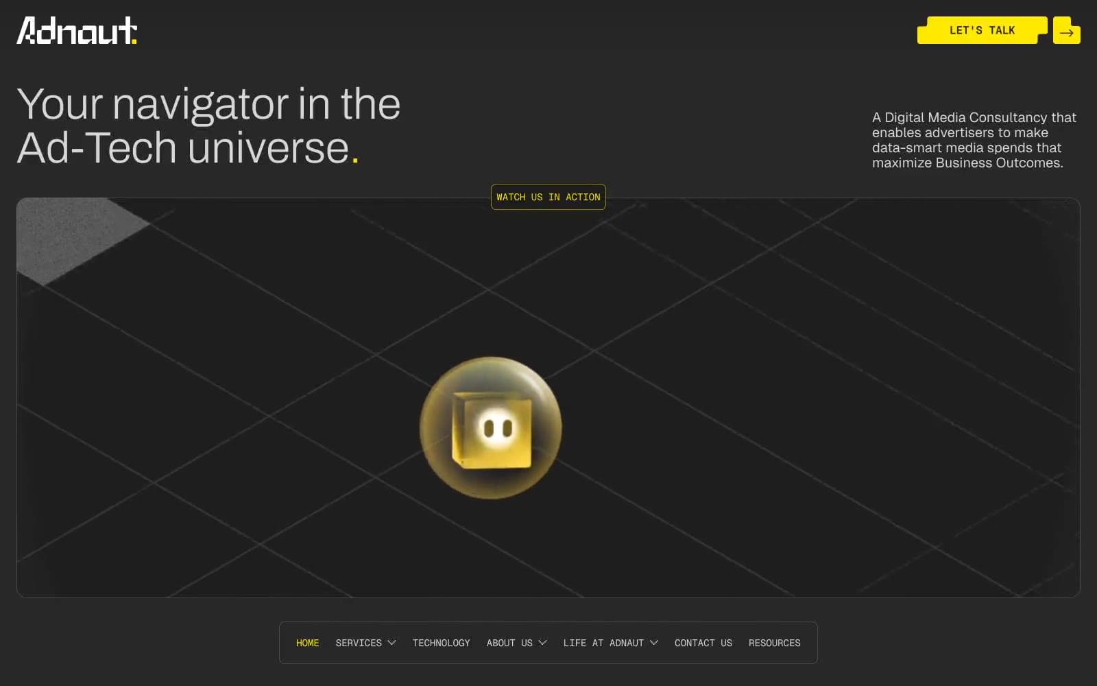
Adnaut
Studio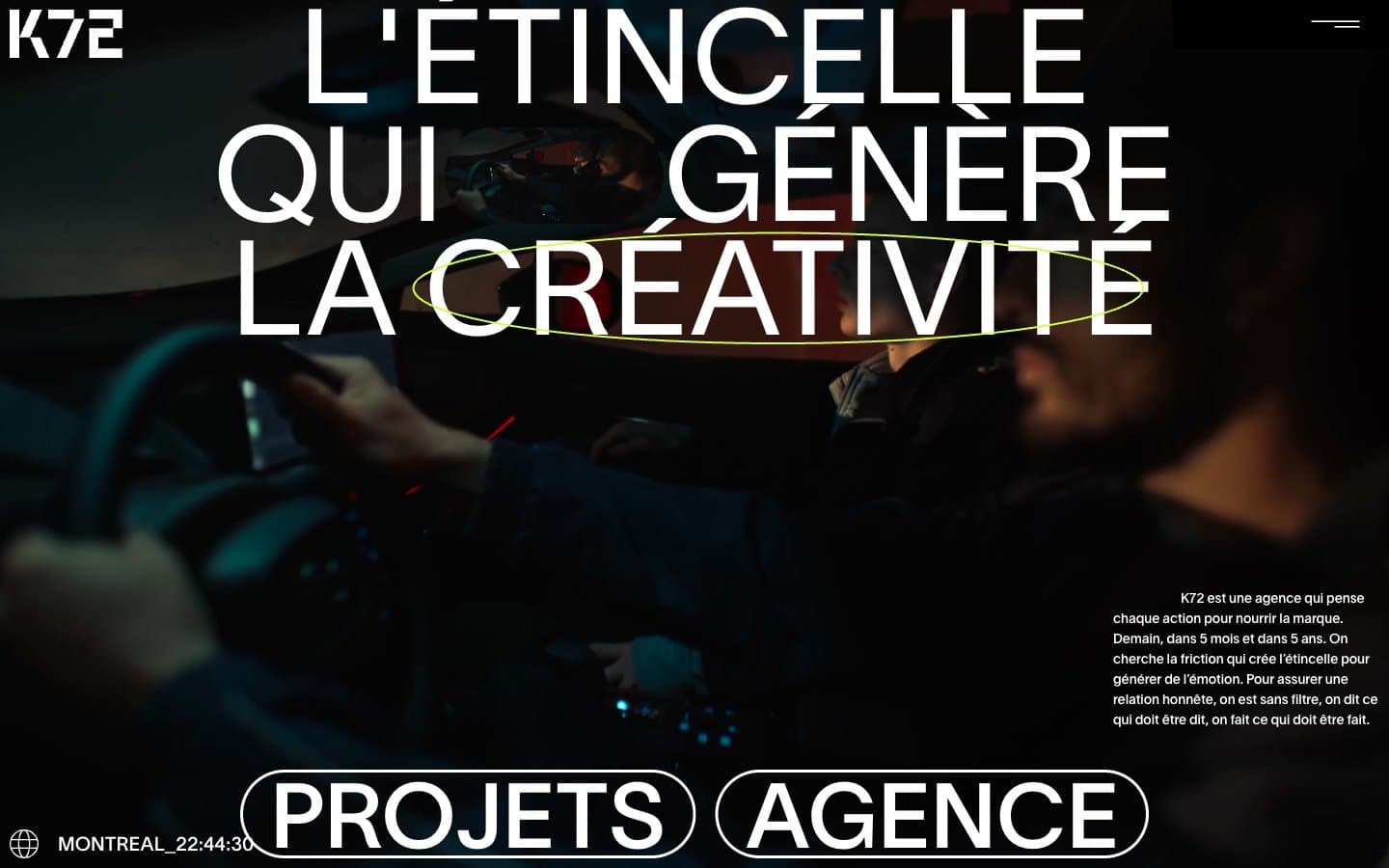
Agence K72
Studio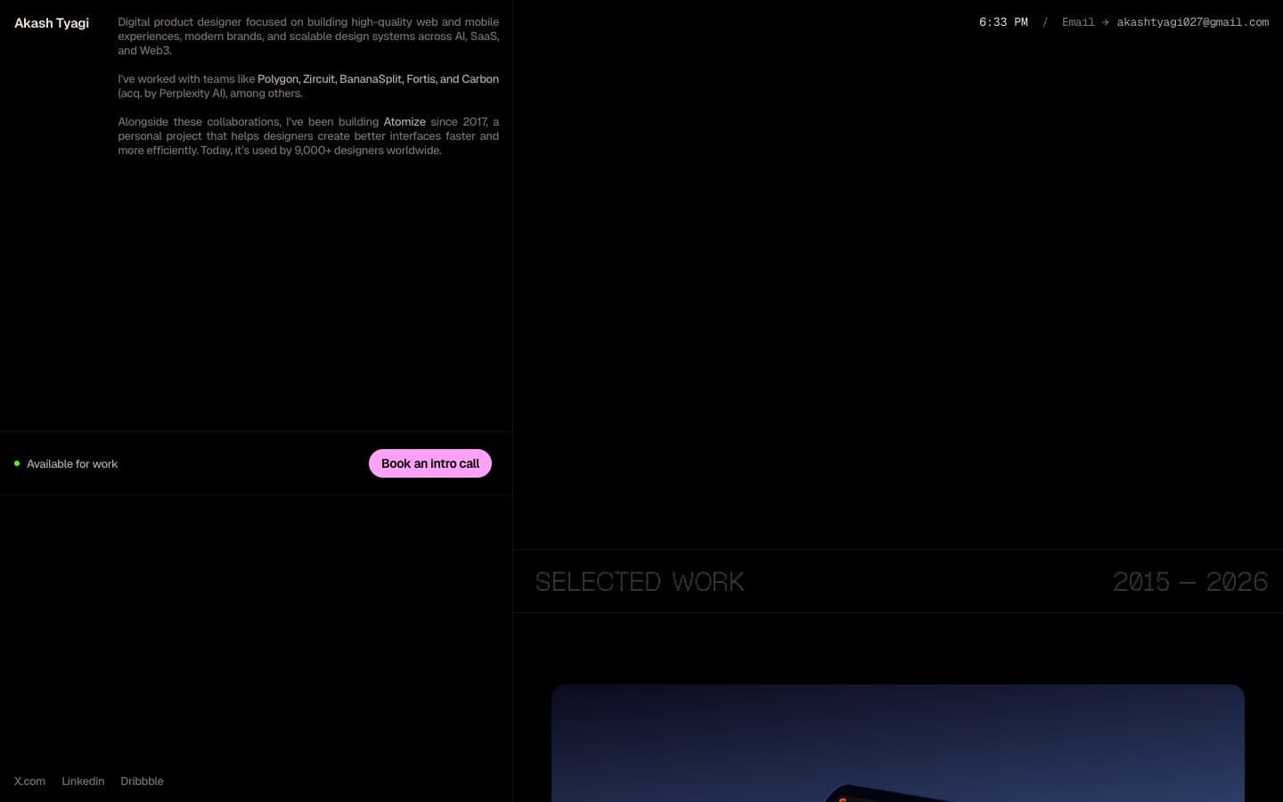
Akash Tyagi
Studio
Analogue
Studio
Athletics
Studio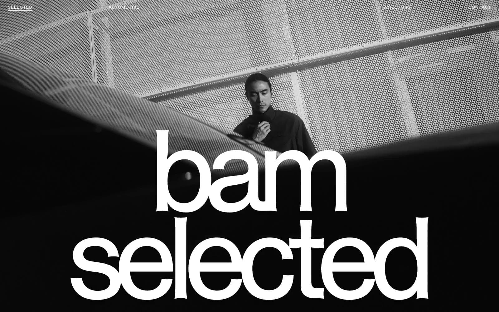
BAM Photographers
Studio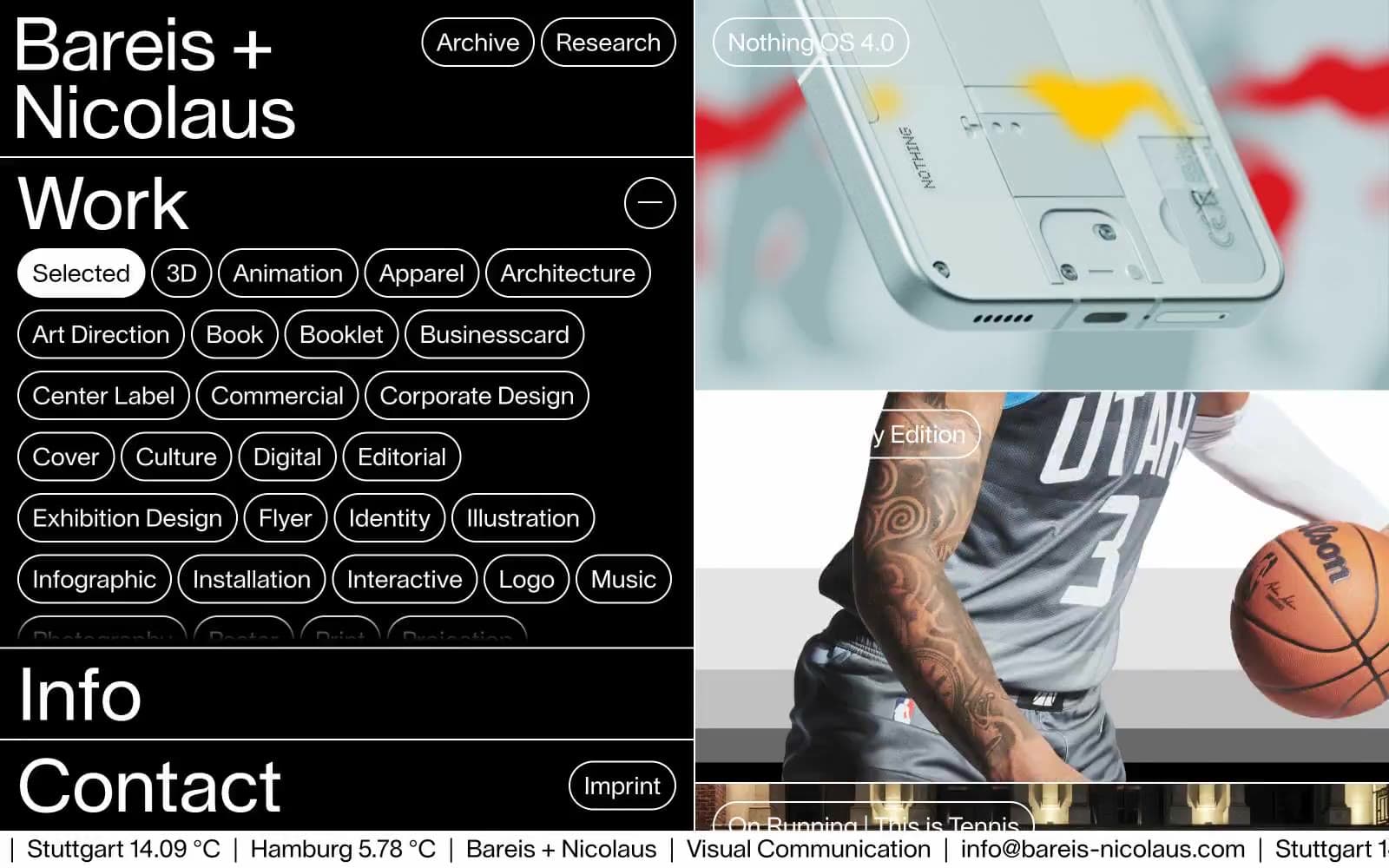
Bareis + Nicolaus
Studio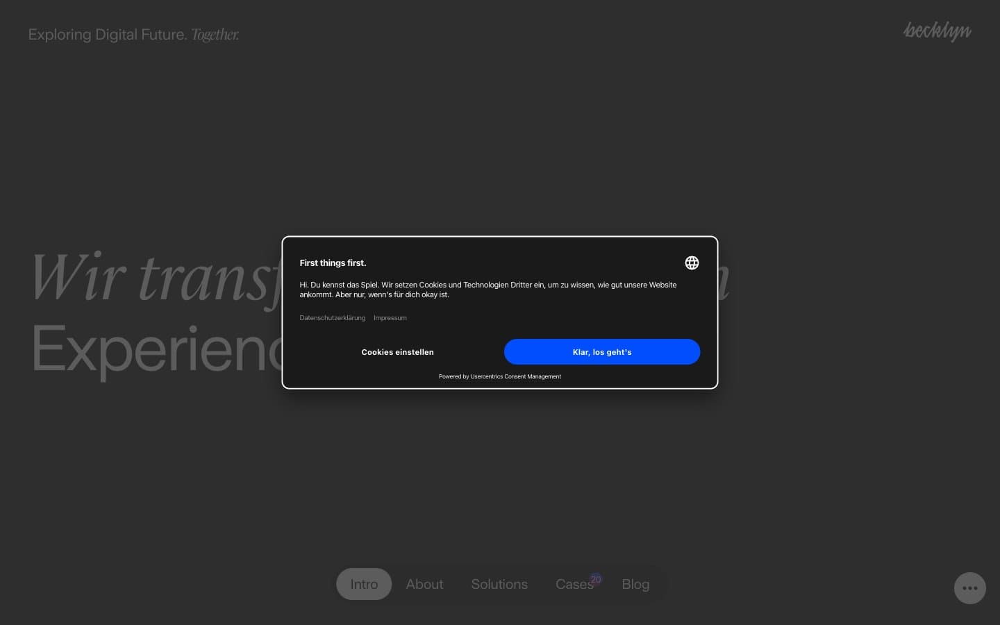
Becklyn
Studio
Branding
Studio


