
Figura. Black-box gallery with neon-white typography.
- Studio
- Dark theme
- 8 colors
- 2 typefaces
Figura operates in a stark monochrome register — a pitch-black canvas (#000000) with white typography that sits on the page like neon signage. The system is built on extreme contrast, not decoration: nothing competes with the words, the work, or the whitespace. White surfaces (the product mockup card) function as proscenium stages that interrupt the dark, creating a cinematic reveal between black sections. The visual attitude is confident and unapologetic — a design studio that bills itself as 'no design thinking theater' should look like one. Type does the heavy lifting: Inter Display in tight tracking for headlines, Geist Mono in wide tracking for small labels, creating a typographic duet between editorial prose and technical metadata.
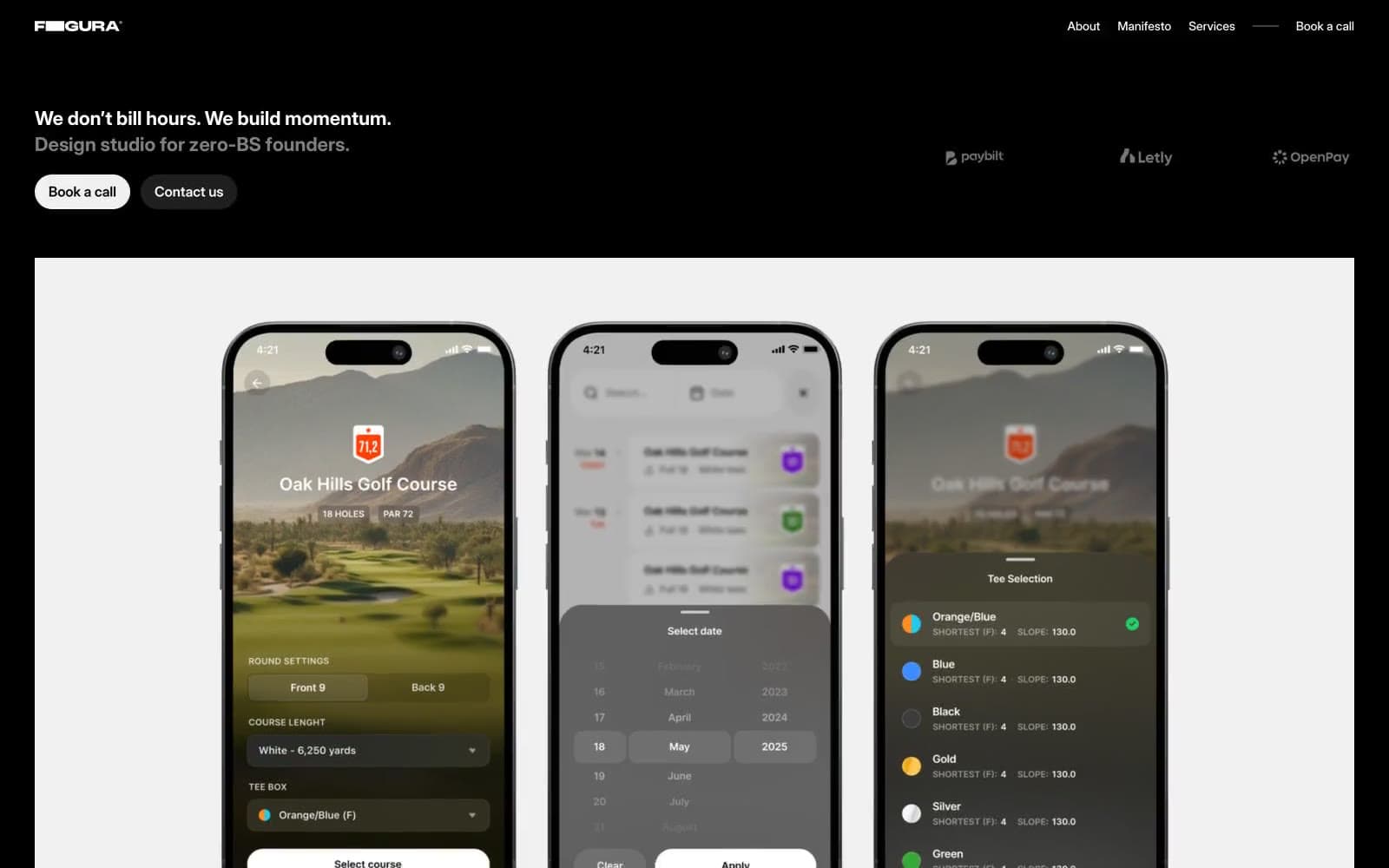
Figura design system

Accent2
Decorative atmospheric gradient — cool, desaturated pastels (pale blue, sage, blush) used as rare background washes to add tonal depth without breaking the monochrome discipline
Secondary atmospheric gradient — a tighter, near-monochrome cool wash for quieter decorative moments
Neutrals6
Page background, section canvas — the dominant ground that swallows 80%+ of the screen and gives white text its full charge
First elevation step — subtle panel surfaces that lift content off pure black without breaking the dark mood
Second elevation step — nested cards or dividers sitting on Charcoal surfaces
Muted helper text, secondary borders, disabled labels — the only non-pure neutral in the palette, carries low-emphasis metadata
Light neutral used as an off-white card surface, softer than Paper for large background fills that need reduced glare
Primary text, reversed buttons, featured surface cards (product mockup stage) — used sparingly so each white element reads as a deliberate reveal
Try a pairing
Pick any two colors from the palette to check whether text stays readable on top.
Aa
Paper on Void
21.00 : 1 contrast
- Body textPasses AA 4.5
- Large textPasses AA 3
- StrictPasses AAA 7
More DESIGN.md files. Same web, different personalities.

Basement Studio
Studio
Production Portugal
Studio
Active Theory
Studio
Adnaut
Studio
Agence K72
Studio
Akash Tyagi
Studio
Analogue
Studio
Athletics
Studio
BAM Photographers
Studio
Bareis + Nicolaus
Studio
Becklyn
Studio
Branding
Studio


