
Fey. Type and silence, nothing else.
- Finance
- Light theme
- 3 colors
- 2 typefaces
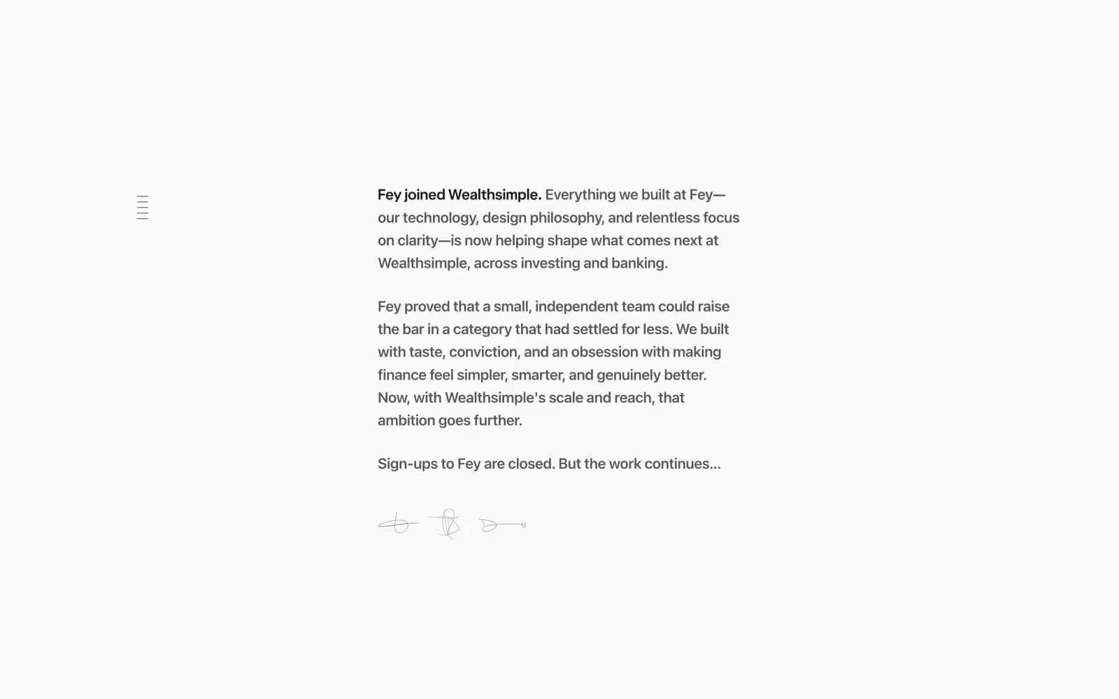
Fey operates as a quiet editorial announcement — a near-empty white page where a single column of 21px serif-quality system text does all the talking. The entire visual system reduces to two ink tones on warm off-white: a graphite body for narrative and a near-black for emphasis and the one link. There are no buttons, cards, icons, or color accents — the restraint IS the design. Layout is centered and narrow (~520px column), with generous vertical rhythm between paragraphs and a small left-edge navigation index that acts as the only structural decoration.
Fey design system

Neutrals3
Secondary body text, navigation labels, and subdued headings.
Body text, nav labels, footer copy — medium-dark gray keeps long-form reading comfortable without high-contrast harshness
Page background — the only surface; everything floats on this warm off-white
Try a pairing
Pick any two colors from the palette to check whether text stays readable on top.
Aa
Warm Paper on Ink
16.33 : 1 contrast
- Body textPasses AA 4.5
- Large textPasses AA 3
- StrictPasses AAA 7
More DESIGN.md files. Same web, different personalities.

Mollie
Finance
a16z speedrun
Finance
Acctual
Finance
Airtree
Finance
Ambrook
Finance
Angellist 2024
Finance
Apron
Finance
Baselayer
Finance
Basis Theory
Finance
BlueYard Capital
Finance
Brex
Finance
Coda
Finance


